Back to Parent

Outcome


Img 20151004 145032.thumb
Show Advanced Options

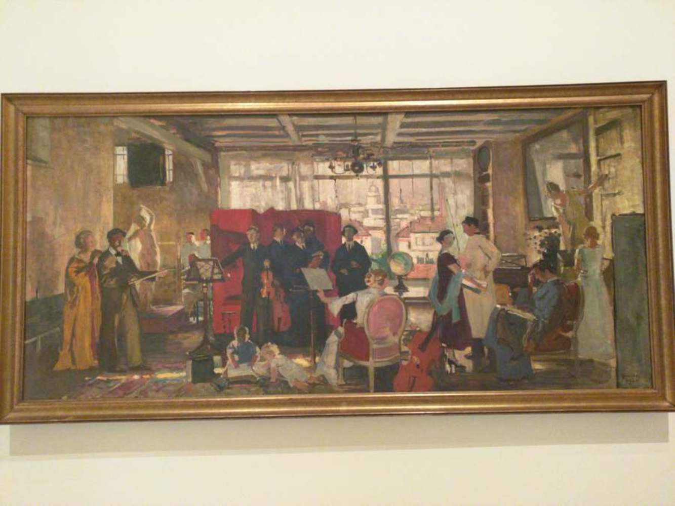
Schola (1926), by Lucien Simon

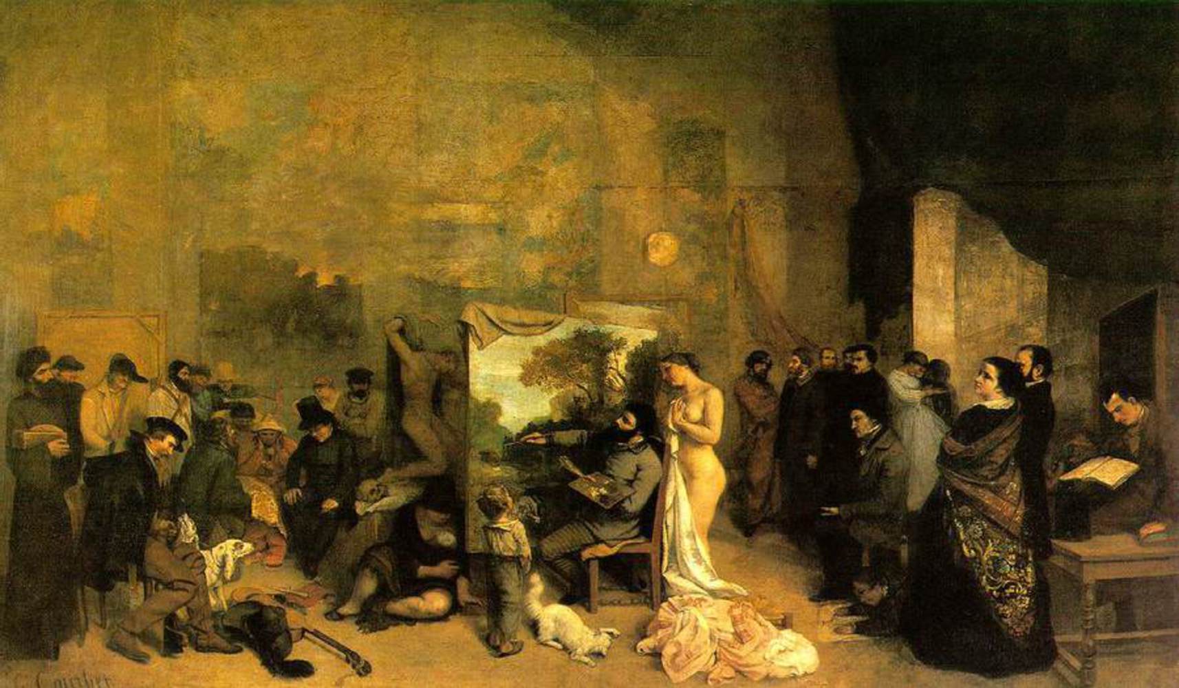
In 1926, Lucien Simon, a French painter, created Schola by using oil on canvas. Because he admired the work of Jean Desire Gustave Courbet (1819-1877) and Edouard Manet (1832-1883) and was associated with a group that admired the two, he wished to imitate their content and style. Using his friends and family, Simon reenacted the scene from Courbet's The Artist's Studio (pictured below), which featured a studio full of influences on his own life. In reconstructing Courbet's work, Simon imitated Manet's style of using flat broad brush strokes, colors, and details. In emulating these two artists, he captured both the studio and the subtle use of geometry to allow the mind to fill in the gaps. Detail is lacking in some parts, but from afar, the painting seems extremely realistic. Most of Simon's other works seem to include flat broad brush strokes as well. I would say his works are mostly realist. He liked to "transfer the psychological depth and intimacy of his portraits of family members into sympathetic portrayals of Breton village life" (source).
Painter.thumb
Show Advanced Options

Experience and Response

The work was in a darkened room in the  Carnegie Museum of Art. I think I was drawn to it because it was big and had a lot of life to it. It was much wider than the span of my arms (a massive painting); I had to physically step back to get the whole image in my vision. I first noticed the lively nature of the room, the nice scene outside of the window, and the different groups separating the 18 people depending on their activities. The flat brush strokes evoked a sense of anonymity (faces are not visible), yet still portrayed such exquisite detail. The warmth of the painting and the children on the ground reading the book made me think, perhaps this is a family? Although the scene seen through the window did not seem American, the 1926 signature at the bottom right made me think of The Great Gatsby, and how extravagant that time period was. However, the people posing for a man painting changed my initial assumption. Perhaps, something of a studio where people could practice their art? Given the angle, it seemed plausible. The man next to the woman in gold seemed also to be painting the room. Perhaps Simon was standing from another angle and painting the same scene, and perhaps he himself appeared in the other man's sketch? It was an overflow of art in one room, almost too much to be contained. The shading helped me place everyone.  Every person was in the middle of an action, and I could place myself in the room and see exactly what they would do next.

Flatbrushstroke.thumb
Show Advanced Options

Product

Things I thought of before beginning:
- warm colors to represent intimacy 

- flat and broad brush strokes to simulate his style

- intimate environment (something meaning a lot to me)

- slightly distorted details, but retaining shape enough to distinguish what it is

Since I can't draw people, I decided to draw my desk with Simon's technique and style. Simon's painting has 19 people and a full room. Because of that, the painting seems to be bustling with energy. My desk is packed full of things, so I think I can somehow get the liveliness aspect through this concentration. I tend to stay in my apartment a lot, so it means quite a bit to me (and also holds all my stuff). Instead of my relationship with people, I sought to portray my relationship with things important to me (sometimes because they represent my relationship with people: presents, things I got from certain events).

Img 20151006 054930.thumb
Show Advanced Options
Experience recreate.thumb
Show Advanced Options

Midway through I realized that I really do suck at drawing, and also, getting details through vague geometry while also using large brush strokes to distort the finer details is extremely difficult. 

I did also almost run out of time, so I couldn't accurately portray the mess that is the bottom left corner of my desk, but I did get to basically include all of the top part of my desk, which holds all of the things I treasure.

Reflection

I learned that attempting to recreate my experience of something bigger than me in under an hour is nigh impossible. I only managed to capture maybe two aspects of Simon's painting out of a few that I wanted to. I think I managed to accurately portray his use of abstract geometry such that objects are distinguishable from afar. I don't think my "flat brush strokes" in Photoshop were very successful. Because I was pressed for time, I couldn't add more detail than I did. If I were to do it again, I might focus more on just the top row of my desk because that's where the bulk of my treasures lie. I would also learn how to properly simulate flash brush strokes. Although I don't think I accurately captured the whole experience, I think I did accurately capture certain aspects of my experience. There are a lot of things happening/existing at once, so your eyes end up wandering to different parts of the image. From afar, you can get a gist of the entire picture and know that it is a desk. However, you can't get the experience of stepping closer and being able to pinpoint smaller things in the image that still hold meaning since the finer details were so hastily done. I do feel that I understand or feel closer to the painting now though.

Drop files here or click to select

You can upload files of up to 20MB using this form.