Outcome
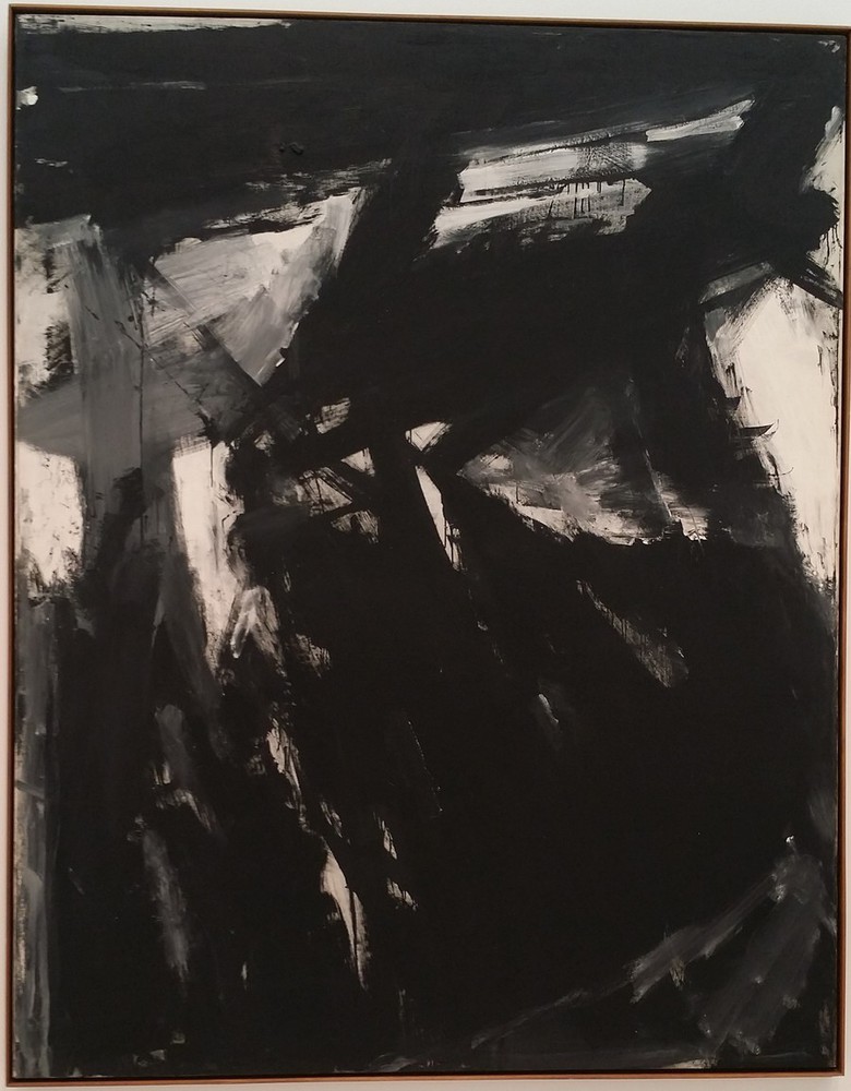
I then took a few steps back, viewed the work with more imagination and emotion, and thought of the following images:
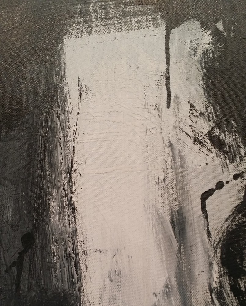
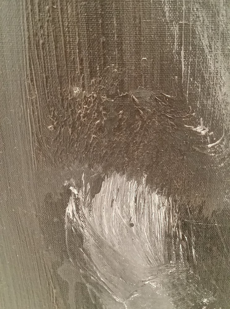
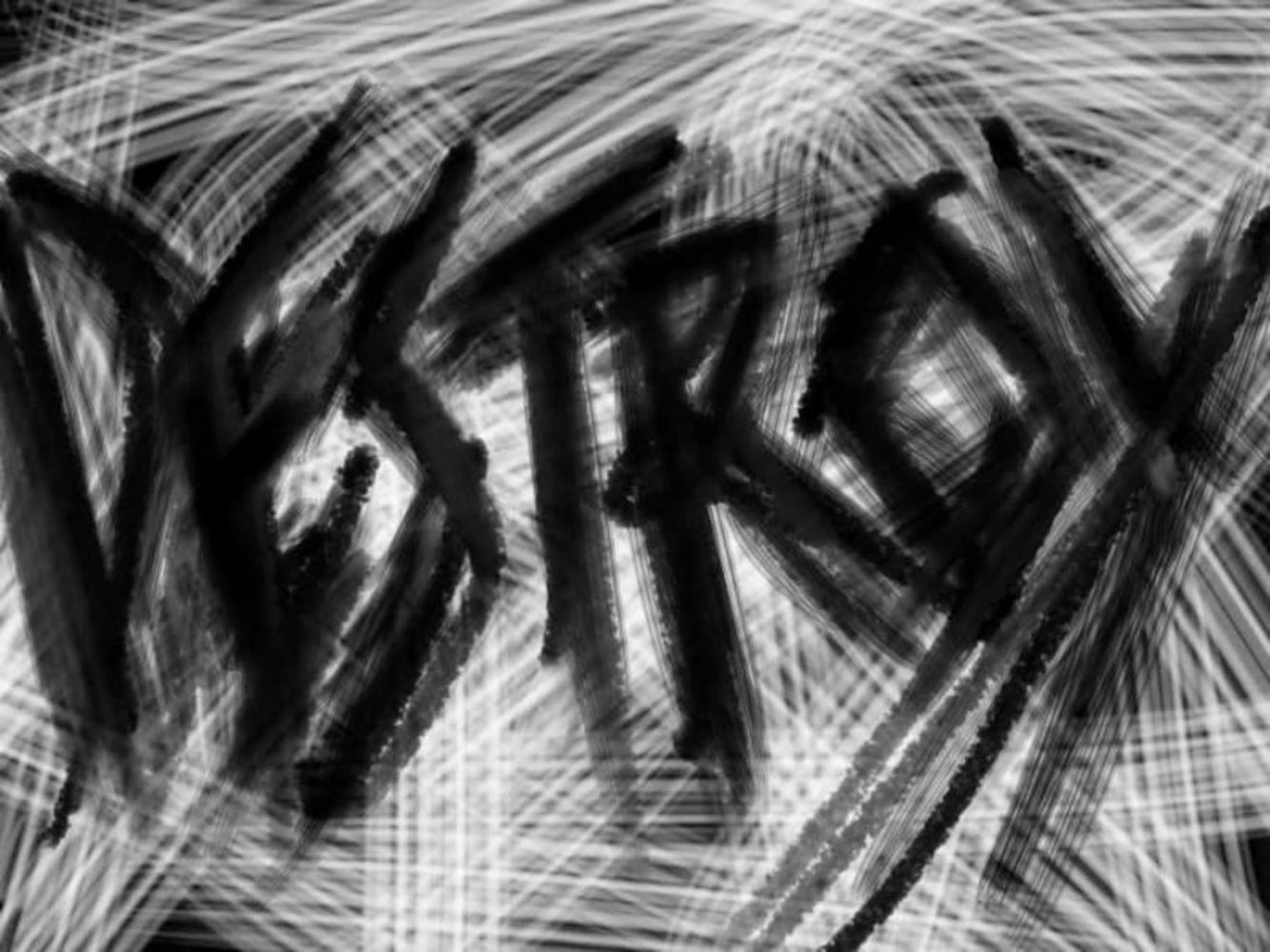
-falling bridge/building structure
-broken ceiling
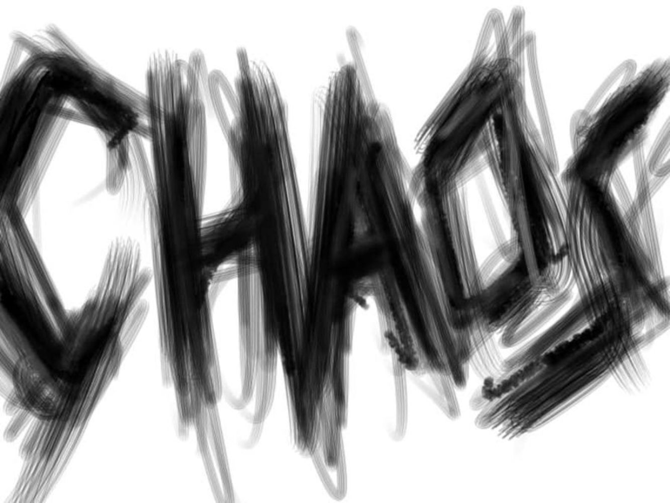
-chaotic battlefield
-spikes jutting out from the ground
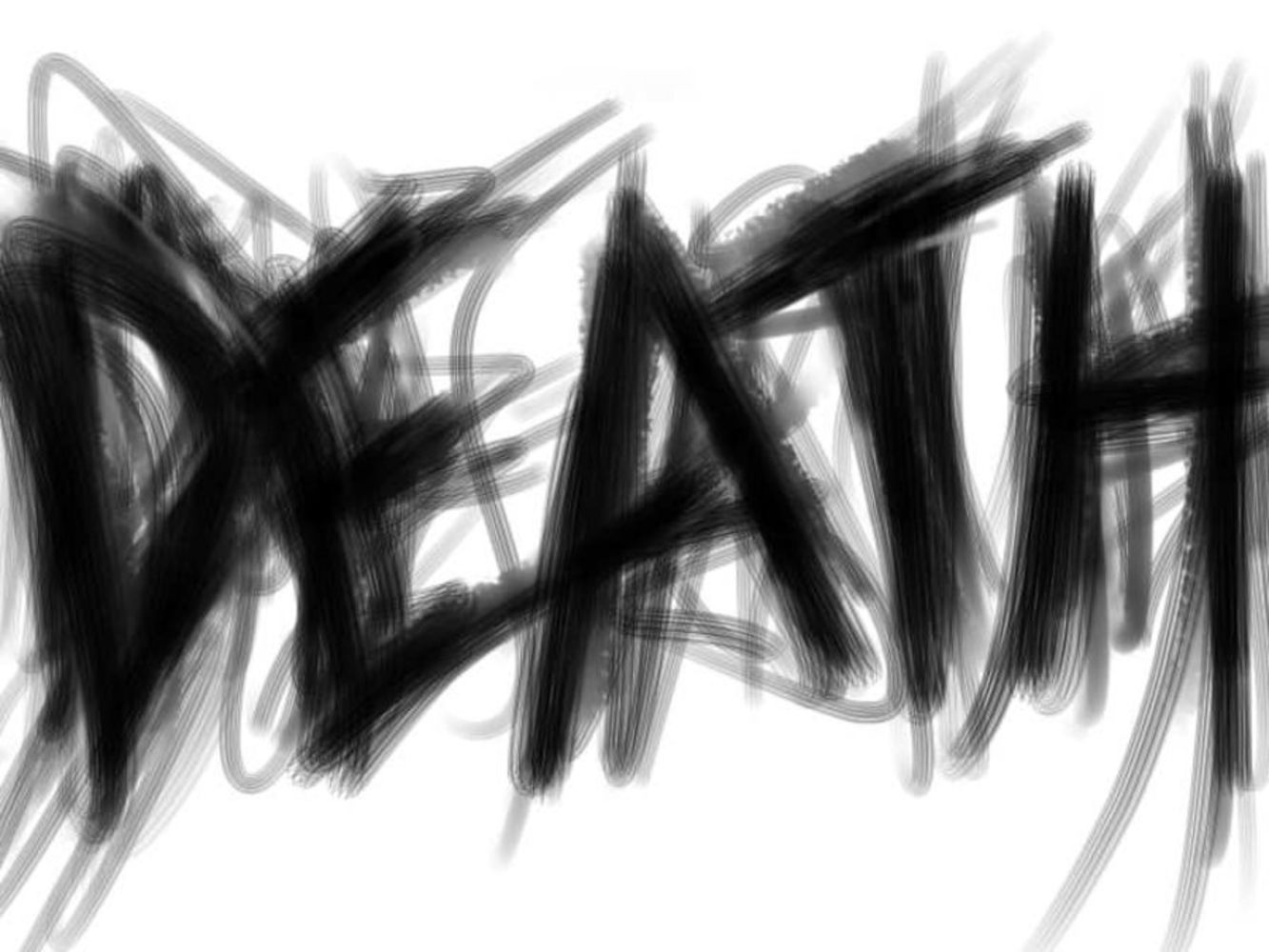
-death
The brush strokes evoked themes of chaos, violence, impatience, and destruction. This was also because I slightly know "Siegfried" from Norse mythology.
I spent the last 10 minutes of my viewing against the wall opposite the work, looking at the piece as a whole and letting my emotions/imagination connect with the piece. As I looked more into the themes, I connected that back to my own recent experiences of disappointment/slight anger, which ended up amplifying it and made me more annoyed than I previously was.
Product
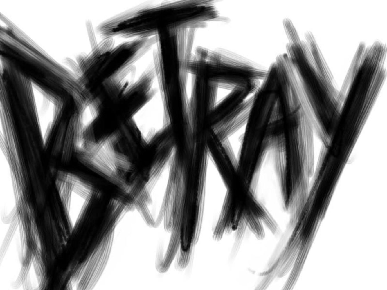
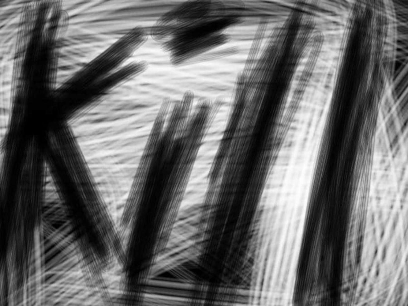
My experience with "Siegfried" really riled up my emotions. I felt my pent-up anger resonating with the violent and chaotic themes of the piece, so I first tried to portray that through chaotic images. My final product ended up being a series of images of words that represent the specific ideas/emotions that I thought of or felt during the experience.
Using the software PaintTool SAI and a Wacom Intuos pro pen and touch medium tablet, I first tried just closing my eyes and letting my anger guide the tablet pen to create random angry strokes, but they looked more like random scribbles on digital media. I did this for the first 15 minutes, but found that it did not work as I expected.
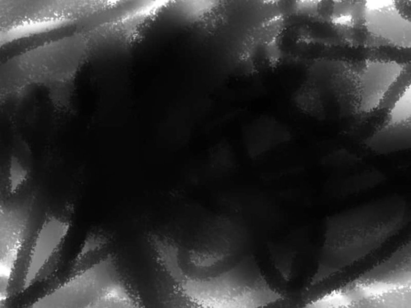
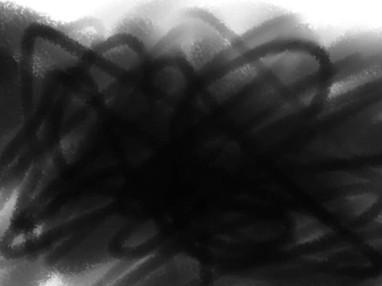
I then decided to write out the particular words that I thought of during the experience. Using the same tools, I still let my anger guide the pen, though I controlled it to create specific letters. The result a bunch of scribbles that together create a rather chaotic font that I am quite pleased with. I also rushed through each creation in hopes of creating a more impatient feeling, and used the bristle brush with the fuzystatic brush in various sizes to create more texture.
I added BETRAY because of the story behind Siegfried's death in Nibelungenlied, in which he helped his brother-in-law--Gunther-- marry another woman, only to be killed because Gunther believed that Siegfried slept with her (though he did not).
Reflection
Part of the reason I like black and white works is because so much emotion and movements can be created with just these two colors. Yet when I try to do the same, it just falls flat. Going in to the product, I thought I had a good idea, but that quickly failed. I was lucky that my idea only took 10 minutes, so I still had about 50 minutes left to try something new. I did not, however, have enough time to deeply reconsider other methods; I had to quickly make a decision and implement it.
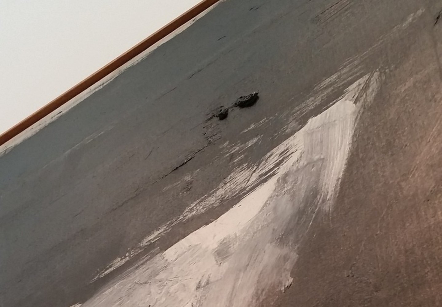
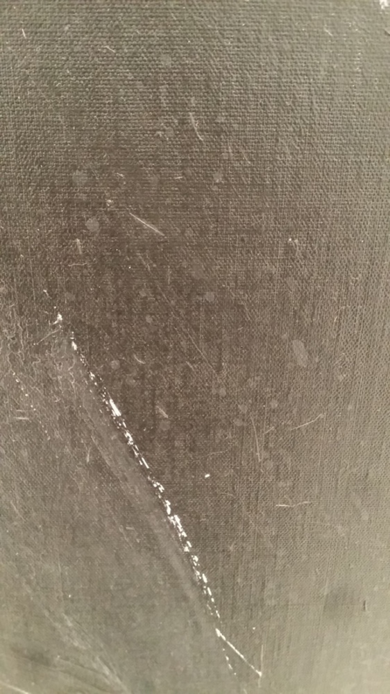
As for the experience, I think I captured the last part fairly accurately (the emotion part), but unfortunately that was only the last 10-15 minutes. I spent at least 10 minutes examining the technical details, yet I did not apply that to my product. I did use only black and white to create some greyish colors, use large strokes, and conveyed a similar theme, but the dripping paint, globs, and extra textures were not present. For next time, I would think about applying the technical details instead of focusing on the emotional details and themes, which ultimately did not encompass the entire experience.
You can upload files of up to 20MB using this form.