Outcome
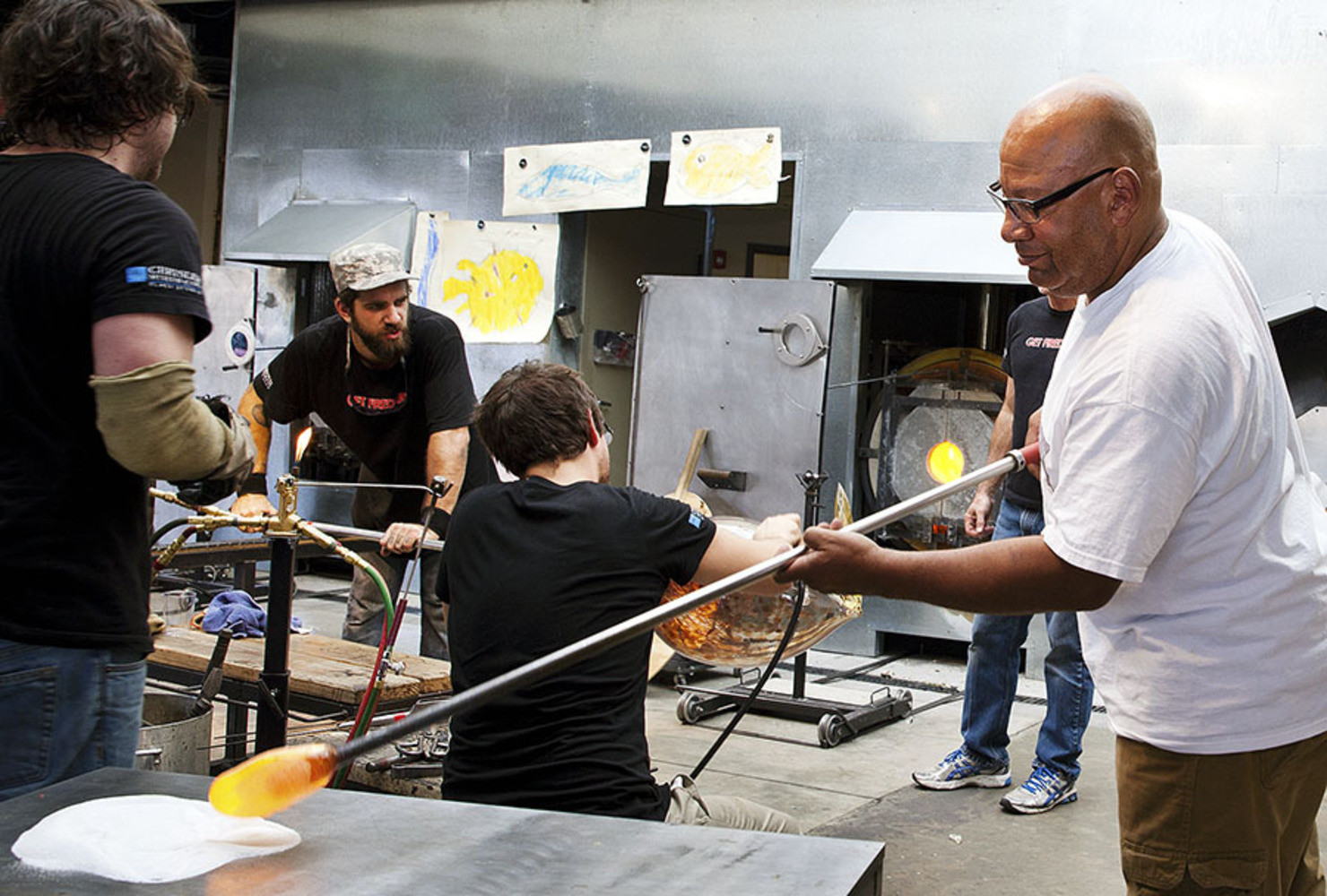
Therman Statom is a sculptor, glass artist, and painter, known as a pioneer of the contemporary glass movement because of his life-size glass ladders, chairs, tables, constructed paintings, and small scale houses created from gluing class plates together. He also sandblasts the glass to use as canvasses for painting and line work, and adding blown glass and found objects to his works. As a young man he enjoyed painting and experimented with ceramics at RISD, but was introduced to blown glass there and eventually graduated with a BFA studying at the Pilchuck Glass School in RISD, later studying at the Pratt Institute of Art and Design. His works have evolved to focus on education in the arts, creating pieces with the help of adults and children as a community, focusing on the act of doing.
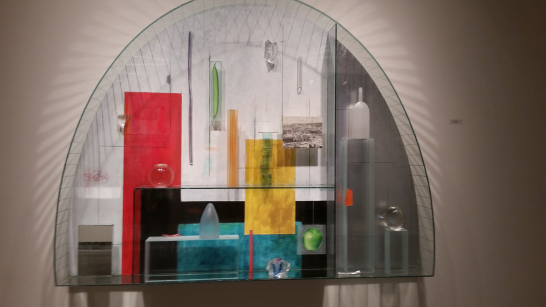
"Indagare", or investigation in Italian, is the exhibit I attended at the Pittsburgh Glass Center by Therman Statom. There were many beautiful and compelling pieces there, such as a glass ladder leaning against a wall painted red, quaint houses filled with mirrors and found objects, paintings, glass chairs, and the most spectacular of them all was the large glass sculpture room called "Constantinople" However, the piece which really drew me in was "Blue Towers". At first glance it wasn't the large wonder that was "Constantinople", nor did it hold the same sort of quaint curiosity that the glass works of the small houses and glass household objects did. However, there was a sort of living beauty that all of the works had that I felt could be truly seen with a closer investigation of "Blue Towers", not to mention I was quite confused and interested in why the work was called blue towers when at first glance, the only blue parts where the blue painted rectangle at the bottom and the misshapen blown glass fragment at the bottom.
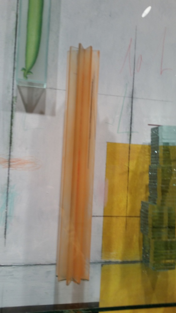
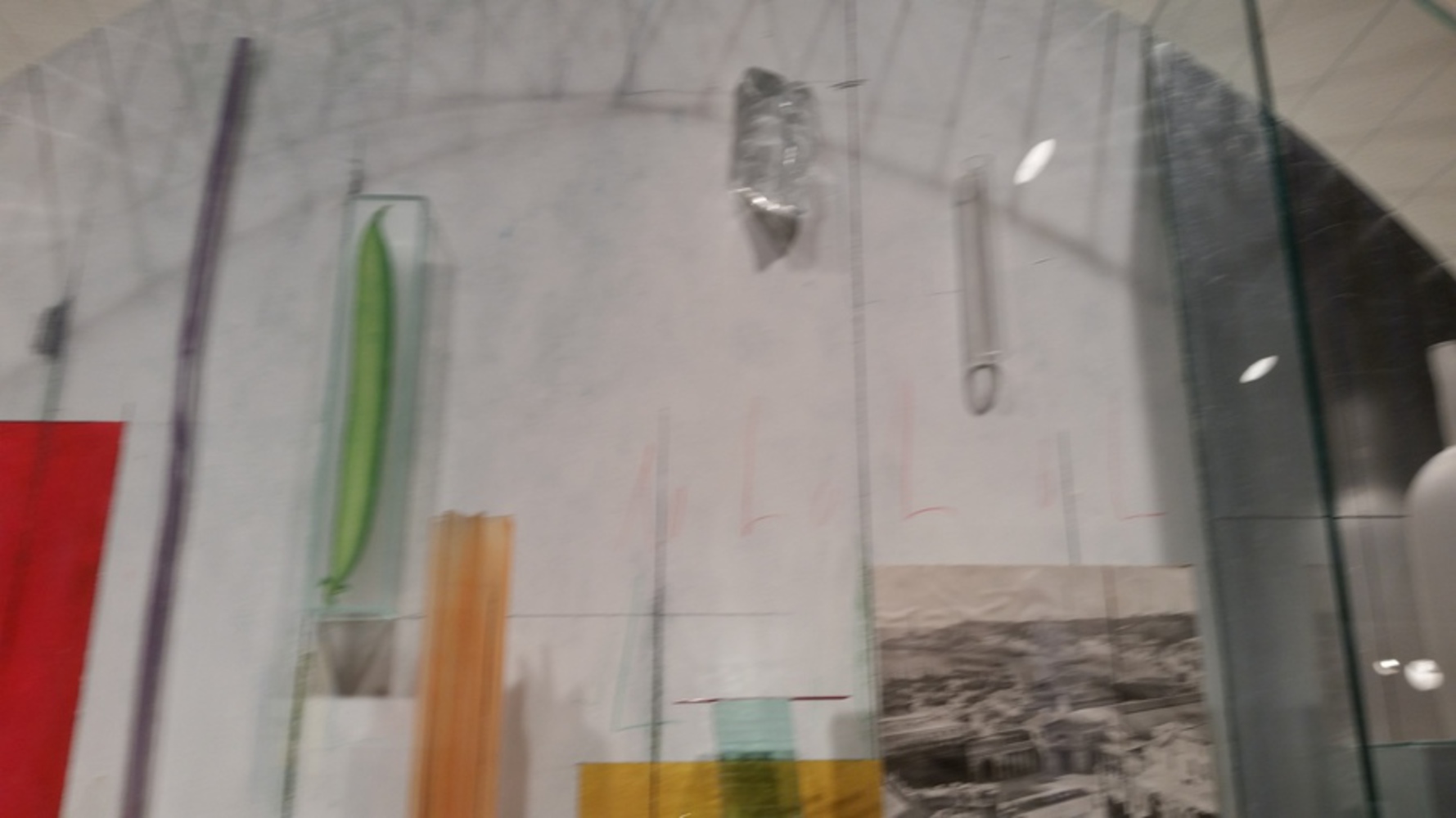
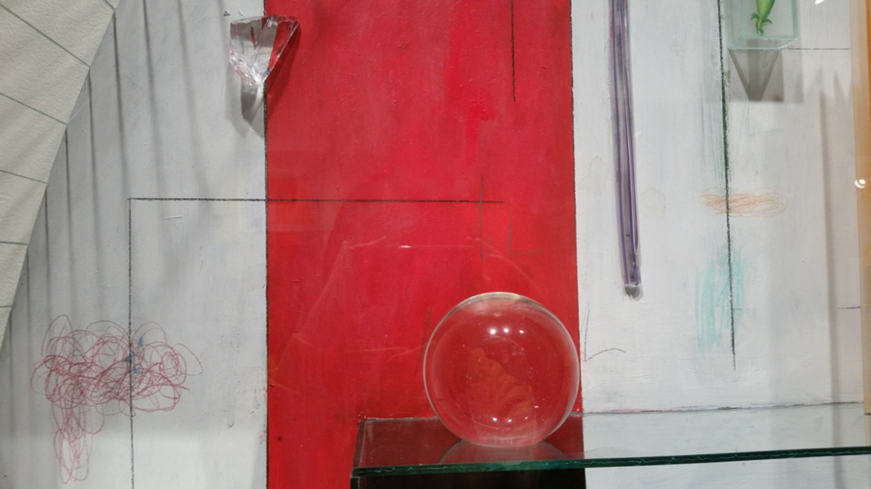
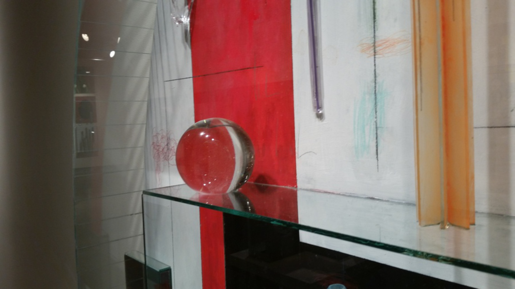
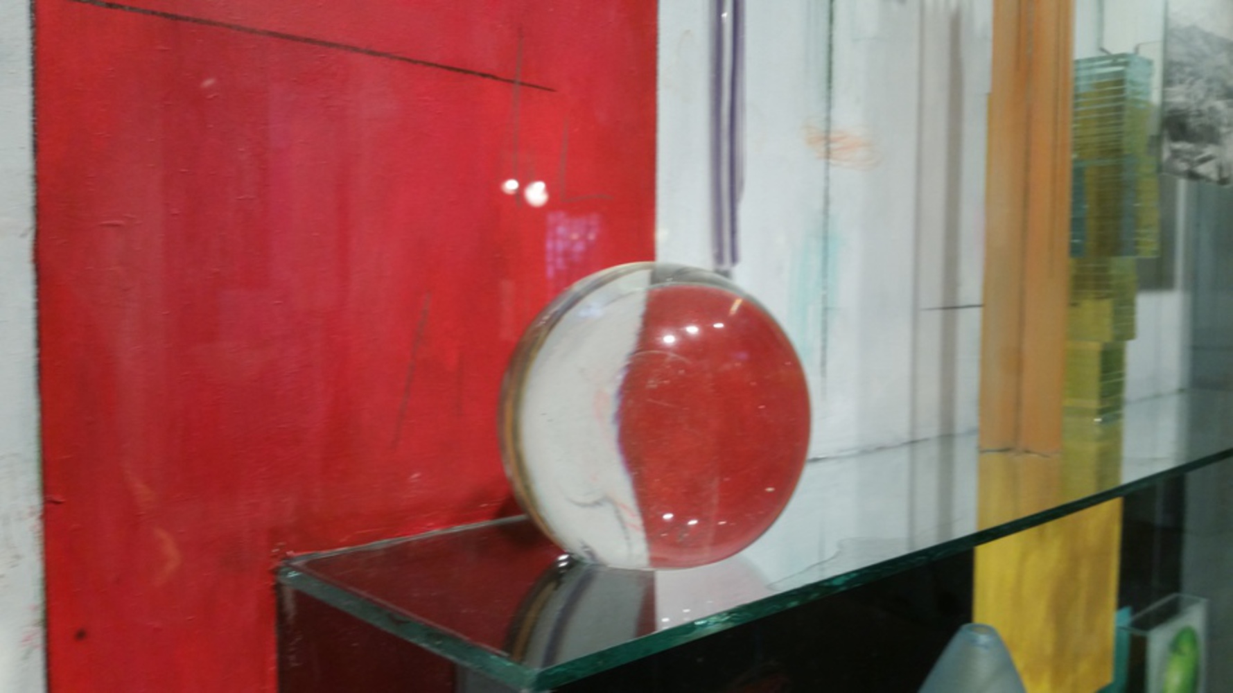
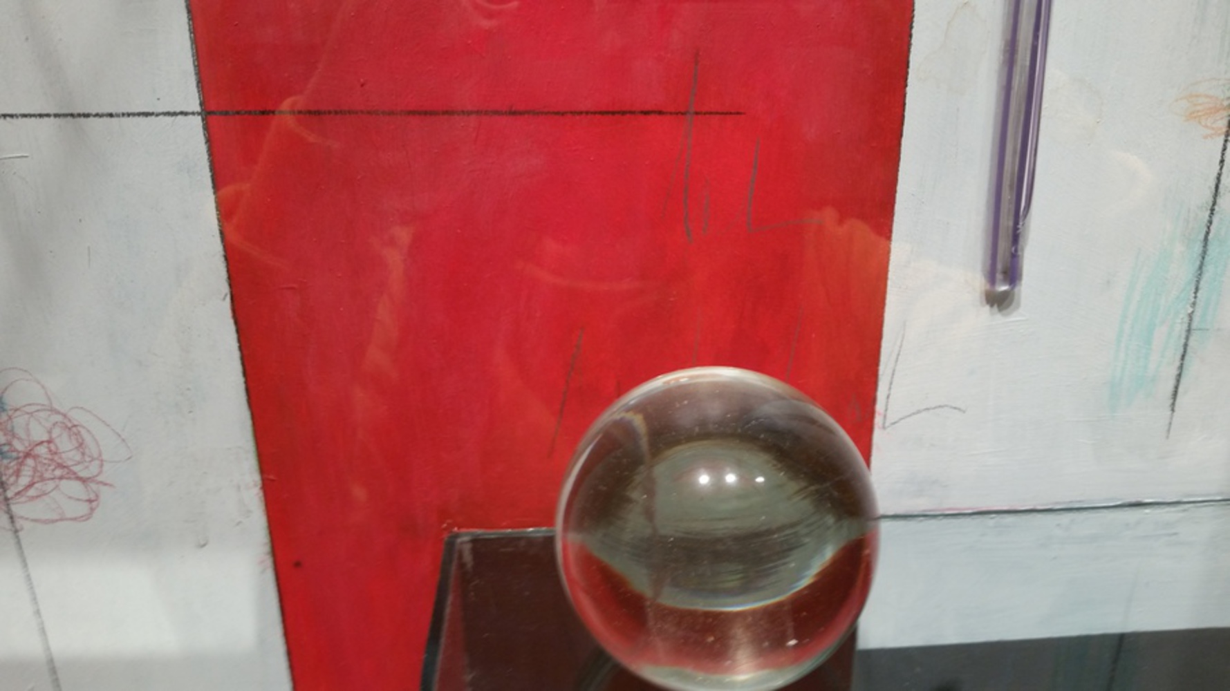
At first glance this piece is a rather jumbled mix of chaos. The background was both paint, lines, scribbles, and aluminium. There were various glass pieces, some of them frosted and painted, other colored, with a mirror and a picture of an aerial shot of a city. However, on closer inspection, the glass pieces warped the deliberately straight lines and colors, blending them like the childish scribbles on the white background of the piece.
Each turn of the head resulted in something new, and it was exciting to see the piece come alive with a closer look and a turn of the head. He also, it appears deliberately used blown glass for this piece, and a well-rounded, smooth piece at that. It is pretty difficult to blow glass and shape it into an almost perfect sphere, and I find it interesting that Statom chose to leave only a small bubble instead of blowing the glass out all the way into a sphere.
So, I tried to create a short little animation in Maya. The animation worked. It was pretty. It did not export. Well, my reasoning for using Maya is simple -I wanted to express the 3-dimensional experience of Statom's art and the experience of viewing the art, so I wanted to do a 3D animation, which would bring out the movement of the light and the reflections of "Blue Towers". I created a glass sphere on top of a blue twisting tower of glass, which references the artwork as a piece. However, the most important part of the piece was the animation. I created a black prism which would wind its way up the tower, drawing inspiration from the glass tower in the artwork which seems like a moving tower. Then there were the revolving planes of color, which I created in a square around the tower and sphere. My experience was one of discovery, so the colors would revolve and around the piece so that each second is different and new. I wanted something that would express my excitement and inquisitiveness and confusion with the piece, so the revolving, constantly moving pieces were the result
One thing I regretted about using Maya for was that I did not have the time to set up the fireworks animation that I wanted to really express my excitement at discovering some interesting new nuance to the piece. Firework animations are time-consuming and require a lot of particle and gravity effects, and I just didn't have enough time. Then there was the glass texturing. With more time I could create a more life-like glass texture, but because of time constraints the warped light effects that I wanted to display could not occur because I used glass presets. I already knew Maya was time-consuming, but next time I should probably give more thought on rendering the work, because the animation refuses to render all of its frames, and it is quite frustrating. I think I rather got some of my experience expressed well, but I really do wish I had more time to really express all of the feelings I had while viewing this piece.
You can upload files of up to 20MB using this form.
