Back to Parent

Outcome


Work

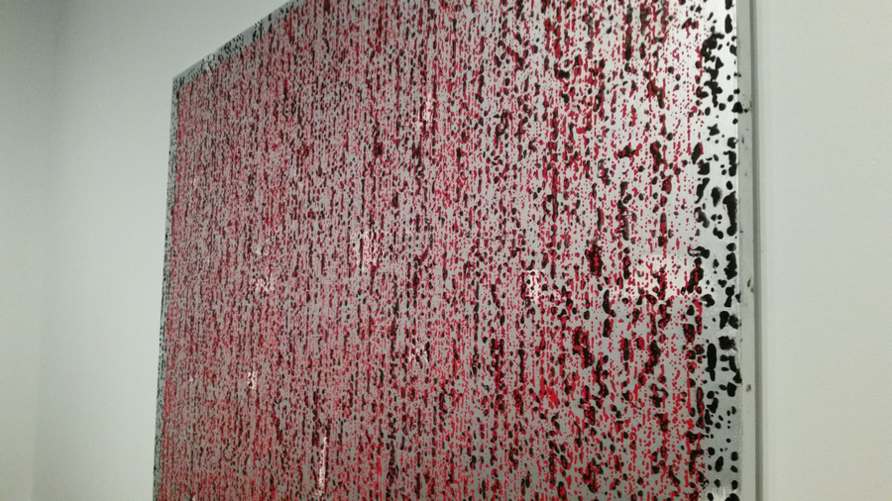
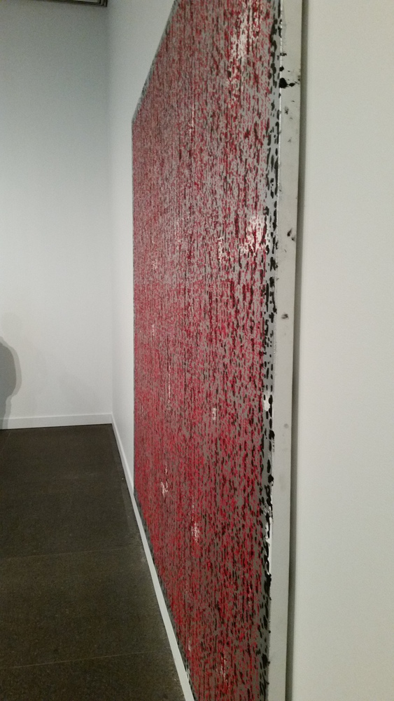
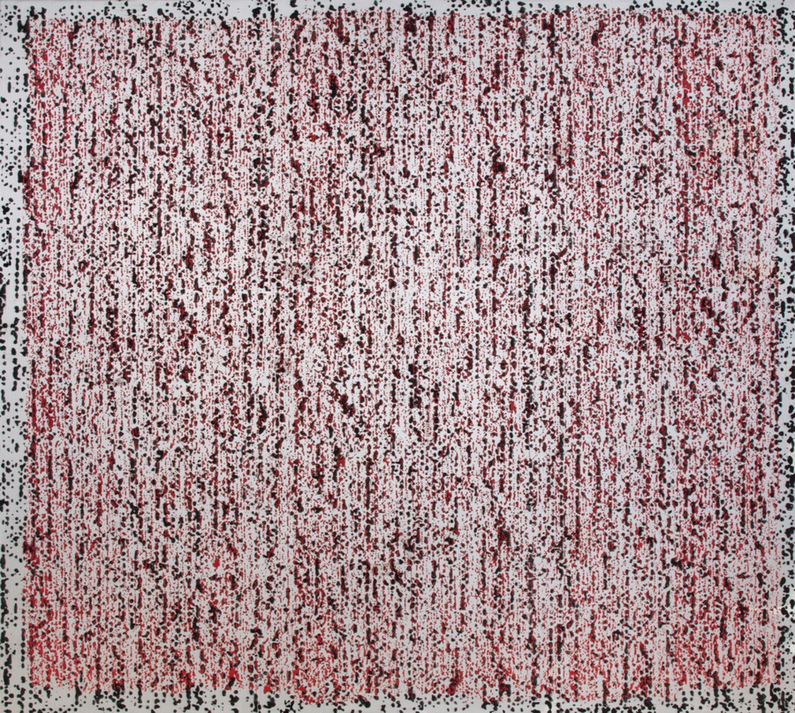
At the Carnegie Museum of Art, I observed Jacqueline Humphries’s “( )”. Composed of oil on linen, it features black and red drips of paint, all on a silvery, reflective background. The black drips are the larger of the two, with many of them merging together to form blobs of black paint; the red is applied in a more dot-like pattern. Together, the two colors seem arranged in columns, though the red stands out more as the top-most layer of paint. The red paint is also confined within a border on the canvas that contains no red paint. In addition, there are several seemingly random white blotches scattered throughout the canvas. Many of these are not visible from certain angles, with the metallic background reflecting light in such a way that the white blends in. 

Jh672.thumb
Show Advanced Options

Experience and Response

All of Humphries’s paintings in the gallery seemed a bit alien, but this was the first that caught my attention and was the most unsettling, partially because of how different it was from the three others in the same room. While the others contained mostly uniformly sized circles and smeared colors, this work contained an uncountable number of small, distinct dots, though still generally arranged vertically.

The red paint drew my eye first, and I imagined blood dripping down from the top of the canvas. As I walked around the painting, however, it seemed that the red paint was in the topmost layer, especially apparent when the black dots all but disappear when viewing the painting from the side. Thus, the red seemed organic and voluminous, some sort of blood-red plant that grew over the rest of the painting, in the process of covering the background. Naturally, my mind wandered to the “red weed” described in H.G. Wells’s “The War of the Worlds” and portrayed in the 2005 movie of the same name. In one scene, the main character walks outside to find the landscape covered in the red weed, thought to be fertilized with harvested human blood.

The black drips were reminiscent of small oil droplets, especially on the metallic, reflective background. This added a sort of mechanical element to the painting, in contrast with the plant-like growth on top of it. The silvery background was encompassing yet dull, and seemed to add a tangible, metallic feel to the entire painting that I almost thought I could smell.

As a result, the painting as a whole was, to me, a juxtaposition of the organic and inorganic, natural and mechanical, though entirely alien and unsettling. 
20151003 161922.thumb
Show Advanced Options
20151003 162043.thumb
Show Advanced Options

Product

Without any photo or image editing experience, I was stumped. I wanted to convey the contrast between my interpretations of the different elements in the painting, but could not think of anything that would look better than a bad Jackson Pollock imitation done in red crayon. 

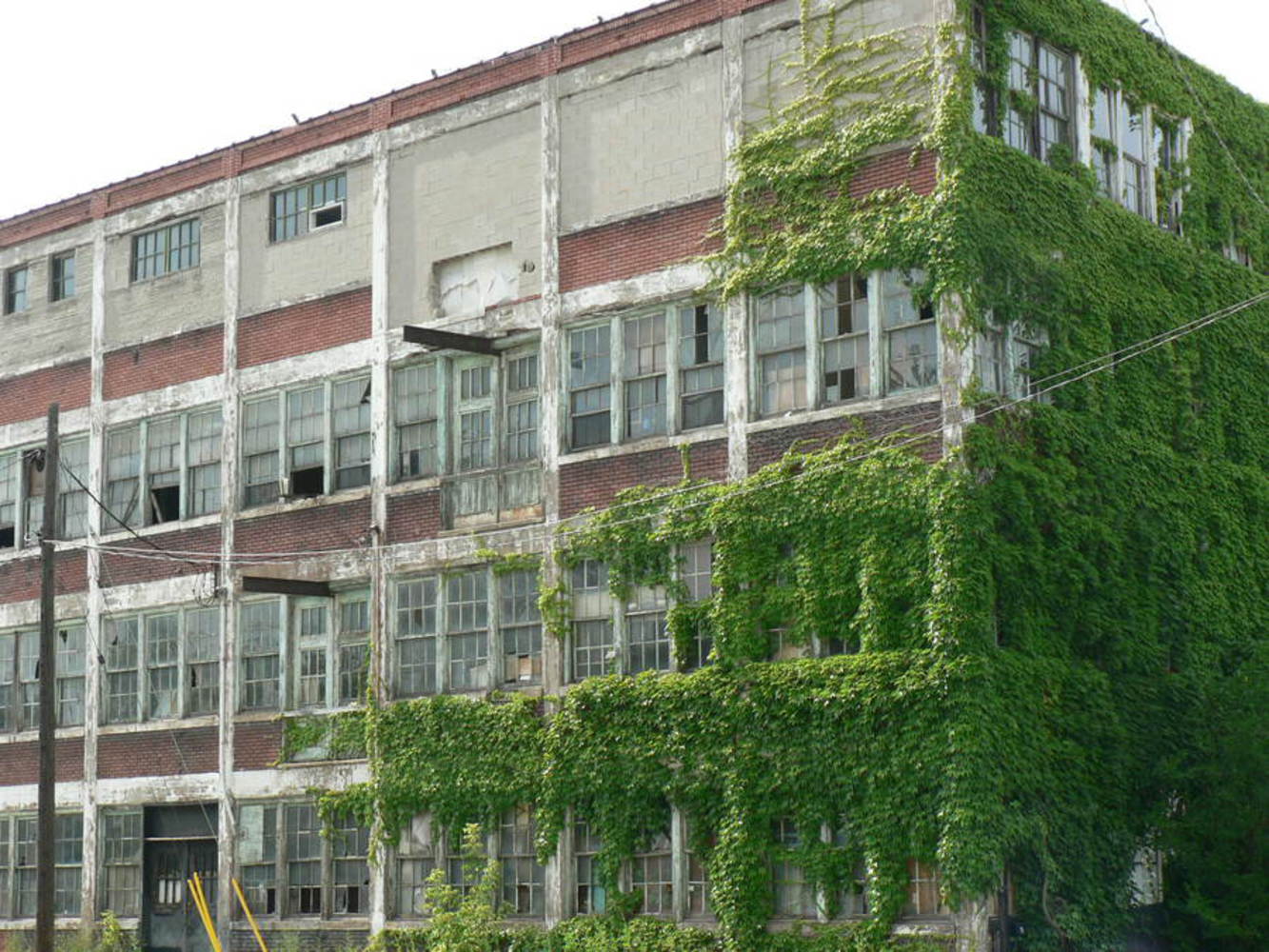
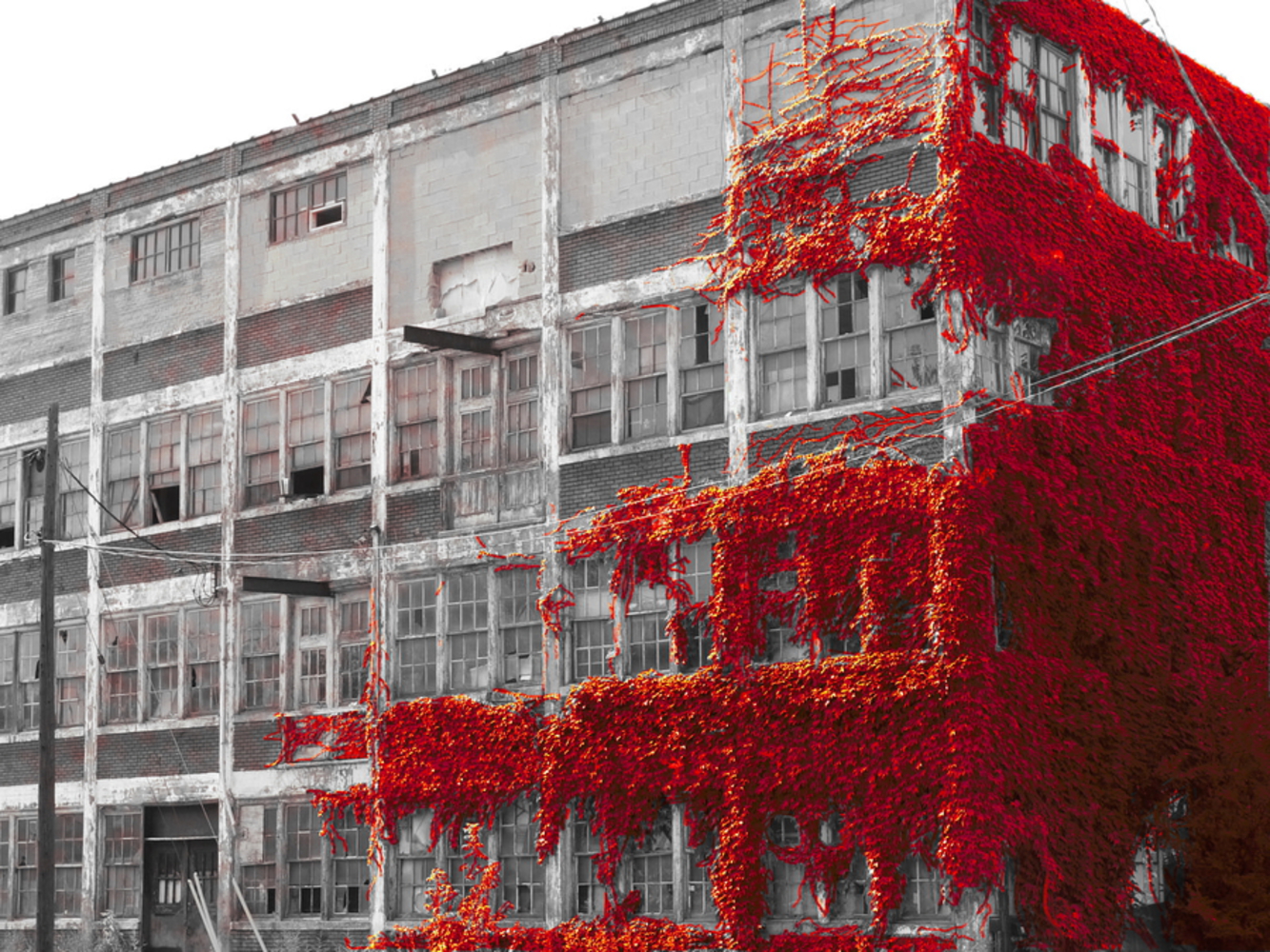
After a quick Google search, I found the simplest, hacky way to get a result close to what I envisioned. First, I found an image of an old, abandoned building covered in vines. I then imported it into GIMP, adjusting the color balance until I had an image that was primarily red. I duplicated this image, converted it to greyscale, and pasted it in the topmost layer. Next, I added a white layer mask, and began painting over the vines with black selected. Somehow, this essentially equates to painting transparency into the topmost layer. Starting with a thicker brush for the denser areas, I made my way to the edges of the overgrowth, zooming in and switching to smaller brushes along the way. After an hour of eyestrain and carpal-tunnel syndrome inducing mouse control, I had a satisfactory image.

Vines.thumb
Show Advanced Options
Vines.thumb
Show Advanced Options

Reflection

My experience-based reproduction certainly captures the contrasting elements I noted earlier, with the artificial building and the organic plants. There is something alien about the bright red vines covering much of the building, especially against the colorless background of the abandoned building. These combined elements create an eerie atmosphere, with everything so familiar and unfamiliar at the same time.

Replicating my experience with the art was unexpectedly difficult. While brainstorming, I often found myself coming up with ideas that were very similar to the original work itself, made up of black and red patterns on a metallic background. This may have been caused by the painting’s relatively simple composition, and I had difficulty abstracting my own experiences away from the relative concreteness of the paint and canvas.

I also could not come up with a way to capture certain aspects of the original painting, like the idea of motion and changing perspectives. Walking around the room, the painting’s appearance would change, whether through the light reflecting differently off the background or the colors covering each other. I could not combine this with the experience I ultimately chose to portray, though I don’t have any idea how I would have shown it anyways.

Drop files here or click to select

You can upload files of up to 20MB using this form.