Back to Parent

Outcome


Juliee.thumb
Show Advanced Options
Stadia ii a.thumb
Show Advanced Options

Work -

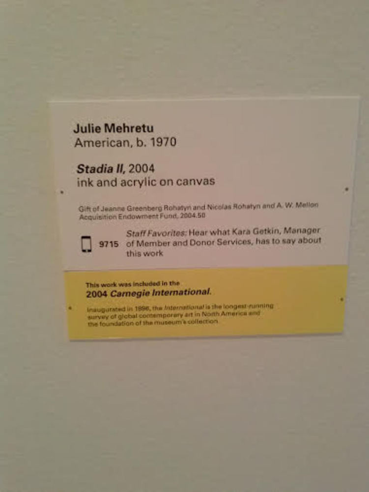
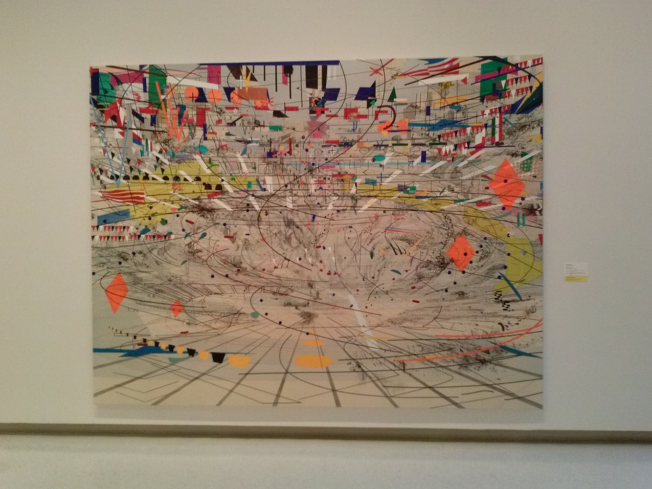
At the Carnegie Museum of Art, I was walking through the contemporary art section, and then I saw the above painting, named Stadia II. American artist, Julie Mehretu, created the painting in 2004. I found this painting compelling for its attention to detail. It give me the impression that the painting was carefully thought out, a feeling that I did not get as much from many of the other contemporary paintings I had seen. From looking at the wide scale of the painting, I can only imagine the much time and effort Mehretu had put into the piece. I am also drawn by the sheer complexity of the painting, which had drawn me into looking at this painting closely.

Experience and Response -

It was dim, rainy day when I was at the museum, yet looking at the painting gave me a sense of happiness and hope. The eclectic amalgamation of varied shapes and black lines all contributed to the buzz in the painting. The curved lines and the orientation of the shapes, tilted sideways, gave me the impression that I was looking in a three-dimensional world, as if there was a world of fine details that await exploration.

The painting also exudes a sense of worldliness, with shapes that appeared to resemble flags of countries. It made me think about the overwhelming size of the world, which made me feel so small. The illusion of fluid-like motion, yet not liveliness, in the painting made me realize how the world can be sometimes a confusing and unfamiliar place. The row of upside triangles on the right look like flags at a race, which made me fear how life resembles a competition and is often fast-paced.

When I approach the painting at a closer distance, I noticed a drastic change in my perception of the painting. It was like zooming on an image with a camera, which was a little dizzying to see.

Perceptions1.thumb
Show Advanced Options
Perceptions2.thumb
Show Advanced Options
Response painting.thumb
Show Advanced Options

Product -

I created my paintings by first producing a background. First, I made a gray textured background to represent the weather the day I went to see the painting.

In order to portray the fluctuation of emotions I experience in studying Stadia II, I was inspired by the graph of a heart monitor, as the activity of the heart is often thought as an indicator of emotion. I put in multiple layers of paint-brushing to add representative layers of complexity to the fluctuating line. The transition of colors represent the change in color of my emotions, from cool blue to excited red.

I chose light and opaque colors to represent the fuzziness of my emotions, which were subdued by fatigue and the gloomy weather. I also made my painting look childlike through the choice of rainbow colors and experimentation with shapes to respectively symbolize my fear and curiosity about the bigger world around me. The mismatch of colors in the stars are there to represent my lack of sense of belonging to the bigger world depicted through the painting, as well as my recurring confusion about the meanings of the shapes within the painting.

Reflection -

Through this project, I learned how difficulty in creating abstract art, even if it doesn’t always at times involve the same level of skill as representational art. And while abstract art, from my impression, does not always seem to involve knowledge of conventional artistic skills, I learned how much abstract art can be richer in meaning. Allowing to freely create my art while creatively choosing symbols to convey was a very meaningful experience.

Next time, I believe I could work on adding more details to the art that can address my spatial perception of the painting, by adding shapes that can depict that. Otherwise, I believe I have captured my experience relatively accurately.
Drop files here or click to select

You can upload files of up to 20MB using this form.