Back to Parent

Outcome


Img 20151003 163601.thumb
Show Advanced Options

WORK

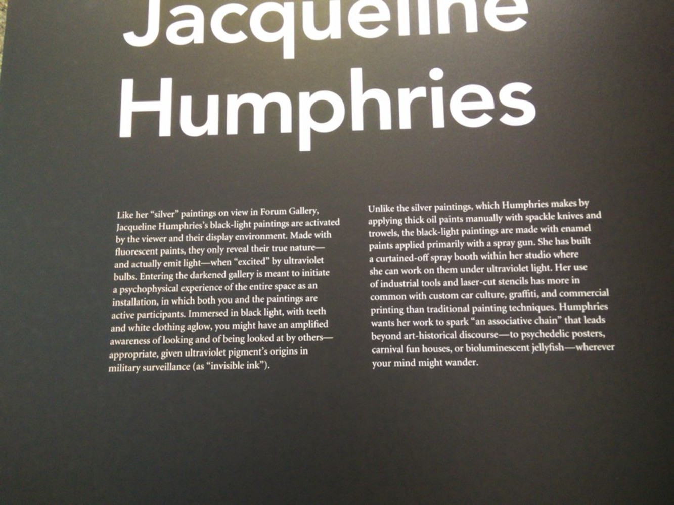
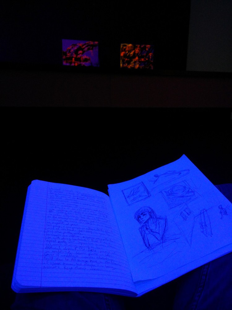
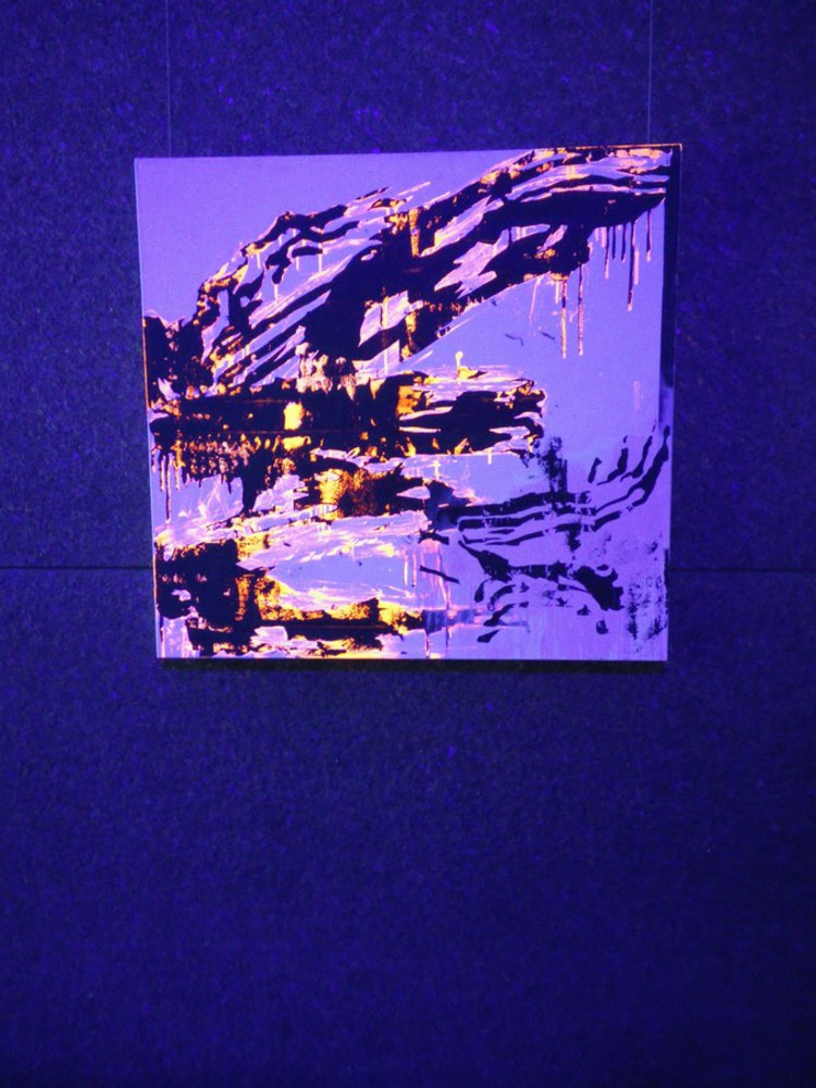
I chose one of Jacqueline Humphries' black light paintings (one of the many Untitled). Alas, my phone camera seems to have trouble capturing fluorescing light, so I only have this photograph which does not do the colors justice. The painting consists of three colors: purple background and stark black forms accentuated with neon pink. 

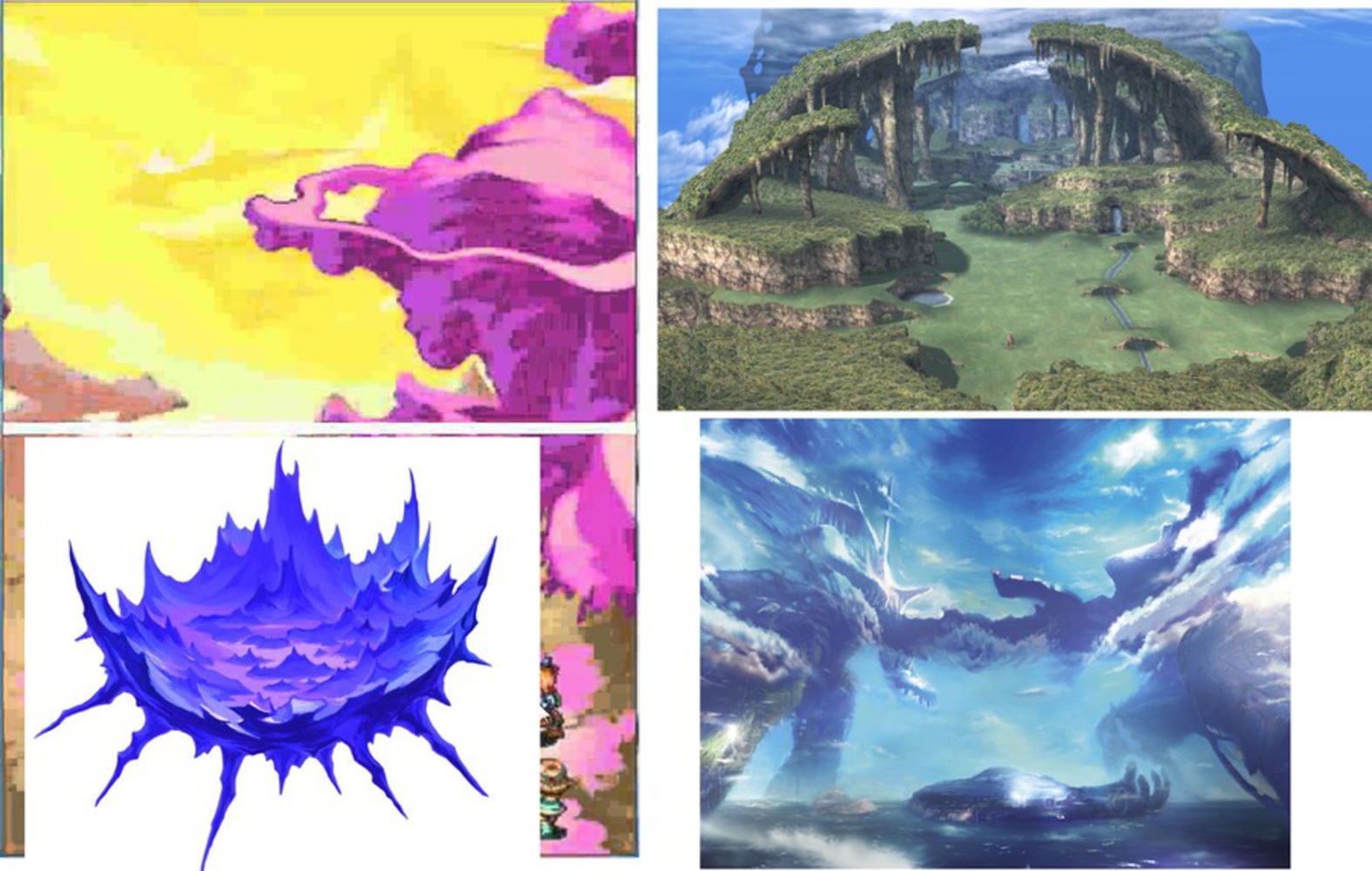
When I saw the painting initially, I was struck by a sense of nostalgia, although I couldn't put my finger on why. The bright magenta and purple painting didn't seem like something that would bring out my rose-tinted glasses, especially since as child I hated pink. But it wasn't so much the specific colors as the shapes formed by them. The black seemed to form a floating island, reminiscent of various high fantasy landscapes. The colored portions formed an alien atmosphere, further accentuating the otherworldliness of the painting.

Img 20151003 163620.thumb
Show Advanced Options
Inspiration.thumb
Show Advanced Options

EXPERIENCE AND RESPONSE

As stated before, my initial response was nostalgia. It reminded me of the sprawling, stylized lands of my youth, when I had the time to spend 60 hours on a JRPG. Despite the harsh appearance of the lines, there was a delicacy to them as well. The tendrils the trickled underneath the main parts of the black, and the neon pink that was spread throughout the painting gave the black forms a sense of fragility. There was also a compelling balance to the image. The black areas were offset by near equal amounts of negative space. The pink did not stray far from the black, giving the two colors a partnership and cohesiveness. The lines guided the eye around the canvas, from one corner to the next and back. But really, the black lights made the experience, suffusing the entire room with purple light, causing the paint to glow. I, too, did glow. Although only the white threads in my jeans shone with any particular intensity, it was interesting to see the paper upon which I wrote illuminate my hands. I didn't radiate as much light as other people who walked in, and as I sat in the middle of the room, I felt almost invisible. A lone viewer watching as others swept in and out, for no one but the security guard stayed as long as I. It compounded the sense of nostalgia and the passing of time.

Img 20151003 163401.thumb
Show Advanced Options
Abstraction.thumb
Show Advanced Options

PRODUCT

untitled (blacklit planet) ~40 minutes, Paint Tool SAI, Wacom Intuos Pen and Touch Small

The exhibition room for Jacqueline Humphries' black light paintings was full of, well, black lights. It gave the room an ethereal, cave like feeling. The fluorescing paint felt similar to some fantasy caves' walls, lined with bioluminescent moss. I tried to capture what it felt like to be sitting there in the silence between the gigantic glowing paintings on the walls. I structured the painting so that it seems enclosed, just like the room. I chose to use a square edged brush to imitate the hard angles of my surroundings, each square representing a moment. The neon colors mimicked the glow of the room. I wanted to express a sense of tranquility and loneliness so I used a lot of blue. I placed a vaguely human figure in the center, representing where I was when I experienced the painting, and focused the colors there since experiences are shaped by the perceiver. The title references a couple different things (video games and alien scenery) where Humphries' work lead my mind.

Show Advanced Options

REFLECTION

It really was different experiencing the paintings in person as opposed to through photographs online. The atmosphere wasn't something that could be brought to life through a monitor or phone screen. I believe I captured how I felt fairly well, but I don't think my interpretation of Humphries' painting is standard by any means. However, since abstract art is subjective, I suppose whether or not I have a typical reaction is irrelevant. 

I think I painted more than necessary (there were several points where I thought it looked pretty complete) because I have a slight compulsion to work close to the limit.  The painting could overall use more purple to evoke the UV lights. I adjusted the saturation levels at the end to make the colors really pop, but it probably would have been better to leave the blues less saturated to give a more tranquil effect and focus more on the other colors.

Drop files here or click to select

You can upload files of up to 20MB using this form.