Back to Parent

Outcome


The Work

When visiting the Carnegie Art Museum I found it somewhat difficult to select an artwork which I felt was compelling enough to want to try to recreate the experience I had viewing it. That is, until I had found an installation of video art by a group called paper rad

Don't Worry be Happy (Stressful Mix)

https://www.youtube.com/watch?v=zIRBbyvoigg

Welcome to My Homepage

https://www.youtube.com/watch?v=cJoP4MkTnwQ

These video art installations were, quite frankly, absurd and supremely fascinating to look at. These videos made heavy use of blown up simple gifs, arranging them in ways that created surreal imagery across a backdrop of pulsating colors and frantic movement. These gifs are choreographed to bizarre chiptune music, adding even more energy (whether it be positive or brooding) to the work.

The reason I found these two video art pieces compelling was how audacious it was. No other installation had quite so much movement in their construction. Another reason was that at the gallery, these videos were featured with heavily muted sound, something which removed context from the rapidly moving images in the video and introduced an even more surreal atmosphere to the work.
Experience and Response:

When viewing these pieces, I was at first exasperated as to what this sort of video art piece could try to communicate. First impressions reminded me of the various bizarre mashups created by the Youtube community. In these mashups, seemingly unrelated clips from all over the internet were compiled together to form something completely different, whether that be song remixes or inappropriate dialogs.

https://www.youtube.com/watch?v=LRTqILMplFA

However, as I looked closer at the piece, I noticed something major. The imagery wasn't quite randomly arranged, but rather it came together to form some larger cohesive imagery. Examples includes the faces formed of collages of gifs in Don't Worry be Happy or the use of the light pyramid in specific scenes of Welcome to My Homepage. This complicated layering of form was used in order to construct other larger, richer features of the video piece. The wide range of colors used also added a lot of energy to the peace. Both of these things gave the work sheer visceral visual appeal and a surreal atmosphere which I responded with awe.

Product


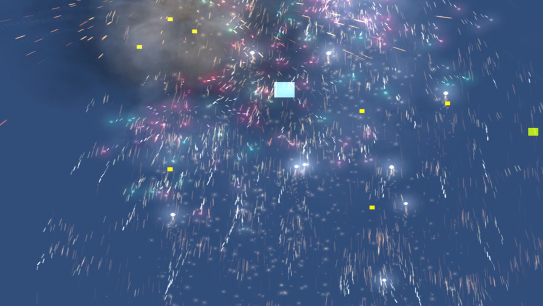
In order to realize the experience that I felt when viewing the piece, I wanted to generate raw visual appeal through the use of relatively simple forms. To do this, I created a relatively simple game in Unity over the course of an hour. Below are 2 versions of the game, which should work on windows and mac.

Show Advanced Options

The game has you control a blue square who collects green powerup pellets. As you collect these pellets, the player character beings to emit bullets. These bullets start off by simply going off-screen, but as you collect more powerups, they will loop around and defy conventional notions of time and space. This leads to a relatively empty and clean starting instance turning more and more cluttered and frantic. Every collision in the game got a very bright explosion effect, something I thought would give the player the same energy as the increased frantic pace of the game. In addition to that, while the base beat is the same, I gave the various interactions between the bullets short distinct sound effects in order to give the piece more texture and energy on the sound spectrum as well when the game got more frantic.

Ultimately, I chose to recreate my experience this way because the idea of simple things coming together to form a complex network of sounds and imagery seemed perfectly suited for a video game. This is because you can automate interactions to the point where they are varied enough to account for a wide range of visual expressions without having to generate each one yourself. This let me generate what I thought was a comparable amount of visual energy as a carefully composed video piece in the hour I was allotted.

Screen shot.thumb
Show Advanced Options

Reflection

From this experience I learned that even that just communicating pure visual stimulus and energy is in itself content that can be expressed in art, even though it is not often talked about from an academic perspective. Things which seem haphazard and random actually take quite a lot of effort to make, and the baffled stunned reaction experienced by viewers is a hard one to generate. Had I had more time to my piece, I think I would have made the game more explicit and given it actual win and lose states, so that the player would be more invested and feel the same sort of energy displayed in game. In addition to that, I would try to add animation to the background, which at the moment is a static backdrop.

Drop files here or click to select

You can upload files of up to 20MB using this form.