I chose the painting, Red Painting by Ad Reinhardt.
Outcome
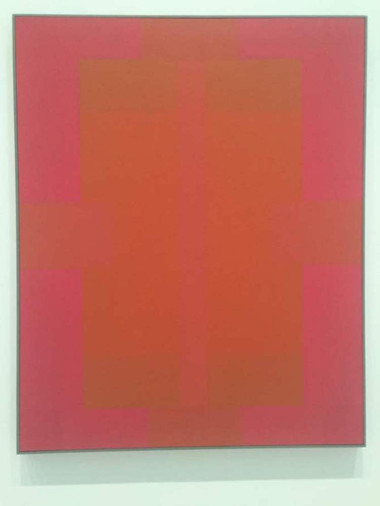
I'm colorblind. Just a little bit. I have a hard time differentiating between reds and greens. When there's a lot of both, I can tell that there are two colors present if I strain myself to look at only particular points, but looking at the whole they blend together. It's impacted me a lot when looking at art in the past, but this piece is all red and still evokes that frustrating feeling of having to strain to see colors.
I was mad about it until my color-abled friend expressed the same frustration. I explained to her that this is what I feel like every time she and her roommates draw something in red and green to mess with me.
Suddenly I had a new appreciation of the piece. It let me relate to a friend how it actually felt to be colorblind. Frustrating, but if you don't really focus on it, you don't notice. At a passing glance, Red Painting can just look like a red canvas, just like colorblind tests look like a mess of circles to me.
So I decided to use this painting. Watching it for an extended period of time was interesting. After a really long time, I found that differentiating the colors was easier, once I knew what to look for, but staring at the center of it still always gave me that almost radiating view of the same color blended everywhere, with a feeling in the back of my head that there was something more that I couldn't see. My friend stayed with me while I watched for a while, but I'm pretty sure she found it frustrating. I'd like to think that my past experience with frustration helped my patience. The more I stared at it the more I wondered why he picked the shapes that he did, but try as I might, I couldn't find any meaning behind them. It didn't help that there was no description of the piece on its nameplate.
After half an hour, I was pretty blurry-eyed to it too, but more than anything I really appreciated that I now had a way for my friend to relate to me, so I made this:
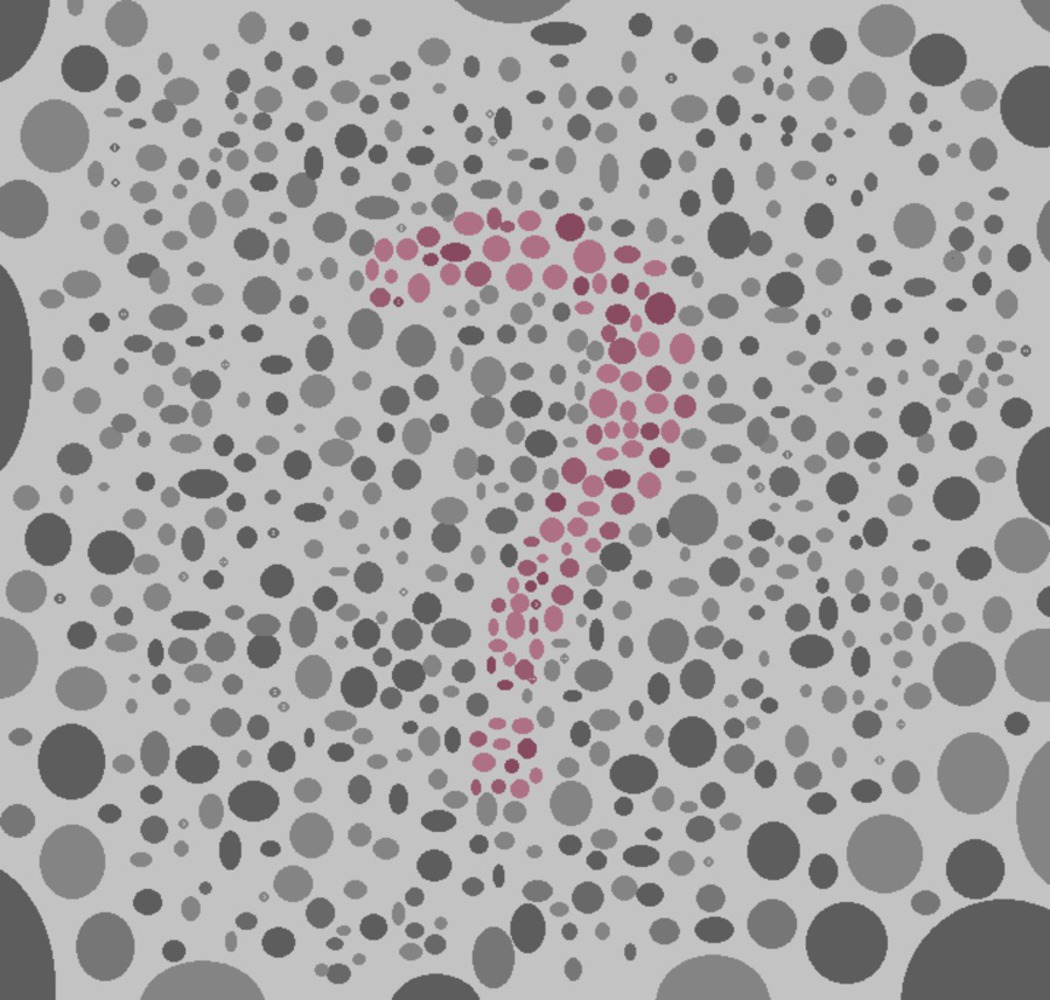
Can you see it? I can't.
I made a pink question mark in an increasingly dense field of gray circles. I modeled it off of a colorblind test I took online, trying to find colors I had trouble with. To me, originally the gray colors looked closer to green, but as it turned out they weren't. I used an eye-drop tool to make sure I got it just right.
To make this, I started with the question-mark. To make it easier on myself, I started out with the question mark being light blue, so I could differentiate while I was making the picture, then filled it in later. My friends also helped me as I got more confused.
I actually made this in MSPaint. Don't hate me. I have no drawing software on this computer, and I'm terrible with Inkscape. So I used paint.
I decided to make the image in the center a question mark rather than the traditional number to represent other people's confusion as to how it feels to be colorblind. I get asked all the time what it's like and honestly, it doesn't really affect me, aside from some awkward moments at the MoMA. I chose to make it difficult for me to see, not because I hate myself, but because the image as a whole represents other people being able to see my confusion.
To me it all just looks normal, because I'm used to it. I don't need to see the question mark, I know it's there.
The circles go from sparse and large to small and dense to represent narrowing of focus to see the image.
More logistically, I picked a few shades of pink and gray before starting, then semi-randomly colored the circles on the page. I clustered colors at some point, and made sure they were near other shades as much as I could. I tried my best to mirror my colorblind tests that I've taken before.
I mostly did this to make it easy on myself. By selecting the colors beforehand and setting up the question mark in blue, I could approach making the finished product one color at a time, and not worry about what color any individual circle was.
I do think I captured the experience pretty well, but more for myself than for others. I made a piece where people can clearly see what I have trouble seeing, which in words is what I was going for. My friend could see what it was like for me to have trouble seeing. It also has a different meaning for the viewer than it does for me. For me it's normal, but for the viewer they can see something new, just like for me struggling to see the shades of red was normal but for my friend it was new.
I learned about putting meaning behind a piece. I have a hard time connecting to pieces that rely entirely on meaning, but I liked making a painting that was special to me.
Next time I'd probably use something better than MS Paint.
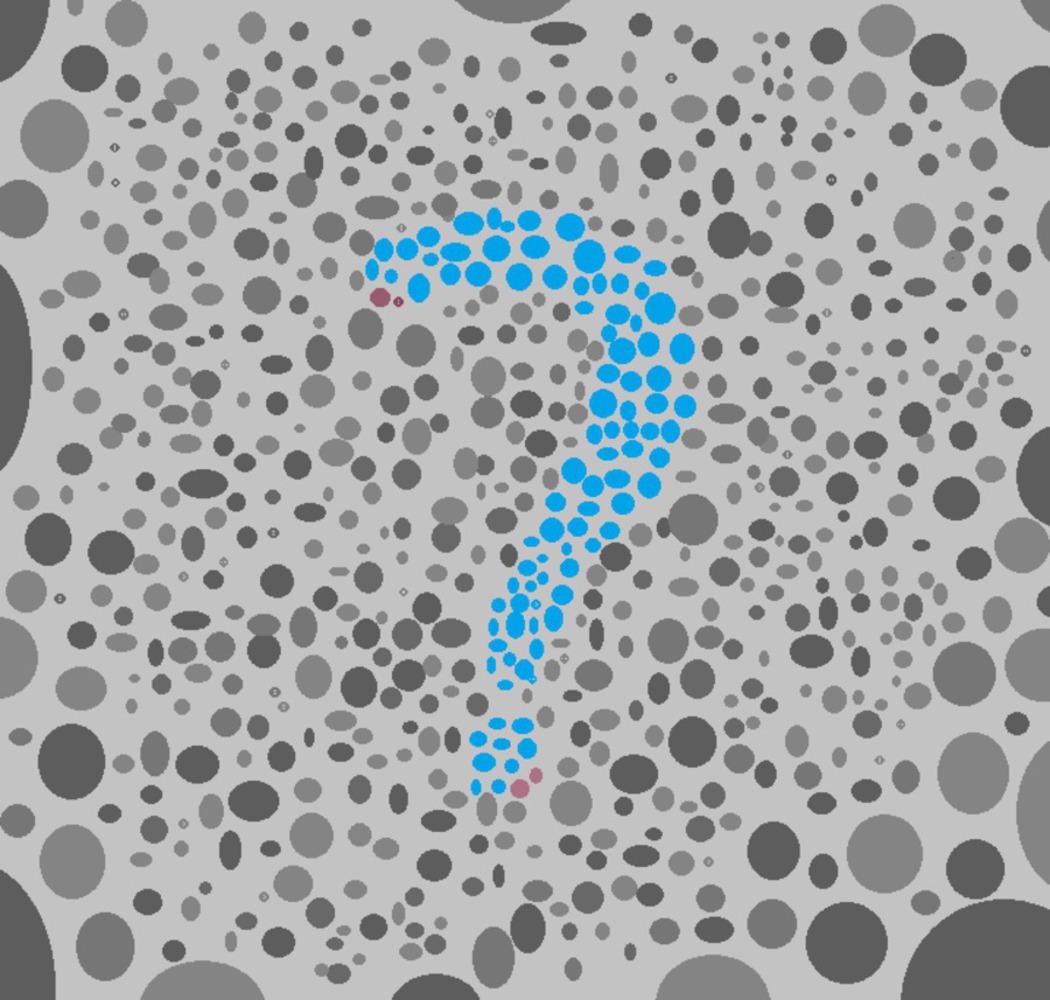
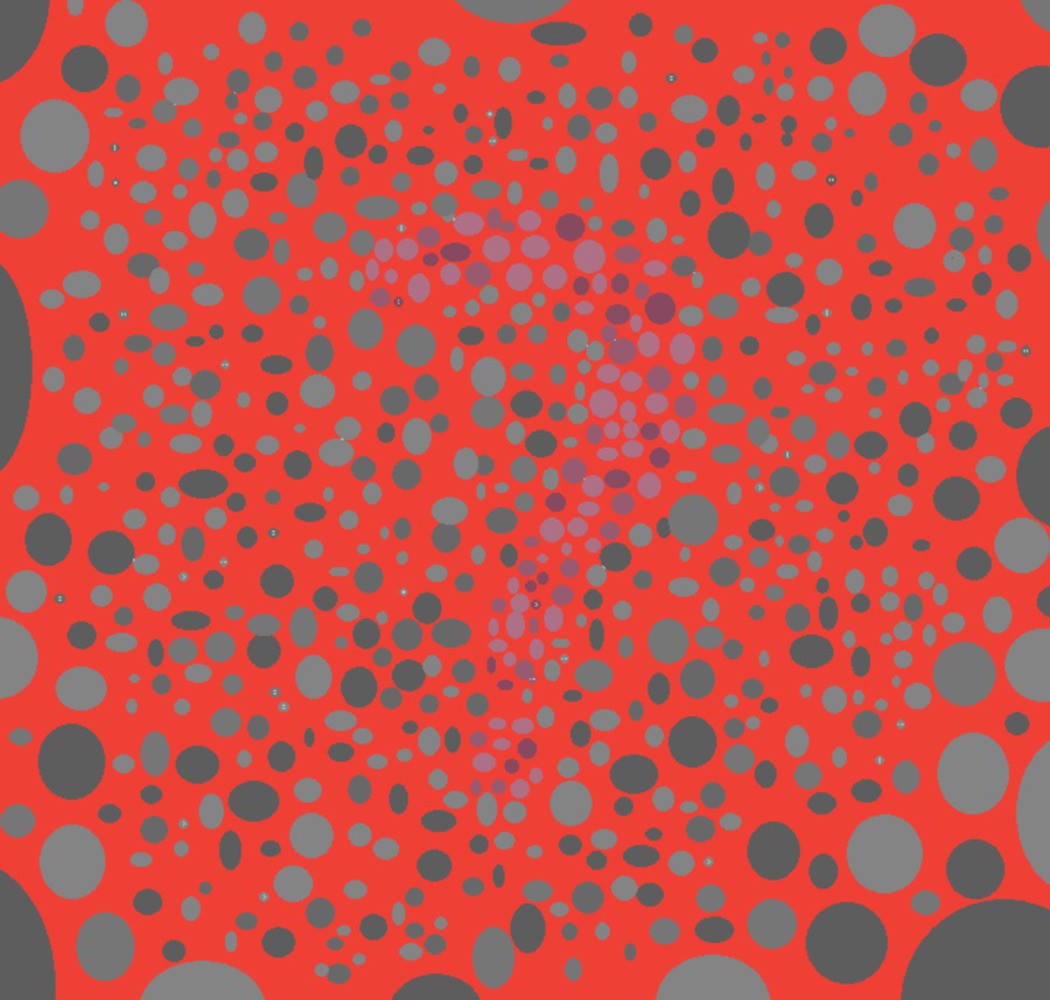
Bonus: I also made these versions
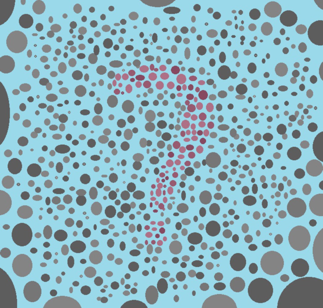
The cyan one I made because I liked the background more aesthetically, but the gray before seemed to fit better for the "colorblindness" theme.
The red one I really almost went with because when I showed it to my friends, they had a real struggle finding the question mark, which is closer to evoking the correct feeling for them. I wound up keeping the gray background anyway though because I wanted it to emulate the reveal of something new to them while keeping things the same for me rather than the actual feeling of viewing the painting.
You can upload files of up to 20MB using this form.