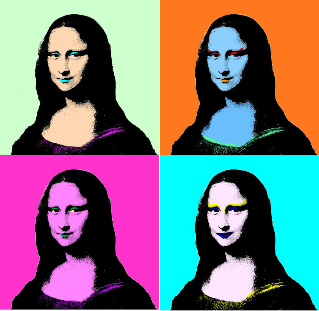
Outcome
Context:
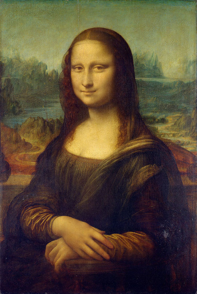
My outcome is very much informed by Andy Warhol. Where he took photographs of famous people and turned them into stylized Pop Art, I decided to take the famous painting the Mona Lisa and use it as a stencil to create my own Pop Art. The stencil idea also came about from my original idea to focus more on street art rather than Pop Art. The color palettes I choose to color the stencils, were colors that I saw being used throughout Andy Warhol's Portrait Pieces.
Process:
I started this project off very confused and unsure of what I was going to do. The idea of using Disney screen caps and editing them to say something maybe a little political was at the forefront my mind, especially after watching Exit From the Giftshop and thinking of Dismaland by Banksy. However, I was very lost in trying to figure out exactly what I wanted to say and what screen caps to do. Then I thought well maybe I should take famous works of art and turn them into like stylized works with inspirational quotes that people use for cover photos on facebook/twitter/tumblr. Then I thought about turning famous pieces of works into PopArt and thought that was more appealing and would ultimately be better than turning fine art into inspirational style quotes.
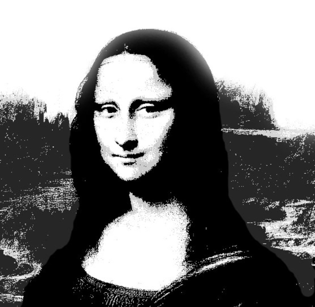
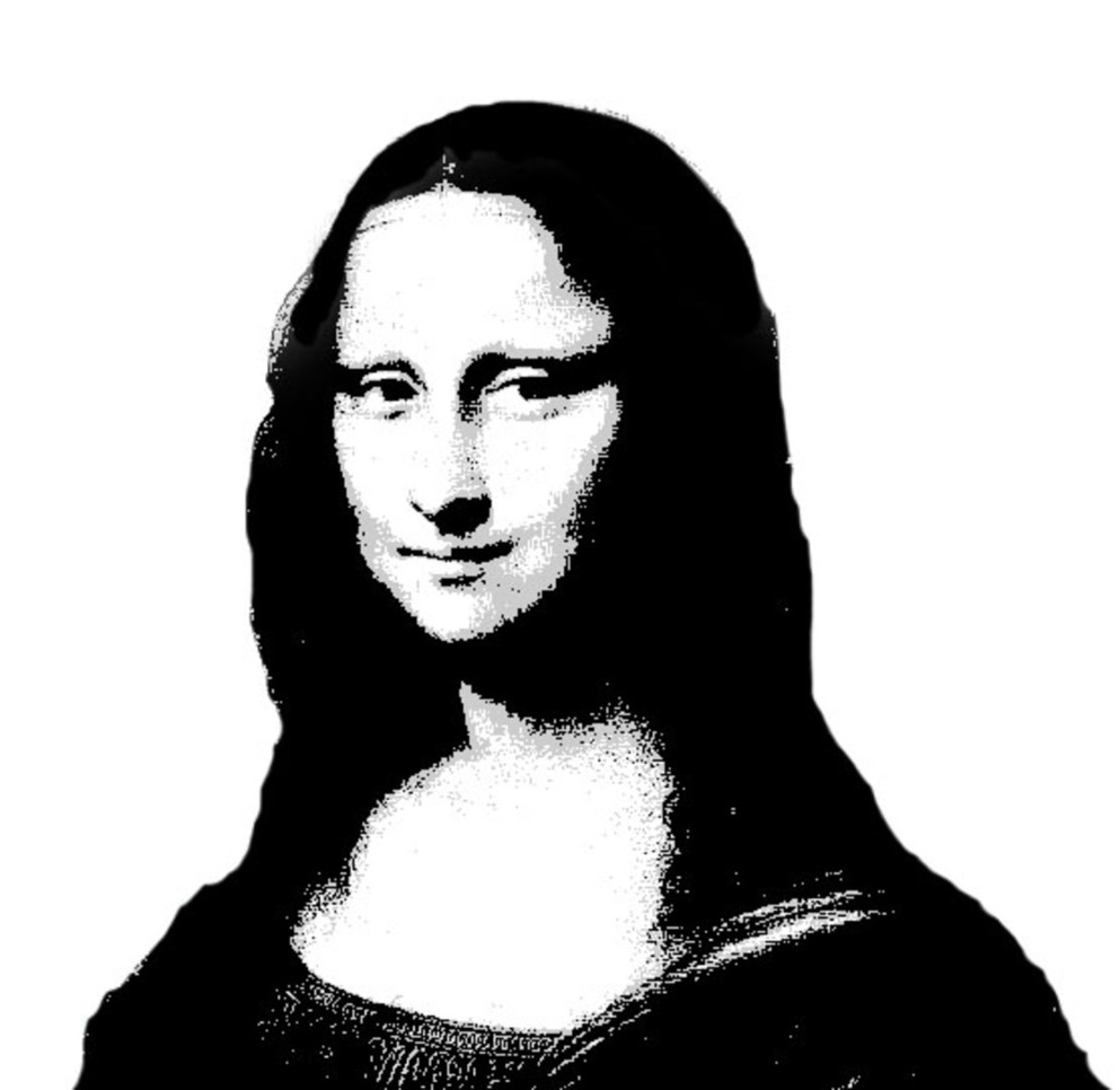
The design choices I made were to get rid of the background that was behind the Mona Lisa, to give each portrait slightly different makeup, and to choose the color palette for each portrait. One of the first and main challenges was getting rid of the background which involves creating another layer, whiting over the background, merging the layers, and then deleting and white space in the photo. Another challenge was deciding the colors for the makeup and the style. I don't know very much about makeup but I wanted each portrait to be different besides the fact that they were different colors, so I attempted four different makeup designs but not all of them were good ideas.
Product:
I created an Andy Warhol-esque painting by creating a stencil of the Mona Lisa and then overlaying that over a layer of various colors to create a Pop Art art piece. I made four different versions of the portrait and then put them together to create four similar but different images. I used Photoshop to create the stencil by changing the threshold twice and then removing the white space so the color layer would be able to be seen from underneath the stencil. I thought of this technique by thinking of how silk screen printings work and how Andy Warhol created his colorful screen prints by painting the canvas first and then putting the print on top.
Critique:
I like this piece but I messed up in picking colors since some of the colors don't seem to work well and leave the piece looking very empty. I think it achieved accentuating the difference between Pop Art and Renaissance Art, so I'm happy with it but there is a lot I would change if I could do it again. I also wonder whether this would have worked with a piece of art that wasn't a portrait, like if I had chosen Starry Night instead.
Reflection:
If I were to do this again I would spend more time picking the colors. I like how the purple one came out but the others seem to be missing something. I think I would also use the other stencil that has the background to see if that adds anything. I would also have textured the hair so that I could color it instead of it being a dark blob. I also wish that instead of just using color that I had used some of the texturing patterns Warhol used in his work. I would also think about choosing different pieces instead of choosing the Mona Lisa.
You can upload files of up to 20MB using this form.