Back to Parent

Outcome


Intention

The intention of this project was to create a stencil that could be bought as a digital file and laser-cut to create a physical, usable stencil. Combining unoriginal pop-culture iconography and tired street-art influences, this stencil will highlight the lack of creativity sometimes seen in street art that is often recreated over and over again. In addition to that, giving people with no artistic inclinations the ability to create street art of their own will underscore the hypocrisy of the kinds of manufactured art seen in "Exit Through the Gift Shop".

The street art stencil book.thumb
Show Advanced Options
Dsc 0005.thumb
Show Advanced Options

Context

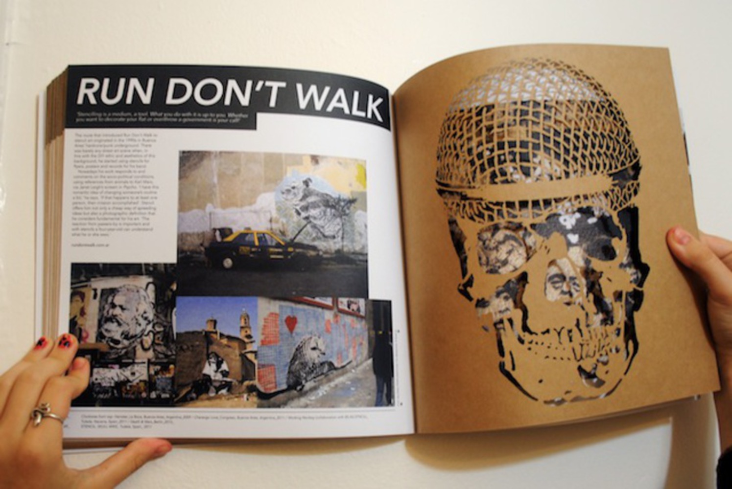
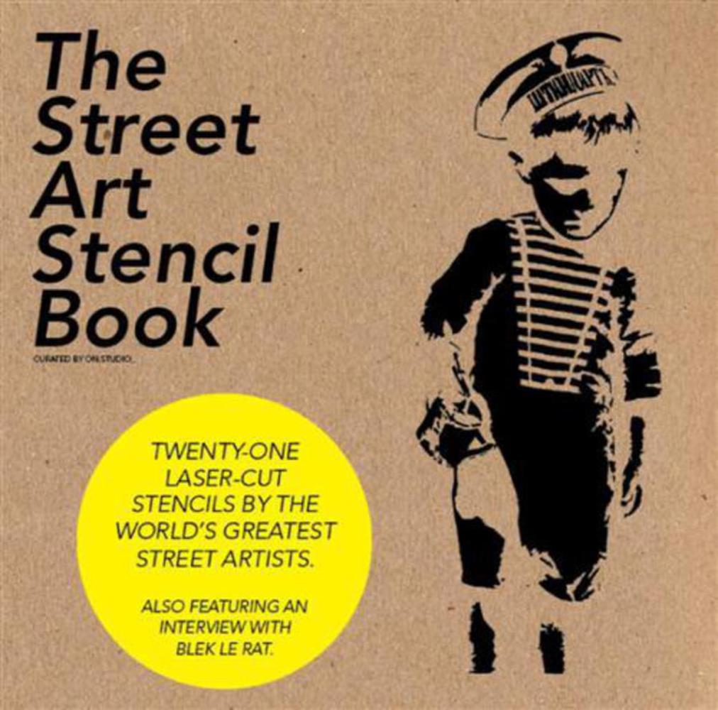
As an individual who has been involved in the creation of street art, I am very critical of resources like those pictured above that give the public access and permission to recreate works. Mass produced, publicly accessibly stencils like this make it okay for people to rip-off creative works and devalue work that is actually original. 

While I don't think graffiti or street art need be creative or artistic, the point of it is to make your mark. From its origins with Taki 183, who used markers to tag subway cars in New York, the point has always been to make something that is your own. 

I think people love to take credit for creative work and have seen this a lot in my own life. Though I always hand-draw and hand-cut my stencils, I've seen people share them on social media channels, which I view as other people appreciating them as well as sort of taking credit for discovering them. I want my work to be appreciated, but Instagramming it and throwing a filter on it is akin to "reposting" and in my eyes is others making my creative work theirs. 

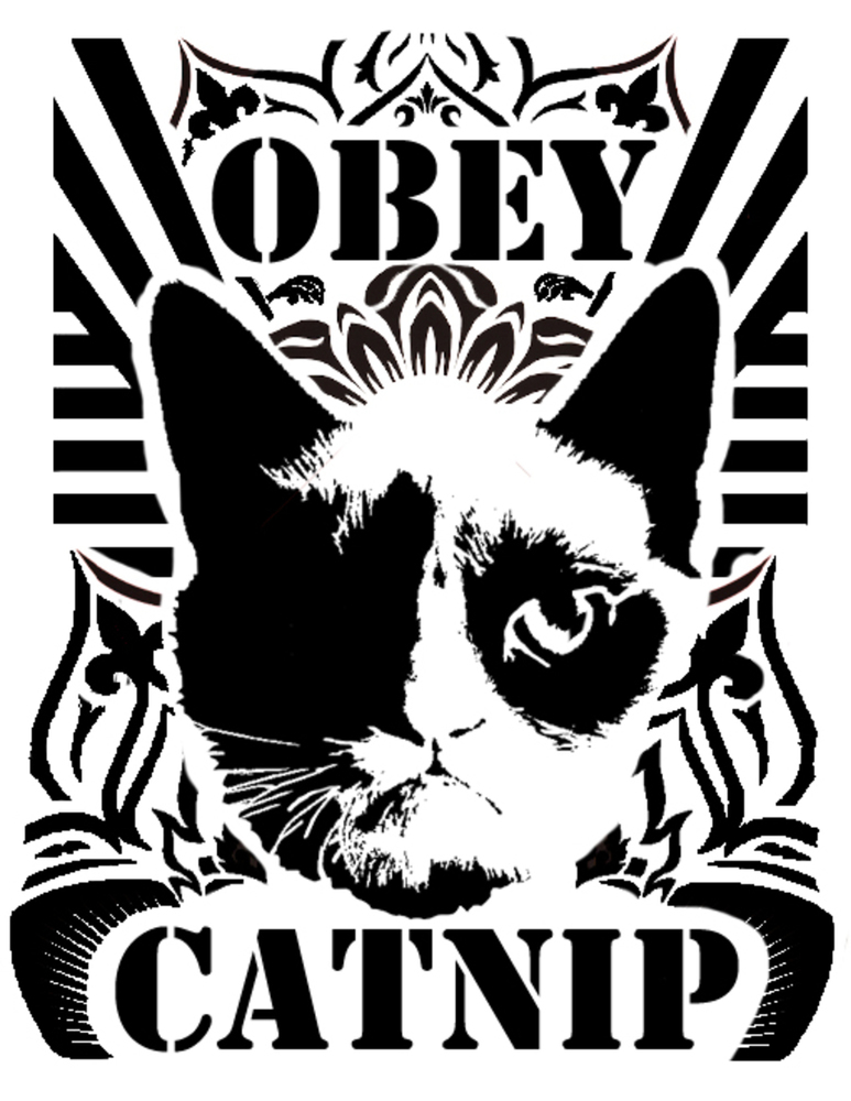
With this as the backdrop of the assignment, I wanted to make a stencil that basically took extremely recognizable works and arranged them into a cohesive stencil that others could print and cut and reproduce (and maybe even spray-paint on something but we denounce that kind of behavior here at Carnegie Mellon). So I took a pop-culture icon, a famous street artist, and a drug reference and put it into one. The result depicts internet icon "Grumpy Cat" and shows a likeness to Shepard's Ferry. 
Process

Because of my personal connection to street art, I knew I wanted to pursue it in some way for this project. There are a lot of forms of street art, including markers, stencils, and wheat pasting. Of all these forms, stencils are the most publicly accessible since they don't require mixing paste, or drawing from hand. An individual only needs to take a stencil someone else made and spray paint it on something. 

While I felt I could create something cool as a wheat-paste poster, my objective for this project was to create something any idiot can and would use, so I wanted to limit my creations to single-sheet, single-color stencils. 

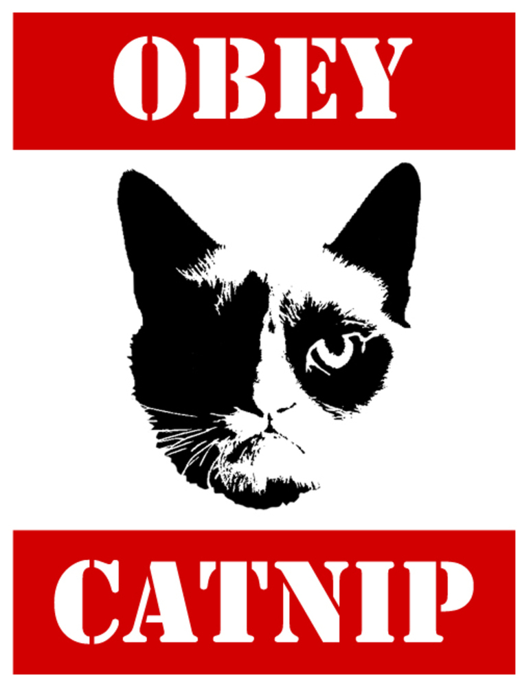
I started by brainstorming recognizable works by graffiti artists as well as pop-culture references and put them together. My initial idea was rather simple, using Grumpy Cat and the Obey mantra.

Catnip.thumb
Show Advanced Options

This was a very simple early iteration. The grumpy cat face was already in a vector form for stenciling so I just added red bars and the words over it. While simple, the colored bars would require multiple stencils, so I decided to go with a single-stencil design to keep it simple for the user. Borrowing more art from Shepard's Ferry, and making meticulous cuts so that the laser-cut version would be a usable single-sheet stencil (meaning all white space is connected), I came up with a final product.

The intricate design was challenging to make a stencil with, since it means that you must be aware of how the page connects and how to retain its structural integrity. Though challenging, I'm no stranger to cutting stencils.

Catnip2.thumb
Show Advanced Options

I used Photoshop on my computer to create this design, which blatantly rips off Shepard's Ferry's wheat-pasted posters. After downloading two images from Shepard's Ferry and this pre-made Grumpy Cat vector drawing, I combined everything onto a Photoshop document and spent some time arranging everything into a cohesive thing. Finally, I added back the stencil typeface words.

Critique

It makes me uncomfortable to publish a work that blatantly rips off other artwork, and even more uncomfortable to know that I actually think it looks nice. Aesthetics aside, I think I did a good job of creating a cohesive stencil that anyone could cut out, tape up, and paint on a wall somewhere. 

While the process speaks to my goal of showing how easy it is to rip off other creative work, the stencil itself looks like a legitimate effort to create something, rather than a jab at the hypocrisy of many street artists. Perhaps making a stencil of someone making street art would illustrate the point better, but I'm happy with the work itself.

Reflection

I struggled with ways to incorporate multiple artists and pop-culture references into a single stencil while still being cohesive. If I would do this again, I would incorporate as many modern themes (Miley Cyrus, maybe?) as I could. I also think I would try to actually sell it. The reason why I didn't was because I thought there was a real chance that someone would use it to vandalize something and I didn't want to be connected to illegal activities. In addition, I think I may have liked to spend a bit more time researching other less commonly known street artists and ripping off their work too.

Drop files here or click to select

You can upload files of up to 20MB using this form.