Back to Parent

Outcome


Intention

I follow Human's of New York (HONY) on Facebook and recently the owner of the page (Brandon) traveled to countries in Europe to share the stories of refugees fleeing their countries. These stories hit me pretty hard.  I have also seen some posts about these refugees by 'popular pages' on Facebook commenting about what they think America and Europe should be doing, and what they really think of those fleeing their countries. Some of these posts really appalled me. Thus, I wanted to borrow two contrasting images in order to challenge those that think in line with the terrible posts and comments that I saw to (see if they're able to) think with compassion and feel empathy.


Process and Context

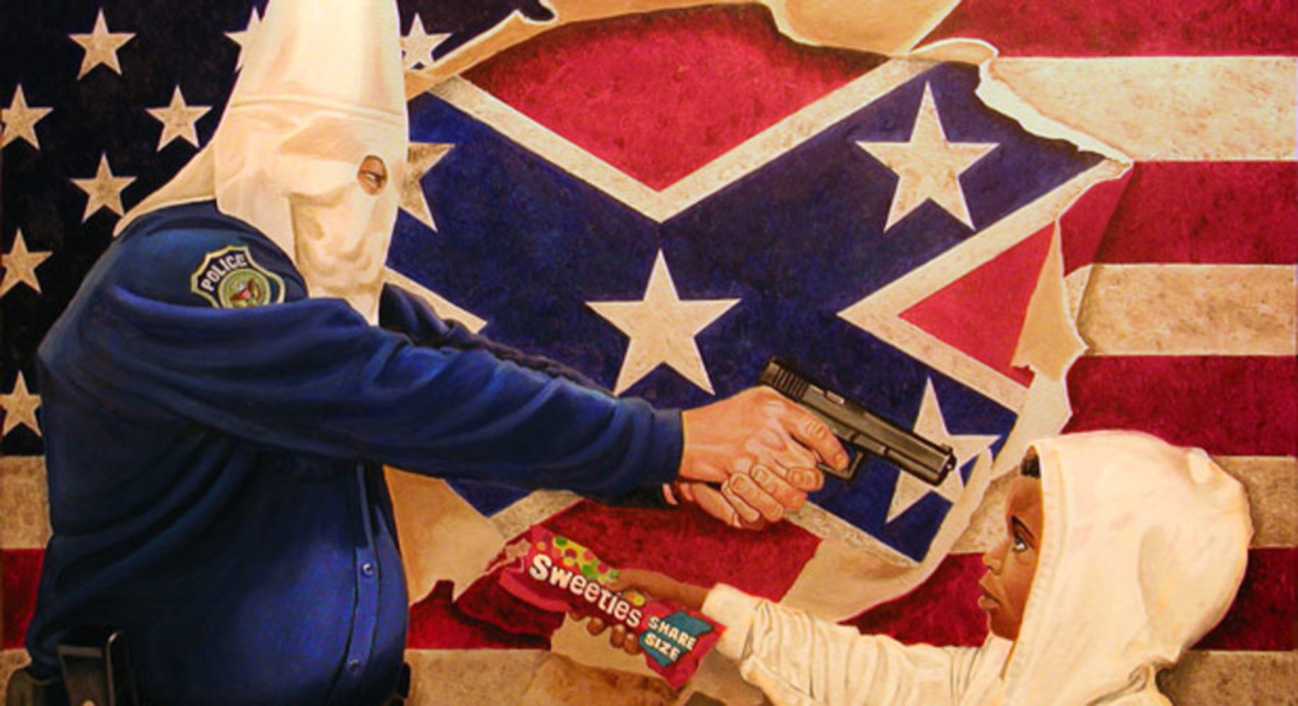
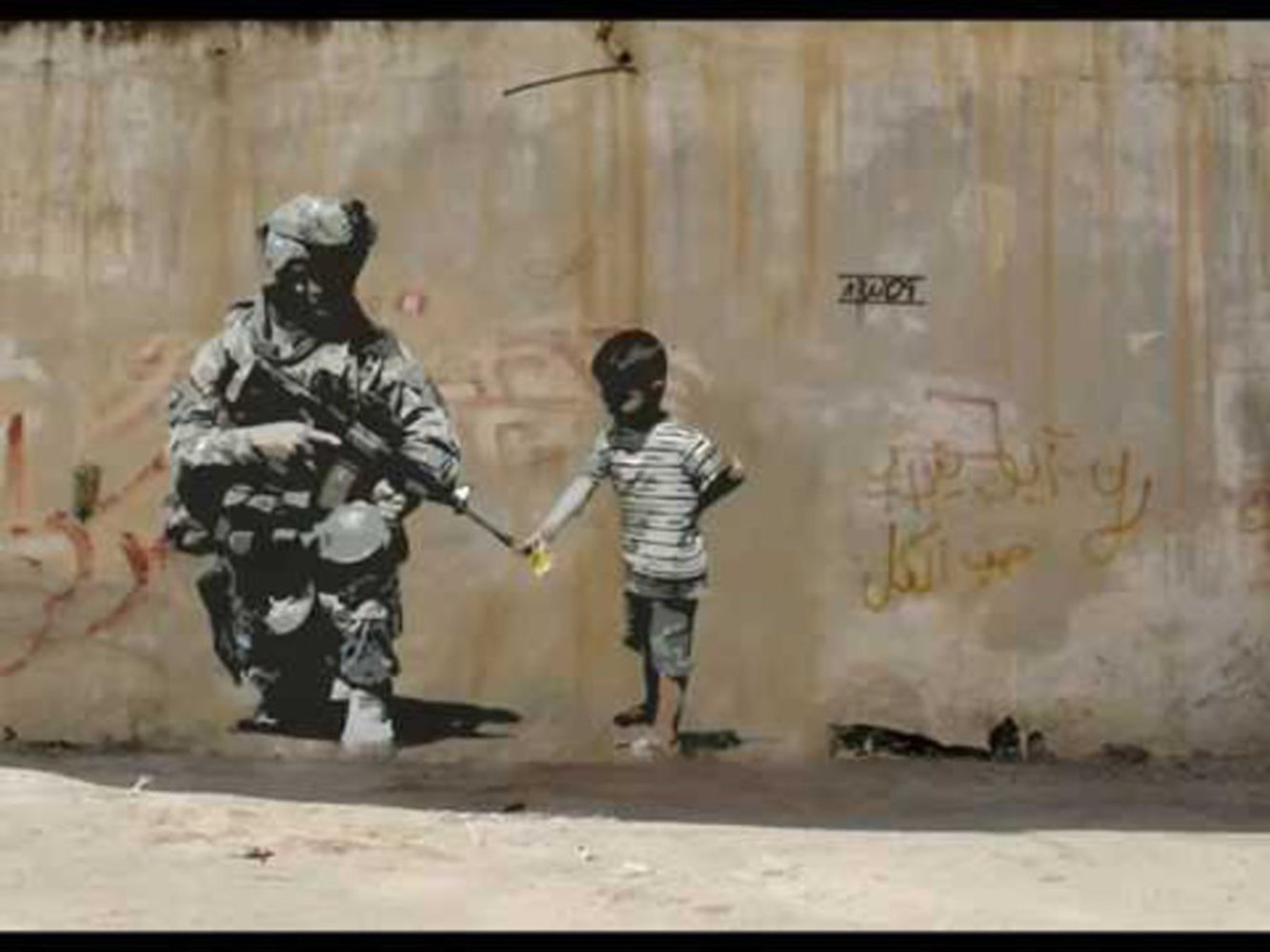
I stated earlier that these disgusting posts and comments (on memes and cartoons) were posted by 'popular pages'. These popular pages were actually the public profiles for some political leaders, most notably Allen West. Thus, I wanted to do something similar to some other political artwork. So I did some research as to what some political artwork looked like and conveyed. While I didn't imitate the style of the art, I like how they clearly had a message behind them and some of them had opposing viewpoints forcing the audience to really think about what their opinion on the matter is.
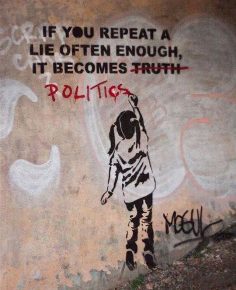
Politicalart2.thumb
Show Advanced Options
Politicalart3.thumb
Show Advanced Options
Politicalart1.thumb
Show Advanced Options

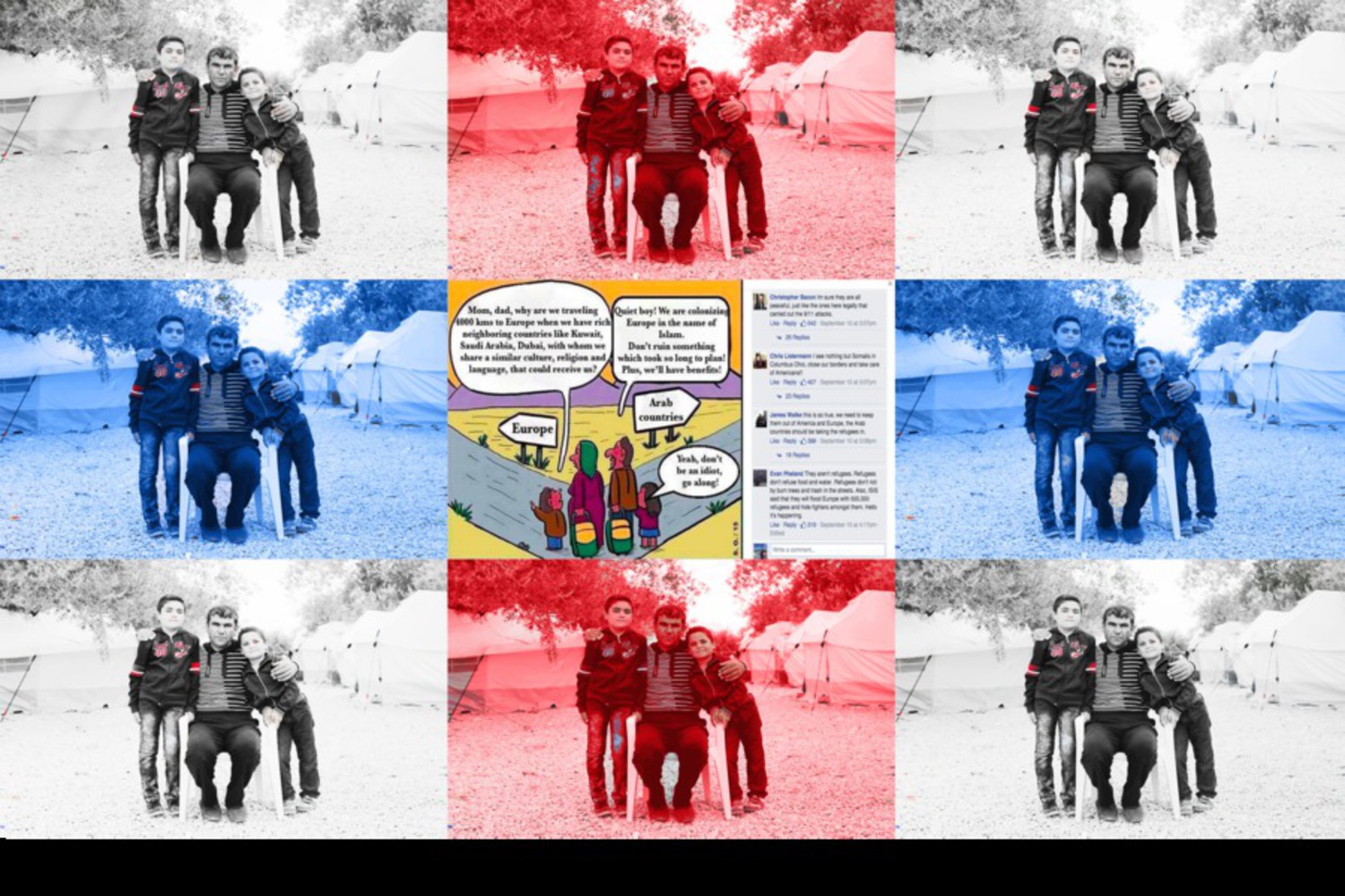
With these images and my idea in mind, I set out to grab one of the more 'hard-hitting' images+captions from one of HONY's recent stories, and a vile cartoon from Allen West's page along with the comments. However, I didn't know what exactly I wanted to do with them. I liked how Brandon (owner of HONY) separated the quote from his subjects, from the photo of the subjects themselves so I knew I didn't want to include the quote in the picture itself, although I knew I needed it for context for the audience. I also wanted the cartoon to draw in the eye more so I wanted that centered. Then I realized I could use multiple of the same HONY picture to be the background of the cartoon, so the audience would realize this is exactly who the cartoon is speaking about. And because it comes from a Republican leader's page, I changed the colors of the HONY picture to red, white, and blue.

Product

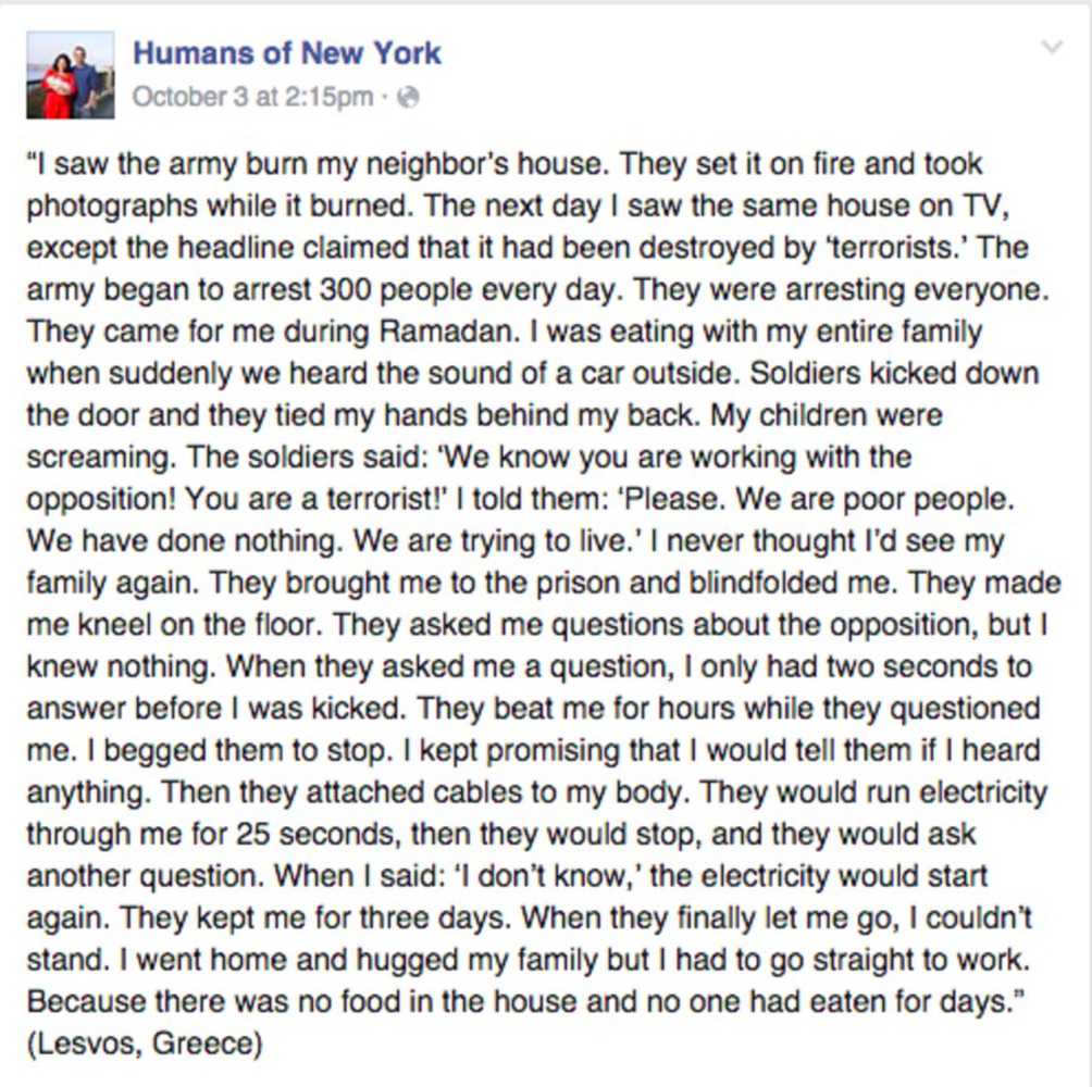
First, here's the quote Brandon got from the person.

Honycomment.thumb
Show Advanced Options

And here's the picture.

Colorcreativeassignment.thumb
Show Advanced Options

Unfortunately I couldn't crop out the empty space on the bottom of the image because the quality of the image would've worsened.

Also, upon uploading the image, the quality degraded so the text in the cartoon along with the comments are a bit hard to read.

For the cartoon, it says:

Boy -
"Mom, dad, why are we traveling 4000 kms to Europe when we have rich neighboring countries like Kuwait, Saudi Arabia, Dubai, with whom we share a similar culture, religion and language, that could receive us?"

Father -
"Quiet boy! We are colonizing Europe in the name of Islam. Don't ruin something which took so long to plan! Plus, we'll have benefits!"

Sister -
"Yeah, don't be an idiot, go along!"

The comments are as follows:

"Im sure they are all peaceful, just like the ones here legally that carried out the 9/11 attacks." - 542 likes

"I see nothing but Somalis in Columbus Ohio, close our borders and take care of Americans!!" - 407 likes

"this is so true, we need to keep them out of America and Europe, the Arab countries should be taking the refugees in." - 398 likes

"They aren't refugees. Refugees don't refuse food and water. Refugees don't riot by burn trees and trash in the streets. Also, ISIS said that they will flood Europe with 500,000 refugees and hide fighters amongst them. Hello it's happening." - 319 likes

I used Adobe Photoshop for all of it. Cropping the photos, then resizing, and overlaying them on layers. Then using the colorchanging tool to make the background photos red, white, and blue. The idea for the colored background also came from Jackson Pollock's pieces because he'd use the same picture but use different color schemes to represent something (or nothing in his words).

Critique

I don't think I've ever found a drawing or piece of static art done by me aesthetically pleasing. However for this one, I think it looks 'ok'. I've never really used photoshop before the recitation a couple weeks ago so I think I can say I'm proud of this considering my artistic abilities and knowledge of photoshop.


I think I matched my intent effectively because I deliberately am forcing the audience to see the cartoon and the comments, along with the quote from the man in the photos of the background. But after that, it's up to the audience to go ahead and think about what this makes them feel.


Thus, I think in a symbolic manner, I did a good job, but I could definitely use work on the aesthetic side.

Reflection

In terms of tools, I actually learned quite a bit of photoshop because of the frustrating time I spent trying to do things. 


In terms of political art, I learned that putting together highly contrasting images forces the audience to at least stop and think about what they're seeing, however it's entirely up to them to actually take the time to consider what the piece of art is trying to say, and why.


I don't think I would've done things differently though because I feel as if I did the best with what I have. 

Drop files here or click to select

You can upload files of up to 20MB using this form.