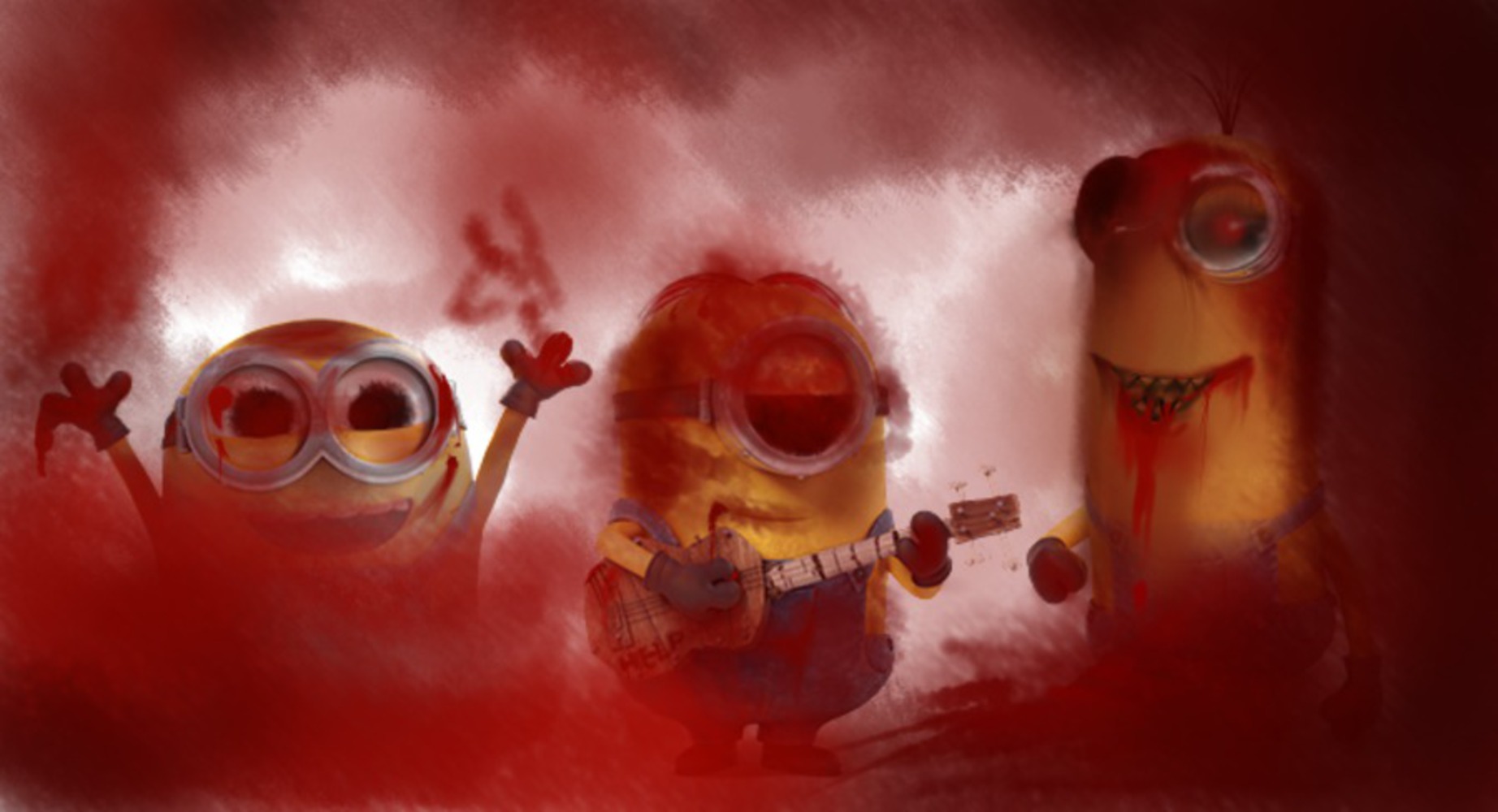
Back to Parent

Outcome


Intention

The amount of death in G/PG-rated films are fairly surprising, but not new. I've gotten used to antagonists falling to their death (Up), main character's parents dying (Lion King), and even songs filled with profane and violent ideas (Hunchback of Notre Dame). When I saw Minions, I already knew it was going to portray villains as awesome, epic, semi-good guys. I watched all the trailers and knew that the minions had a bad habit/tendency to kill off their bosses by accident. But at the same time, I knew it was going to be a silly comedy family movie. My intention in this project is to step away from the family aspect, look at the minions objectively, and portray the amount of "blood" on their hands.

Context

The outcome is to draw attention to the amount of deaths in a very comedic family-oriented movie. This relates to many other important depictions that movies do not take very seriously, such as the physical appearance of the Disney princesses. The work done by street artists in "Exit Through the Gift Shop" obviously inspired this project, but I only connected with the idea of bringing a problem to light, as I am out of touch with current events. While Banksy typically draws attention to hypocrisy in current events, I went for pop culture. I followed Buzzfeed's take on Disney princesses with realistic proportions, and aimed to point of the death aspect of Minions that was really turned into comic relief. While watching the Minion movie, people were probably laughing when the vampire died from the sunlight and when the T-rex fell down into the lava; by the time the Yeti died, people were probably thinking "Oh no, not again," but without any strong emotions because after all, all of the bosses died before. While I realize Minions is aimed towards children, and those deaths were not meant to be serious, we should think about how we portray death in movies.

Process

I spent a lot of time brainstorming for ideas for this exercise. I considered doing something related to Japanese culture because that consists of a majority of my life. Japanese pop culture, however, is so eccentric and peculiar. They take something popular, exaggerate it, and integrate it into their already crazy pop culture. They have anime, manga, games, etc for whatever fetish someone has. I couldn't think of a good way to satirize a specific image when it can already be interpreted as a satire. I considered current events, e.g. the pope tour, but decided against it because I'm not very caught up with recent events. In the end, I watched the Minions movie Friday night and noticed that when the bosses (T-rex, caveman, pharaoh, vampire, Napoleon, etc) were killed in some way by the Minions, it was done comedically. The only emotion the Minions seemed to feel was disappointment because now they had to find a new master. I decided to create an image that more or less accurately reflected the Minions kill count.

Product

I took the following image of the three main Minions: Kevin, Stuart, and Bob:

Minions 2.thumb
Show Advanced Options

Using the software PaintTool SAI and a Wacom Intuos pro pen and touch medium tablet, I created the following image:

Minions editted.thumb
Show Advanced Options

I made use of the airbrush to try to mimic some of the street-art spray paint styles and create a bloody setting. I also darkened their eyes but tried to make the edges fuzzy to look more crazy. The Minions also have blood splatters made to the best of my ability. While the Minions never ate anyone, Kevin and Stuart have blood leaking from their mouth because they were responsible for the caveman getting eaten by the bear. It may not seem very obvious, but for each death, I put circles of red to create the background, each one getting darker and more visible than the previous. There were six deaths that I remember (Scarlet Overkill not counted because she almost dead but not fully dead).

Critique

The image came out a lot different than I expected. While I like how Bob turned out, Stuart has random dark clouds around his face and Kevin just looks like a vampiric fiend. The background also covers the Minions more than I would have liked, but I didn't do it in a separate layer so I couldn't change it. In particular, Bob is almost completely covered, while the area above him is fairly white. As for the overall intent, I think the image does portray it to some extent as the Minions do look homicidal, though maybe a little too much. The Minions do not, however, have the same level of killing intent. Bob looks happy to be covered in blood, Stuart just doesn't even seem to care, but Kevin looks like he will murder the viewer. Overall, the Minions are harder to see than I would prefer, and the intent is portrayed too strongly, but I think it does hit the intent and the outcome fairly well.

Reflection

The part I struggled with most in the process was coming up with an idea to steal. I wanted to do something that hasn't really been done before, but most of the ideas I had were related to fan art, which has definitely been done before. I was also worried about coming up with something too obscure because the image I recreate won't have much meaning. Even when I finally came up with an idea, portraying the intent was more difficult than I expected. As from the above section, I do think the image I made could be better at portraying how the Minions are murderers, and next time I would use Photoshop because it is an actual photo editor. Next time, I would like to do something more along the lines of street art, such as the stenciling and . I also think I overthought the process too much, because I tried to come up with a way to digitize what I considered a more physical art, but at the same time the process many street artists use is partially digital.


Note: I sold a copy as an online poster for $5 to a friend from high school.

Drop files here or click to select

You can upload files of up to 20MB using this form.