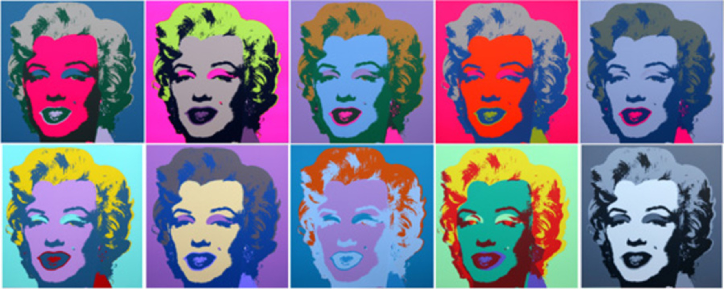
Back to Parent

Outcome


Intention:

Paintings in the past, especially those oil paintings, are always seeking a sense of completeness. The artists worked their way to make the canvas full. Therefore I was thinking, what if I work the opposite way? So in my project I discomposed the picture I’v stolen. Besides, I also want it to be interesting, to make the viewers to think “oh that’s fun”.

I chose the Apple logo because to me it means pop culture. Among young people, using a I-product is fancy and fashionable. Sometimes it even seems that one have to use I-products in order not to be looked down upon. Although I like the design of I-products, I really don’t liked the peer pressure that come with them. So the goal of my project is to eliminate this pressure of pop culture as I tear apart the “Apple”.

Context:

Andy Warhol’s mass-production of celebrity faces in response to consumerism really impressed me. In my opinion, he is rejecting the uniqueness of some celebrity people claim to have. For example, in his Marilyn Monroe paintings, by duplicating her faces and changing the colors of her face, I feel like Andy Warhol is saying: “See, your face isn’t unique at all. I can steal it and change it whatever I want.”

Also, Warhol stated that “Pop artists did images that anyone walking down the street would recognize in a split second”, which reminds me of Banksy’s street arts. What Banksy produced conveys a strong idea and is definitely eye-catching. Nevertheless, the form of his creation is always not complicated and in contrary to Warhol, he never use many colors.

Therefore in my project I used Warhol’s method of duplication but kept the color simple.

Marilyn.thumb
Show Advanced Options
Bansky flower brick thrower..thumb
Show Advanced Options

Process and Product:

I used Photoshop for this project. My project is pretty simple. It is just the logo being gradually “eaten”. So I chose a picture of the Apple logo and copied and pasted it. And then I created the “Eaten” effect using the pen tool(since the background is white). I kept my project black and white because I want it to be able to painted as street art.

This is my final project:

Apple.thumb
Show Advanced Options

Critique:

I’d say it meets my expectations. I think at first glance it is fun and eye-catching, that is, viewers can “recognize” what it is “in a split second”. In addition to that, because of my product’s simplicity, viewers can easily remember it and think about it later, even though they are not looking at it anymore. If this is painted on a wall on the street, people driving and walking by can recognize and remember it.

However, I doubt that I can sell this to anyone. Although my idea in this is unique, the product itself is very easy to create. Anyone with some Photoshop skills can do this.

Reflection:

I struggled for days before I started this project because I had not the slightest idea what I should do. But then all of a sudden I came up with this idea I really like. To be honest, it was after I had finished this project that I started to think about my intents. But I think this also means that my subconscious created this project.

After finishing this product, I began to think about how my way of duplicating the apple relates to Warhol’s duplication of celebrity faces. I see a paradox in Pop art. Although pop artists are seeking to reject consumerism and making works for the public, their works (like Banksy’s works) are often very expensive and highly sought after. This makes me think that, all those faces Warhol painted are , after all, the same Marilyn Monroe. And in my project, even though the Apple is gone at the end, people still know that there used to be (or should be) a Apple.

Drop files here or click to select

You can upload files of up to 20MB using this form.