Back to Parent

Outcome


INTENTION

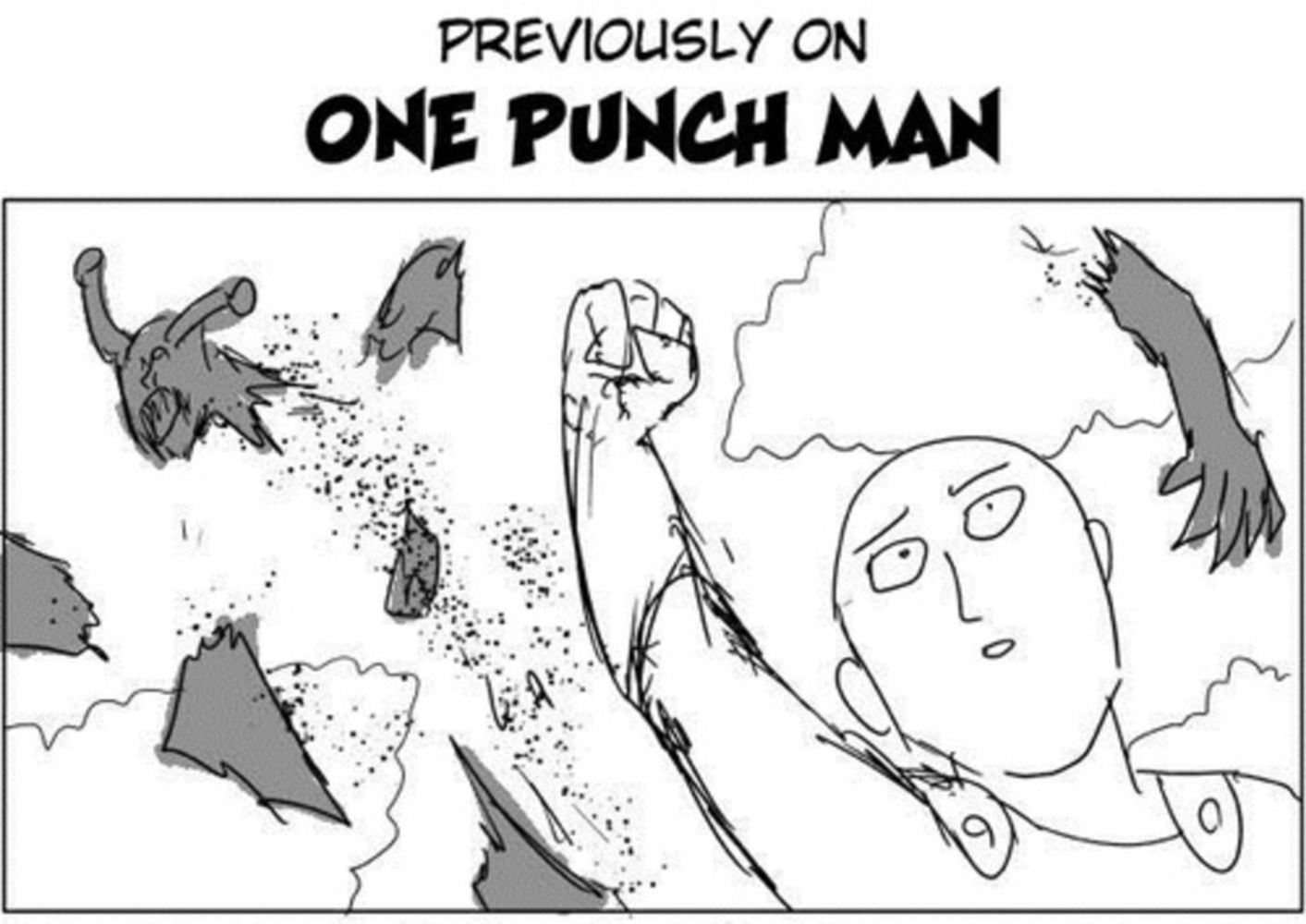
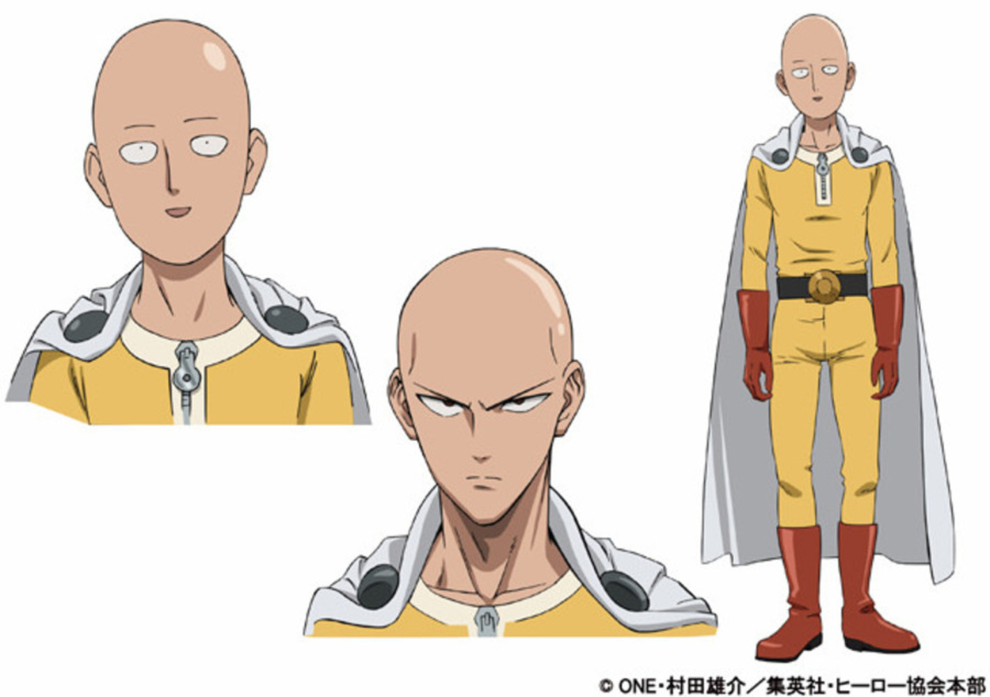
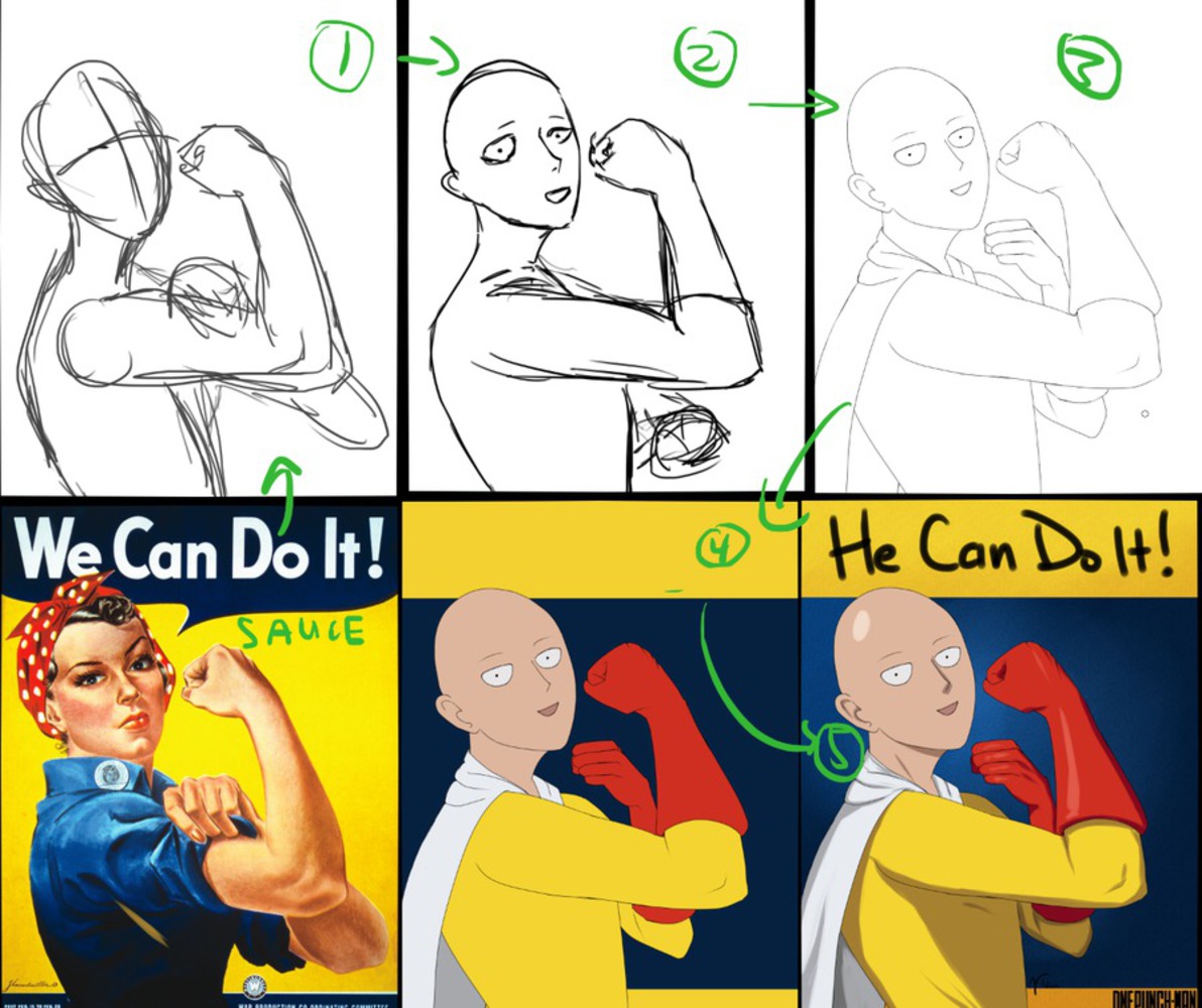
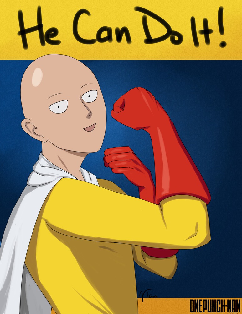
I wanted to make something that I would actually be able to sell. I might be tabling in the Artist Alley at Tekko (local anime convention), so I can kill two birds with one stone - generate something for class and also something to sell at the convention. What sells? Topical topics. What's topical right now? Well, as far as anime goes, I'm told One Punch Man is very popular. The anime adaptation of the manga adaptation of the webcomic known as One Punch Man has just begun, having aired its second episode just this past weekend. It also happens to be a comedy, making slightly subpar artwork more passable (the original webcomic flew on its comedic merits, not its artistic ones) as long as the message gets across, so my art wouldn't have to be terribly impressive. Also, apparently, this particular combination of material hasn't already been done, so I decided I would make it happen, because this is clearly what the world needs.

Webwanpan.thumb
Show Advanced Options

CONTEXT

When it comes to stealing for the purpose of making money with art, one of the first things that comes to mind is fan art. There's a lot of fan art out there on the internet and a lot of people sell it, sometimes stealing it from the fan artist too (double steal, wowie!). Ideas are rehashed over and over again. Nothing is really truly new; just a fresh structure built upon years of thought. So here is me rehashing, though more explicitly than more rehashes tend to be.

PROCESS

I went through a lot ideas (political pop art ala Shepard Fairey, Bernie Sanderstorm, This is Not a Pipe (Dream)). Originally, I had settled on a commentary on the eSports scene (and actually made the piece). The source meme was very old by internet standards, so it wasn't particularly relevant. Plus, I wasn't happy with how it turned out. I doubt anyone would actually buy it, but I hadn't come up with anything better. Until last night.

I was watching One Punch Man and thought the main character, Saitama, would be perfect for a parody of the "We Can Do It!" propaganda poster from the World War II era. He's the world's strongest superhero, able to beat anything with just one punch. The original poster's intention was a morale boost, but Saitama is regarded as something of a downer. He makes all the other superheroes look bad since he can defeat any of their opponents easily, and he doesn't care about collateral damage, so he racks up repair expenses like nobody's business. I thought it would be an interesting juxtaposition of ideas (serious war efforts and derpy superheroism).

Saitama.thumb
Show Advanced Options
Wanpanprocess.thumb
Show Advanced Options

PRODUCT

1+?? hours, Paint Tool Sai on a Wacom Intuos Pen and Touch Small

I didn't record my work for once, so I'm not sure exactly long how it took, but it was more than an hour. Most of the time was spent on doing line work. My hand is not particularly steady, so it took a lot of tries and software stabilization to create the line work. The coloring was easy, since I made sure to close the lines so I could get nice bucket fills. I decided to swap the background colors from the original poster, since Saitama's suit is yellow, and I moved his left fist since he doesn't have any rolled sleeves to pull up. Other than that, it's a fairly straightforward parody.

Wanpanman.thumb
Show Advanced Options

CRITIQUE

It might have been a mistake to use gradients for the background while Saitama is rendered in an almost cell-shaded style. The background texture was definitely a mistake though. Should tone it down or get rid of it altogether. I didn't notice it at the time, but the top text is slightly transparent and looks strange. Probably should've used a computer font and just typed it out instead of hand writing it. 

Without context, it looks like another generic "We Can Do It!" parody poster. Perhaps I should've added some monster guts and derpified his face to get a larger contrast between the original work and this one. The dark background also makes it look more serious than I intended it to be.

I'd probably buy the poster if I weren't such a cheapskate. With a little more polish, I'd probably plunk down a ten for it possibly, so I suppose it meets my goal, but there's a lot of things I could've done better.

REFLECTION

Design and composition is a huge struggle, as I rediscovered when I did my draft of my eSports piece. Drawing hands is as difficult as ever, as is drawing two eyes that actually match. There are a lot of little things I'd like to fix. Colors, font, the awkward shoulder/back juncture, the hand in the back, and the stuff mentioned in the critique. Maybe make a serious!Saitama version to go with this one. But overall I'm quite satisfied with I've created. I have a great affection for One Punch Man and am happy to have been able to contribute to the fandom. 

Drop files here or click to select

You can upload files of up to 20MB using this form.