Back to Parent

Outcome


Intention  

"Last Watch" is a digitally painted and altered work with the primary goal as an environment concept piece. It strives to gain acceptance from the digital art community and fit into current trends and modern standards. At the same time, it also questions what it means to make "original" art in the electronic world filled with plagiarism and advanced software. 

Context

Clearly, I was inspired by environment concept pieces, often fictional works that evoke a certain atmospheric mood. These pieces are often bought and sold as wallpapers or can even evolve to become bases for animated game/movie scenery, an undeniably lucrative business. At the same time, I was also influenced by the current trends towards heavily digitally altered borrowed art or distinct renditions of pop culture figures. Andy Warhol is a famous figure whose art falls under the former category; I was heavily inspired by his digitally altered versions of already existing pieces which made use of different color palettes to evoke different emotions. 

Andy warhol marilyn.thumb
Show Advanced Options
Andy warhol 2.thumb
Show Advanced Options

Sakimichan, a highly successful digital painter, may be the epitome of the latter; her incorporation of popular motifs and personal twists on famous cartoon figures has earned her the patronage of thousands of online fans throughout the world.    

12032200 1643350542572768 8846706846726585834 n.thumb
Show Advanced Options
11202618 1595109224063567 5195190636881962828 n.thumb
Show Advanced Options

Process

Initially, I had wanted to do a photo bash, or an incorporation of several elements to create one art piece. This would mimic the style of Sakimichan, who usually takes popular culture icons as references for new paintings. However, I felt that this kind of individualized rendition is generally quite accepted, and would not "break" any established rules in the modern day. I decided to go towards an environment concept art piece because I wanted to evoke certain emotions through my art. Specifically, I wanted to be able to digitally alter an art piece to generate very different moods as a demonstration that even minor changes can make a big difference in perceiving the same work. I would also challenge the idea that true artists never borrow from other artists and minimize their use of advanced software to enhance their work. At the same time, I wanted to incorporate a familiar or iconic figure to further create a connection between my audience and the painting, thus in creating the original artwork, I included this figure as the focal point. 

Product

I started off my image with a digital painting that I collaborated with my boyfriend to create. Our original inspiration was an environmental concept fan-art for Okami, a popular action-adventure video game starring a sun goddess who takes the form of a white wolf to save the world from darkness. Our composition consists of a white wolf at the focal point overlooking a mountainous region towards a pink sunset with two moons:

Environment concept.thumb
Show Advanced Options

  Our references pictures are given below:       

10305956 820838487964140 1163417025252961890 n.thumb
Show Advanced Options
11143339 849562195091769 1776234111949055015 n.thumb
Show Advanced Options
Overwatch blizzard 2.thumb
Show Advanced Options
Wonderland in the chinese mountains wallpaper 1920x1200.thumb
Show Advanced Options

The image was painted with an Wacom Intuos pen and medium tablet on Photoshop and Paint Tool Sai. My boyfriend also acquired some custom brushes from open sources on DeviantArt. 

Untitled2.thumb
Show Advanced Options
Untitled.thumb
Show Advanced Options
Untitled3.thumb
Show Advanced Options

After my boyfriend completed the painting, I used PaintTool SAI to manipulate the hue, saturation, brightness, and contrast of various layers. I also roughly colored over various elements of the painting to match my intended effect. The results are below: 

Colorpoopblue.thumb
Show Advanced Options
Colorpooptoxic.thumb
Show Advanced Options
Colorpoopdark.thumb
Show Advanced Options

Critique

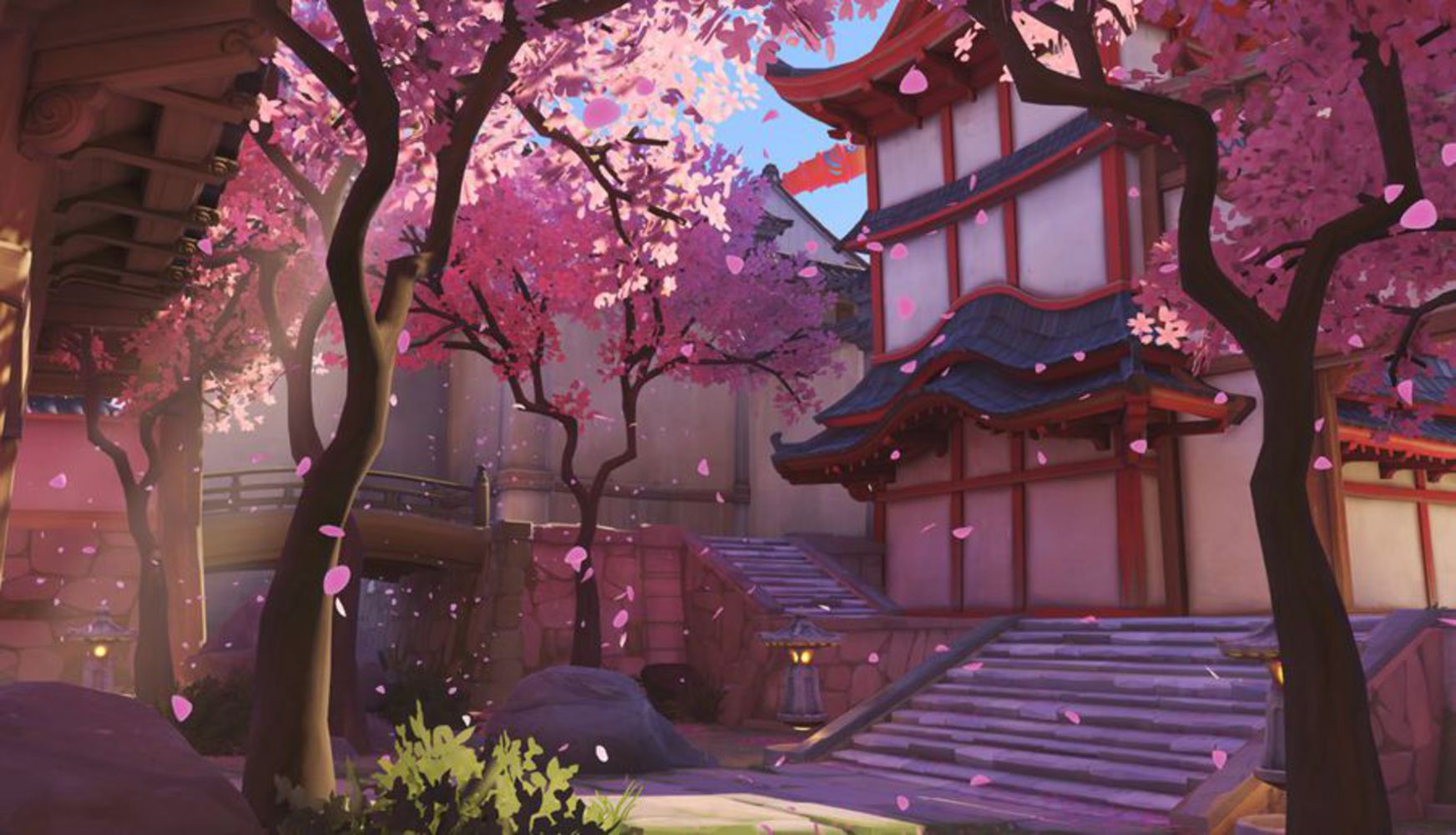
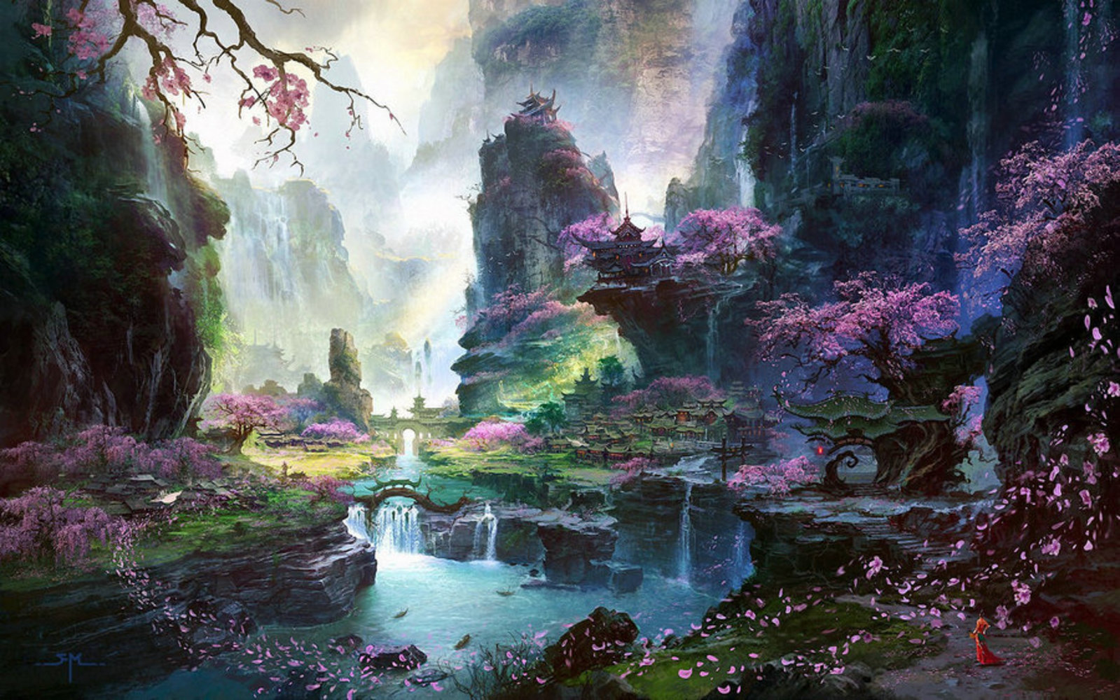
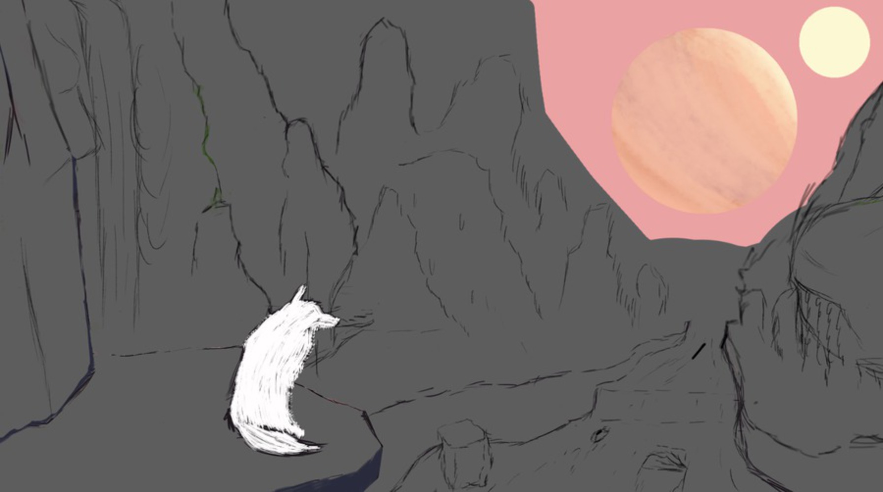
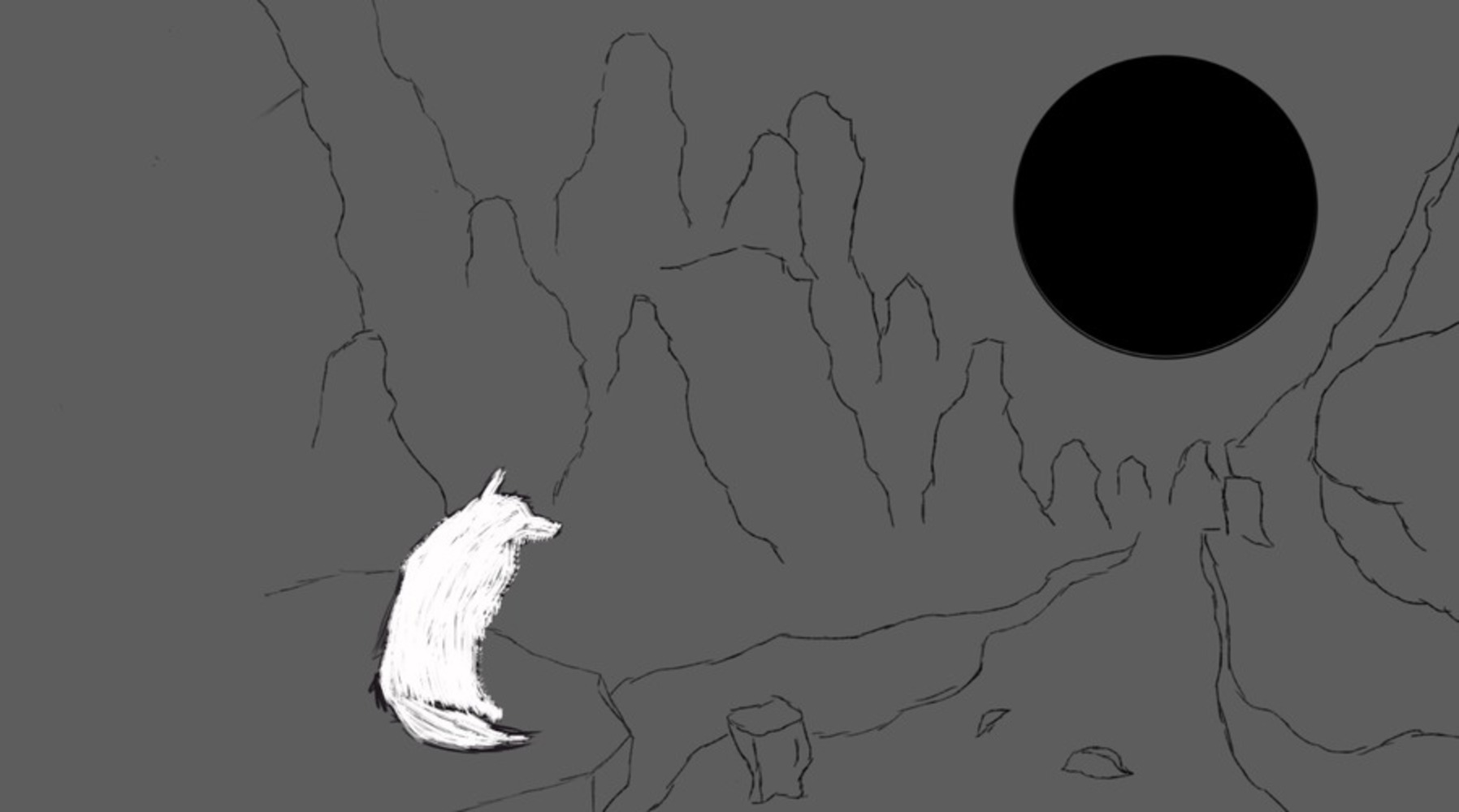
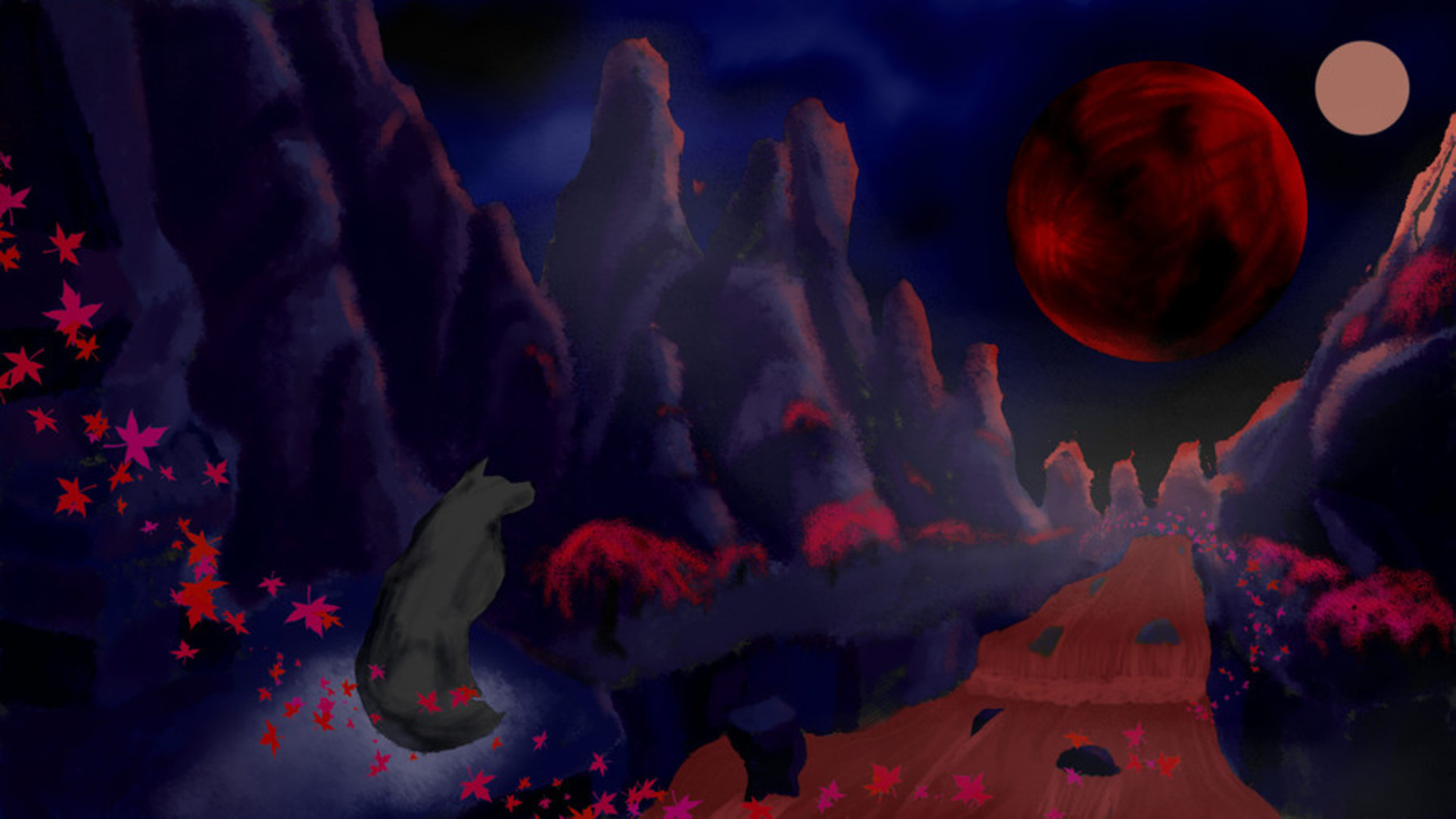
Although I cannot take full credit for the original painting, I was very impressed by the flow of the composition. The usage of the thirds rule was very evident, and clearly guided my eye through the painting. The highlights and shadows were also done very nicely, and the perspective was accurate. The final touching details such as the cherry blossom trees and falling leaves greatly augmented the surreal experience. However, I felt that the environmental concept did not personally evoke any strong feelings. This is where each of my photo manipulated renditions come in and evoke prominent feelings of renewal, toxicity, and foreboding, respectively. "Blue Renewal" achieves its refreshing, minty vibe through the use of a cool color palette; in particular, cyan is used as the prominent highlight, with more muted purples to indicate shadows. On the other hand, "Toxic Paradise" makes use of clashing colors and various shades from neon to ashy to produce what I felt was the most effective trigger of disgust. Finally, "Bloody Ritual" attempts to heighten its shock value by using dark, bloody red tones along with a dark, moody navy blue. However, I felt that I did not achieve the maximum level of satanic foreboding, partially due to the fact that I could not further darken various elements without losing detail. This was a problem for all the digitally manipulated renditions, in addition to being unable to fully blend elements of contrasting colors. 

Reflection

Through this project, I became more familiar with PaintTool SAI and the qualities of brightness/contrast and hue/saturation. I also began dabbling in color theory as I attempted to create various moods through usage of distinct colors. Overall, I realized that photo manipulation is not as "cheap" as others may believe it is; the intricacies required to really master the usage of Photoshop tools and to know when to apply them is no trivial matter. Additionally, just as Andy Warhol's work demonstrates, the choice of color palette is also another profound design decision than an individual can make in regards to one's art; if not selected deliberately, the effect is unlikely to be successful.   
If I were to repeat this project, I would attempt to change the values of various more elements of the painting, which would force me to experiment with more colors to create an image with greater depth and complexity. I would also do additional research on distinct color palettes and refine my final image by adjusting the edges between contrasting colors. 

Drop files here or click to select

You can upload files of up to 20MB using this form.