Outcome
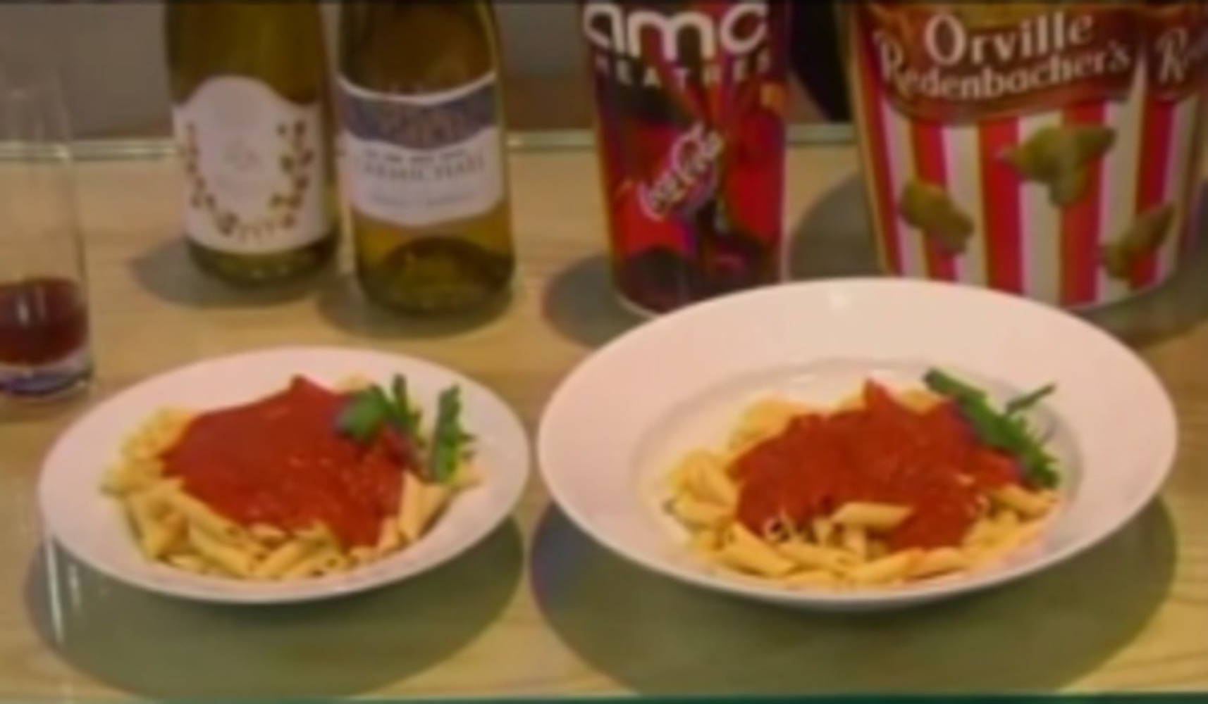
This first image is a very straightforward example of the Ebbinghaus illusion. There is roughly the same amount of pasta on each plate, but because one plate is bigger than the other (the plates can be seen as the encirclement) the pasta is seen as smaller. I thought was it was interesting example because it seemed like it could have been done completely unintentionally; just imagine someone distributing poster onto differently plates and thinking "Now I know that I put the same amount of pasta on each one..."
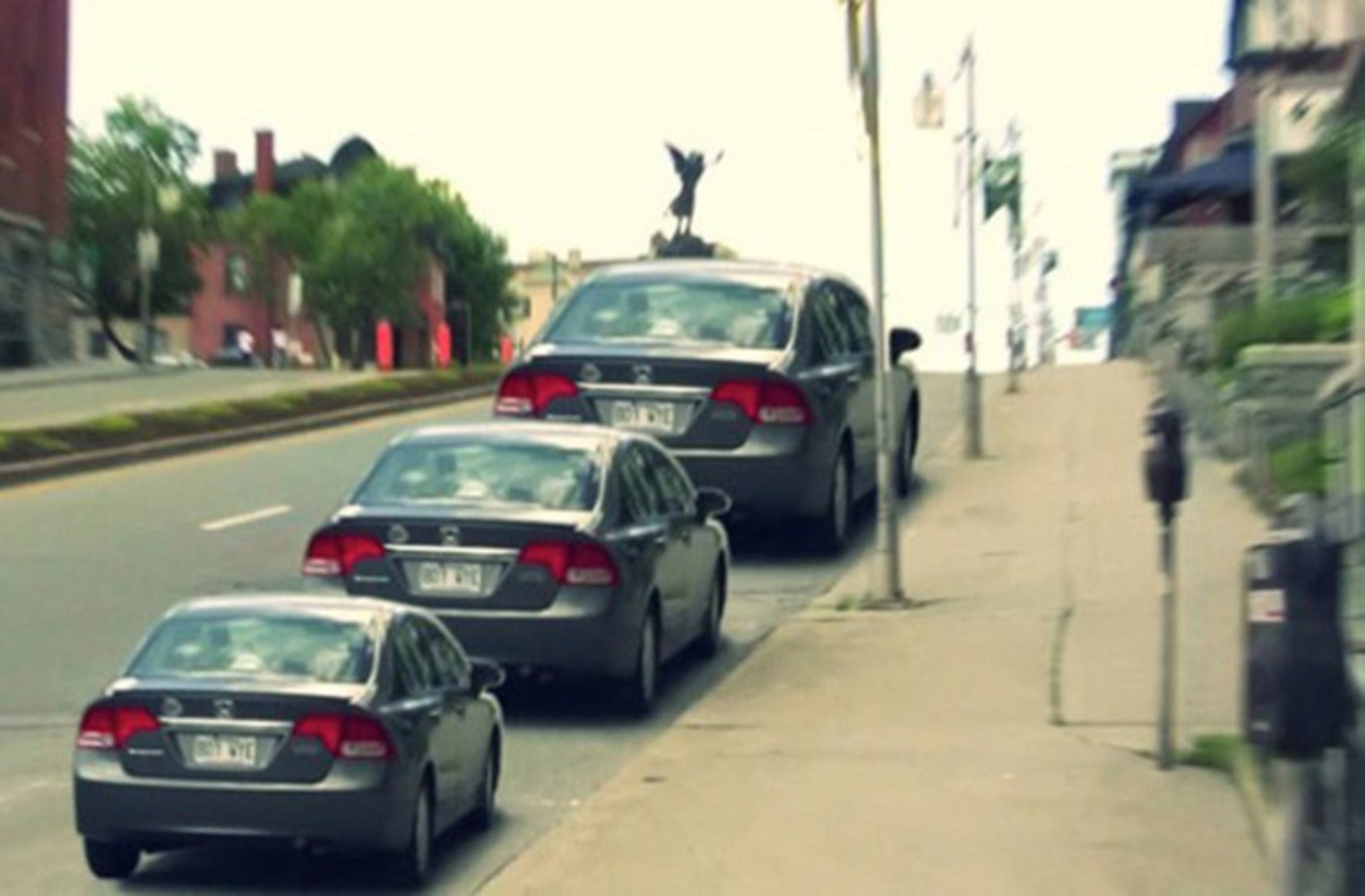
The second image is a little more complicated version of the Ebbinghaus illusion. All three cars are actually the same size (they’re actually the same image repeated 3 times), but for some reason the cars further down the image appear smaller. At first, there’s no obvious indication why there’s a size distortion; there’s no official encirclement of the cars. However, looking at the image further, the street can be seen as an unofficial encirclement. The “smallest” car takes up the least amount of street while the “largest” takes up the most.
Because this is a generated image (specifically the cars were replicated and placed) this specific event did not happen. However, with cars roughly the same size, with the same placement, and from the same point of view, a similar image could be observed in real life.
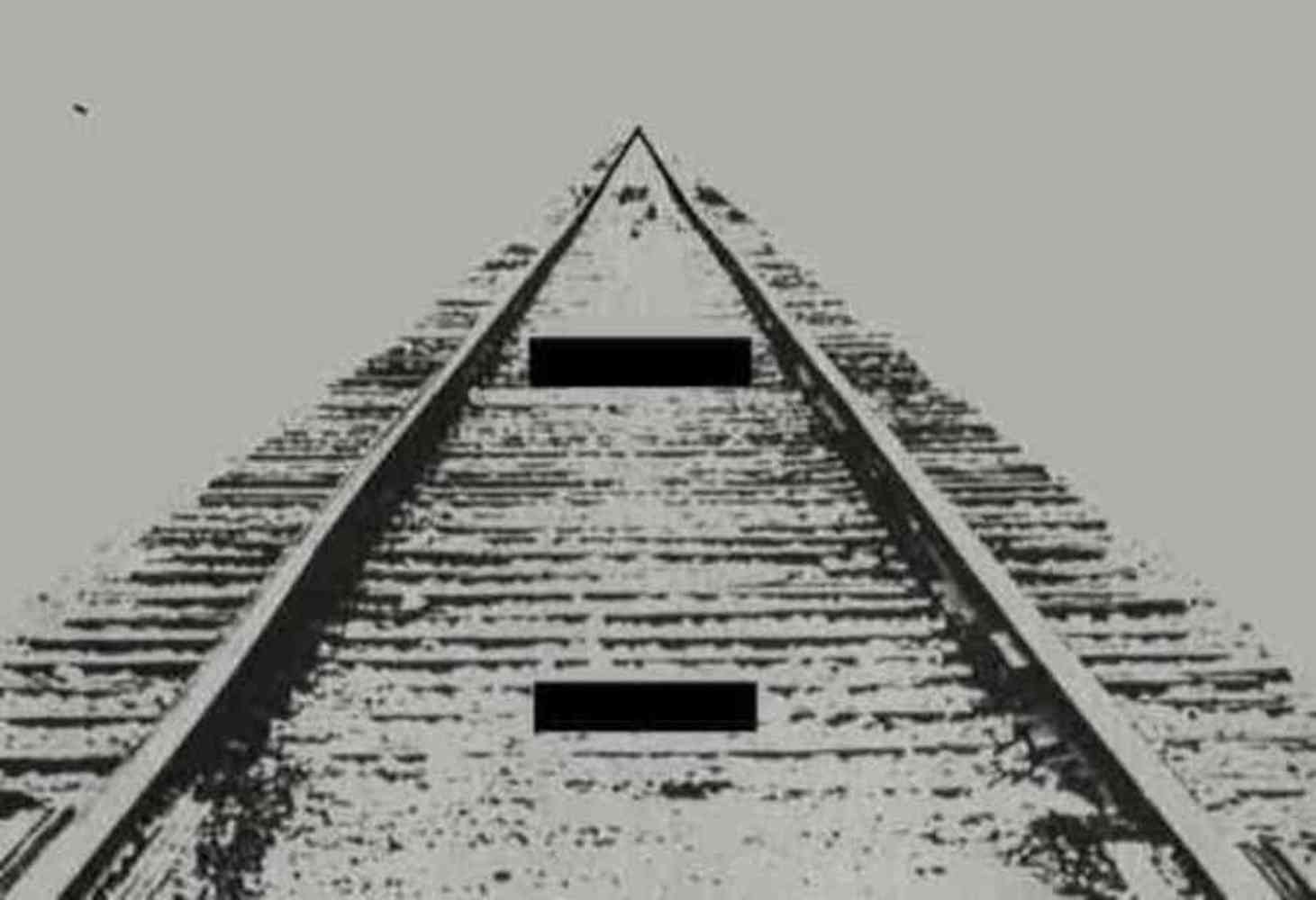
Unlike the Titchener Circles, the surrounding objects do not encircle the central objects in this image, and the central objects are contained in the same encirclement instead of being separated. The basic principles of the Ebbinghaus illusion, however, remain the same. The line at the bottom of the image appears smaller, because the tracks are farther away and thicker. The line near the middle of the image appears larger, because the tracks are closer together and the they appear thinner. I liked the way the image used Ebbinghaus illusion because, unlike the Titchener Circles, the image "flows" as one entity as opposed to the two central objects being separated.
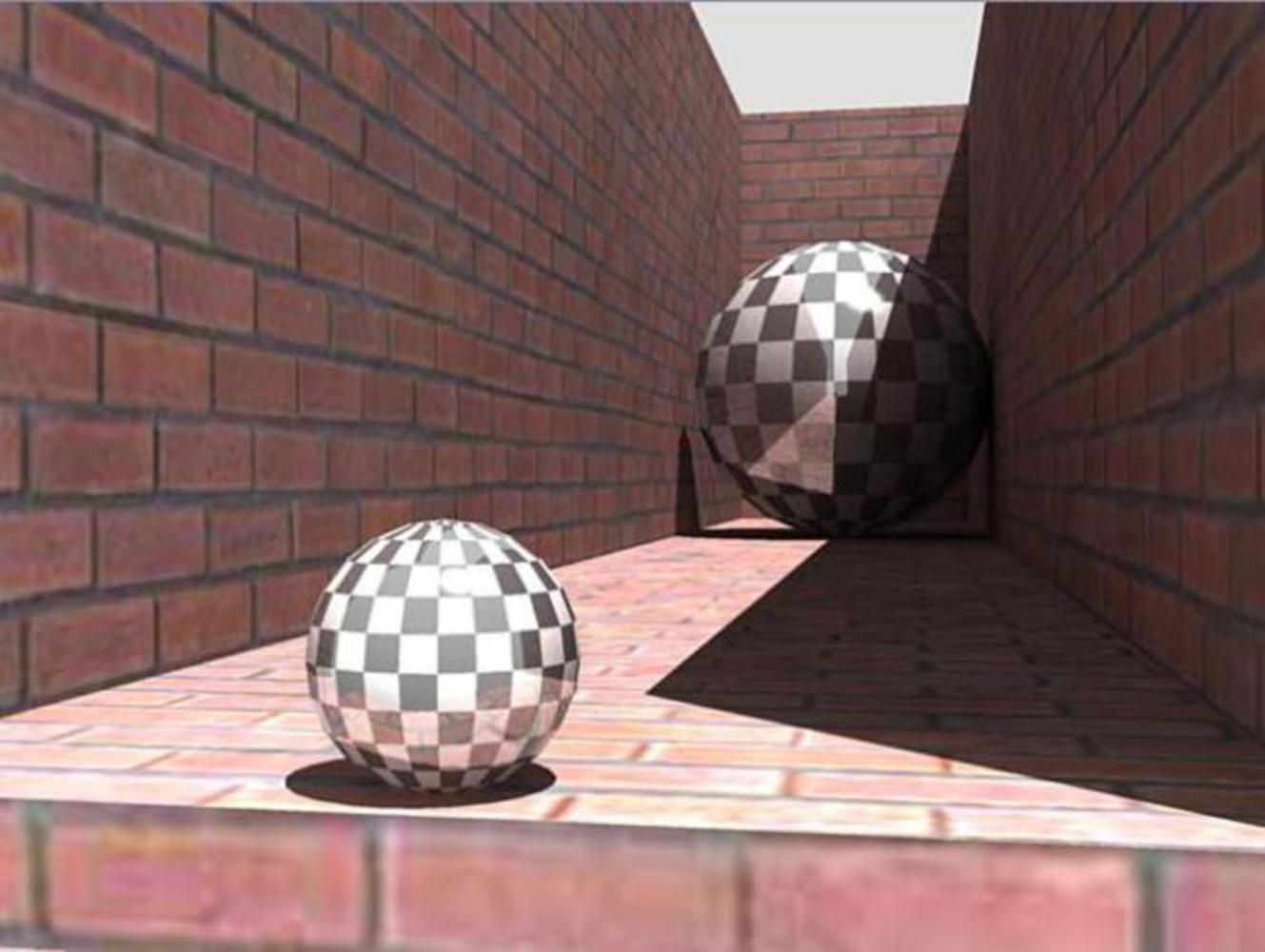
Unlike the previous image and the Titchener Circles, the below image is 3-dimensional. Whiles the spheres may be the same size in a copy-and-paste sort of manner, the additional dimension really helps the farther sphere seem bigger and not just look bigger. The basic principles of Ebbinghaus illusion is there, the closer walls make the farther sphere look larger than the closer sphere where the walls are farther away. However, the way the walls are given depth and dimensional, it makes the audience think they are the same width all the way through. Because of that, and because our minds are used to recognizing things farther away as being bigger than they actually look, the farther sphere seems to dwarf the closer one.
Reflection
Optical illusions are things that I knew existed and that were cool but never paid a lot of attention to how they functioned. After doing this project, I'm now really curious about how a lot of the illusions I've seen before play with perception and cognition. Up to this point, a lot of our projects have been dealing with observing art/media and responding to it; therefore I'm not sure how much these optical illusions could have really been implemented in them. For any upcoming projects that deal with perception and cognition, I'd think it be interesting to try to implement some of them. The Ebbinghaus Illusion in particular would be a good technique to distort the size of objects in the piece.
You can upload files of up to 20MB using this form.