Back to Parent

Outcome


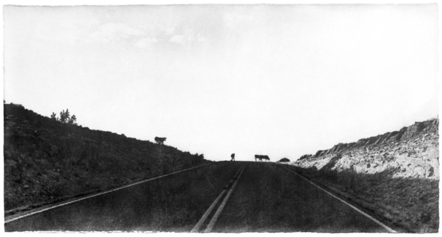
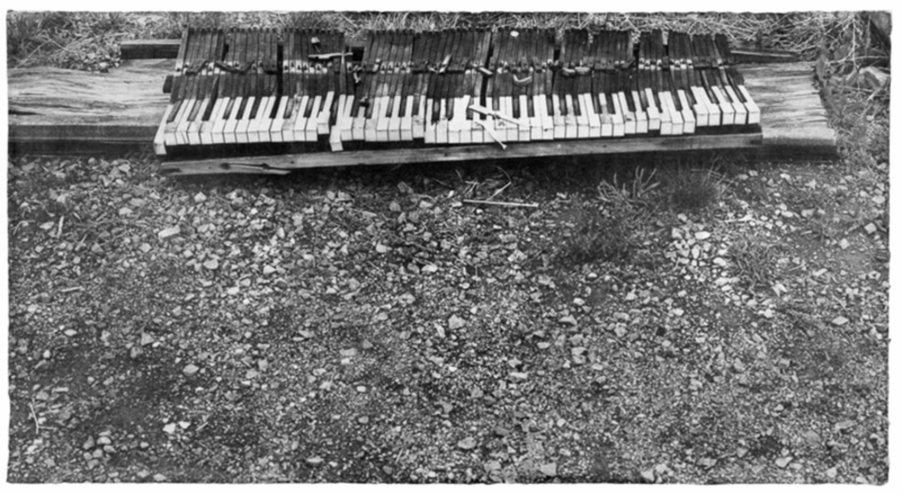
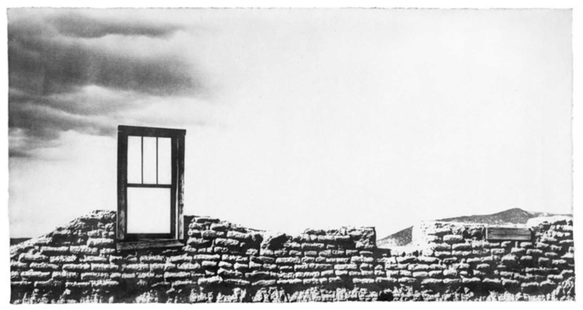
Jungjin Lee's style for Wind used high contrast, lopsided photos of wind devastated areas to emphasize what was destroyed in these rural communities.

In these photos, the divide between the subject, the crisp outlines, and the negative space that is the sky and the ground in the piano picture. This eliminates most gradients in these photos, leading to things being colored very dark or very light. These gradients that this gets rid of are usually very big indicators of texture and dimension in photographs, so by getting rid of texture, you emphasize the contrast that the objects have with the negative space, specifically in Lee's photos, the contrast between the sky and ground and the devastated landscape. 

There is also an imbalance in these pictures where one side is heavily filled with negative space, while the other side is the object being photographed.
18 wind 07 106.thumb
Show Advanced Options
Wall.thumb
Show Advanced Options
Man.thumb
Show Advanced Options

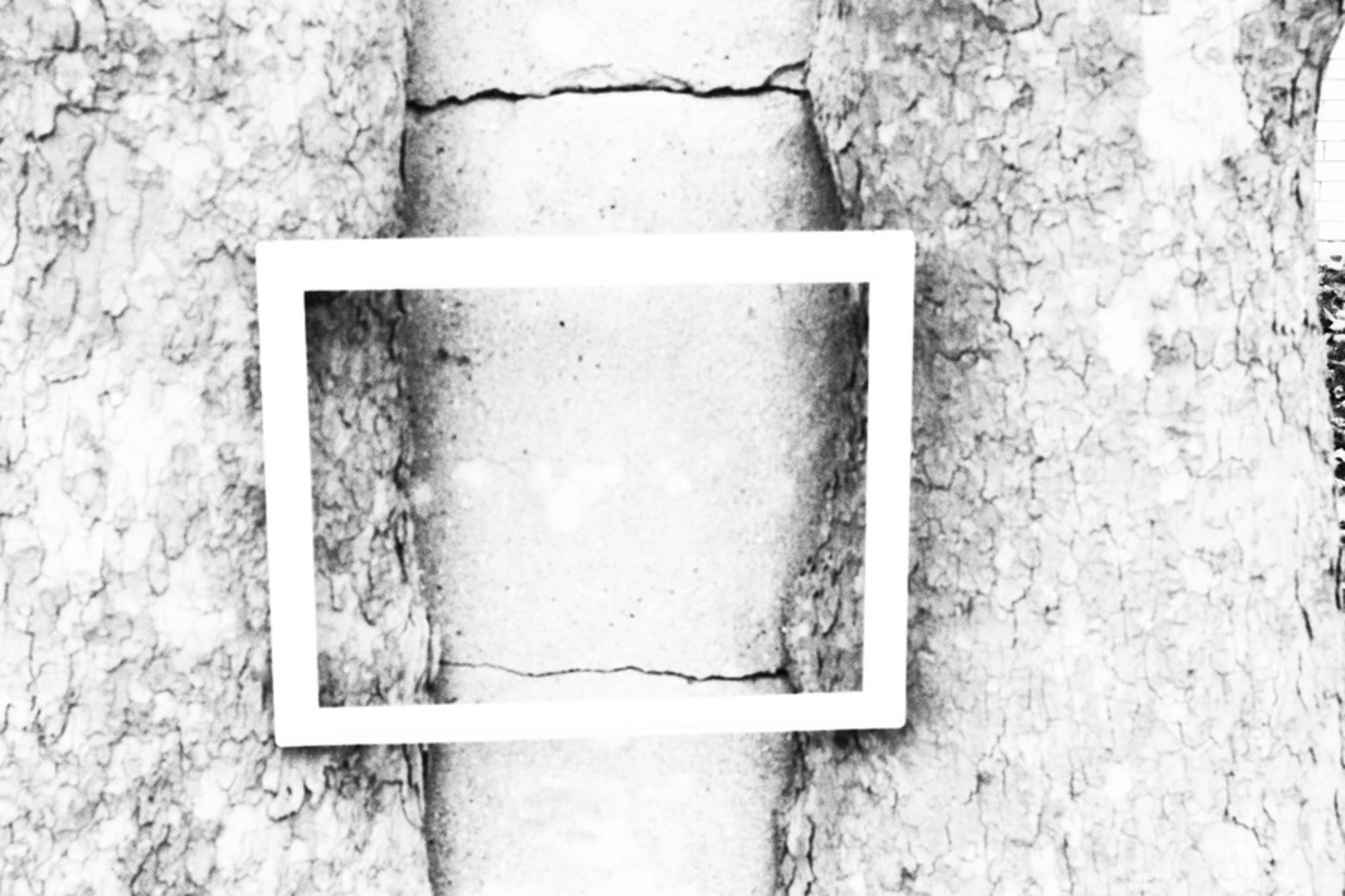
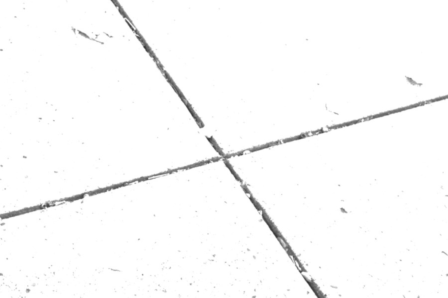
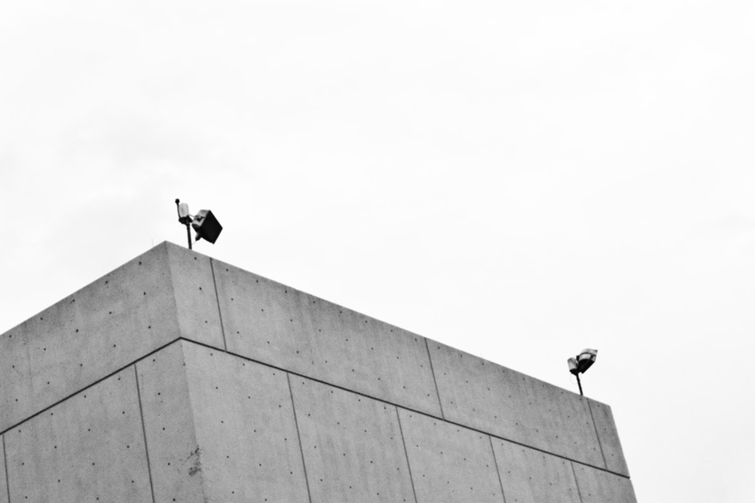
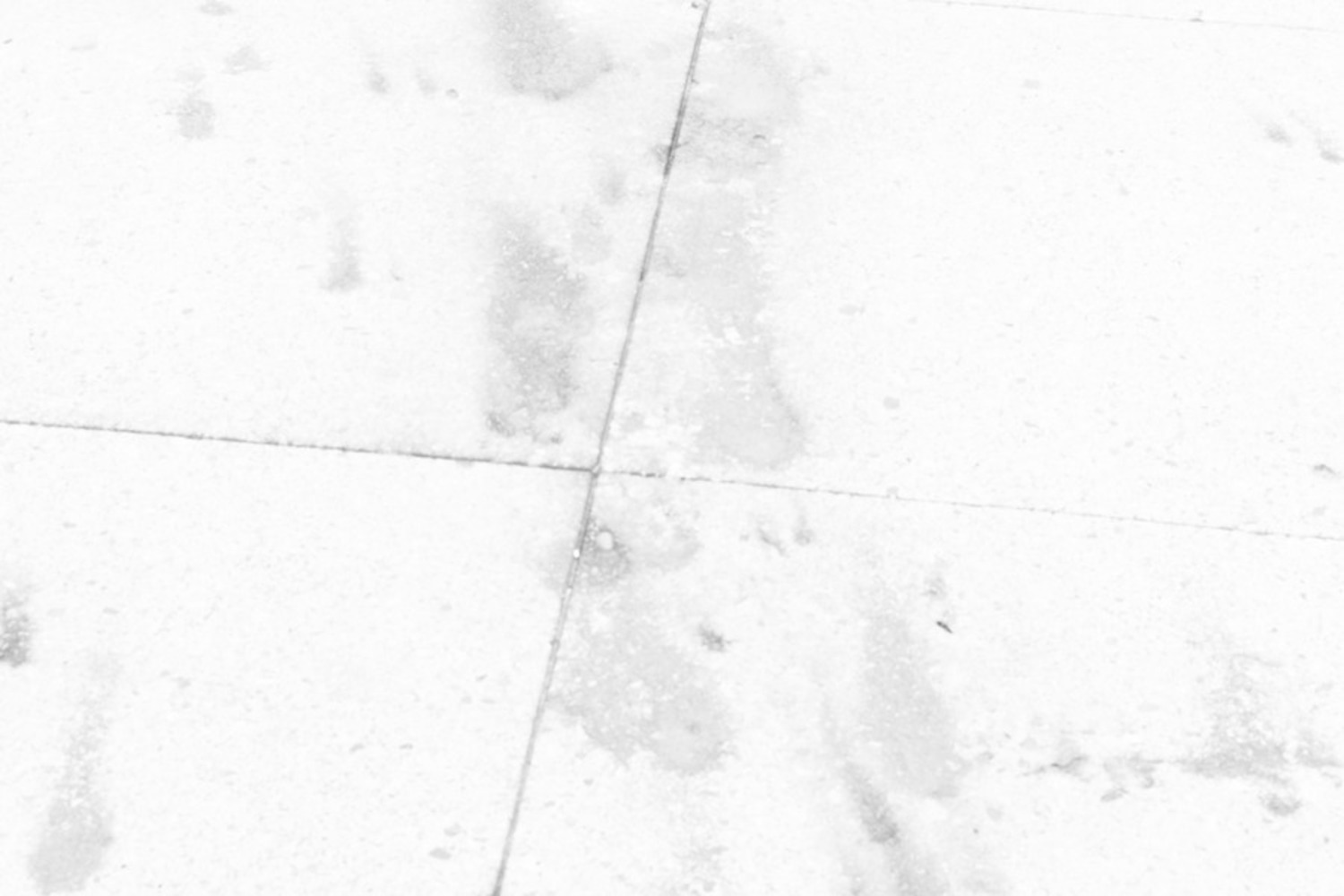
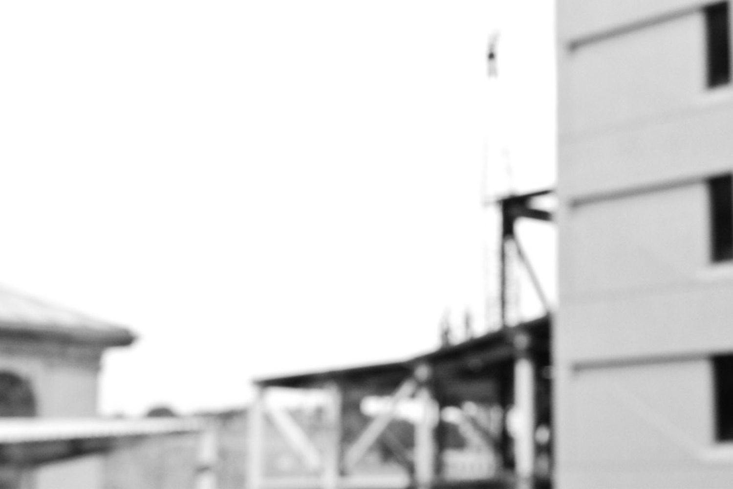
What I did to replicate these photos was to find places on campus (due to time constraints) that I though would have very noticeable and well framed negative space produced from very bright objects, and positive space from very dark objects when the contrast was turned up. I also tried to find objects that would produce these positive and negative spaces with geometric silhouettes. I found some of the most amazing patterns in the cracked and weathered pathways around campus, as well as taking a different look at the construction for Scott hall which in itself was a kind of human destruction that also signals the rebirth of something new in place of what was demolished which is an aspect I can also see in some of Lee's photos such as the one with the man in the road.

Some of the Challenges I encountered when doing this were making the photos have the same white/dark balance as Jungjin lee's photos. I tried turning down the shutter speed, opening the aperture, and upping the iso, But that just made everything brighter. I also tried to do it in post-processing, but I could not figure out how to make brights brighter and darks darker without destroying the silhouettes I wanted.

Tree.thumb
Show Advanced Options
Cracks.thumb
Show Advanced Options
Wean.thumb
Show Advanced Options
Stained.thumb
Show Advanced Options
Construction.thumb
Show Advanced Options
Drop files here or click to select

You can upload files of up to 20MB using this form.