Back to Parent

Outcome


Intention

Color perception is more complex than the average person might think, if said average person hasn't done much study in the area of color theory. I am personally only casually acquainted with its many concepts, but I still lack the ability to select colours, especially on a digital medium, such that the work has the overall intended effect as imagined in my mind. Hence I will look into discussing the typical color illusion - seeing some colour when another is present, due to surrounding colours, or visual movement, etc. This would be a good opportunity to educate myself a little more on a very important concept in artmaking.
The dress  28viral phenomenon 29.thumb
Show Advanced Options

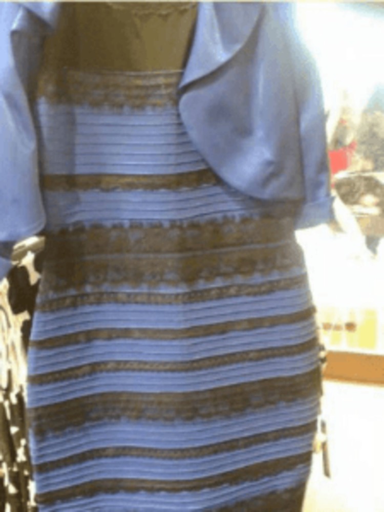
You are, of course, likely aware of viral phenomenon of "the dress", in which the color of the apparel was hotly debated due to the washed-out, poor quality of the photo. A majority of respondents to a survey found the dress to appear black and blue, followed by white and gold, among other color combinations. Some also reported being able to "switch" between various colour perceptions of the image. I personally see the dress as blue and black - it is possible to see the blue portions as slightly less blue, and the black portions as slightly more gold if I try hard, but the initial impression is that it appears to obviously be a blue and black dress. 

The disparity in the perception of the colour of the dress comes from the interpretation of the ambient lighting in the photo - under typical, yellowish light (like sunlight, or the typical incandescent light bulb), the dress is almost unambiguously blue and black. But if the ambient lighting is perceived to have a blue bias, then the blue in the dress is interpreted as the result of this more bluish lighting, and therefore appears to actually be white instead. 

What's especially interesting about this example is how it illustrates individual differences in the perception of colour - on a great scale in social media. Obviously there are plenty of colour illusions out there, but one of this level of individual difference is rather unusual.

Screen shot 2015 10 15 at 2.15.34 pm.thumb
Show Advanced Options

This example is rather reminiscent of Adelson's checker shadow illusion, where the typical viewer perceives the tile labelled B to be of a white colour, while that of A to be of a darker grey colour, when in fact the two colours are exactly the same. There are many ways to prove to oneself that the two tiles are indeed of the same colour (using an eyedropper tool, for example), and one that perhaps is most illustrative is by removing the tiles from their surrounding context - and that is the crux of the matter, really, that we perceive in relation to other objects present in our perceptive field. What's also interesting about this color illusion is that besides teaching one about the relative perception of colour, it also exemplifies how the eye disregards more gradual changes in colour - hence the fuzzy, gradient shadows blend in perfectly to create this visual illusion, as the mind adjusts for interpretation of the actual colour of the object.

There are plenty of examples in everyday life - wearing one colour onstage as its opposite color shines on you is bound to have unexpected consequences, or perhaps heading to another fancy location where lighting tends to be unpredictable - a party, or a bar with nightlife activities. It is even as simple as waking up in your room at the golden hour and finding that everything has taken on a sort of amber color, although it doesn't take long to adjust to the change, and your eyes are usually good at determining the true color of objects under biased lighting in any case - how this interpretation works on an individual level is what causes the color illusion phenomena discussed above.

Screen shot 2015 10 15 at 2.23.54 pm.thumb
Show Advanced Options
Screen shot 2015 10 15 at 2.24.01 pm.thumb
Show Advanced Options

As you can probably tell, images such as these are made to illustrate the limitations (or amazing capabilities, depending on your.. perception) of the visual system. The chess pieces, and the horizontal bar are of the same/uniform colour, but their surroundings cause us to interpret the true colours in different ways.

But what about more everyday examples in media? Truthfully, selecting colours in the creation of artwork is all about this. When I first started off making artworks as a child, I would always be mildly confused as to the end result of my works - I was always choosing the "true" colours as I had imagined them in my mind, so why was it that the final product seemed so garish, unbalanced, and generally unrepresentative of my intended portrayal? Probably it didn't help that the color pencils and crayons I started out with were rather limited to begin with, and didn't mix very well in any case, but the idea is that choosing colours separately for every object in your artwork is going to make the end product look like it was stitched together from different worlds of coloring - they were colored that way, after all. To achieve the harmonious look like in so many famous paintings, artists would often have to do a layer of underpainting to better define the values of the colours first, and then concern themselves more with application of colour. The modern digital version of this is first completing an artwork in greyscale, and then using another layer (usually set to modify or overlay) to paint on the colours.

Screen shot 2015 10 15 at 2.44.33 pm.thumb
Show Advanced Options

Other times however, one might want to set a particular color as the defining tone of the picture - with digital tools, this can be as simple as flooding the image with the chosen colour, and then painting over it with lowered opacity so that some of the underlying colour might show through - exactly like some oil painting techniques with glazing. In this video, Sycra discusses how one ought to select colours for a harmonious effect, showing how "blue" may not be the typical blue colour one might select on a white canvas, and how different colours can look different in a painting dominated by another colour - and therefore, how one should adjust for this selection.

Show Advanced Options

The video is rather lengthy, so here's a boiled down version of it - generally, the further you are from your original colour on the colour wheel, the lower the saturation you should choose, if you're going for a more harmonious selection of colours. As we've seen, the perception of colours change depending on its surroundings. Therefore even the humble grey block may appear to take on green hues when surrounded by a vibrant shade of red, and one should account for this illusory effect when applying colours from opposite ends of the color wheel in the same painting.


Or maybe he ll give me yours  by alicexz d47ep8v.thumb
Show Advanced Options

Here's an example of alicexz's work, which tends to feature vibrant colours with rough edges. This particular work has a strong red bias on the subject, and the redness in the face de-emphasizes the red of Sansa's auburn hair. Contrast this with another of alicexz's paintings of Sansa:

A pretty little talking bird  by alicexz d4qxopm.thumb
Show Advanced Options

This one is more balanced in terms of colour - the background is greener, Sansa's face is paler, and the red in her hair stands out more in contrast, where the face was more the object of focus in the picture above (and not only because of the picture composition). It can be surprising to use a color picker tool to go over the paintings, and realise that the "vibrant" red of the hair was really a murky brown that only appeared as red as it did because of the surrounding green. 

Reflection

It's one thing to read about color theory and see examples of the effect of color perception in art tutorials, but quite another to actually employ the techniques. I was really quite surprised when I first got into digital art and tried to study the colour compositions of some of my favourite artworks by pulling them into Photoshop and using the color picker tool on them. It reminded me of an old friend who would shade their drawings, even colorful, bright drawings, with greys and blacks and other colorless choices to horrendous effect - it seemed to me that I had also been painting blindly without carefully considering how to pick colours that would compose a harmonious picture, rather than disjoint pieces each seemingly with their own personal sun in the top-right corner. Seeing a walkthrough of the process and examining some real life phenomenon, it just drives home the point harder that colour can be a really subtle point to nail down - choosing the color in the color wheel or color gradient can feel completely different from choosing it with the context of the painting in the background.
Drop files here or click to select

You can upload files of up to 20MB using this form.