Back to Parent

Outcome


Perceptual Illusion

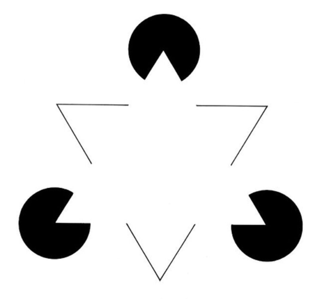
The illusion which I chose for this project, Kanizsa's Triangle, is one example of a family of illusions called Illusory Contours. This optical illusion occurs when an edge is perceived without luminance, color, or texture differences defining that edge. From a neurological standpoint, illusion is triggered by visual cortexes. As for what stimulates this response the general idea is that the choice of shapes provides specific cues about the depth of objects to the viewer. In Kanizsa's Triangle, the pacmen appear to be "deeper" in the picture due to the association between depth and brightness. These cues then signal to the brain that there is a bright triangle which is obstructing the smaller circles, leading to the illusion.
2006 06 24 kanizsa triangle.thumb
Show Advanced Options

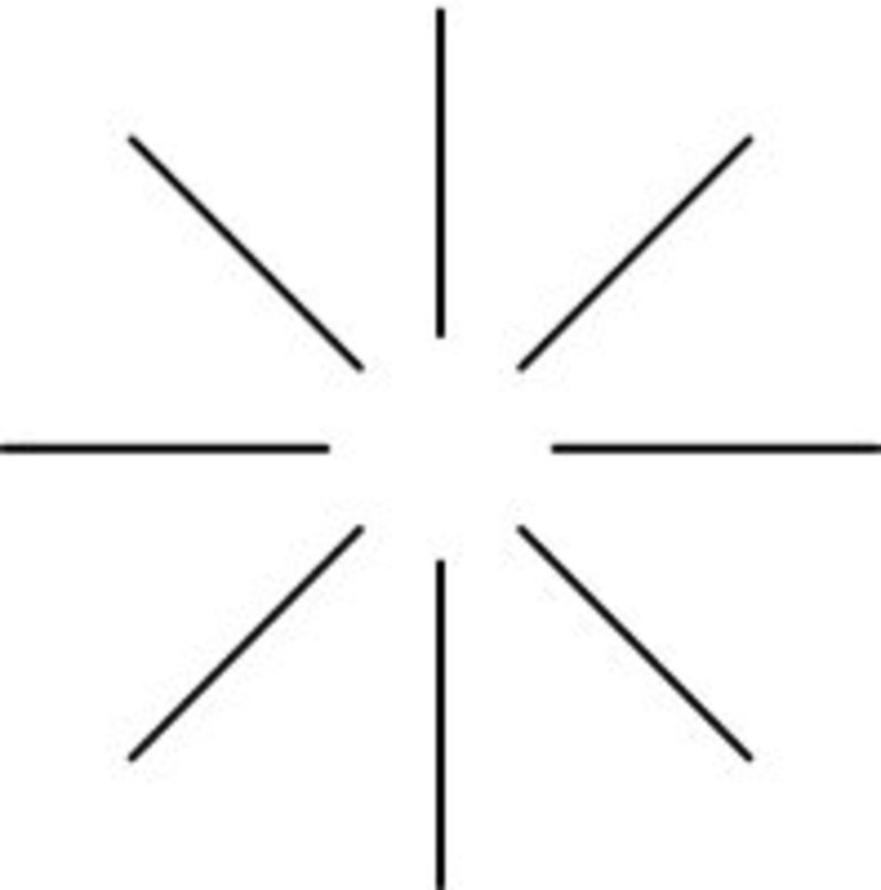
In this other example, the circle that seems to lie at the center of the image is a result of the sense of depth given by the lines surrounding the circle.

Illusion2.thumb
Show Advanced Options

Examples in the world

Real2.thumb
Show Advanced Options

This loading symbol is the most obvious example of the effect. What makes it interesting is that the circles of increasing size themselves form a large internal circle. The "obstruction" in this case would be a frame of sorts that encompasses the other black circles, similar to the frame of a old dial phone.

Real1.thumb
Show Advanced Options
Real3.thumb
Show Advanced Options

These 2 hazard symbols also feature the effects of illusory contours. The yellow hazard symbol create the impression of a circle surrounding the black circle in the middle of the image, while the biohazard symbol creates rings that lie along the other 3 prongs. The circle in the first symbol is interesting as it creates a balance between the yellow and black eements, while the rings in the biohazard symbol is notable because it provides subtle emphasis to the prongs by giving it a white outline of sorts

Examples in Media/Art

Media1.thumb
Show Advanced Options

The first example in media is not too different in implementation as the other real world examples. This is the logo for a popular online first person shooter called Team Fortress 2. The illusory contour present in this logo is the circle formed by the empty space between the 4 slices. However, because of the surrounding black background, we perceive the black shapes as obstructing an orange circle. This gives the logo the effect of appearing more like a set of crosshairs, befitting for a first person shooter.

Media2.thumb
Show Advanced Options
Media3.thumb
Show Advanced Options

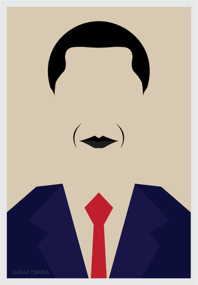
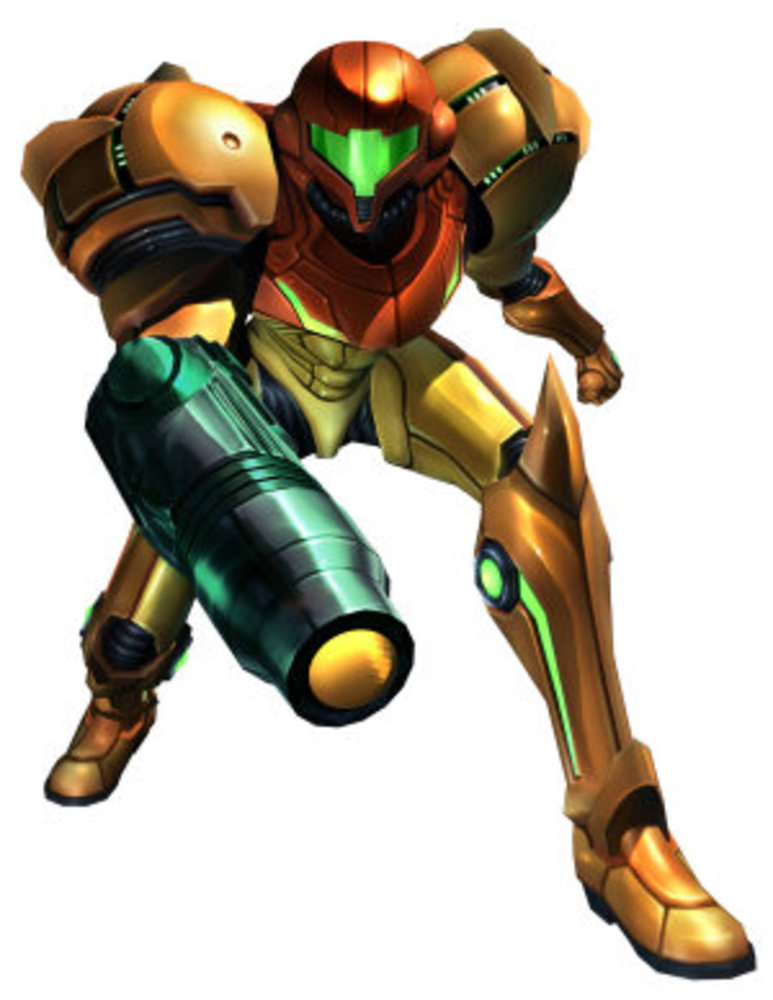
These next 2 drawings are examples of minimalist compositions. The first is a stylized version of the following image, while the second is a minimalistic portrayal of president Obama.

Media2.5.thumb
Show Advanced Options

Whats notable about these minimalistic renditions is that the illusory contours allows these images to capture the essences of the original reference pieces. This is because the illusion highlights the general shape of the objects in question (being a space suit and face respectively). By doing so, it gave the artist the ability to not have to explicitly render details that such as the outline of the objects, allowing them to give the pieces a more minimalistic style.

Reflection

In the process of investigating this optical illusion, I learned about how they can be used to give emphasis to certain parts of a piece of art. In all of the examples, the illusory contours gave each piece additional form without using too many additional outside details. For this illusion specifically, I could use it in my digital media work in a way similar to how they were used here, namely, to give my work a more simple appearance while still giving enough nuanced detail to be distinguishable.
Drop files here or click to select

You can upload files of up to 20MB using this form.