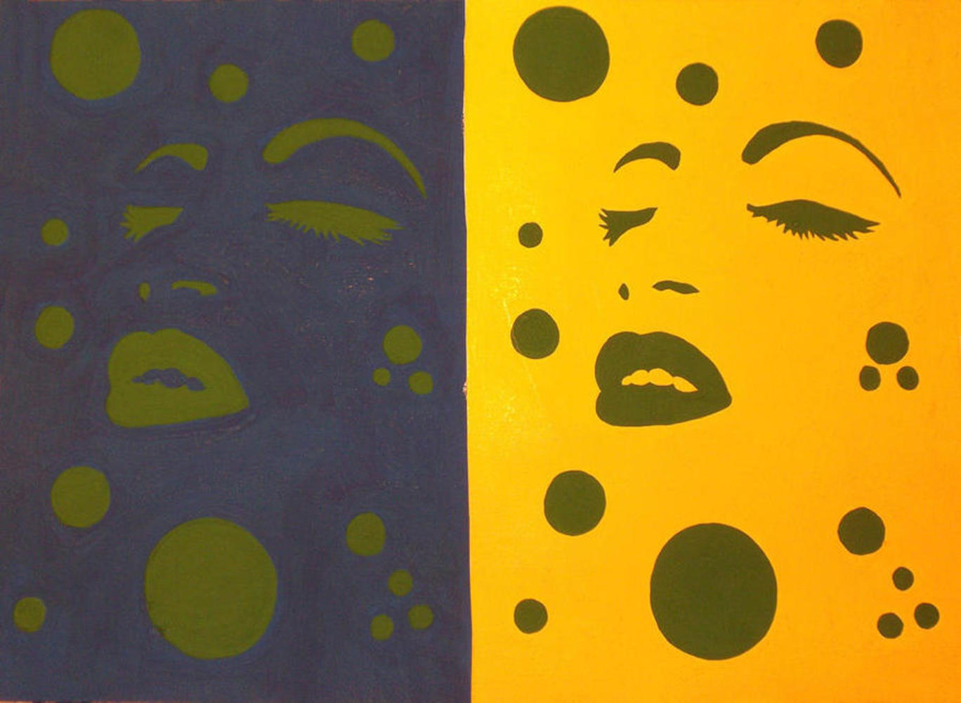
Back to Parent

Outcome


Intention

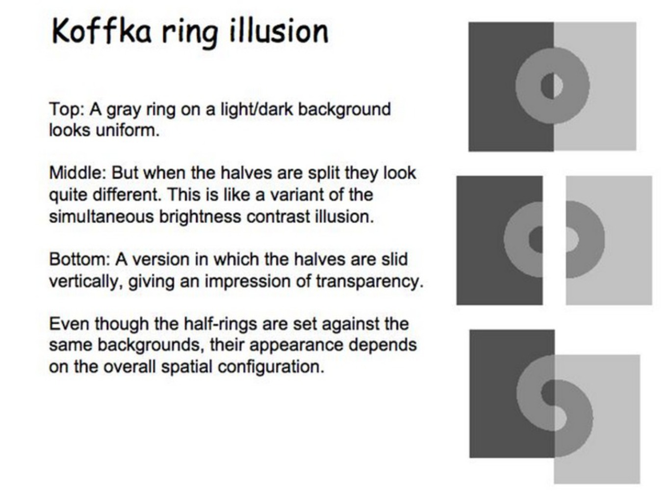
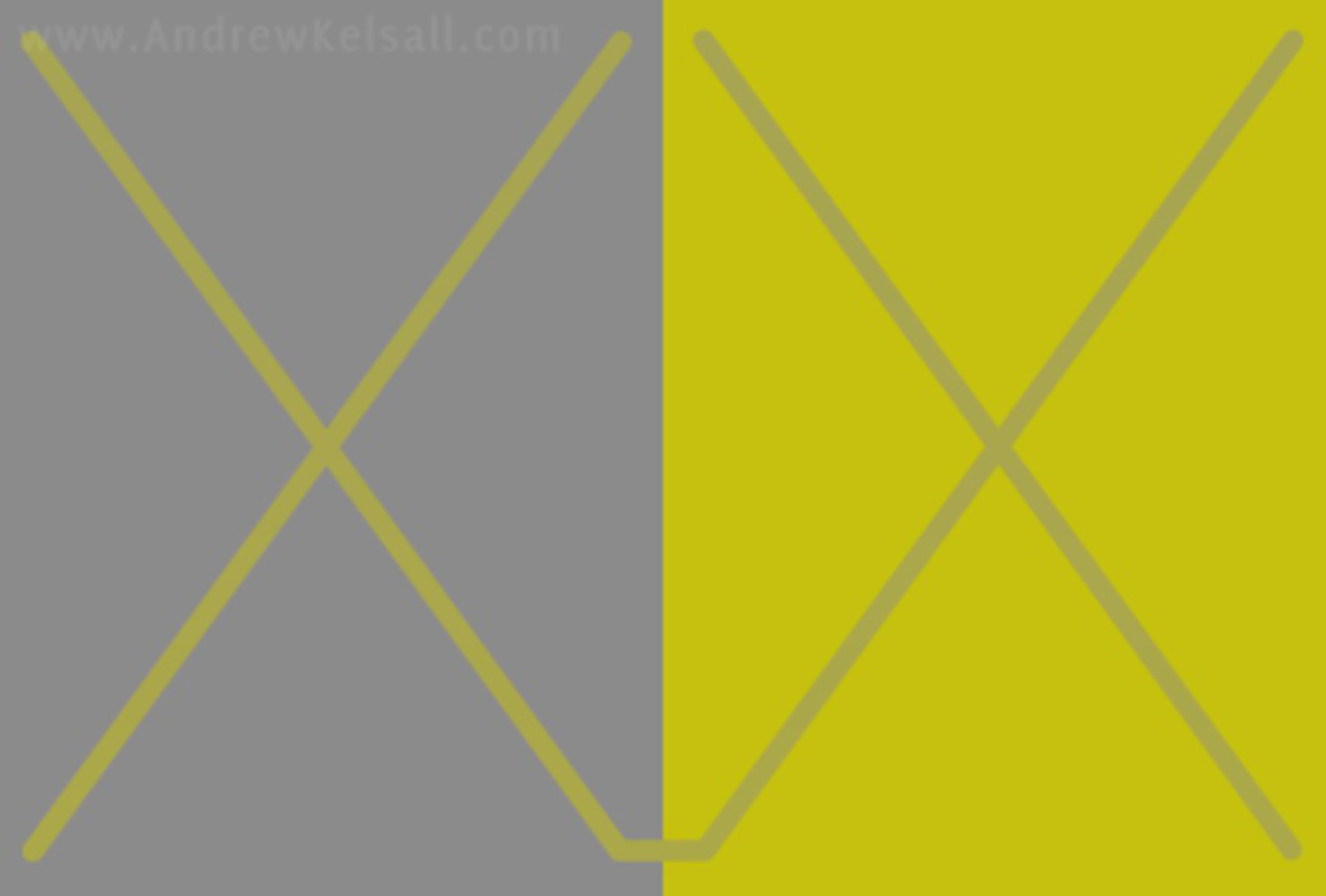
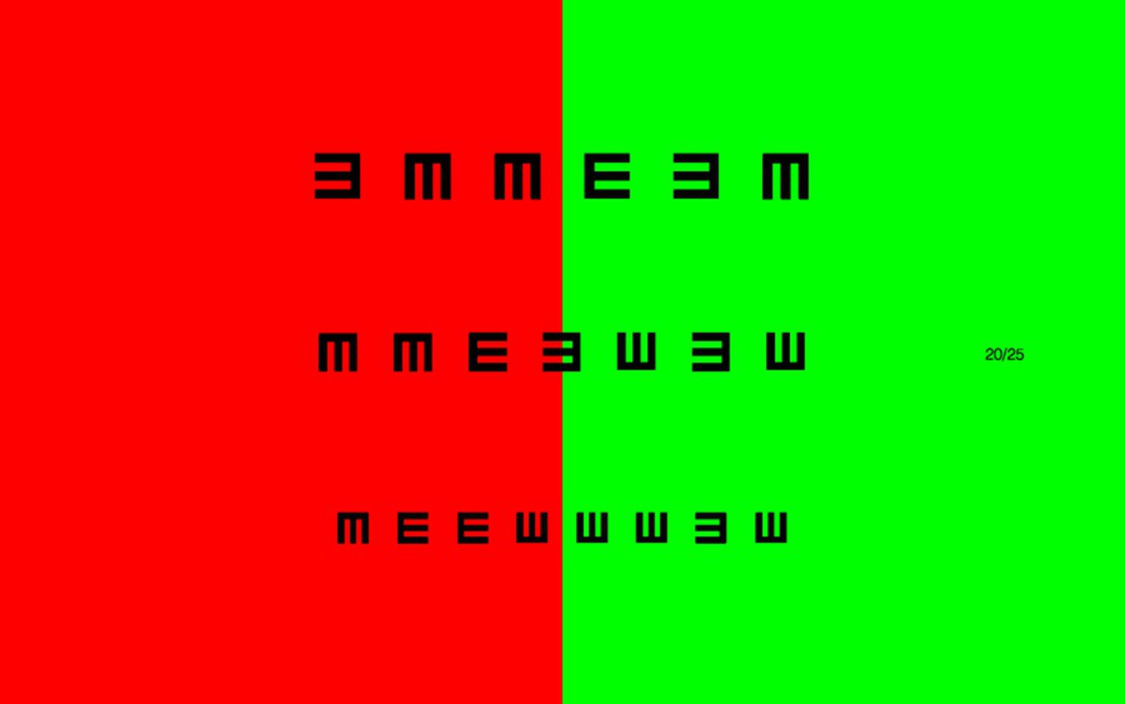
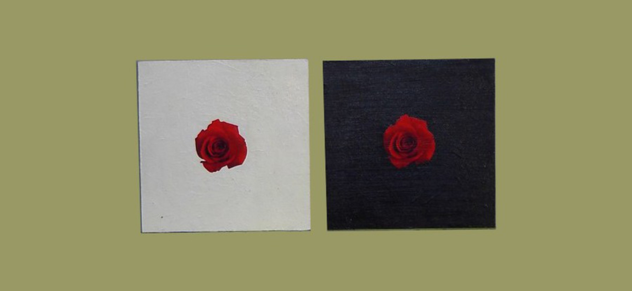
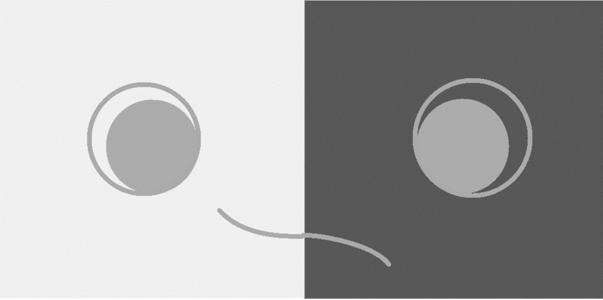
Simultaneous contrast refers to the manner in which colors of two different objects affect each other. Simultaneous contrast illusion is how this effects change people's view towards colors or even distort people's perception. The first picture attracts me is just a grey bar in the background of black to white color gradient(showed below). I cannot believe the grey bar does not change its color after I tested it using photoshop. However, even though I tested it and convinced myself they are the same color, I still couldn't control my brain to perceive them as the same color. For example, like for the Muller Lyer Illusion, when I convince myself those two lines are of the same length, my brain can kind of treat them as same length. But for this one, I cannot. Moreover, I cannot understand why my brain keeps treat the same color as different color. This is the first motive that drove me into this illusion. I want to find out why my brain cannot break the illusion even though I know it is fake.


After I did some research about how it works, I was then curious how it may apply in my life and art, since I did not know how. I found it far more interesting than I thought it would be, because it applies many area that I did not expect. Here is the documentation.

1024px gradient optical illusion.svg.thumb
Show Advanced Options
Koffka ring.thumb
Show Advanced Options

Explanation

Before I go through the examples, I want to talk about how this illusion works.

Firstly experience it with the following link:

http://web.mit.edu/persci/gaz/gaz-teaching/flash/contrast-movie.swf

Reading through many materials and seeing many of the pictures, I think the cause of this illusion is the change of average background light intensity, or illumination. With darker background (less light intensity), the grey bar seems lighter, and with lighter background, the grey bar seems darker.

The simultaneous contrast illusion does not only exist in white, grey, and black, but also in other colors. That is what makes it useful. The contrast illusion gives artist two options: to use the same color and let people perceive them as two, or to use two different colors in different backgrounds to make people perceive them as one single color to preserve the consistency.


Furthermore, the topic goes from simultaneous contrast illusion to simultaneous contrast. Every artist may use simultaneous contrast to emphasize the main part of their artworks, or use different color of background to express different feelings. We can see more in the examples I provide.

Albers.6.thumb
Show Advanced Options
Simultaneous contrast .thumb
Show Advanced Options

Examples in the world

Tumblinge.thumb
Show Advanced Options

This is an eyesight test image. Usually ophthalmologists show these pictures to patients and ask them which side is more clear, and then adjust their glasses. I do not know how it works, but I believe there is something related to simultaneous contrast as the principle of using two background colors. Our retina should perceive these color with the same light intensity compared to black characters if there is nothing wrong with our eyes.

Color blind test.thumb
Show Advanced Options

This is not a good example of simultaneous contrast illusion, but to some extents it is. I think for some people who are not color-blind, it may still take a while to figure out the number in the graph. Because of the simultaneous contrast illusion, the colors affect each other, and the green color blends into the red, orange and yellow.

Examples in Media/Art

No name.thumb
Show Advanced Options

This paint has two parts, and the artist used the same color and same shapes of the main part, which is a woman's face. However, the background is different. The right part has a orange background, which is lighter. That makes woman's face clear, and the orange color shows warmness. But for the left part, the artist used dark blue, which make the picture dim. The left part shows a totally different color tonality. The woman in both sides seems like sleeping, but in the left part, the woman seems sleeping at mid-night, and her face is more morbid.

Contrast bw.thumb
Show Advanced Options

This is another example of changing the background. These two pictures, with the same rose in the middle, give two different feelings to the audience. The white one gives me a sense of peace, while the black one implies a bad event or a bad ending, in my mind.

Wakexiii.thumb
Show Advanced Options

This picture gives me strong feelings because of the large contrast between red and blue. If there is only red part, or only blue part, I may only treat it as a normal landscape. But with the blend of two colors, it seems like the battle between earth(red) and sea(blue). With the simultaneous contrast, red and blue blend so well with each other, but preserving their own color as well.

My own artwork

Seeing all these artwork, I just have a feeling to create an artwork showing the illusion. I am so surprised (especially by the Koffka Ring Illusion) that one color can be treated as two in different backgrounds, and two different colors can blend so well with each other. It is the cover picture of my project this time. My original idea is to present two funny faces on the same picture to increase the components of contrast in the picture, but keep the picture seems harmonious.

Main 2.thumb
Show Advanced Options

Reflection

I learnt a lot from this project. From my research, I know why my eyes may perceive the same color as two. Starting from simultaneous contrast illusion, I continue to discover how simultaneous contrast works with the same principle. It has a wide range of use in art.

They can trick our eyes, so that the colors we think are the same maybe not, while the colors we think are different may be the same. That leads to how could artists adjust color to express their ideas and feelings. They can use same color in different backgrounds to show the contrast, or use the different color in different backgrounds to preserve the consistency. Moreover, with a large variety of color choice, they can think of how to use proper color for background to express their different feelings. For example, green can mean lively, while blue can mean peace. The background will also affect the main body of the artwork, which is how simultaneous contrast works.

For me personally, I will say there is a lot of things I may take care of in my future artwork. I will pay attention to the use of shades, comparison and contrast between colors, background color choice, and so on. 

Show Advanced Options
Drop files here or click to select

You can upload files of up to 20MB using this form.