Back to Parent

Outcome


The illusion that I selected is altering a physical space using shading. We perceive depth primarily using binocular vision, but there are several monocular ways to detect depth that our minds have adapted and become accustomed to. Because of these connections between visual cues and our depth perception, the world doesn't become flat every time we wink. 

One such cue is lighting and shading, and when properly manipulated, it can be used to alter one's view of a space to make it think it is larger or smaller, or in some cases bring entire spaces into existence that were not there previously.

Examples in the world


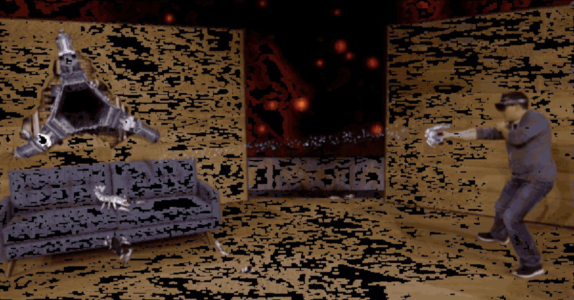
This illusion is used often in fields like augmented reality, including some kind of shading to show that it has some sort of spacial tether to the real world. In the GIF below, the robots come out of the black space in the middle of the pod that supposedly burst through the wall. This gives the pod the illusion of depth, making it not seem strange to us that things can fit inside or crawl out of it.

Microsoft hololens demo.thumb
Show Advanced Options

The effect can be found in a lot of design fields, from putting depth into fonts:

Shadow.thumb
Show Advanced Options

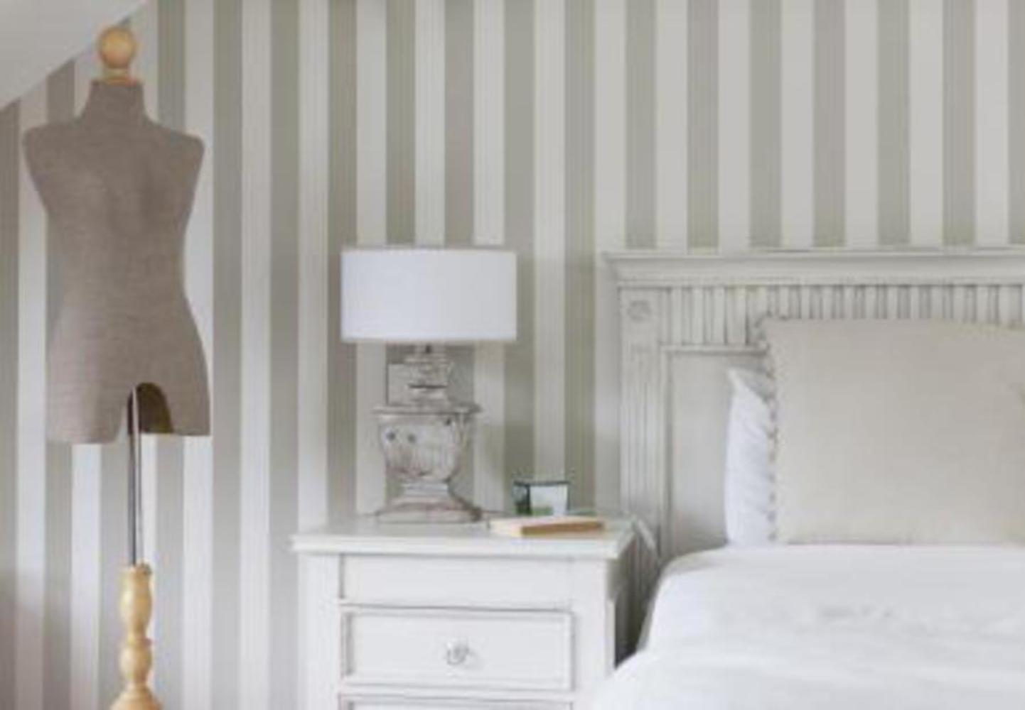
To interior design, using different shades of the same color to make smaller rooms look bigger.

Greyroom.thumb
Show Advanced Options

All of these effects capitalize on our familiarity with depth's effect on shading. By shading actual objects in a way that we associate with depth, people can trick our minds into imagining space where there is not, producing some desired outcome.


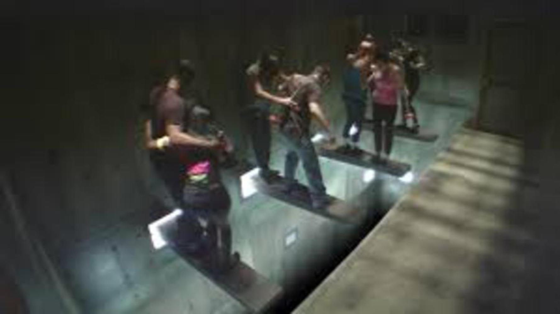
Maybe my favorite example of this, and a good transition into mass media, is the short-lived game show Exit on Syfy. It used practical special effects to make safe environments seem deadly, to give the participants the illusion that there were real stakes to them winning or losing. In the challenge pictured below, they used lighting effects to make the pit seem bottomless. I couldn't find a more overhead picture, but in the show you can't see any part of the bottom. They are given a toilet plunger and a ledge to stand on as the floor pulls away, and every second they don't answer a question, their ledge retracts further into the wall. Very gripping.

While the contestants know there's no danger in this event, they still often scream and hold on to their ledge for dear life, because the darkness below seems to indicate an endless drop.

Exit.thumb
Show Advanced Options

Examples in Media/Art

The music video below has a ton of perceptual tricks strewn throughout it, but the ones I want to highlight are at 1:25, 2:57, 3:10, and 3:20. They use shading to both show depth that is not there (2:57, the pit that the pole is going into, or 1:25, making some of the boxes that are further ahead or on the same line seem further back) or in the other cases using shading to make something seem on the same depth as something else, when it is actually much further away or on a different plane.
Show Advanced Options

Another prime example of using light and shading to illustrate depth is in light shows, such as the following deadmau5 concert. They use gradients and shading to give the illusion of depth and motion coming off of a stationary wall.

Show Advanced Options

Also, I had to include this classic gag.

Show Advanced Options

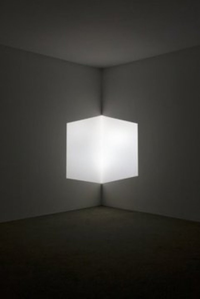
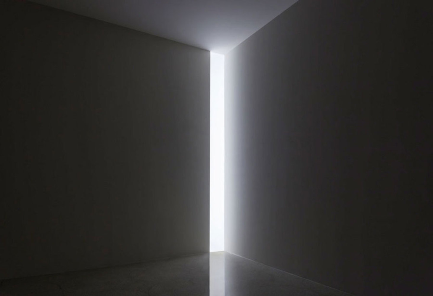
But actually, what made me want to do this project was the suggested artist James Turrell. Specifically, the piece with the cube in the corner of the room, though my favorite of his pieces definitely wound up being the one that looks like an opening door (both shown below). I loved how just using lights in the wall makes it look like there's a physical object floating in the room.

By using lights and shading, Turrell manages to trick the eye into seeing a cube protruding from the wall. How cool is that?

In the image beneath that, the light coming out of the wall makes it look like the wall is a sliding door to a room much brighter than it, giving the wall the appearance of masking a much larger space. It feels almost as though someone can just walk through the light.

Turrell claimed that his works cannot be fully appreciated without being experienced in person, but I'm blown away by the simplicity and effect of his work.

Turrell1.thumb
Show Advanced Options
Doorway.thumb
Show Advanced Options

Reflection

What did you learn? How could you leverage this illusion in your own digital media?

I really liked seeing the practical application of the illusion in the real world. It's neat to think about the design considerations made in every day life. I personally learned different ways that shading can be used to manipulate depth perception, such as light being a form of extrusion and darkness as a form of intrusion. Also, darkness can be used to accent something light to make it look like it's popping out.

I can use this for my own art when doing shading or layering, but I think this is way more applicable to larger art demonstrations. Like with James Turrell, even the photos of his exhibits are way more intriguing than the photos of his prints. I think he was right about this effect needing to be experienced in person. So something more like the light show, or an interactive piece would benefit a lot more from being accented by light.


Also, side note, this is super cool and useful for VR and AR, which is a medium I hope to get involved in soon.

Drop files here or click to select

You can upload files of up to 20MB using this form.