Back to Parent

Outcome


Intention: Perceptual Illusion 

The term “steganography” refers to the process of concealing some sort of a message within another medium. Generally, the hidden messages “appear to be (or be part of) something else,” like an image. The big idea is that the hidden message does not immediately catch the attention of the viewer – instead the image must be intentionally examined for one to notice the message.

For this project, I chose to study a type of steganography where words are hidden in larger pieces. There are many cases where upon first glance, we just see interesting shapes or patterns. But after closer examination, we may realize that various letters have been intentionally concealed. This type “illusion” works because our focus is drawn more towards the design or the larger picture so we quite often fail to identify and isolate a hidden pattern. It relates to perception because we tend to only perceive what’s on the surface. It takes some digging to recognize where there might be an underlying message. There is more than meets the eye!

I picked hidden words as the topic of this project because I think it’s really cool how art can be used for more than just aesthetic pleasure by concealing secret messages. This practice makes art into a fun puzzle of trying to figure out if and what an artist might be trying to convey beneath the surface.

Examples in the world: Mass Effect

I found a couple of examples of hidden letters or words in the following logos.

Upon first glance, the Sun logo just appears to be some squiggly lines. But actually, the lines form the letters “S,” “U,” and “N” and the word “sun” can be read around the square four times. This is an interesting application of hidden letters because it actually conceals the entire company name. 

Screen shot 2015 10 19 at 12.24.20 am.thumb
Show Advanced Options

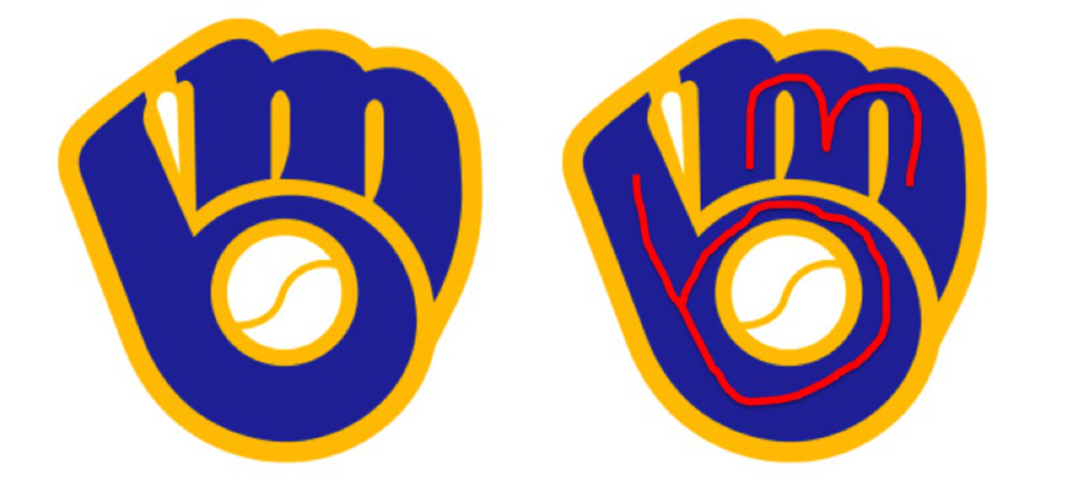
The Milwaukee Brewers logo is a baseball mitt holding a ball. But it’s also an “M” and a “B.” The initials of the team are encoded in the image. This logo conveys the name of the team as well as expresses the focus which is obviously baseball.

Screen shot 2015 10 19 at 12.24.52 am.thumb
Show Advanced Options

The Goodwill logo looks like a cute little smiley face, but it doubles as a concealed lowercase letter “G,” which obviously stands for Goodwill. 

Screen shot 2015 10 19 at 12.24.01 am.thumb
Show Advanced Options

The LG logo is a smiley face constructed from the letters “L” and “G.” This is another example where the initials of the company are obscured in its logo.

Screen shot 2015 10 19 at 12.25.06 am.thumb
Show Advanced Options

In all of these examples, just a few letters are hidden in the logos. The letters represent the initials or the name of the company that the logos represent. This practice not only makes for more interesting logos, but also draws attention back to the name and brand of the company. A logo is supposed to be recognizable, and using this technique will help a viewer more easily associate the logo with the sponsored company.

Examples in Media/Art

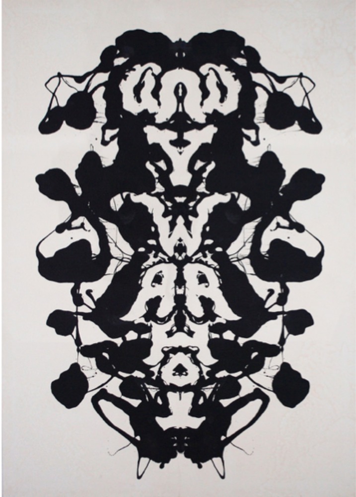
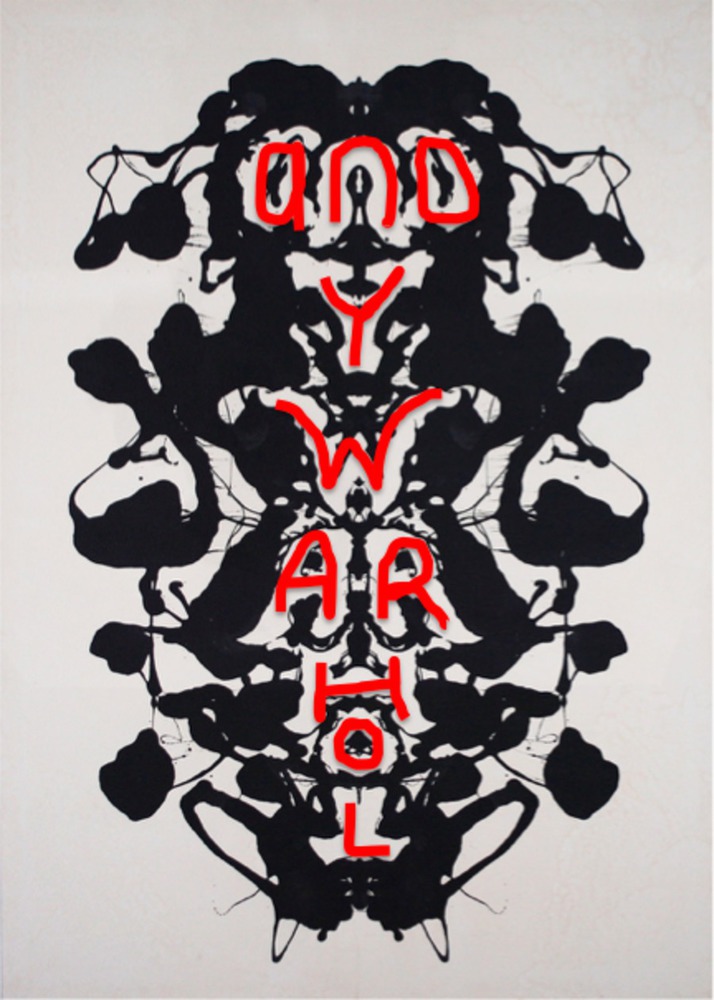
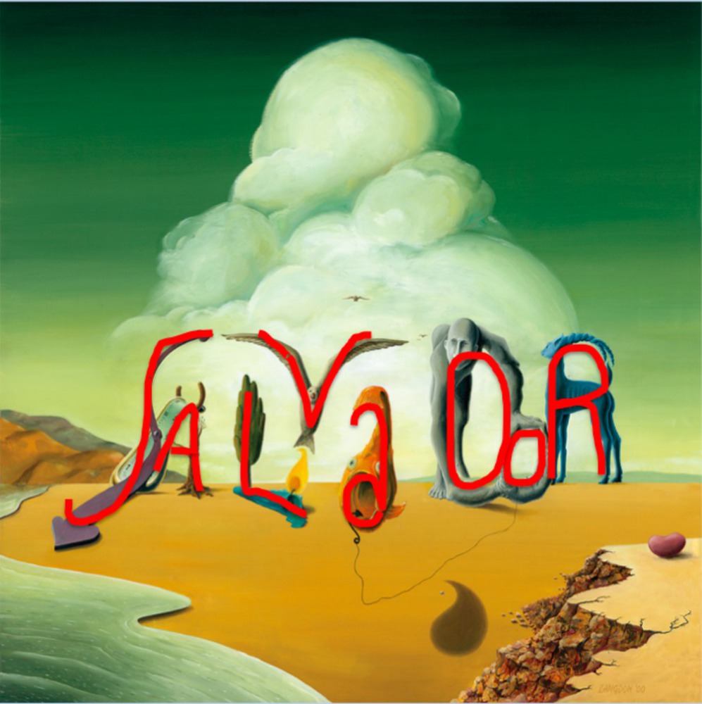
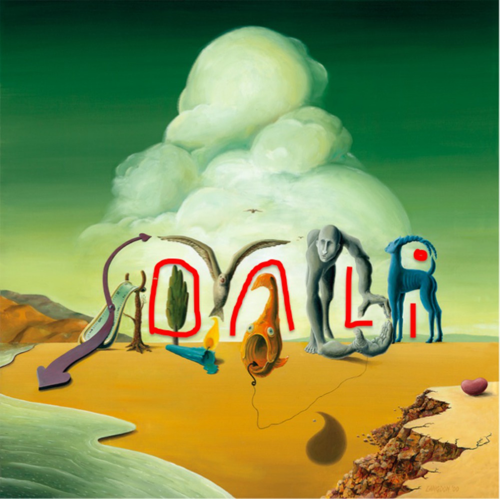
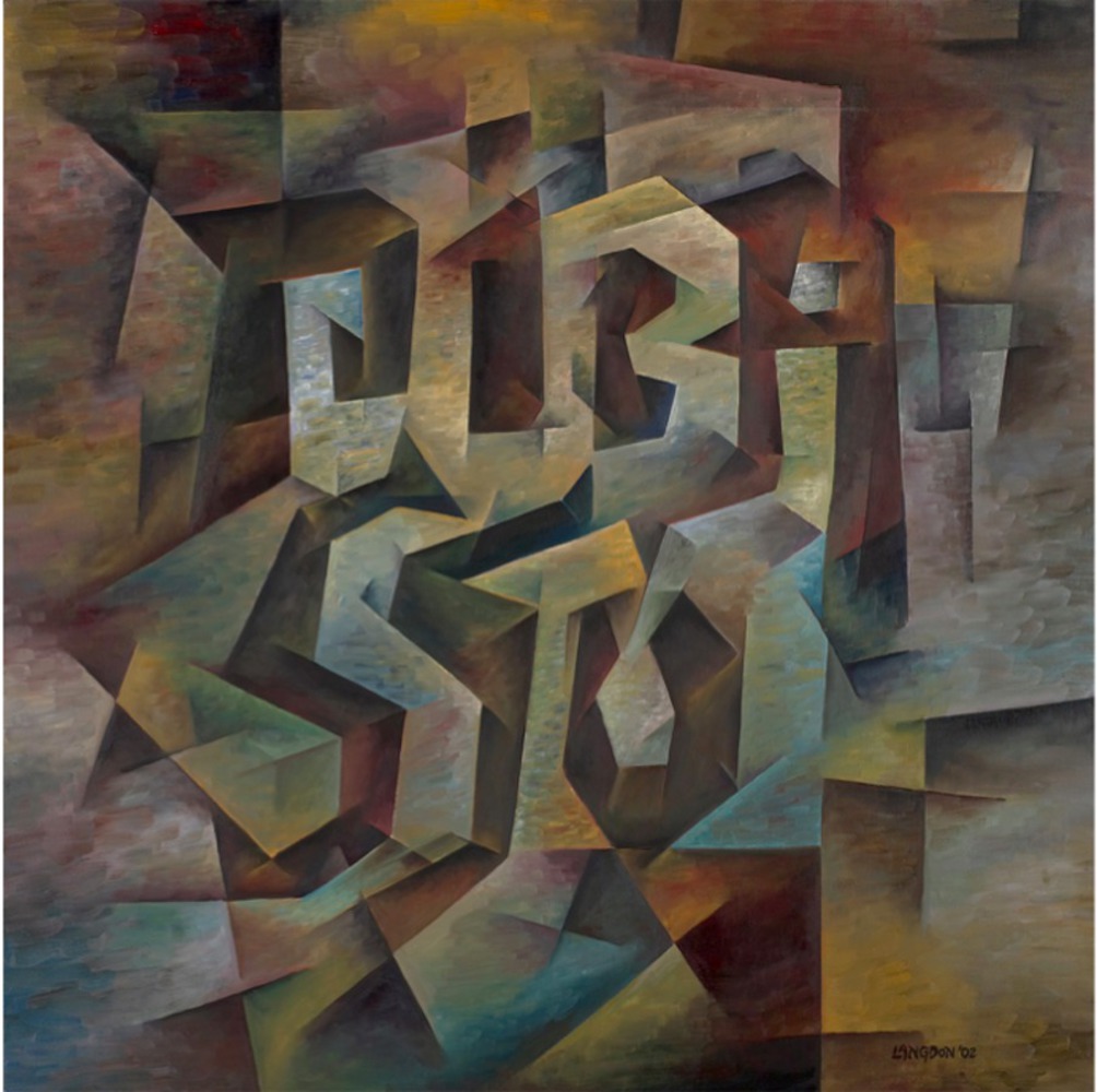
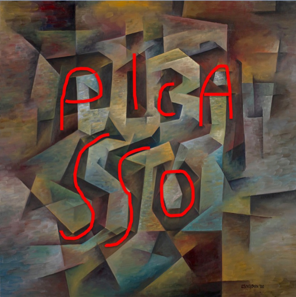
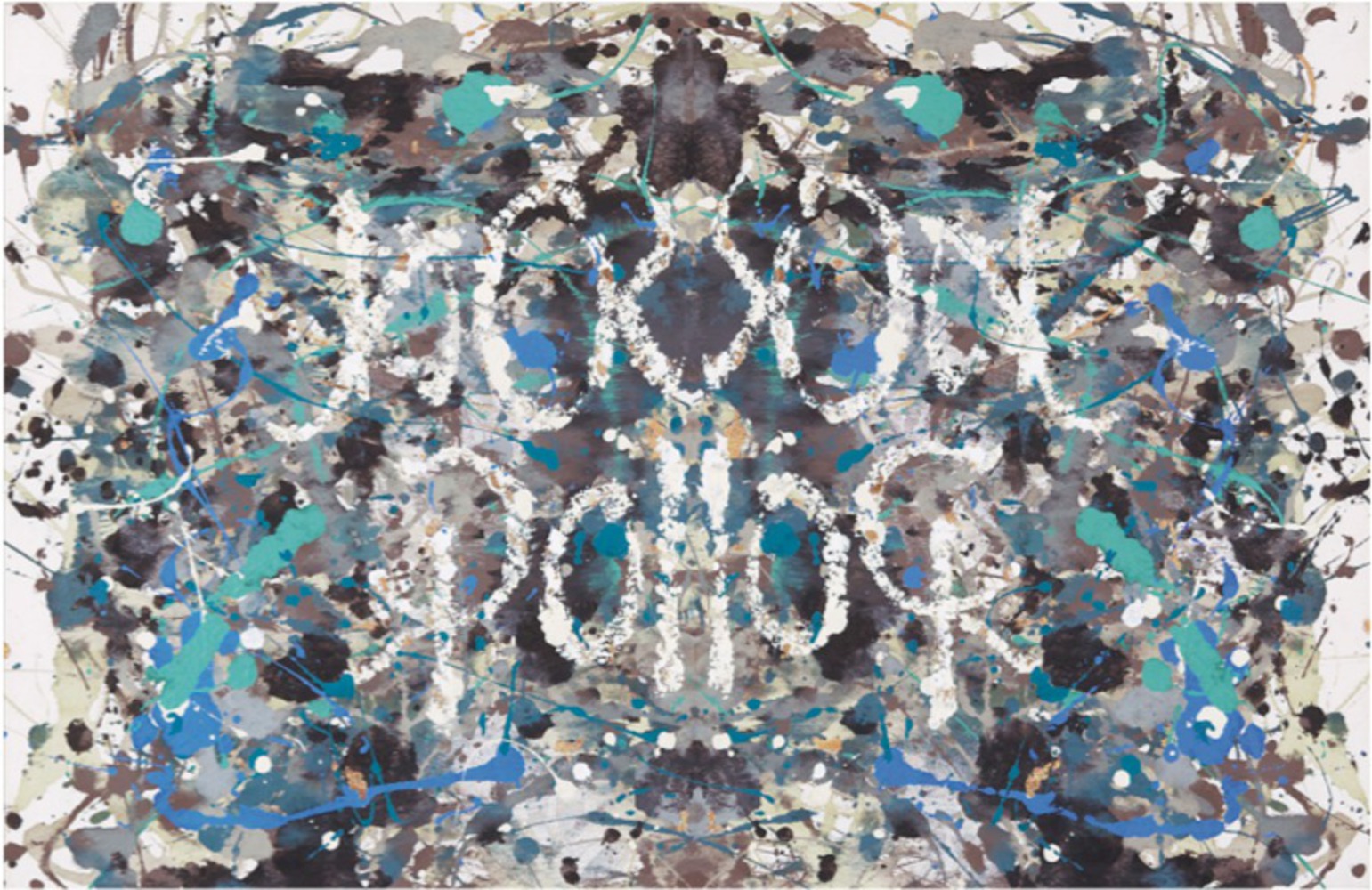
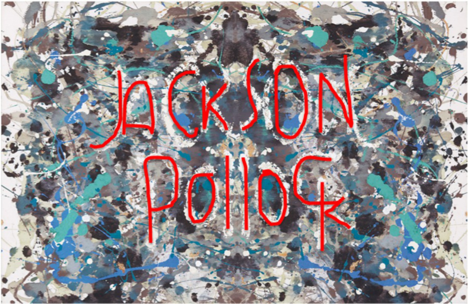
My favorite of the examples I found were pieces by an artist named John Langdon. The ones I was immediately drawn to were paintings that were tributes to famous artists. Their names are disguised within the artwork. 

Andy Warhol: This one is extra cool because it is symmetrical but the name is still readable. 

Screen shot 2015 10 19 at 1.04.15 am.thumb
Show Advanced Options
Screen shot 2015 10 19 at 1.03.49 am.thumb
Show Advanced Options

Salvador Dali: This one was my favorite because as soon as I saw it, I knew some sort of word was hidden but it took me a very long time to figure out what it was. I also liked how Langdon used both the positive and the negative spaces to encode both the first and last names. 

Screen shot 2015 10 19 at 12.42.45 am.thumb
Show Advanced Options
Screen shot 2015 10 19 at 12.42.12 am.thumb
Show Advanced Options
Screen shot 2015 10 19 at 12.42.24 am.thumb
Show Advanced Options

Picasso: I think Picasso’s first name, Pablo, is probably depicted here too, but I haven’t been able to find it yet! 

Screen shot 2015 10 19 at 12.43.13 am.thumb
Show Advanced Options
Screen shot 2015 10 19 at 12.42.54 am.thumb
Show Advanced Options

Jackson Pollock: In all of these tributes, Langdon tried to mimic the style he artist he is honoring. I like this one because I think it best incorporates Jackson Pollock’s ideas and techniques. 

Screen shot 2015 10 19 at 9.32.16 am.thumb
Show Advanced Options
Screen shot 2015 10 19 at 9.34.41 am.thumb
Show Advanced Options

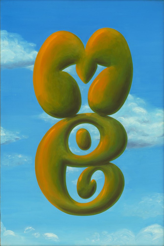
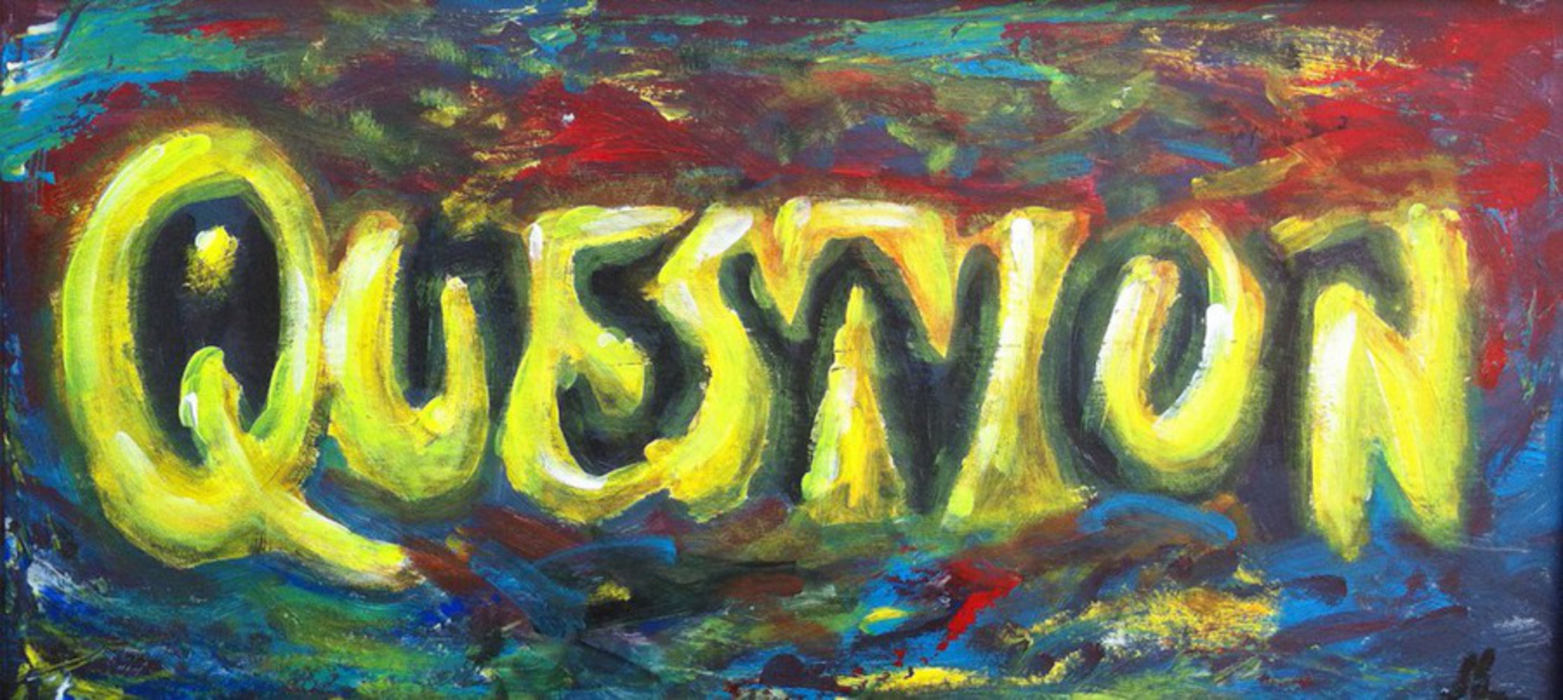
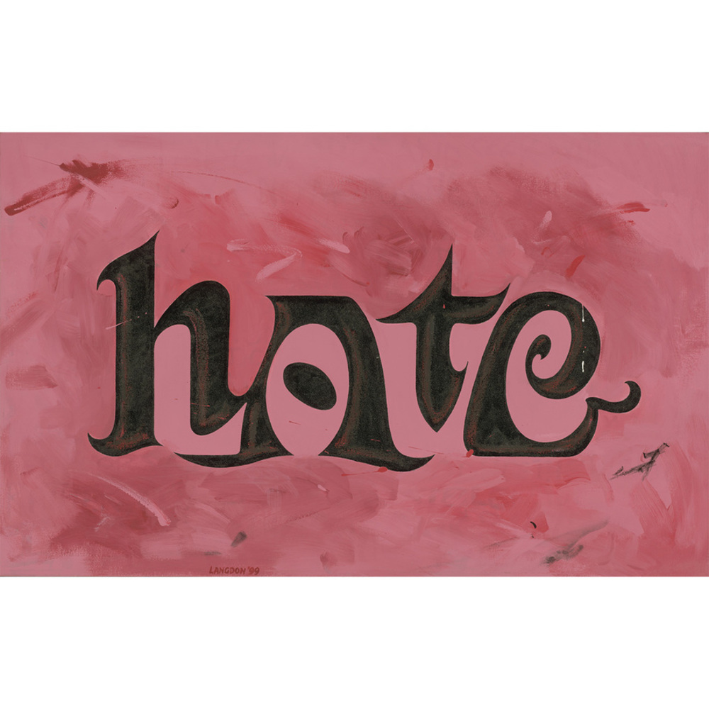
I also liked these paintings by Langdon. These all use the positive/negative space to convey different words, too, like the Salvador Dali one. We have me/you, question/answer, and hate/love.

Us copy 684x1024.thumb
Show Advanced Options
Question answer johnlangdon1 1024x459.thumb
Show Advanced Options
Love johnlangdon.thumb
Show Advanced Options

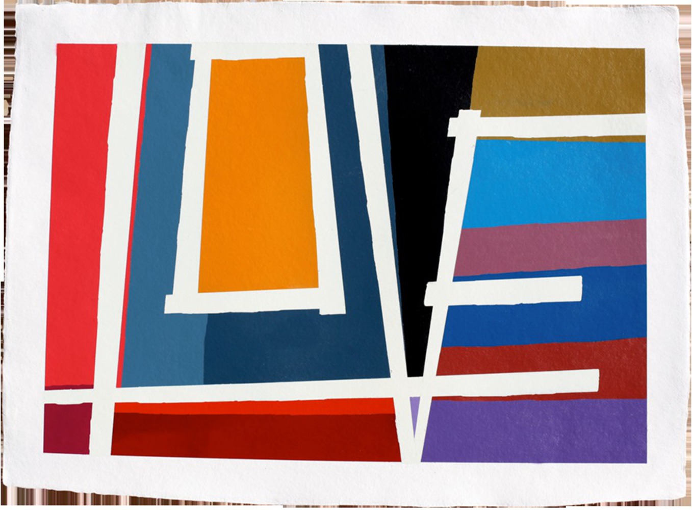
I also wanted to throw in two other examples of words hidden in art: This abstract color painting by Charlie Edmiston looks like fairly random blocks of color but actually displays the word “love” in white.

Charlie edmiston paintings 5.thumb
Show Advanced Options

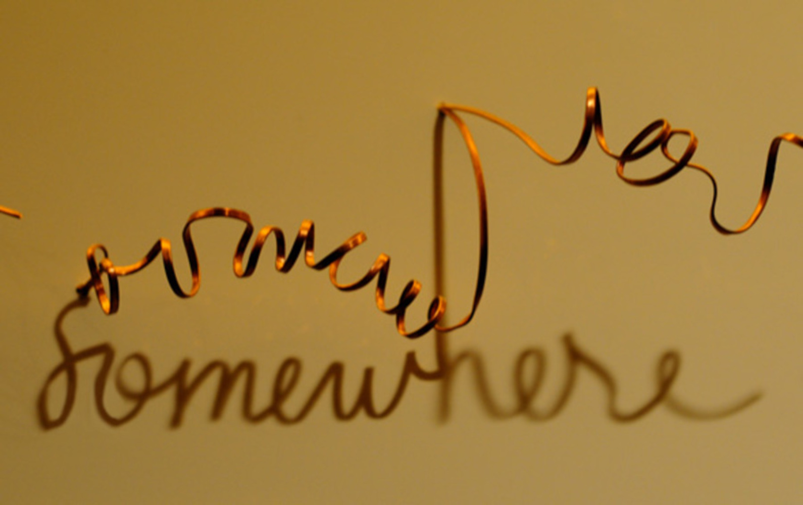
This piece of shadow art by Fred Eerdekens is a different way that words are hidden in art. The coil does not appear to be anything meaningful, until a light is shined on it. Then the hidden word, “somewhere” is revealed to us.

Fred eerdekens gold shadow2.thumb
Show Advanced Options

Reflection

Through this project, I learned about the different ways in which artists can conceal words in their pieces. I didn’t realize how many companies and brands subtly insert their initials or names into logos. This is an interesting marketing technique because it reminds the viewer who or where the product came from. I also learned about how words can be hidden in paintings. Langdon liked to exploit both positive and negative spaces around objects to convey two different (and often contrasting) words. Edmiston used abstract shapes and bold colors to spell out words in a nonobvious way. And Eerdekens used a completely different kind of art – a coiled wire with a light shined on it – to spell out words and phrases.

I like this technique a lot because it challenges the viewer to critically examine and perceive a piece of art. It turns viewing art into a puzzle to figure out any possible subtle messages. And it gives the artist a chance to convey an additional level of meaning in their work. Perhaps in the next piece of digital media I produce, I can conceal a hidden message of my own. I think it would be cool to hide my own name in a piece of work (in the style of Langdon’s artist tributes) instead of the traditional signature of an artist in the lower corner.

Drop files here or click to select

You can upload files of up to 20MB using this form.