Back to Parent

Outcome


Curatorial Statement

Write about the big ideas behind your project? What are the goals? Why did you make it? What are your motivations?


We intend to create a work that appears to change, but does not. It will showcase how changing perspective can be misinterpreted as change in the subject itself. We use changing lighting to create visual change in a subject while the subject itself remains the same. Because of visual pareidolia, change is perceived because the lighting creates order out of random objects. In addition, we will use the Shepard's tone, the sound that appears to change while remaining at the same pitch, to add to our theme of uniformity. Because the video will loop forever, the pitch will be perceived to be rising, while at the same time the visual will seem to change because of the lighting even though no change, other than the lighting, is occurring.

As the "face" appears, you are given the impression of sadness in the objects. We know the objects' locations and what they represent. Then, the light shrinks away, removing the face from view. We still know the feelings of the objects. The sadness has permanence despite whatever else might change. 
Product

Detail what you created. What did you create, how, etc.? What tools and technologies were involved? Include appropriate content and illustration


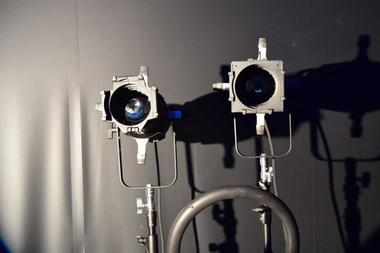
We created the video with a DSLR camera from Hunt at the visual studio. The items in the video are two stage lights, each on top of a lighting stand, and a small ladder. After capturing the footage, we edited the frames on Photoshop (painfully because it was our second time using Photoshop, the first being the time in recitation) and trimmed it down to about 4-5 seconds.

Show Advanced Options

Perceptual Illusion

The visual illusion we created revolves around visual pareidolia, which is our tendency to see faces out of random objects. This illusion in general occurs because our brain is just wired that way (more specifically, there is a portion of the brain called the fusiform face area that appears to specialize in face recognition). In the video, this illusion occurs because the light is initially pointing to only one light, which draws your attention away from the rest of the "face," but as the light spreads out, it brings your attention to the entire "face," and you can see it due to visual pareidolia.

The auditory illusion we chose, the Shepard-Risset tone, is created by a superposition of pitches separated by specific intervals that consistently decrease or increase, which result in a sound that seems to constantly increase or decrease without actually moving to a different octave. The overlapping notes heard at a single moment are all an octave apart, creating an ambiguous tone, and each scale fades in and out so we can't hear the beginning and end of the scale. Each scale, though, is increasing/decreasing, thus the ambiguous sound we hear seems to be increasing/decreasing without end.

Context

Describe what informed your ideas and your outcome? How does your outcome relate to other work in the field? What are the precedent projects?


Given the limited artistic ability and lack of experience with video-editing software, we looked at simpler illusions for inspiration. In particular, we wanted to so something along the lines of the videos of light hitting people's faces from different angles. Our final outcome relates to the general pareidolia face pictures you can see with a quick google search. The usage of lighting to draw attention is a technique frequently used, for example, the spotlight in theater, or the videos of light hitting people's faces from different angles.

Process

Outline your approach to the project? What ideas did you generate and how did you refine or reject them? What did you research and explore? what were the design choices? What challenges were encountered and how did you resolve them?


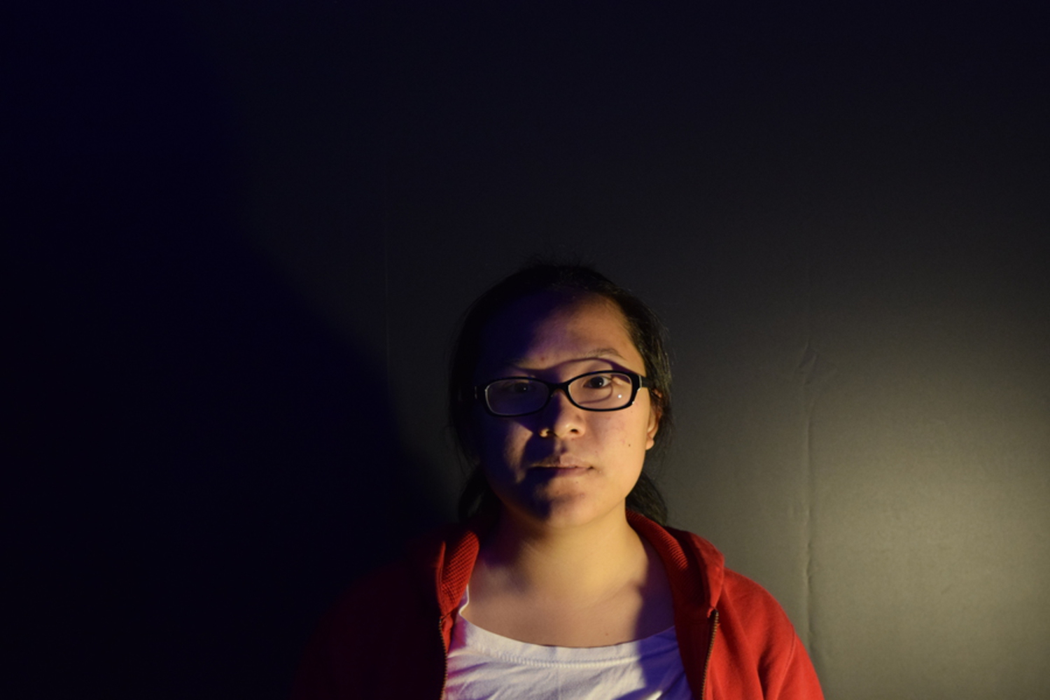
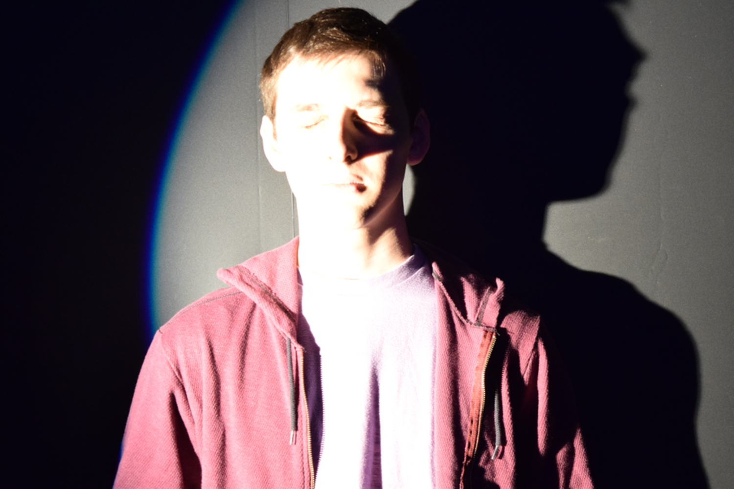
We had initially wanted to emulate the first video seen under the Attributions tab in which a face changes drastically when exposed to light at different angles. We could not recreate that effect very well, however, due to our lack of a completely dark room and a way to stabilize the light. We would see shadows, but they would not alter our faces very much. 

Dsc 0008.jpg.thumb
Show Advanced Options
Dsc 0026.jpg.thumb
Show Advanced Options

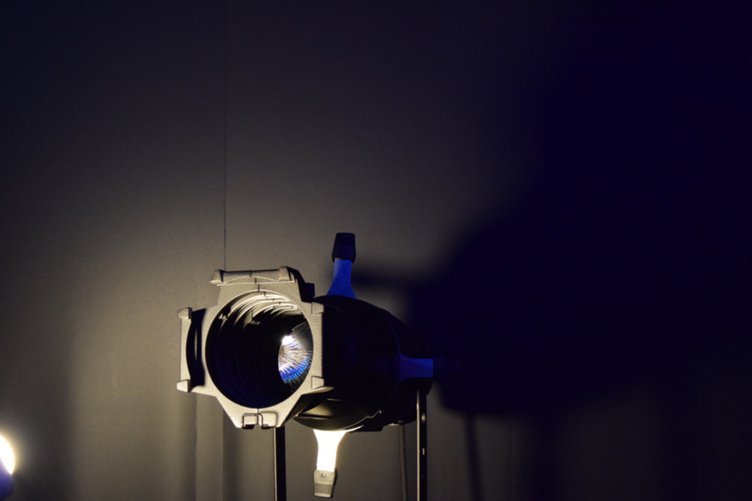
Our next attempt involved one of the lights we were using for the shots. We had expected the more complex shape of the light to produce a more noticeable effect, but it did not. 

Dsc 0046.jpg.thumb
Show Advanced Options

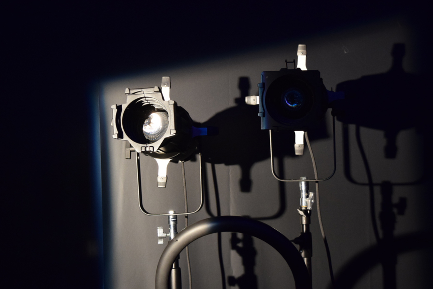
Out of frustration, we made a sad face using two lights and a step ladder. While fiddling with that, we found that we could make only one or two components of the face visible at a time by blocking off the edges of our light source. From there we filmed a shot of progressively revealing the entire face starting from a small square of light on one eye.

By increasing the contrast, lowering the brightness, and looping that video, we could create a repeatedly appearing and disappearing face. 

Dsc 0058.jpg.thumb
Show Advanced Options
Dsc 0066.jpg.thumb
Show Advanced Options

Critique

What does your inner critic say about this work? Is it beautiful and interesting?

As the creator of the work, when I view it, I'm influenced by the amount of effort each member had to put in, simply because we didn't know how to use the camera or Photoshop well enough. At the same time, I think it does give the effect we wanted it to have, that is, at first you can't see the "face," but then after the first iteration, you can see it because its already been revealed. In addition to its physically sad face, the fading of the face, both in and out, also gives it emotion and creates a sad theme. I think we could have played more with the lighting, but overall, I think its a good representation of our skill level and does evoke emotion, which does make it beautiful in a sense. As for interesting, I think it doesn't hold my attention for a long time, that is, after 3 iterations I feel like I've seen it all, but at the same time, I'm not quite sure how to make it more interesting. I also think the lack of action makes it more poetic because much of the experience is then up to how the viewer wants to interpret it.

Reflection

Reflect on the process of making this project. What did you learn? What would you do differently?


Jeffrey Bradley: I had overestimated our ability to recreate what we saw as well as the resources available to us. The lending desk had little to offer outside of a camera and a tripod. We might have had better luck filming in one of our rooms where we would have complete control over lighting. In the studio we used, we were not able to turn off all of the overhead lights, leading to a lackluster result in our initial idea. If I were to repeat the project, I would plan ahead more instead of hoping to figure out the plan on the set. In addition, I would research how to use photoshop before sitting down with limited time to use it. 

Rachel Gu: Initially I was fairly overwhelmed with this project because I have no experience in creating videos beyond the small thing we did in recitation. I think it was a good experience that resulted in a not as great final product. If I were to do something similar again in the future, I would try to create something more along the lines of what I'm familiar with, and get used to these video editing/capturing techniques in general.

Jan Martinez: Wait, so we each write our own critique? Ok then. If I could redo this, I would not try to make it a gif. Partly because gifs don't have sound. Also because gifs are just weird and bulky. Besides that, I would try to work out a more robust and complex video instead of a quick "illusion". Something along the lines of playing a song to a video than then tells it's own story with video magic. Examples being "Sacrilege" by Yeah Yeah Yeahs and "This Too Shall Pass" by OK Go. I think I'm done now.

Drop files here or click to select

You can upload files of up to 20MB using this form.