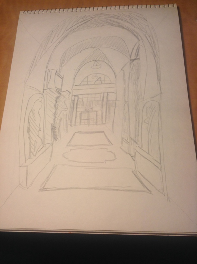
Below is my final drawing. After mapping out all the main features of the room, I attempted to add shading. This helped to distinguish some of the features and add to the feeling of depth.
Outcome
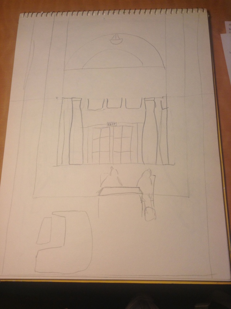
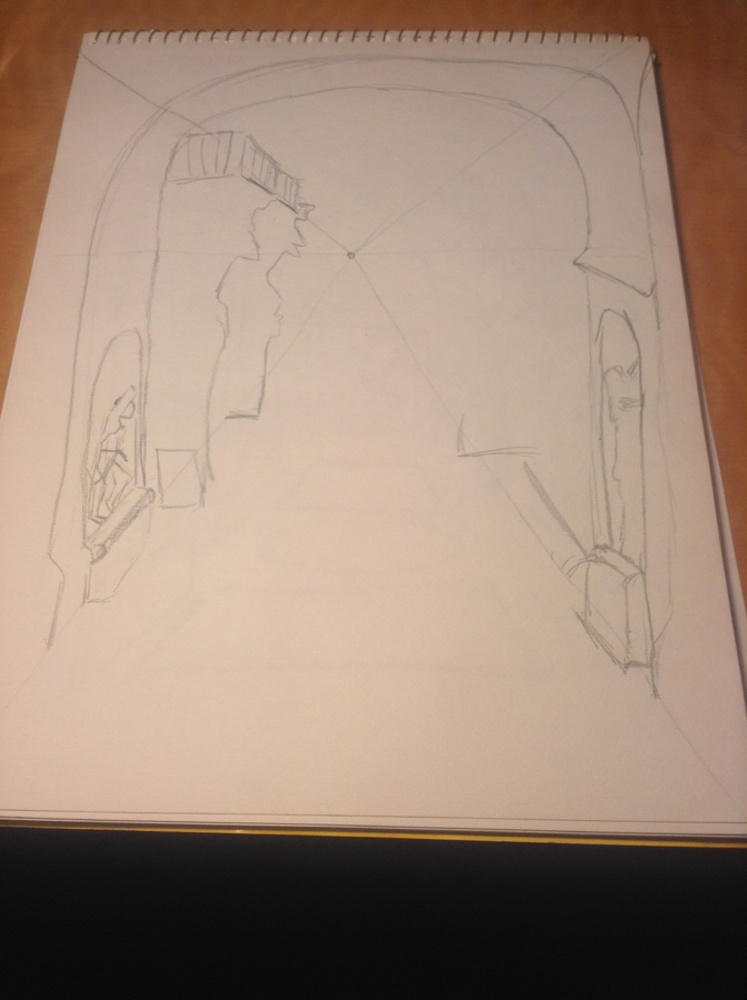
Above are my first two drawings. In the first one (the middle image), I was focusing too much on the horizon line, and trying to place the features of the room in relation to it. The vanishing point was behind the 'EXIT' sign, but since I was focusing on the horizon too much, this isn't where it feels like it is when you look at the drawing. In the second one, I put my vanishing point a bit too high on the piece of paper, which distorted the image. I discovered in doing this one that it was easier to get depth while drawing from the vanishing point than the horizon line.
You can upload files of up to 20MB using this form.


