Back to Parent

Outcome


Product

Here is a highly-informative* graph of my sleeping hours, complete with highly accurate** projection values for future sleep time, using state-of-the-art, highly advanced algorithms***, and presented with top-notch design skills**** and easy-to-understand layout.

Hourslept.thumb
Show Advanced Options

*with regards to my sans of humour

**for some value of "high" and certain niche understandings of "accurate"

***adding two

****featuring everyone's favourite typefaces

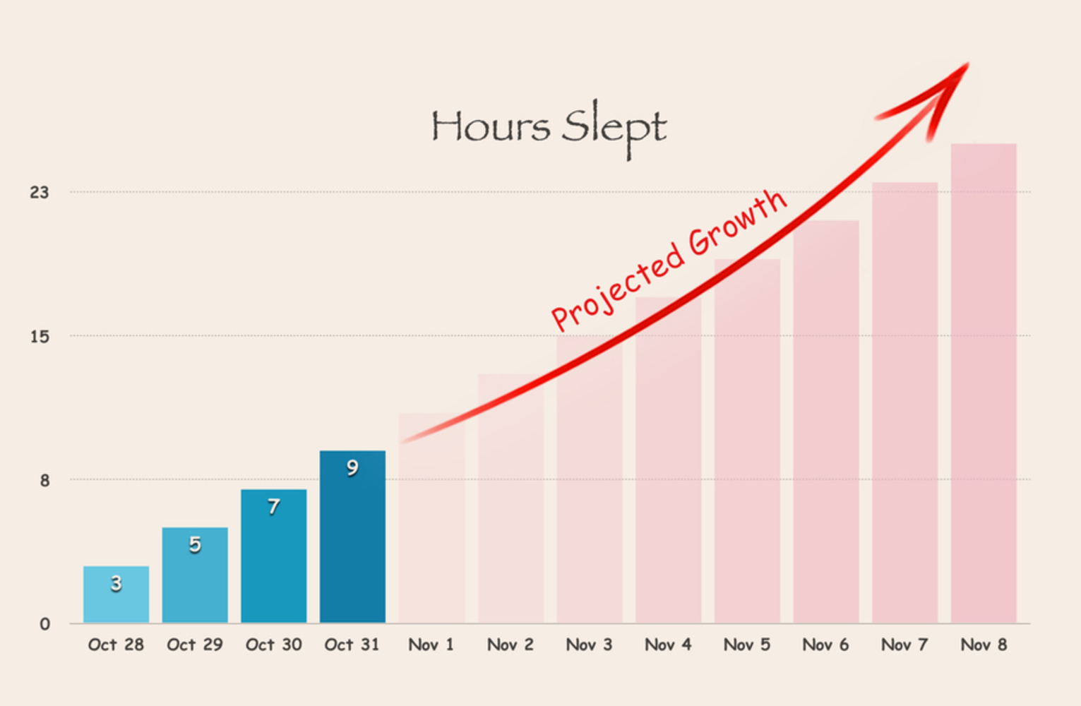
The base graph was created in Numbers, and then edited in photoshop. Some of the things I did:

* removed the value labels for the number of hours slept for the projected values. quick arithmetic reveals that I will be sleeping for 25 hours on the night of November 8th.

* maintained the unhelpful y-axis values to deter immediate realisation of that fact above

* removed the y-axis line for value 30, to exaggerate the values of the projected hours

* added a curved arrow to suggest some sort of exponential growth, although it is clear that the project itself is linear

* moved the graph label closer to the bars to exaggerate the height of the arrow

* used <month day> labels for the x-axis to obscure the fact that the increasing trend of the non-projected data (Oct 28 - Oct 31) can be explained by the fact that Thursdays (which Oct 29 is a) are my busiest days, followed by kinder Fridays, and then blissful weekends. 

Intention

I wanted to highlight the problems with the extrapolation of data making expanding on the silly notion that past data can be used to predict future values, when that data is small or just outright invalid for extrapolation. When people identify a pattern or trend in data, it can be very easy to engage in confirmation bias (I would sure like to believe that there are more than 25 hours in a day, and that I can spend that much of it sleeping) and also dismiss falsifying data as insignificant, outlier data (although I didn't quite need to do that this time). 

These are simple concepts in basic epistemology you learn in both science and philosophy, but being constantly aware of the cognitive shortcuts your mind likes to take is difficult. If it's not a topic I'm personally interested in, I'd take the first thing that comes to mind and put it down on paper, and within minutes the whole thing would be clean out of my mind. Yet, even as I'm aware of this failing, I have a passionate dislike for the unwillingness and sheer laziness to think things through before holding opinions on what should be objective fact (or even worse, controversial topics liable to affect others). Hence the project on a simple and obvious case of poor extrapolation.

Context

I wanted to choose personal data to work on, especially since I know that it can be very easy to lie to yourself about the frequency with which you partake in some action, especially when that action is maybe something you shouldn't be doing so often. I considered topics like diet (I don't eat very regularly, and the food that I do eat tends not to be very balanced) and personal hygiene (I can go three days without showering, more if it's a really, really busy week), but the former idea didn't seem easily quantifiable and the latter might cause too much social repercussions, so I thought I'd do the next big thing on the list - sleeping. There does seem to be this wholesome, community spirit-like tradition at CMU where comparing your sleep hours is like some kind of ill-advised competition. Or at least it seemed so back in Freshman year. 

The idea of extrapolating my sleeping time in a ridiculous manner was also inspired by this xkcd comic, which I'd read a long time ago:

Screen shot 2015 10 29 at 5.57.17 pm.thumb
Show Advanced Options

Process

The day we received this assignment, I remembered that I happened to have had a particularly poor night's sleep the day previous, so that became the starter day for the data collection. Once I looked at the trend, I knew what kind of data misrepresentation I'd be going with - flawed extrapolation. In a moment of dark humour I found it very droll that the data predicted many nights of increasingly lengthier sleeping time, considering that nothing could be further from the truth. On one hand I wish I could have had more data to work with, yet on the other I know that having more days of the data would likely mess up the trend I was going for. I might have been able to sidestep that by strategically removing certain days from the bar graph, but it would be pretty obvious just looking from the day labels - it would have been easier to get away with it using weekday labels, but then I wouldn't have been able to obscure the alternative reasoning for the linear increase in sleep time as mentioned above. For some reason, I seem to think that more data means more convincing, more impressive - that, in itself, is probably another mental blip with regards to statistics and intuitive reasoning.

Reflection

I realised just how deliberate you have to be in order to misrepresent your data - it really didn't come naturally to me - I'm realising just how much talent Fox News must have in their ranks to consistently produce such quality, astounding levels of data misrepresentation. It's not something I could do out of sheer carelessness - I'm more used to double-checking that I have my data labelled correctly and the values are correct than go out of my way to break graph-making tools and make extra effort into "polishing" the graph.

Looking back, I see a few more opportunities for data misrepresentation. For example, skipping certain days without reflecting that fact using a blank bar, or just plain misrepresenting the height of the bars. Perhaps it would also have been interesting to do a 3D version of the graph, maybe with the top-down view to really exaggerate the growth of the numbers, and to further obfuscate the relative sense of value increment.

Drop files here or click to select

You can upload files of up to 20MB using this form.