Back to Parent

Outcome


Product

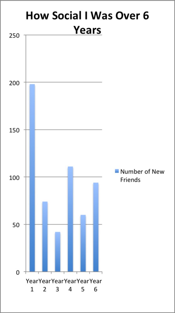
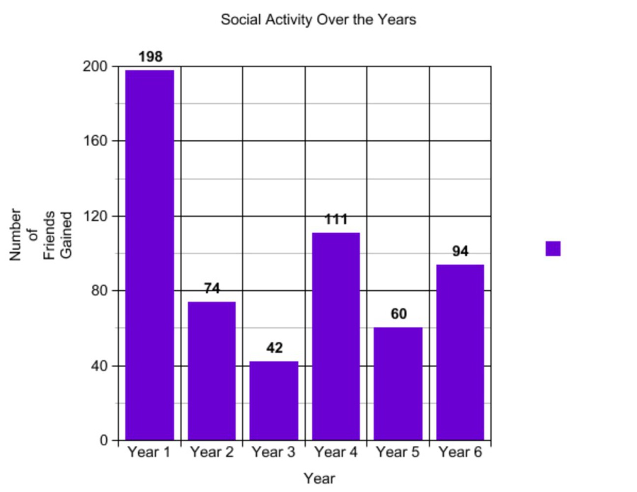
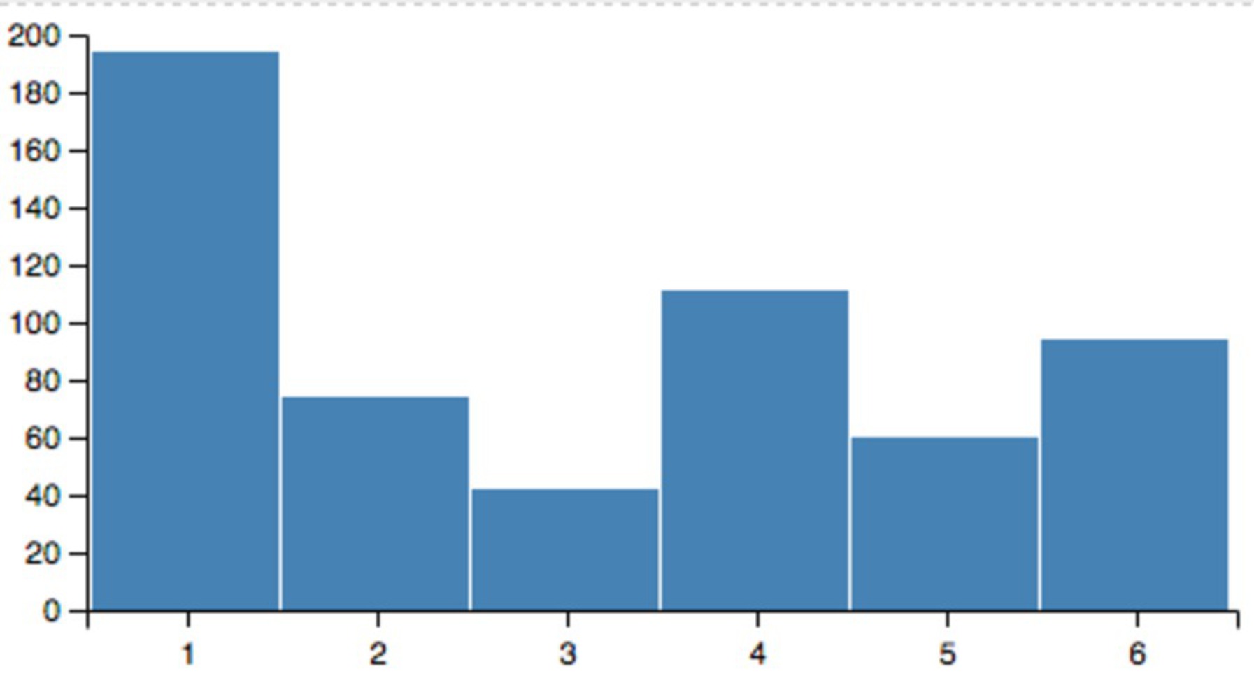
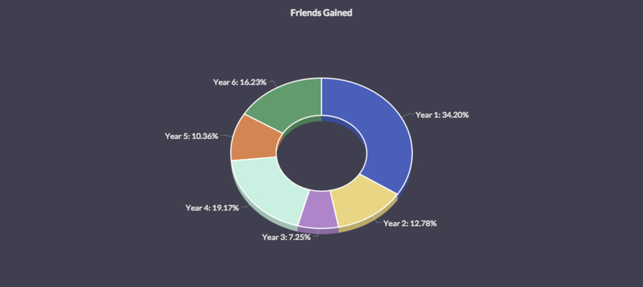
Detail what you created. What did you create, how, etc. What methods or techniques did you use? What tools and technologies were involved? Include images, code or video.


I wanted to use real data but I wanted to make it personal data because I personally found that mining through datasets of random things did not interest. So I came up with the idea to analyze 'how social I've been' over the years. To do that, I wanted to use my Facebook friends I've added. Thus, because I created my Facebook account in the beginning of November in 2009, the data spans 6 years. The Years start from start of November of Year X until end of October of Year X+1

Year 1 - Freshman, High School

Year 2 - Sophomore, High School

Year 3 - Junior, High School

Year 4 - Senior, High School

Year 5 - Freshman, College

Year 6 - Sophomore, College

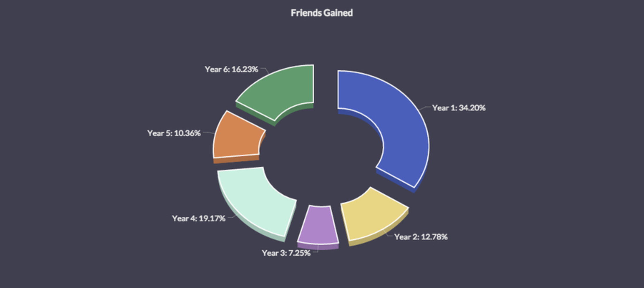
My product was this 3D Donut Chart.

Amcharts.thumb
Show Advanced Options

Facebook lets you download your information as an archive, and this information includes your friends list so at first I used this. So I downloaded my archive, but after opening the friends list they stored, I saw that it didn't include data with when I became Facebook friends with the person. So I had to go into my activity log, go to friends, and then scroll down the years so the entire page (from 2009 - 2015) loaded and included all my added friends along with time stamps. Then, I selected all and copied it into Sublime. From there, I separated each of the 6 years into their own text files, and then did a CTRL+F to find the string "became friends" and recorded the count for each of the years.

Then, after a long time of playing with other data visualization tools, I found one that I evetually settled with on amcharts.com. I added in my own data from one of their samples in Javascript and then exported the image.

Intention

Write about the big ideas behind your project? What are the goals? Why did you make it? What are your motivations?


For me, if I meet a person that I think is cool or nice a couple times, then I'll add them as a friend on Facebook because like why not. I wanted to run with this idea because I wanted to be able to measure how my 'social activity' has changed over the years, and then I wanted to try and see if I could skew the data in a visual manner to show that as I've become older, I've become less and less engaged in social activity, or at least less and less engaged in meeting new people (such that one of us wants to add the other one).

Context

Describe what informed your ideas and your outcome. How does your outcome relate to other work in the field? What are the precedent projects? Situate your ideas relative to work you've seen in class, or elsewhere


I was inspired by Nick Fenton's personal annual reports because the data he created about his daily life was incredibly interesting when visualized. I had never thought what everyday-life data would look like if it was recorded for a long period of time and then visualized. 


Another inspiration was manyeye's (from the video screening we were assigned last week) data visualization tools for every day people. At one point in the video, the presenters pulled up a tree of someone's wedding, and they were able to sort it by the labels the person added in. So, I wanted to find something that was already recorded about me and I thought "Facebook" and the rest was history. 


One last inspiration were those questions that news stations use for their arguably unusual data, or random data statistics that 'UberFacts' posts on twitter. While the data I used is accurate and true, it doesn't exactly say too much about how social I've been in these years. Of course there is a relationship, but it's not the entire story.

Uberfacts.thumb
Show Advanced Options

The question for the above 'statistic' would be something like "Are you a real vampire, and if so, would you classify yourself as goth and do you belong to an organized vampire group"? I wonder what the sample size for this was.

Process

Outline your approach to the project.  How did  you arrive out the outcome? What did you research and explore? What were the design choices? What challenges were encountered and how did you resolve them? Document design decisions and challenges encountered.


After I figured out what I wanted to do, I had a hard time finding the write visualization tool. I initially thought about using bar graphs so my first thought was excel.

Chart.thumb
Show Advanced Options

I think that this does a good job of 'lying' even though the data is accurate because I purposely minimized the width of the chart. But I didn't feel like it was artsy enough. The same goes for these two bar graphs, however their distortion isn't as great because their widths are larger.

Otherchart.thumb
Show Advanced Options
Vegachart.thumb
Show Advanced Options

When I found amcharts, I originally created this: 

Amcharts copy.thumb
Show Advanced Options

While I feel the distortion is present, I went with the expanded version because to me, when I analyze the components as they are separated, the affect of my social activity declining since Year 1 is much greater.

Reflection

Reflect on the process of making this project. What did you learn? What would you do differently?


I personally feel that this was one of the harder projects for me because I wanted to use a dataset that was personal to me, and finding that took a while. And even after that, it took an even longer time of finding a data visualization tool that had a right balance of distortion and art. I learned that it is much harder than it seems to create artistic data visualizations. And I also learned that Facebook doesn't add your activity log to the list of items in your profile archive you can download.

Drop files here or click to select

You can upload files of up to 20MB using this form.