Back to Parent

Outcome


Product

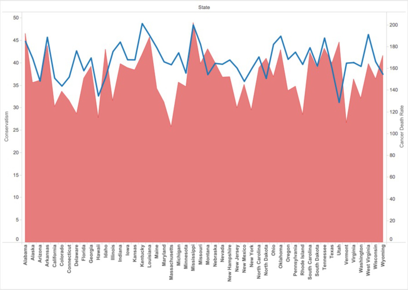
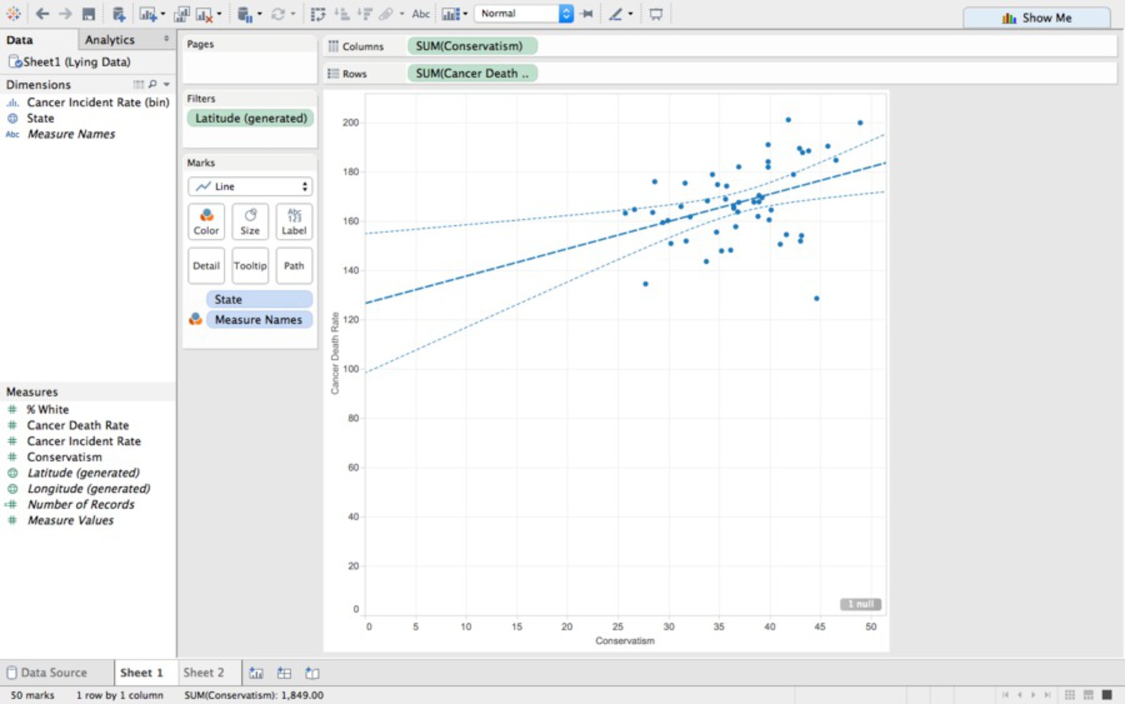
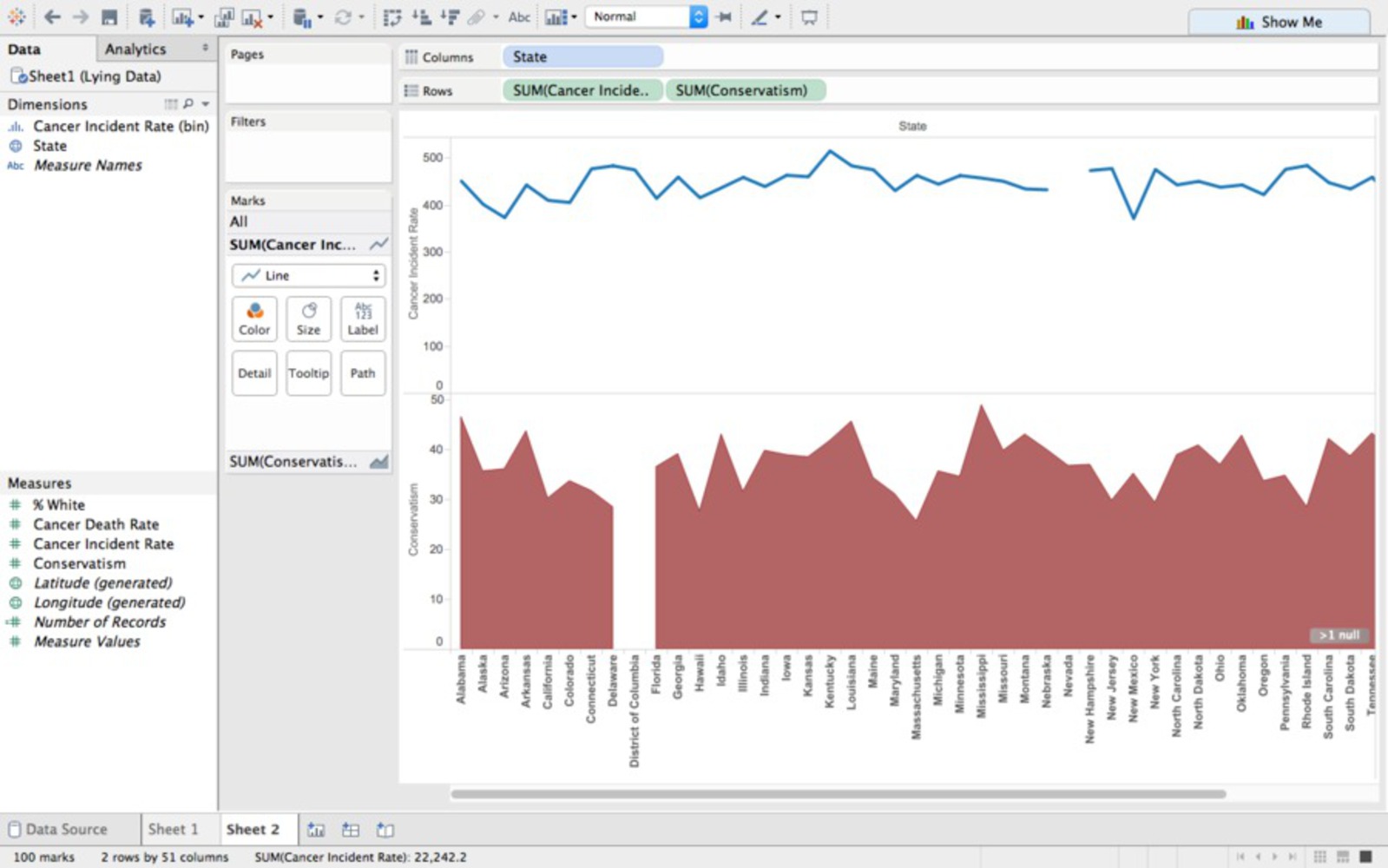
Using data about the political conservatism of each state, and the rates of cancer deaths of each state, I generated a line-and-area plot that correlates conservatism with cancer. I inputted the data into Tableau and fiddled around with the graphic options until I created something able to convince its audience these two occurrences are related, at a glance at least.

The axis to the left and the red plot represent political conservatism, while the axis to the right and the blue line represent cancer death rates; the bottom axis represents states.

What helps this graphic misrepresent data is the public's lack of familiarity with this kind of visual representation; most people aren't use to comparing data from this type of chart. What is evident is that conservatism and cancer death rates correlate around several key high points, making it appear as though there's a general trend.

Screen shot 2015 11 02 at 6.22.11 pm.thumb
Show Advanced Options

Intention

Before we were given the premise of this project, the class observed several instances of misleading. Most of the data correlations seemed reasonable, or at the least, I didn't look at the two variables and think them being correlated would be ridiculous. For this project, however, I wanted to compare two unconnected variables. This is not a graph you would see except on the most radical anti-conservative's desk. Though the are many who'd publish data about the negative consequences of being conservative, they'd be few who'd actually declare that a person's political leaning affect their risk of cancer. Because the assignment was already to misrepresent data, especially data they would sway someone, I decided I wanted to make a ridiculous correlation.

Context

In class, we saw how blatantly misleading some graphical representations of data can get, the FOX News line chart is a particular example. As I stated in the previous example, my intention was to correlate very unrelated data to highlight how ridiculous this misrepresentations can become. From the class reading, we read that graphical excellence includes depicting the data as objectively as possible. But because all graphics are presenting the data in a way that the audience sees a certain trend, they all are trying to convince their audience of something. This means all graphics are potentially misleading, because the relationships between the data may not exist regardless of the correlation. 

Process

In order to find two variables whose correlation could be viewed as ridiculous, I searched for data on popular and controversial topics. Eventually, I found this data map (along with the corresponding data) of cancer death rates of each state.

Screen shot 2015 11 01 at 1.57.18 pm.thumb
Show Advanced Options

From that point, I began looking for data maps of unrelated controversial topics, and came across this data map (along with the corresponding data) of political conservatism of each state.

Screenshot 2015 02 10 11.07.39.thumb
Show Advanced Options

Afterwards, I generated a scatter plot from the data sets. However, Excel was not able to create a believable correlation between the two variables.

Screen shot 2015 11 01 at 7.47.35 pm.thumb
Show Advanced Options

So, I began looking through the suggested tools on the project's google doc. I download Tableau, inputted the data, and began testing out various types of data representation. The ones that, I thought, were the most believable were the scatter plot with an added trendline, and a combined line-and-area plot. After surveying several acquaintances, I decided on the line-and-area plot.

Screen shot 2015 11 01 at 7.47.47 pm.thumb
Show Advanced Options
Screen shot 2015 11 01 at 7.47.11 pm.thumb
Show Advanced Options

Reflection

Generating graphic graphics is much harder than I expected. First of all, I had trouble finding data that fit the specifications I needed after deciding on the cancer death rates data map (i.e. must include a data map, corresponding discrete data for each state, and be generally unrelated to cancer). 

After that finding the data, I had trouble getting it to correlate. I assumed because of the correspondence on several points that I'd just have to make a scatter plot and have a trendline visually guide the audience into seeing the correlation. When that didn't happen, I downloaded the Tableau software and began playing around with their graphics options. Even then I still had trouble formatting the data. 

I would say I did a fair job on this project. The data doesn't match up perfectly, but there's definitely some correlation that could convince someone not immediate put off by the variables that here might be something more to their relationship.

If I were to do this over again, I'd probably restrict myself less, and not make the two variables so easily dismissible about each other.

Drop files here or click to select

You can upload files of up to 20MB using this form.