Outcome
Intention
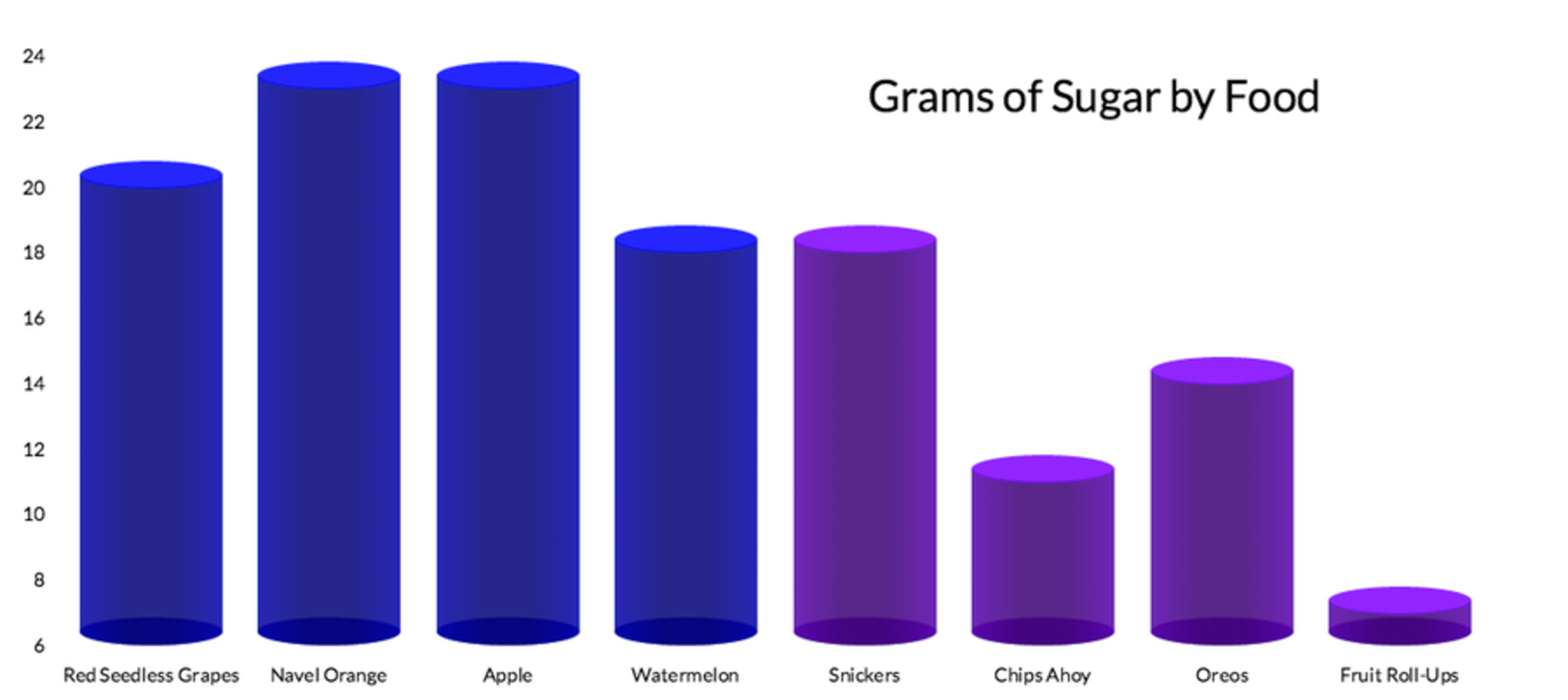
In the spirit of Halloween, I wanted to make candy seem like a healthy choice of food when we all know that it really isn't. The goal is to make a viewer easily see that the purple columns represent food that contain less sugar. Someone who looks at this graphic without truly considering what is being presented will leave with the idea that sweets are healthier than fruits.Context
Going into this project, I knew that there is a lot more to nutrition than the amount of sugar in an item of food. Sugar occurs naturally, and so the type of sugar you find in an apple is going to be very different than the type you find in, say, a Snickers bar. However, consumers often consider sugar simply an unhealthy part of the food we consume. This fact made me want to manipulate nutrition information to make sweets seem healthier than fruits when in fact you'd need a lot more information to decide which food is better for you.One of the other ways I manipulated data was to leave out some important data points, much like in the following graphic:
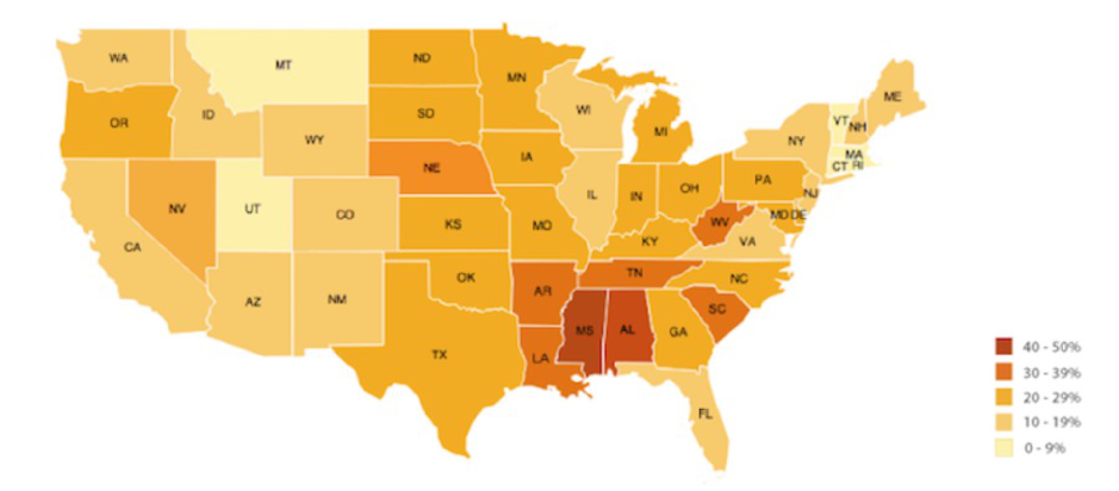
As they explain at https://wiredcraft.com/blog/data-visualization-mapping/, this graph leaves out Hawaii, Alaska, and D.C., which means it is not completely representing the data. My data visualization commits an even greater crime; I picked which data points to use to create the most dramatic results. All the data that I do present is truthful, but I also chose to leave out some foods that would have made my point less clear. For example, strawberries contain only 7g of sugar, but including them would have made them look healthier than almost all of the sweets I included. Thus, I chose to omit strawberries and other foods that ruined my lie.
Finally, my graph breaks Tufte's second rule since there are very few labels on my graph describing what I am measuring, which leads to ambiguity.
Process
In making this project, I knew from the start that I wanted to make sweets seem healthier than fruits. There are three techniques I used to create such a lie. The first two I've already mentioned:1) I didn't convey enough information to truly communicate the nutritional values of the foods included
2) I omitted data that would have made my lie less clear
If you've been paying close attention to my graph, you may have noticed how vague it is with respect to what each bar represents exactly. That is, what amount of food am I considering here? Are the proportions realistic?
The answers to these questions bring me to my third technique:
3) There is no standard amount of food used to present my data
I tried to use 1 serving size for each food (as determined by the USDA), but for some foods (such as the apple), there was no value for "1 serving," only for "1 large apple" and "1 cup slices" (my graph uses the former). Thus the data shows different amounts of each food considered.
Even if I had been able to show one serving size per food, would this give a better picture of the data? Not really, because I don't think people really eat one serving size. For example, one serving size of Snickers (according to the USDA) is 1/3 a King Size bar. I don't think most people, when given a King Size candy bar, eat only a third of it and then stop.
Once I found the data I needed, I simply put it into the example code and viewed the results. At that point I could omit any data that ruined my lie.
One of the design choices I made was to make the fruit bars blue and the sweets bars purple. I chose to do this so that at a glance you could easily see that there is a difference between these two groups of foods.
Reflection
I think that the final result achieves my original goal of making sweets seem healthier than fruit. I learned how easy it is to lie while still using actual data points. However, my inner critic is a bit concerned about how simple the graphic is. On one hand, the simplicity helps to convey my message, as it is easy to quickly see which foods (and even which category of food) contain more sugar. On the other hand, we looked at a lot of beautiful, complicated visualizations in class and mine is a boring bar graph. Perhaps a different form of presentation would create a more attractive piece, but I don't think the clarity of my message could get any clearer. In other words, my final project emphasizes intent over beauty, and I'm not sure that's best.Perhaps also adding a key explaining the difference between the blue and purple bars would make the graphic easier to quickly understand.
You can upload files of up to 20MB using this form.