Back to Parent

Outcome


Product

Behold, a scatter plot of 31 entries detailing the amount of sleep and studying they do and the GPA they ended up with. The x-axis corresponds to the GPA each person had, so going from left to right, we have an increasing GPA. Blue is studying and orange is sleeping.  

Tools: Microsoft Excel

Data: GPA, Sleep, and Studying survey given to mostly college students

Screenshot %2895%29.thumb
Show Advanced Options

Intention

Last year in my CS Freshman Immigration course, I remember something that our freshman advisor told us: "Study smart, not hard." So I decided to make a graphic that pushed the data away from what he said. My graphic probably doesn't put out the best message, but it served my intention.

I wanted to show that as long as you study more, your GPA will go up.

Context

Before I started the project, I did a quick Google search for "lying graphics" and found a bunch of bar graphs where they highlighted a difference as much bigger than it actually was or 3D pie graphs that were tilted to make the data closest to the viewer seem much more than the other data. For the 3D pie graphs, I've definitely seen some graphs trying to imply that certain religions were bad.

I wanted to produce a similar effect (but not offensive). In this case, I chose a data set that probably was not randomly distributed. There was one high schooler in a set of around 31 people. That would make the high schooler about 3% of the data. Because the set was so small, I could skew it to show correlations and effects that I wanted to show. 

Process

I thought about some things that were related to my own life. Sleep and GPA are probably near and dear to the hearts of most college students. I did a quick search for data sets relating to this and found the link I gave above. 

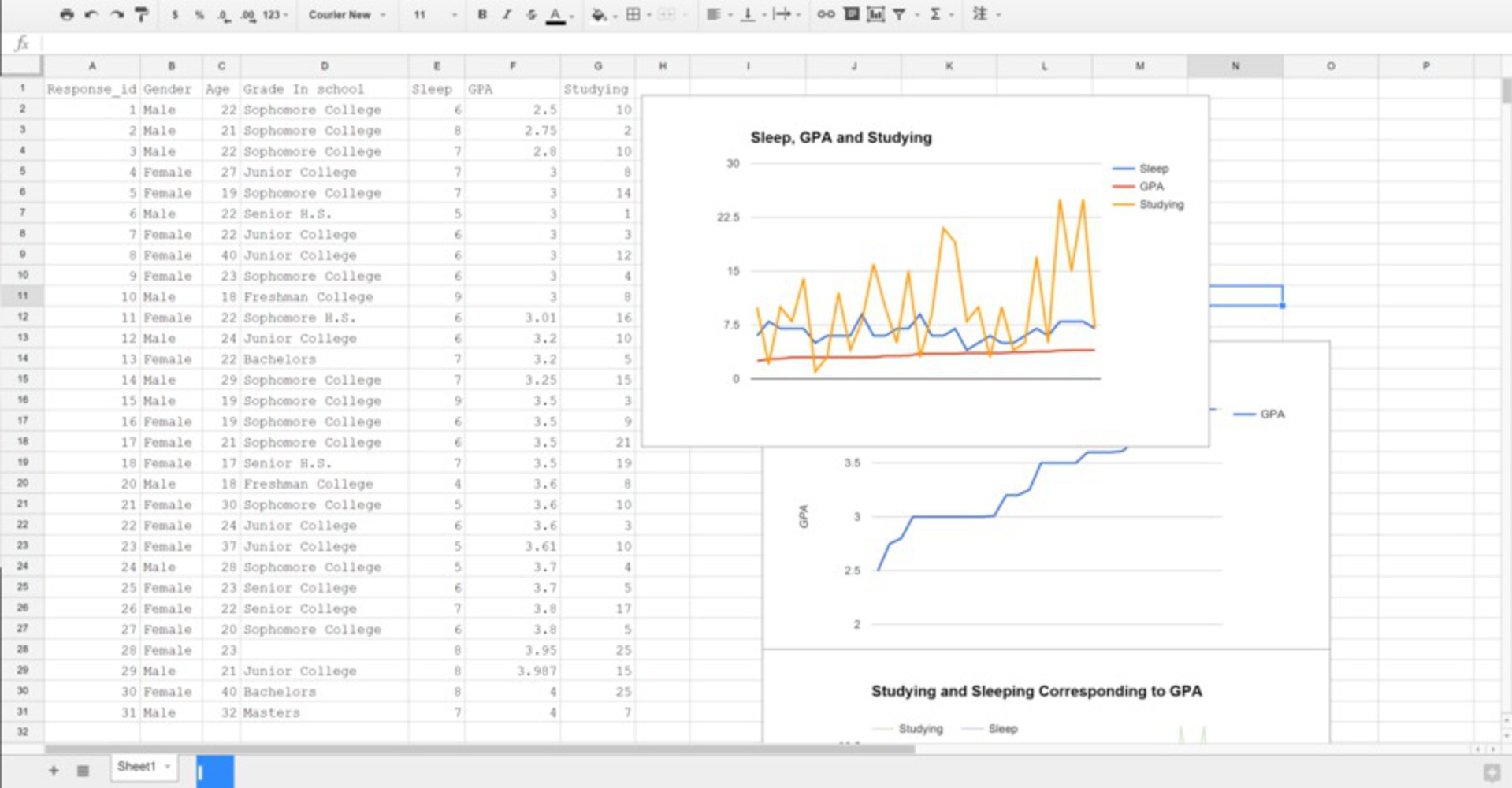
I copied over the data into Google Sheets and plotted everything at first (age, sleep, GPA, studying, concentration, etc.), and it gave me a general gist of what everything looked like in relation to each other. However, I really didn't care for the age or concentration, and they wouldn't help me to get my point across, so I just deleted those two columns.

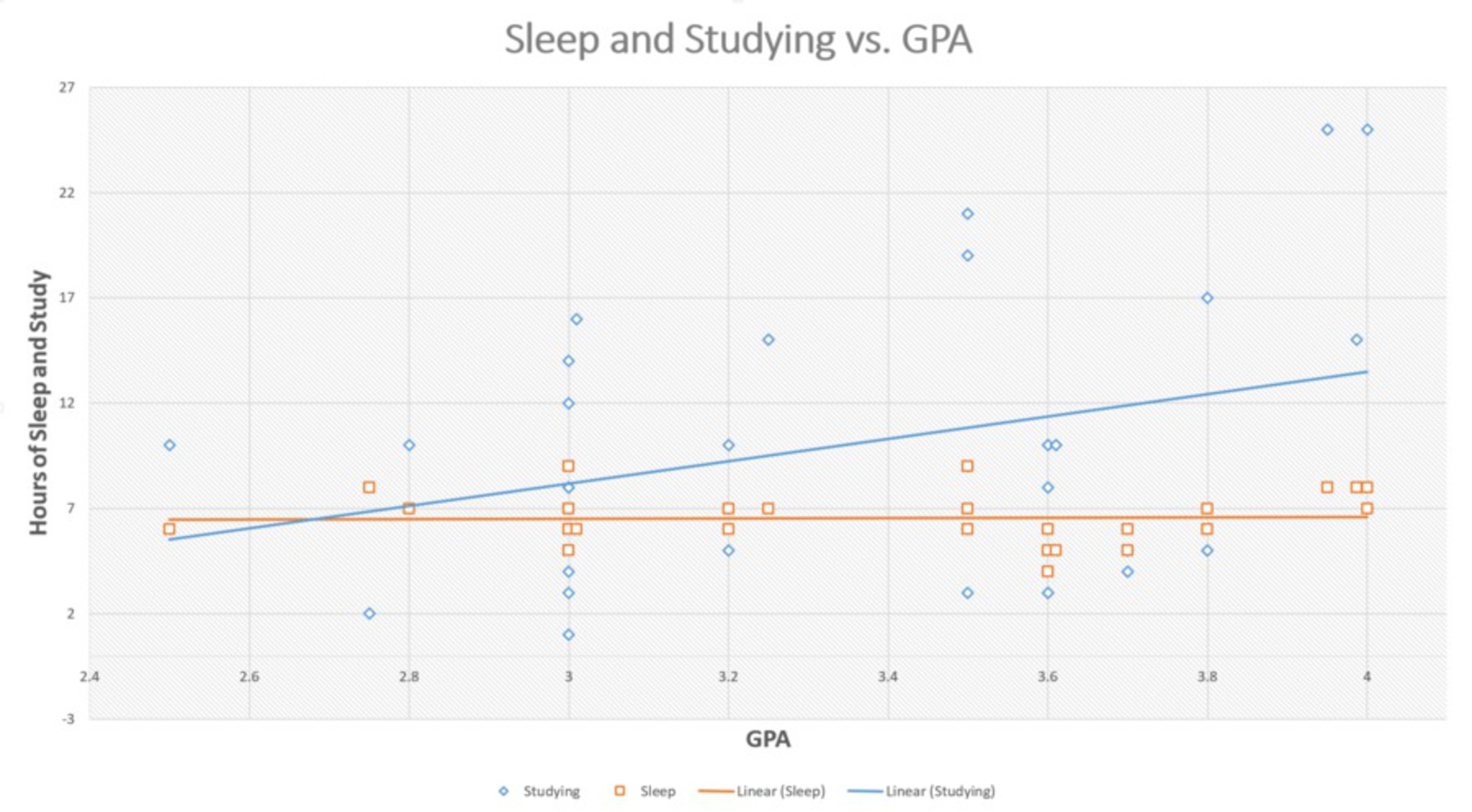
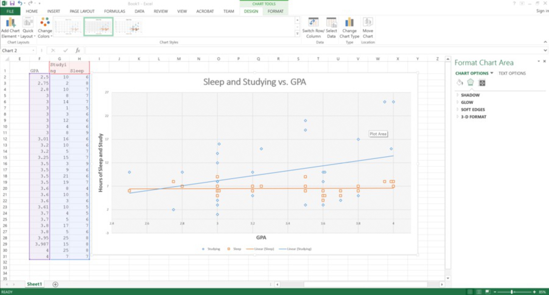
Instead, I wanted to show the correlation between GPA, sleep and studying. So, I plotted them together and realized that studying actually increased with GPA while sleep seemed to stay stagnant. So I went forward with this set because it had data that would help me in my intent.

Screenshot %2896%29.thumb
Show Advanced Options

Unfortunately, Google Sheets wouldn't allow me to do a linear regression on sleep and studying, so I moved everything over onto Microsoft Excel. I extracted only the relevant data before plotting. Below, I was able to show linear regressions on the two pieces of data that I wanted. It makes the increase in studying and no change in sleep much more blatant.

I also minimized the range of the max and min values on the x- and y-axis so that the changes would seem much bigger.

Screenshot %2898%29.thumb
Show Advanced Options

Reflection

It's actually extremely simple to skew with data. Creating the graph took me around five minutes once I found the data. You plot it once to see the relations you want to highlight. Then, you plot it again but with more customized settings to actually show that difference. Since it's so easy to manipulate data, it's kinda terrifying to know that organizations like Fox News can just skew a graph and show it to impressionable minds watching their channel.

If I were to do it again, I would make it more artistic. I thought that my graph was simple and to the point (there are less "excellent graphics" properties that it violates, so it makes it more believable). Because it doesn't contain any fluff (non-graph-y things), it's believable that it was used in a paper or something. However, my graph isn't eye-catching, I guess the other side is that maybe people wouldn't care to look. In that case, if I were to do it again, I would make my graph have an even more forceful perspective.

Drop files here or click to select

You can upload files of up to 20MB using this form.