Back to Parent

Outcome


Product


For this project, I made a chart animation to show different CMU instructors' different courses evaluations. I use the database from CMU faculty course evaluation website. In the chart, each pie represents one professor in math department and each section of the pie represents one course. The pie is rotating. When the animation stops, the text on the top is the name of the course on the top section of the pie. The bigger the section is, the higher grade for that course is. For this chart animation, I used python and event-based-animation from 15112, and then took a screen video for the animation since the website does not support python animation. For the data, I downloaded them from CMU website as xml and did some analysis.
Show Advanced Options

Intention

For this project, I have two purposes. The first is to lie to the viewers by intentionally manipulating charts. For example, I intentionally hide some information, make the chart colorful and distractive and use the pie chart to exaggerate differences even among similar grades on evaluation. The second idea is to present the chart in a beautiful and artistic way. 

Context

My idea is from multiple resources. First, 15112 teaches me how to do animation by coding. It's quite useful because it's gonna be such a pain if I use premier or photoshop to do such a lot video editing. Second, I got the idea about hiding information from fox news. Actually, lots of professors got very close grades on their courses but my chart does not show data starting from zero, so the difference is actually far more dramatic than it should have been. Third, I got some intuition from the online data representation websites in the guide. I found that those visualizations which has multiple colors are more distractive and beautiful, so I chose different colors for the pie.


Screen shot 2015 11 02 at 7.58.38 pm.thumb
Show Advanced Options
Screen shot 2015 11 02 at 7.58.31 pm.thumb
Show Advanced Options

Process

Choosing data:

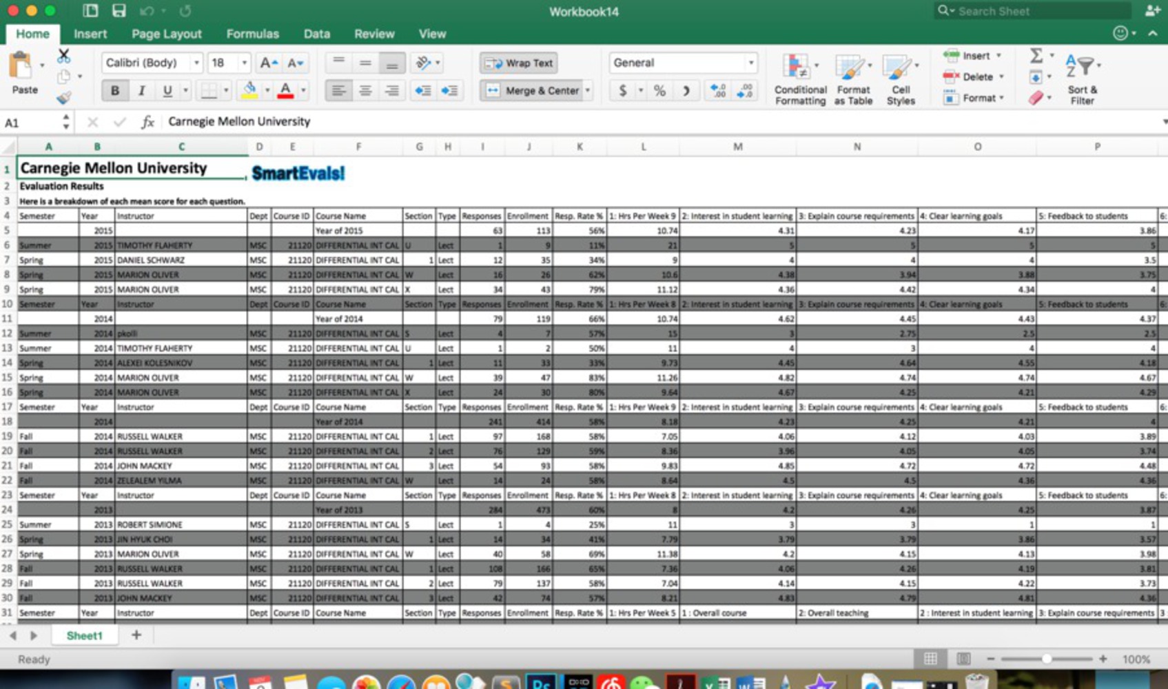
First, I went over several data websites and tried to find some valuable and meaningful data to make my chart. However, it turned out that all those websites do not provide data for free. Then I just chose CMU website and used those free data about courses and professors. I downloaded those data and had my idea. 

By intuition, the bigger the area is, the better the professor should be. However, I use following tricks to cheat viewers:

 I found each of 6 courses' professor and intentionally chose 9 of them. Some of the professors almost have taught all those courses and some of them just taught one or two of those courses. By intentionally choosing professors, I dramatize the different professors' difference in course evaluations. The chart is biased because some of the professors have not taught most of the courses. They taught more other high level courses so even though in the chart they might appear only have small circle areas, they might be great professors because there are still a lot of courses they teach but I don't mention in the chart.

In addition, the cut-off of the course evaluation grade is 2, which means that even the professor has similar grades on the course evaluation, their pie areas might appear very differently because all grades less than 2 are cut off. Also, since the chart is pie, as the grades become higher and higher, the difference in areas will be more and more dramatic because of the nature of circle. If two professor's grades are different by 1, 3 and 4 will cause more difference in areas than 2 and 3. Actually, most professors' grades on courses are above 4, which means the difference is dramatized a lot.

The other thing I do is that I don't mention that the black area of circle might be because the professor has never taught the course. Therefore, viewers might just think the professor teaches so bad that they do not have any grades.
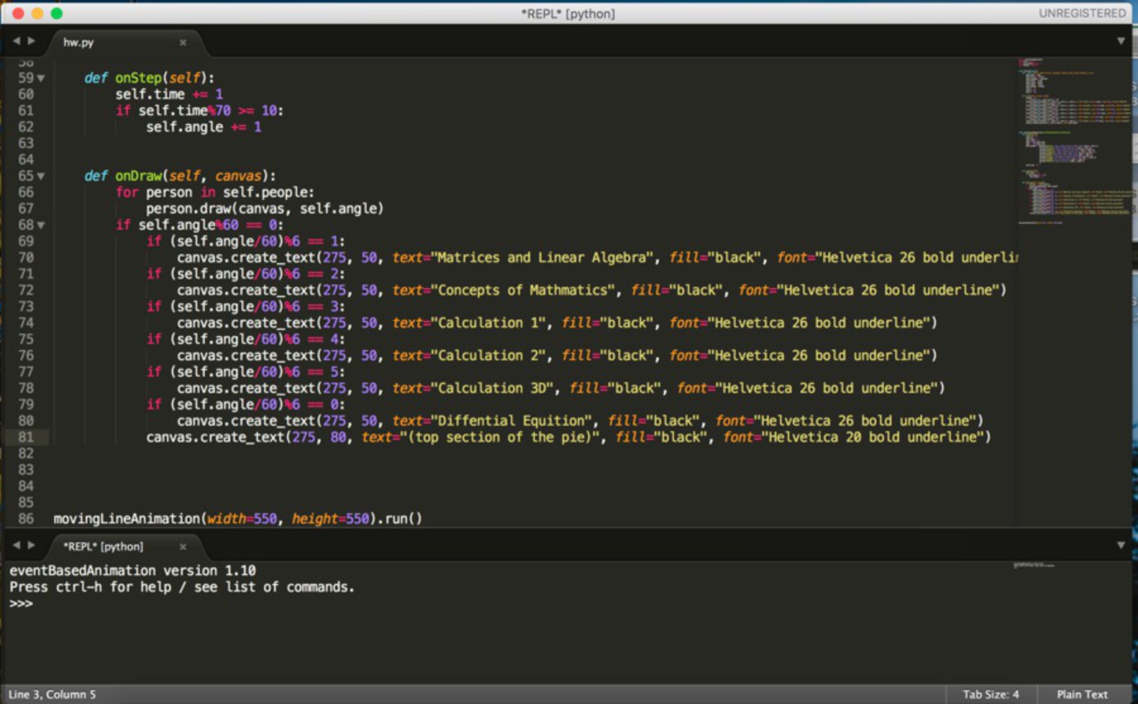

Making chart:

First, I did some coding in Python. Then, I took screen video by using quick view and then uploaded it to the youtube.

Making chart:

First, I did some coding in Python. Then, I took screen video by using quick view and then uploaded it to the youtube.

Screen shot 2015 11 02 at 8.48.42 pm.thumb
Show Advanced Options

Reflection

From this project, I learned that the visualization of data can lie to people by creators using specific tricks, even though the data itself is truthful. Associated with the reading, I still don't think the purpose of visualizing data is to achieve beauty because after all, what we want is data and information. We need to conceive them correctly. The purpose of data visualization should be easier for viewers to conceive but the most important prerequisite is that it must avoid as much as bias as possible. The benefits of convenience must be over the short comes of misleading. As media designers, even if we try to do the right thing, we cannot promise other people try to lie to viewers by manipulating data. For this project, I just use some easy and common tricks but I got very deceiving data presentation.  Later on, when analyzing charts and those processed data, I will be much more careful than before to avoid being cheated.


Drop files here or click to select

You can upload files of up to 20MB using this form.