FCE (Faulty Course Evaluation)

Made by Roger Liu

To create a visual composition which conveys misleading information about CMU faculty

Created: October 29th, 2015

0

Product

Here is an animation which depicts the average hours spent on courses in the Computer Science department and the students rating of these courses, extrapolated over a period of time. The data was taken by averaging the values for various categories in CMU's Facualty Course Evaluation database.

The data was compiled and averaged in Microsoft excel, and the results were plotted and then animated using Adobe Flash.

0

Intention

The initial goal of the project was to show how unit counts typically don't accurately represent course workloads, however, it was hard to gather the data to be able to communicate that idea (since there wasn't a database for previous course unit counts). Since I still wanted to do something related to the amount of time students spend on a course, I then decided to try to show some trend from semester to semester, extrapolating that data to make a general point. For this specific work, I chose to correlate the workload of students with their satisfaction with the course, driving home the point that more spending more hours a week on a course had a negative effect on the course's overall rating. In order to better drive home the point, I chose to not scale the y-axis and have the y-axis not span the entire range of values. This led to the trend appearing to be more dramatic than it actually wass. In addition to that, the animated face at the bottom, along with the changing color of the arrows and numbers were used to further impose the "forceful" point of view that this trend was detrimental for the students learning experience.
0

Context

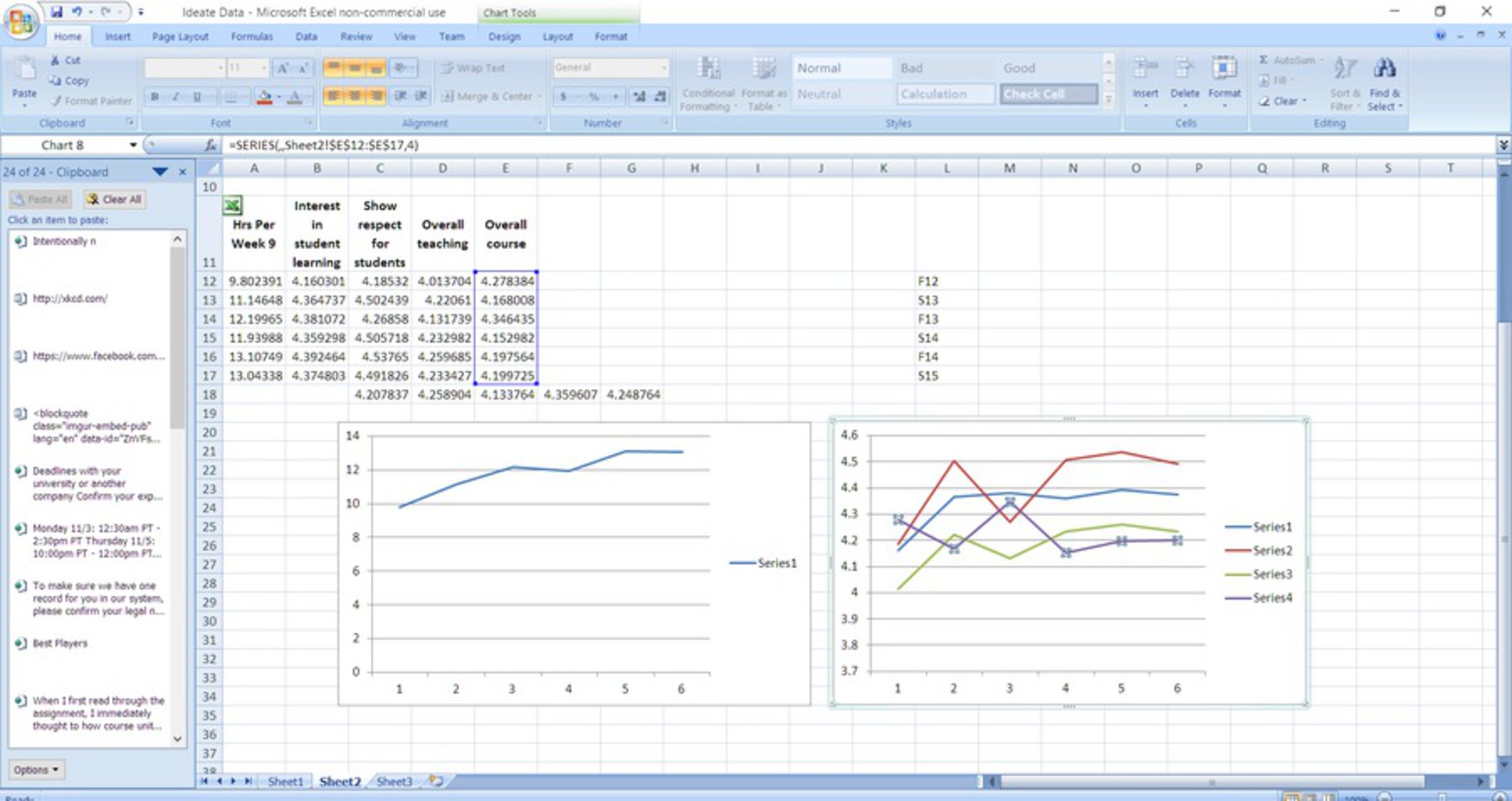
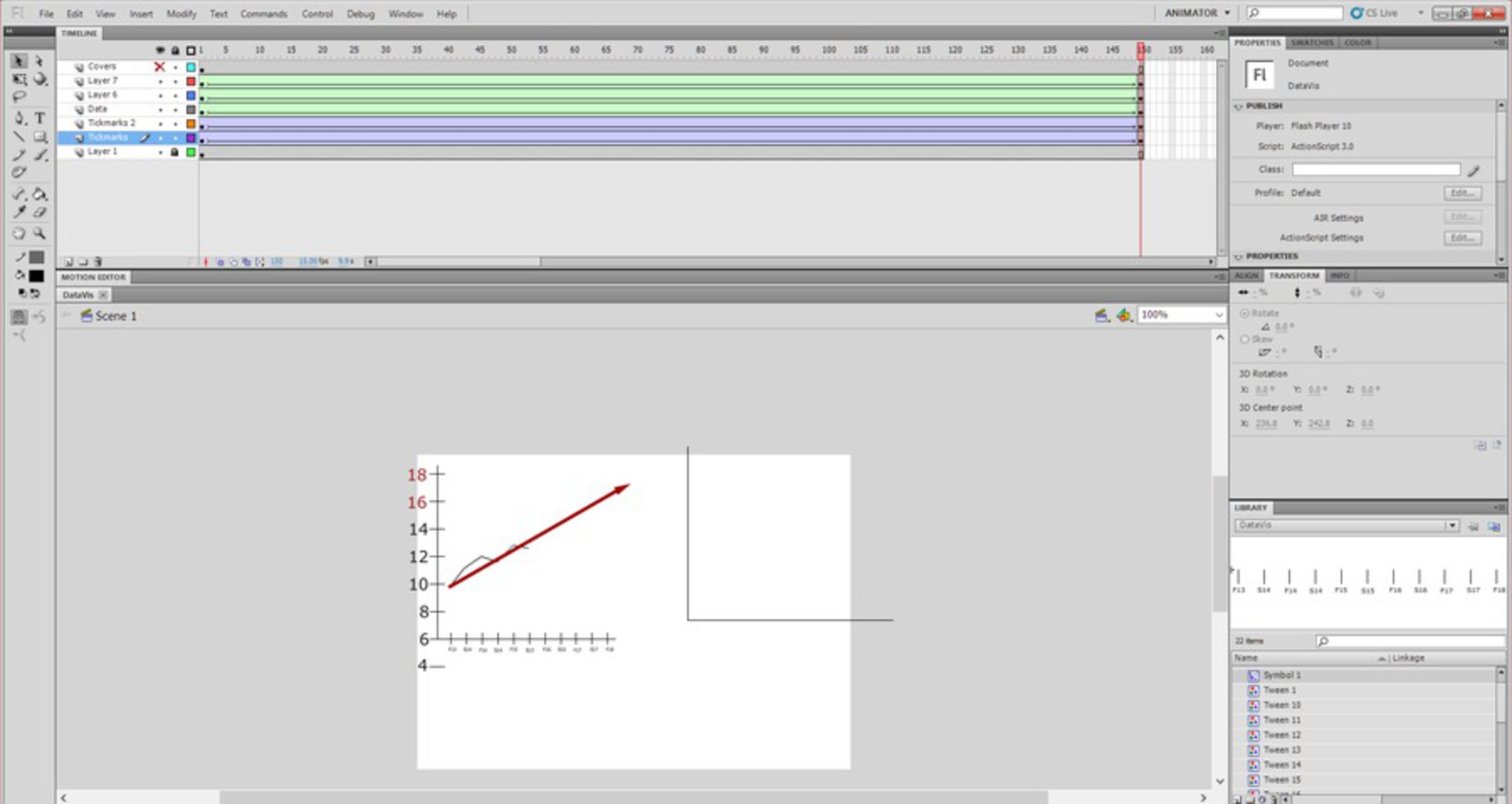
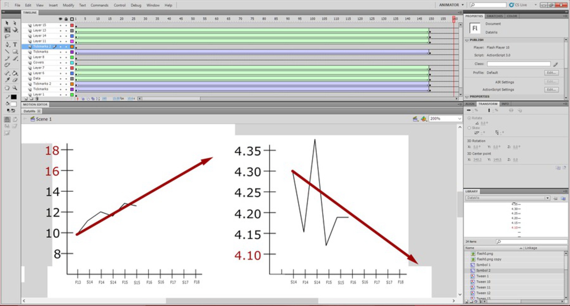
When I first read through the assignment, I immediately thought to how course unit counts don't accurately represent the number of hours you spend on a course. One of the most notable one is the Computer Science course Operating System Design and Implementation, which is a 15 unit course that reportedly takes up to 30 hours of time a week.

From this starting point, I then thought to see how many hours are spent on average overall courses in CMU's CS department, The ultimate goal was to try to find and exploit some correlation between course unit count and the amount of time spent on the course. That data however wasn't readily available on the database, but I found another interesting correlation to show. That is, the apparent increase in course load over time. Correlating this data with the overall course rating, I found that over the years, course load went up while course satisfaction generally went down. Deciding to communicate this idea in my graphical representation, I went and created an animation which extrapolated that data along line charts.

0

Process

To complete this project, I first compiled data from CMU's Faculty Course Evaluation website into an excel document, averaging the data values for hours per week, interest in student learning, respect for students, overall teaching, and overall course rating. These values were then plotted in excel, and I looked to see if there were any general trends that I could use to make a point.
0

Noticing that over the years, hours spent per week has gone up while overall course ratings have gone down, I decided to then take those 2 datasets and extrapolate them over a longer period of time. To do this, I mimicked these data plots in adobe flash, drew a rough line of best fit, and proceeded to animate what would happen if the trend were to continue into the future. On its own however, simply extending the line didn't give the impression I was trying to go for, so I decided to change the colors of the lines as time progressed to indicate that the situation was getting "worse". Lastly I added a face at the bottom of the graph, to fully convey the student's emotional state as things trended towards "worse"

0

Reflection

Reflecting on this project, I wonder if there was a most interesting way to go about displaying the data. While a line graph is perhaps the most suited towards showing a trend in data over time, it doesn't carry the same volume/occupy the same amount of space that the other graphs like pie and bar charts do. If this project were longer term, I'd try to create my own data visualization program to show what was happening in a more visually appealing way. In addition to that, if I had access to the unit counts for past courses, I think I could provide some interesting insight to how exactly unit count correlated to hours spent, a relationship which is potentially very interesting
x
Share this Project


About

To create a visual composition which conveys misleading information about CMU faculty