Straight from the CMU Brochure

Made by ashleyle

"Straight from the CMU Brochure" aims to present data on CMU tuition and financial aid in a way that soothes our poor (literally) souls.

Created: November 2nd, 2015

0

Product

Below are two charts, the former which is a bar chart and the latter, a bubble chart, both made from the online data visualization website Plotly. If you hover over various sections of the chart, you'll see the exact statistics from each university. In addition, the charts are interactive, so feel free to push some buttons and see how I tampered with the data. The bar chart visualizes average student debt at graduation for various private universities, while the bubble chart displays average met need-based aid at yet another set of private universities. Common to both charts are statistics from Carnegie Mellon University, our beloved university. 
0
0
0

Intention

The idea for creating charts that would fit the bill for "prospective student brochures" at CMU sprung out of the fact that this weekend was Sleeping Bag Weekend. Several students from my high school had come to visit, and while I was showing them around campus, they all expressed concern about the financial burden of attending this university (which I'm sure almost all of us can relate to). This made me wonder about how the CMU admissions office presented the options for and statistics of financial aid, which led me to create these FOX News-esque versions of what might actually show up on a brochure for CMU. The immediate goal is, of course, to convince prospective students that CMU is a totally affordable option among private universities. Indirectly, however, I attempt to poke fun at all school admissions and their often silly attempts to convince prospective students that their school is perfect in every way. 
0

Context

As I mentioned above, the charts are loosely based off of the various silly ways that FOX News distorts their charts to (poorly) force a perspective, like below:

0
The pie chart adds up to more than 100%.
Fox news graph fail.thumb
0
Note the lack of an approve option.
Fnc phony poll chart.thumb
0

My own charts also skew and omit data, although somewhat (dare I say) more subtly than FOX News does. They are also highly reminiscent of my own memories of college admission brochures when I was applying for college, as no matter which college I went to, none of the brochures portrayed any negative characteristics or weaknesses. I'm sure that times haven't changed since then, so current college admission tactics are probably still fairly relevant. These distortion tactics also extend to any field which requires one to sell oneself, a product, or a service, including resumes, advertisements, etc. 

0

Process

Before I decided on depicted college debt and financial aid, I did extensive research on available online data sets. However, none of the options that I was considering (how friendly are dolphins compared to jazz musicians?) came in an easily manipulable format until I came across Kiplinger's Best College Values ranking which, incidentally, ranked CMU. The table had various columns of information, but I decided that only the student debt and financial aid would be relevant and necessary to make my point. I created two Google Spreadsheets and cherry-picked which universities I wanted to use (for debt, these were the universities that had higher debts at graduation; for financial aid, universities that met less financial aid). I then looked for a data visualization website, which was more difficult than I thought it would be because most weren't free, required code, or needed to be externally downloaded. I finally found Plotly, which was relatively simple and fairly customizable.
Initially, when I plotted debt, I used the bubble chart below: 
0
0

At this point, I had switched the template and customized the colors of the markers, grid lines, and outlines to make the color palette more visually appealing. However, I felt that it didn't accentuate my point that CMU's debt at graduation was lower than student debt at other universities, so I switched to a bar chart and adjusted the y-axis to make CMU's debt appear to be the smallest. If you autoscale the final product at the top, you can see the original bar chart. 
For the bubble chart depicted financial aid, I knew that I wanted to do a bubble chart since I had picked data points that would make CMU's statistic "float" to the top (I started documenting universities that had financial aid much lower than CMU's). I then scaled the circles by size to further emphasize my point and changed the y-axis to make the other universities "sink" to the bottom. 
For both charts, I kept having the issue where the labels would interfere with the axis titles. I was able to fix it on the website by changing the margins, but the embedded code seems to ignore these adjustments, making the embedded version rather ugly. 

0

Reflection

If I were to repeat this project, I would definitely try to create my own data visualization  through code rather than relying on rather limited online websites. I would also use more extensive data sets and perhaps find a way to highlight CMU's data point. I am excited however that I was able to find Plotly and quickly learn how to navigate their interface to produce these charts. In addition, I was forced to make design decisions between charts and data features to most effectively portray my data in a way that forced a certain perspective, which is definitely a useful skill. Overall, even though this data may be seriously skewed, it does make me feel somewhat better than many other private universities have it much worse. 
Just kidding, maybe. 
0

Attribution

The charts were created by Plotly, website here: 
https://plot.ly/feed/

The data set is provided here: 
http://www.kiplinger.com/tool/college/T014-S001-kiplinger-s-best-values-in-private-colleges/

The spreadsheets I created to import to Plotly were created by Google Spreadsheets, and the pictures of FOX News were found here: 
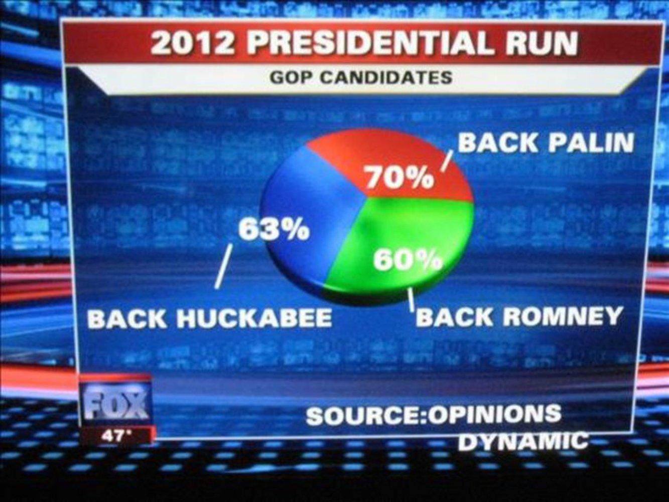
http://www.businessinsider.com/fox-news-charts-tricks-data-2012-11
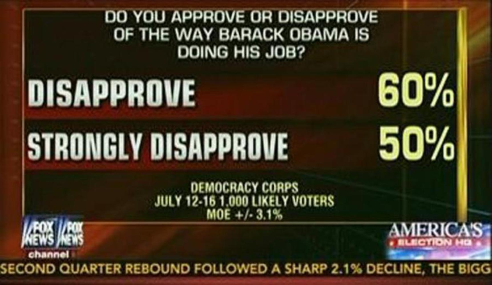
http://crooksandliars.com/2014/07/fox-news-phony-obama-approval-rating-chart 

x
Share this Project


About

"Straight from the CMU Brochure" aims to present data on CMU tuition and financial aid in a way that soothes our poor (literally) souls.