Taste of Pittsburgh
Made by Ankita Patel
Made by Ankita Patel
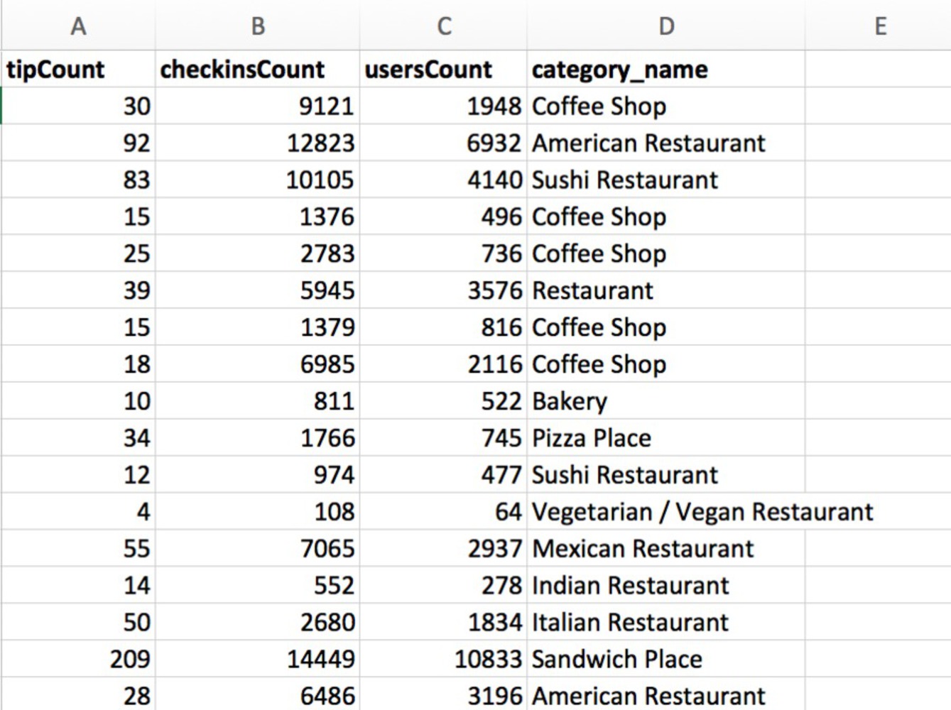
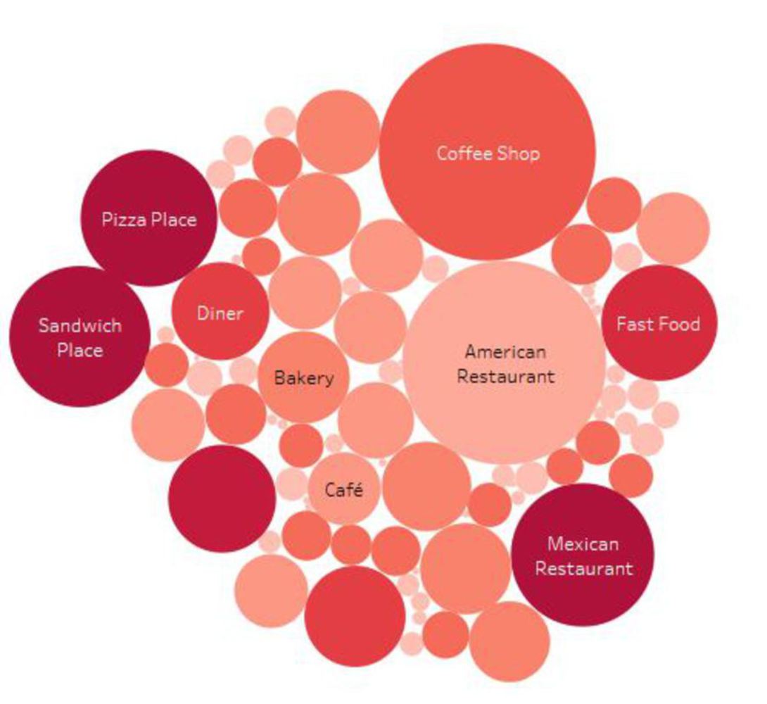
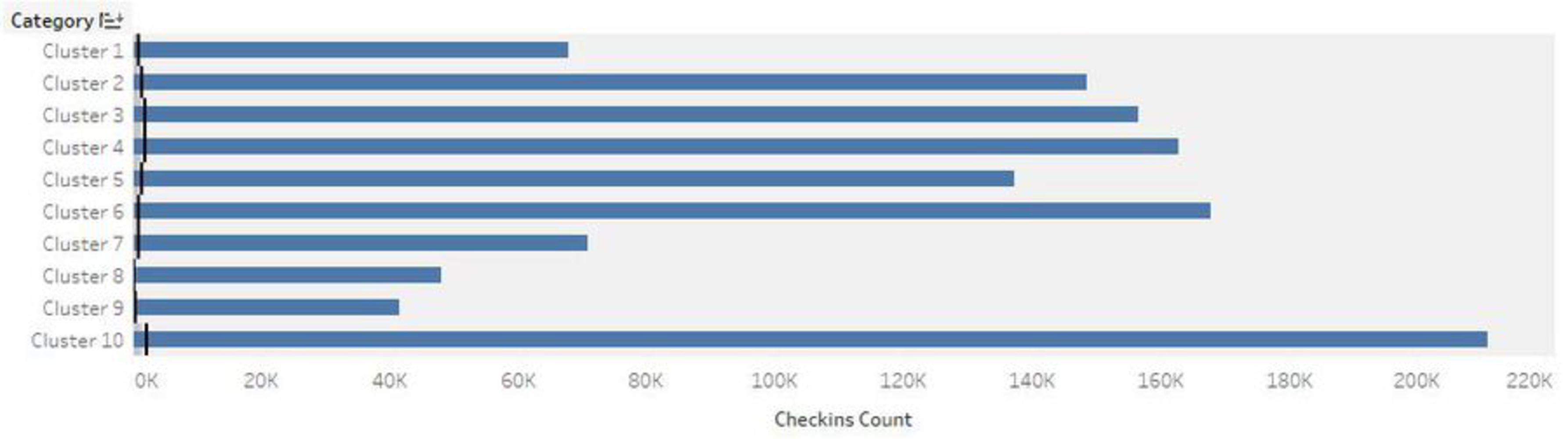
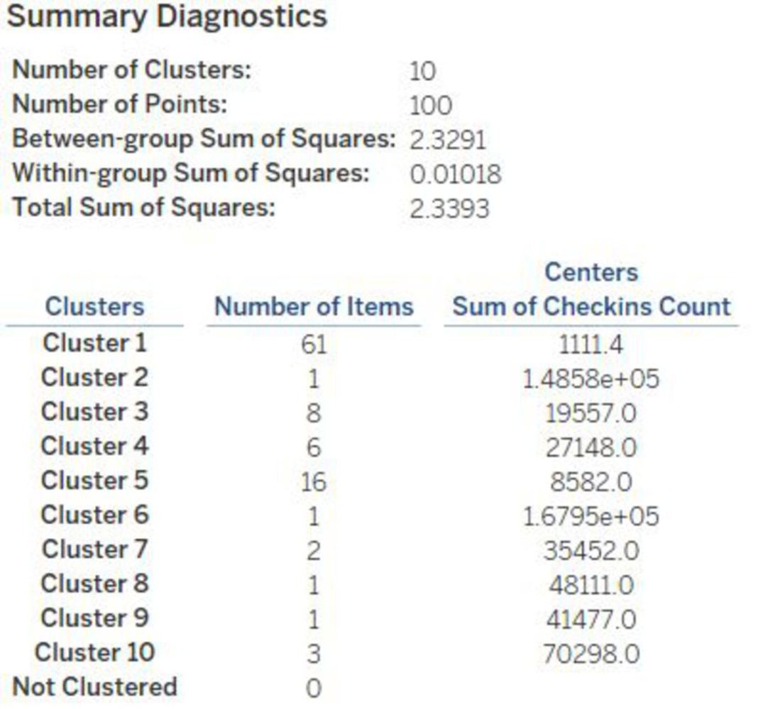
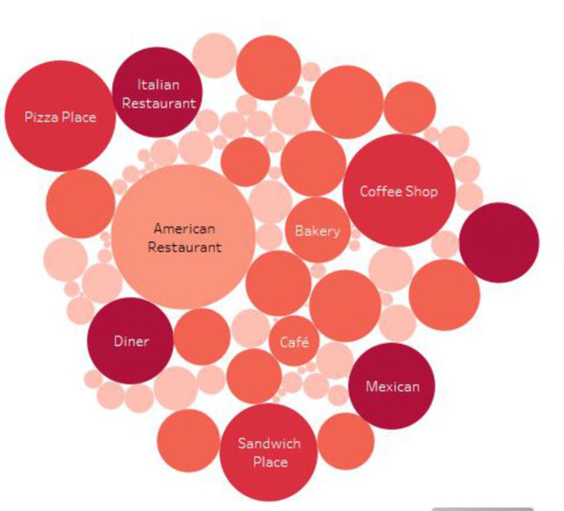
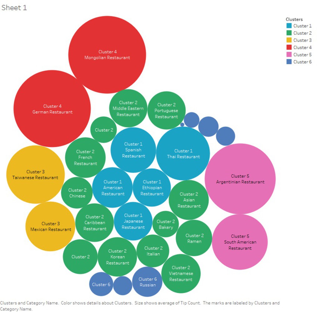
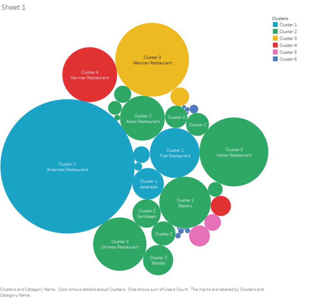
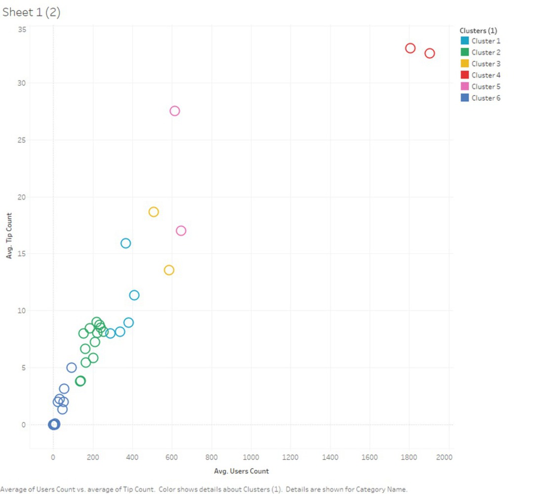
With K-mean clustering analysis, this project is intended to discover what is the taste of Pittsburgh, through data scraped from Foursquare
Created: October 30th, 2017
With K-mean clustering analysis, this project is intended to discover what is the taste of Pittsburgh, through data scraped from Foursquare