Global warming is a lie

Made by Dominic Liu

To manipulate data in such a way that it misleads viewers to believe the average global temperature is decreasing from year to year.

Created: November 1st, 2015

0

Product

I created a graph depicting global average temperature anomalies by year, which is essentially the difference between a particular year’s average temperature and the overall average from 1951 to 1980. I used the Internet to find the appropriate data, then used Microsoft Excel to organize and depict it in graph form.

0

Intention

    The goal of my project was to manipulate accurate data from a trustworthy source in such a way to convey a trend that seems to be the exact opposite of what was originally intended. In this case, looking at the data conventionally would have shown an increasing global temperature, but by inverting the axis, the same data could be used to show the opposite. I also decided to add more distractions, such as the color gradients. Because we typically associate red with hot and blue with cold, someone who merely glances at the graph would have an easier time reaching the faulty conclusion. I chose this particular topic because of its controversial nature, with many people on different sides of the climate change debate interpreting data in different ways to yield different results. With this project, I hope to teach viewers to carefully consider all the specifics regarding data they are given, as well as its context.    

0

Context

Soon after being assigned this project, I had a rough idea of my goals for the final product. As I said before, I chose this particular topic because of its controversial nature, and because of the extensive “lying” that is already prevalent in debates on it. The data I used is not uncommon, generally known as the “Global Land-Ocean Temperature Index”. In graphs illustrating this data, the vertical axis values are generally understood to be the single year average minus the base period average, resulting in an upward trend that indicates increasing average yearly temperatures. I wondered if I could somehow use the same data to mislead people into interpreting the opposite, that temperatures are actually decreasing from year to year.

0
Typical graph of the same data
Climate change  vital signs of the planet  global temperature.thumb
0

Process

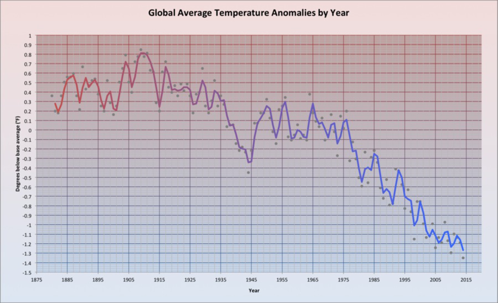
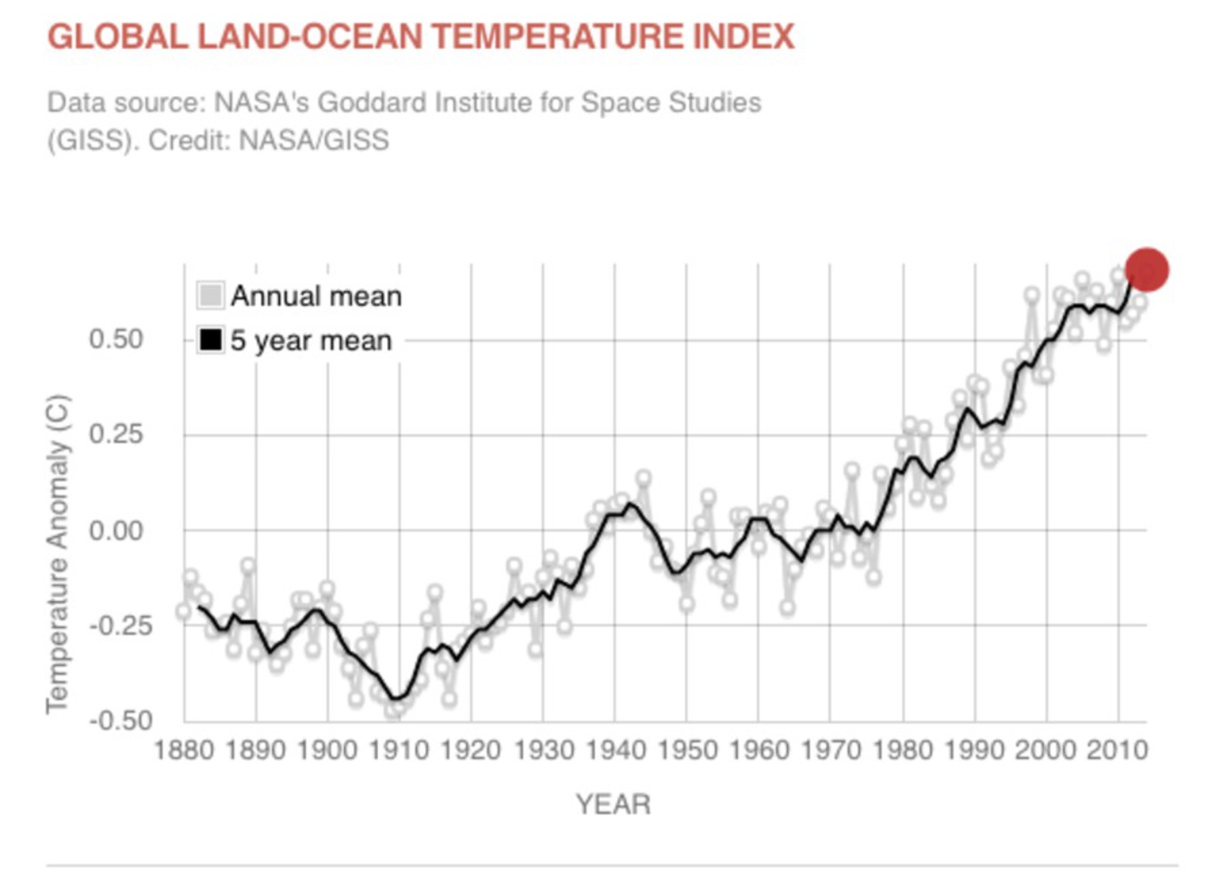
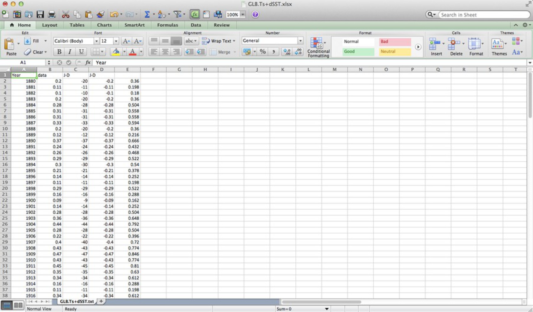
Once I had an idea of my direction, I began looking for data I could easily manipulate. I cycled through most of the evidence people cite as support for climate change theories, from ice cap area to global temperature. I eventually found the Global Land-Ocean Temperature index, which describes the change in global temperature relative to the 1951-1980 average. Further searching led me to NASA’s climate website, where I found the complete set of data I needed as a txt file. I downloaded it, then opened it in Excel, taking a few attempts to adjust the column boundaries so that everything would be organized correctly. Since the data was in 0.01 degrees Celsius, I multiplied all values by 0.018 so I would have a more common Fahrenheit scale. Finally, because I wanted to portray a trend of decreasing temperature, I multiplied all values by -1. 

0
Data as txt
0
Editing data
Data.thumb
0

To create the graph, I added a simple “Scatter” chart and selected the appropriate data for each of my axes. To make the trend more apparent, I added a simple moving average trendline. Finally, to further mislead and distract viewers, I colored the trendline, background with a gradient that implied decreasing temperature from top to bottom.

0

Reflection

I am satisfied with my final product. Without knowing the true meanings of the values, it is very difficult to discern what the actual trend is, even though the graph does not outright “lie” about anything. The color gradients are perhaps the most effective at misleading viewers, since they allow the entire image to imply a decreasing temperature trend. I don’t think there is much more I can do with the data itself, so if I had any additional time, I would have worked on the graph’s aesthetic appeal, or augmented this set with other similarly manipulated data to suggest decreasing global temperatures.

x
Share this Project


About

To manipulate data in such a way that it misleads viewers to believe the average global temperature is decreasing from year to year.