CMU Diversity in Departments
Made by Eric Wang
Made by Eric Wang
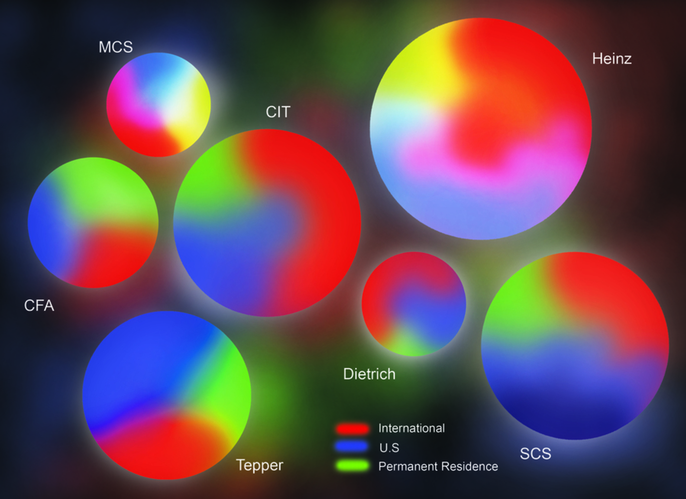
This project provides a more cohesive way of understanding the diversity of CMU through a simple, easy to understand visualization of students' background data. -Data from 2014 enrollment gathered from SIS. Permission of use from department head.
Created: September 14th, 2014
This project provides a more cohesive way of understanding the diversity of CMU through a simple, easy to understand visualization of students' background data.
-Data from 2014 enrollment gathered from SIS. Permission of use from department head.