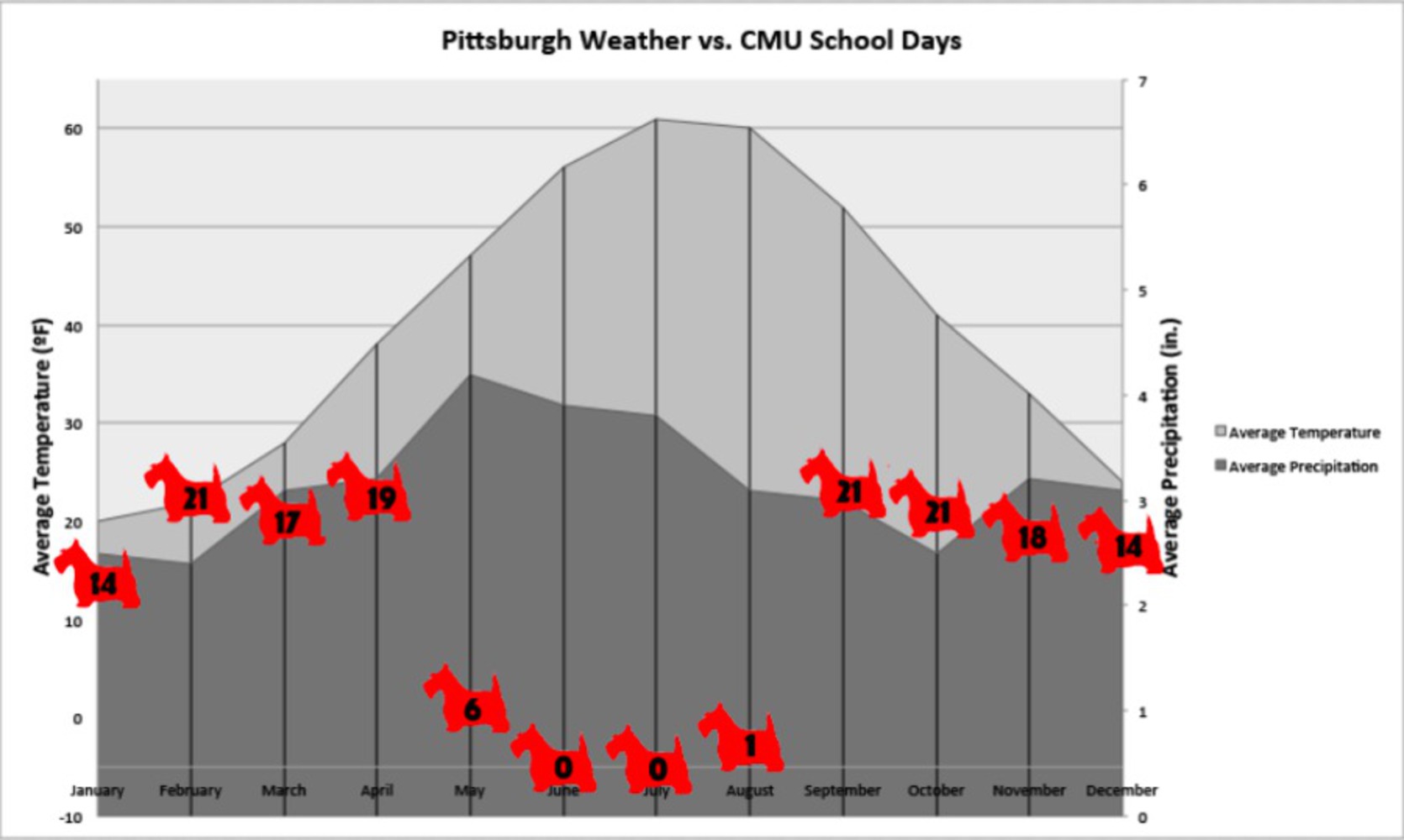
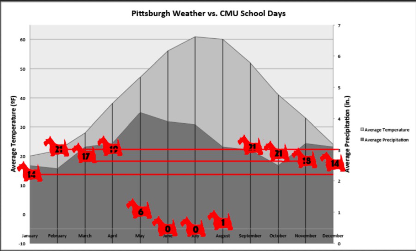
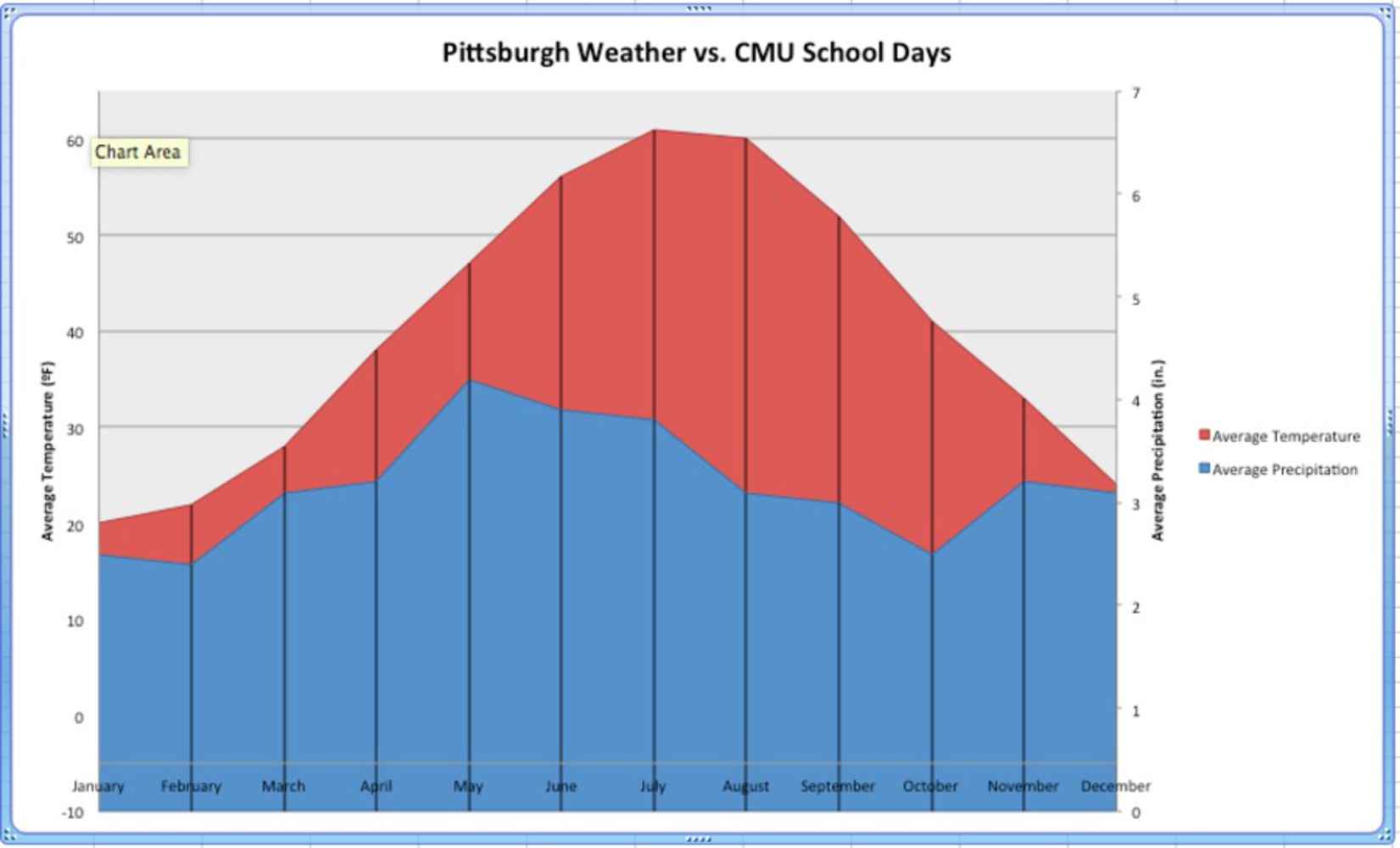
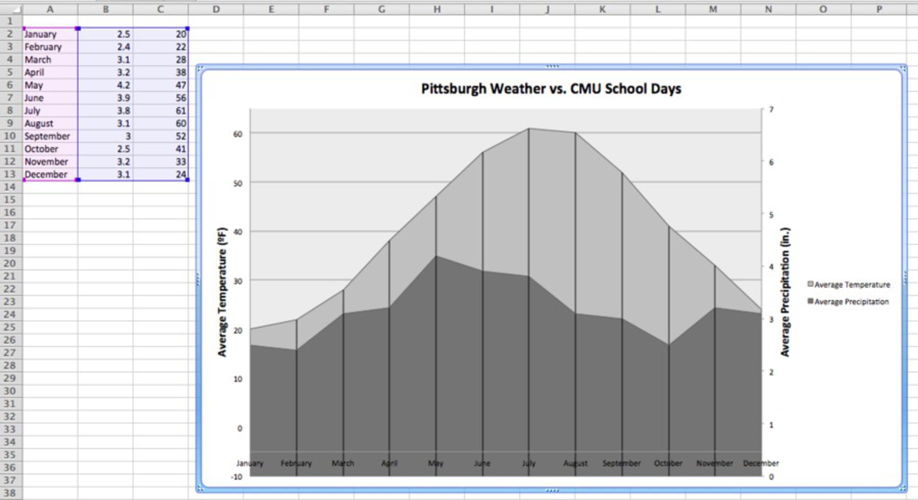
CMU weather

Made by Marie Shaw

To make a graph that shows that CMU has more classes when the weather isn't good.

Created: November 2nd, 2015

0

Product

I made a graph comparing the Pittsburgh weather and the days of class CMU has throughout the year. I used Excel and Photoshop. Excel was used to make the gray graph, and I used Photoshop to add the red Scottie dogs.
0

As you can see, the lower the Scottie dogs, the higher the temperature is, and the more precipitation there is, the higher the Scottie dogs are.

0

Intention

My motivation was to complain about how it seems like there's worse weather when CMU has class. As you can see below, the Scottie dogs didn't have an axis they followed, and were placed to get my point across. I was trying to show that the more days of school there are in a month, the more precipitation and more cold it is.
0

Context

I used Fox New's strategy of now following the vertical axis for my Scottie dogs. I also chose particular data that worked for me, like with the temperature data, which is a strategy bad researchers use. Finally, I compared two data sets that don't actually have a causal relationship. 
0

Here are two examples of the techniques I mentioned above.

0

Process

First I thought about what I wanted to do for this project. My first idea was to do something with Halloween, as it was a timely topic, but I couldn't find any interesting data sets. I came up with this idea as my friends and I were all complaining about CMU together, and I joked that CMU probably controlled the temperature to make us most miserable.


I first went on weather.com and found these graphs of Pittsburgh weather. The first thing I did was choose the Average Low for the Average Temperature instead of have both the Average High and Low, as I wanted to make it look like Pittsburgh has even worse weather than it actually does. 

0

Next I entered this data into Excel and made a Stacked Area graph. The red and blue is what I came up with first. I changed the color to grays to reflect the cloudy Pittsburgh skies and added vertical lines so it was easier to see where each month was. 

0

Next I opened up Photoshop and moved the graph into it. I took a black Scottie outline off of the internet and selected the black and colored it in red. I added the number of school days each month has on top of each Scottie and used them as plot points.

0

Reflection

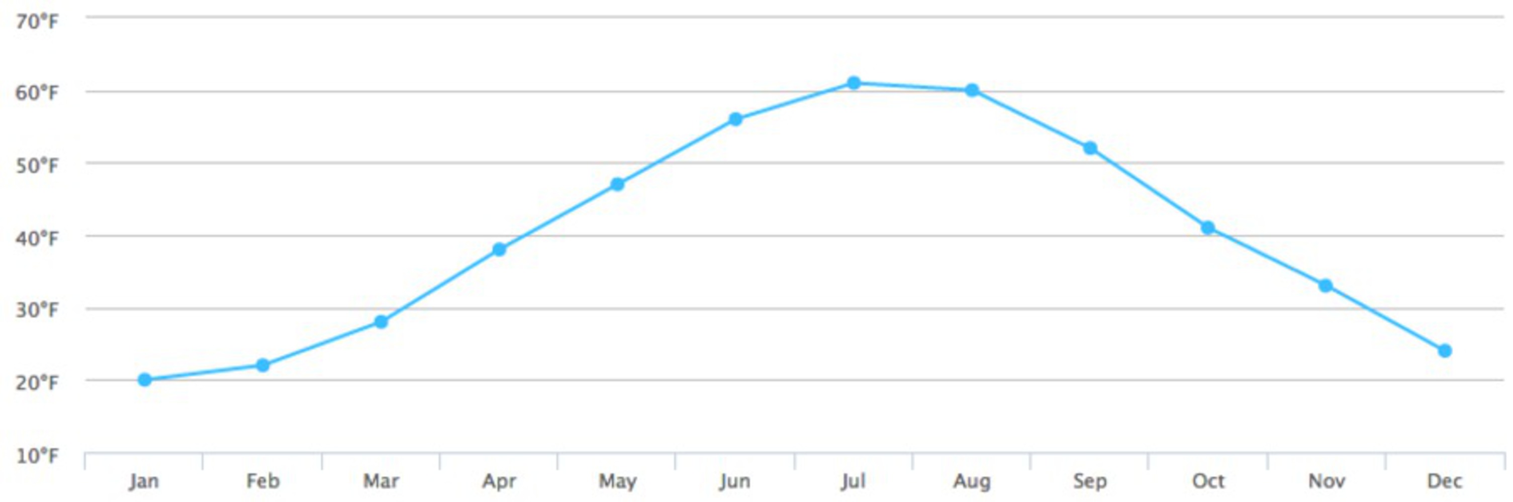
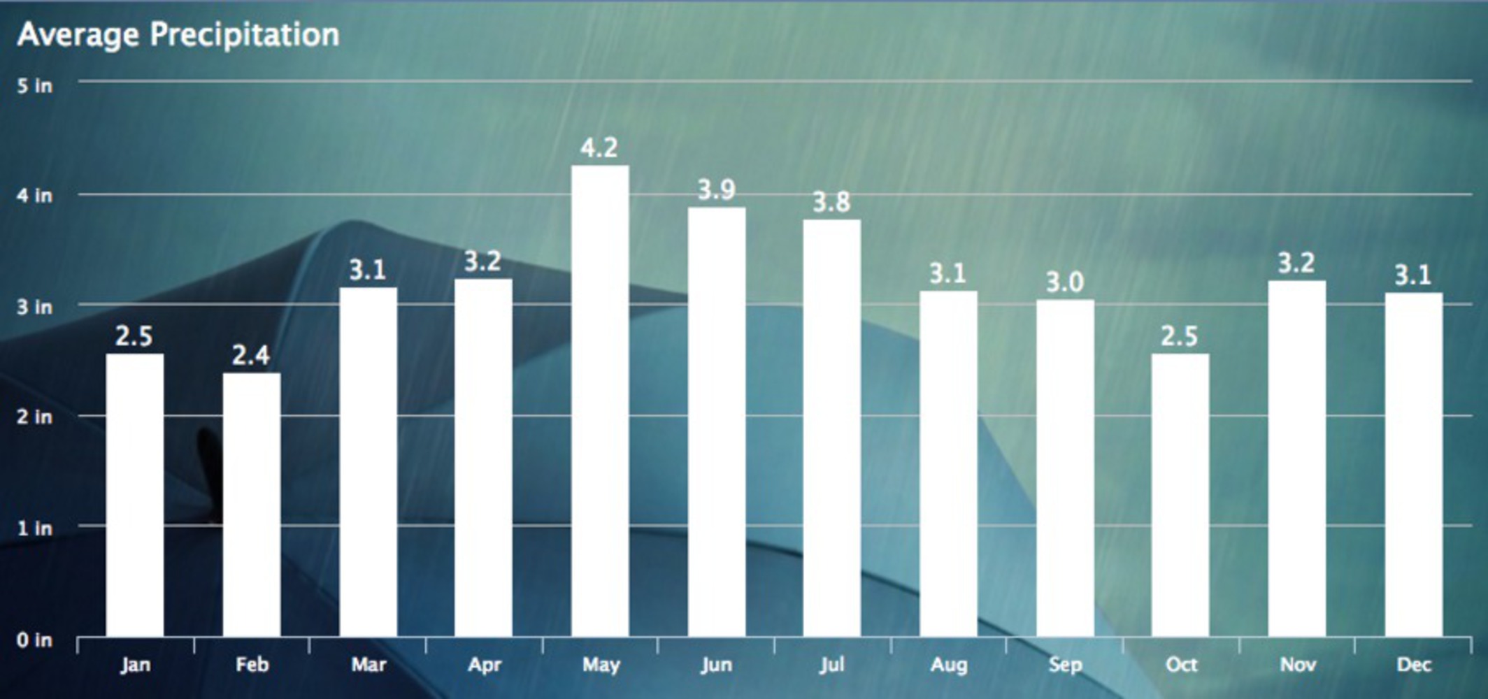
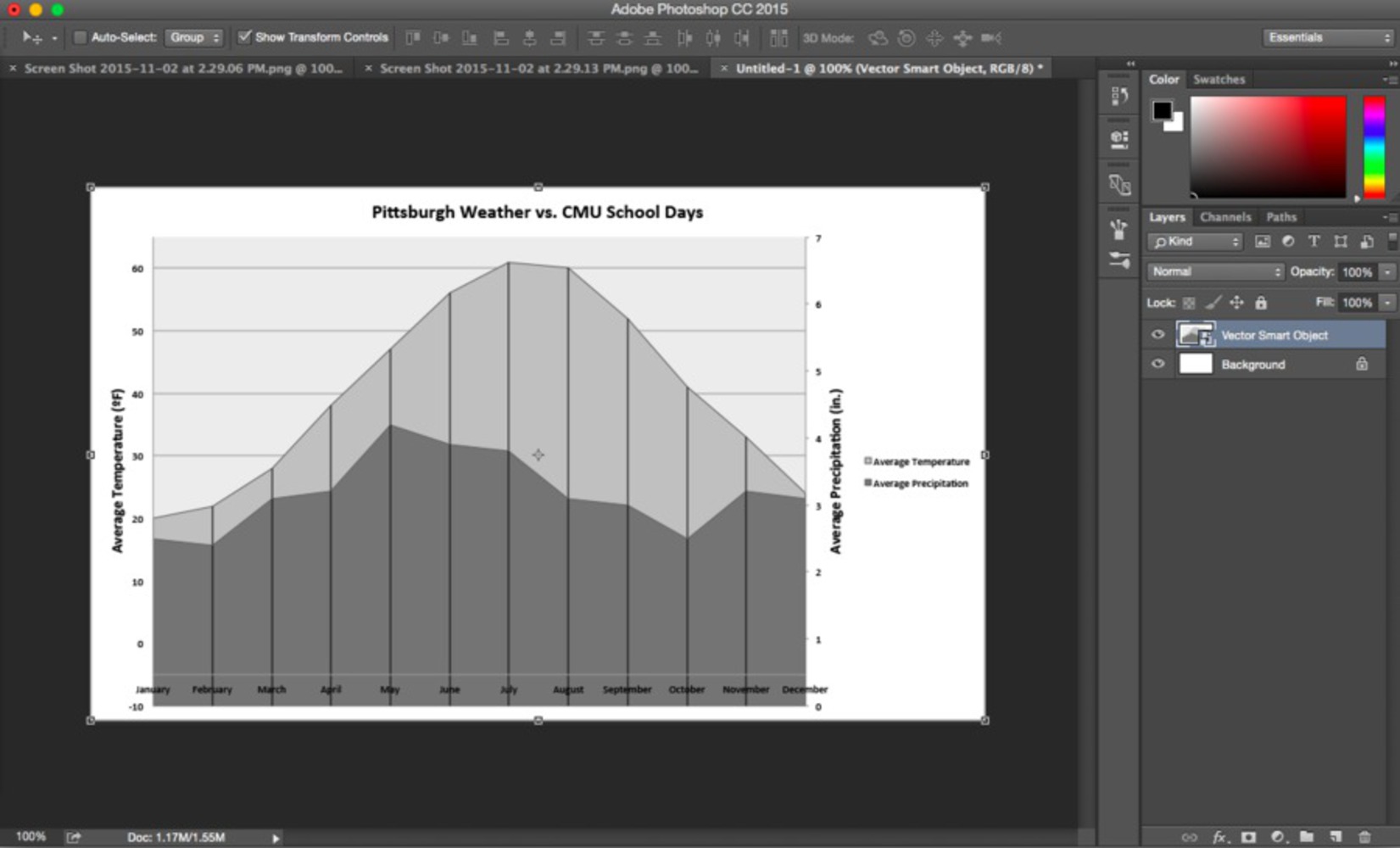
My project I think lacks an immediate understanding of what it's trying to convey. Also, if I could do it over, I would do something like compare the weather between weekdays and weekends/holidays, as I feel like that would have more impact than what I did. Keeping it at two variables in a 2D graph may have made it easier to read, even though the three variables on the same graph help with the intention of making the graph have more lies.

If I had more time and sticked with the graph I produced, I would also add more color and make it look nicer. Maybe a visual of rain in the background would have helped.

I learned that making graphs look nice is difficult, and it's even more difficult to make it easy to read.

x
Share this Project


About

To make a graph that shows that CMU has more classes when the weather isn't good.