Contrast

Made by Mauricio Cano

Created: October 28th, 2014

0

I made all the pieces with pencil, focusing on adding texture and tone to the drawings rather than color. 


For this first one, I chose to represent the following image: 

0

Drawing #1 -- lines and dots:

0

Drawing #2 -- shapes:

0

Drawing #3 -- Symmetry: 

0

Drawing #4 -- Asymmetry

0

For the human form, I chose to represent this image: 

0

Drawing #1 -- lines: 

0

Drawing #2 -- shapes: 

0

Drawing #3 -- intricacy: 

0

Drawing #4 -- economy: 

0

For the emotion, I chose to represent "horrified."


Drawing #1 -- lines: 

0

Drawing #2 -- shapes: 

0

Drawing #3 -- predictability: 

0

Drawing #4 -- spontaneity: 

0

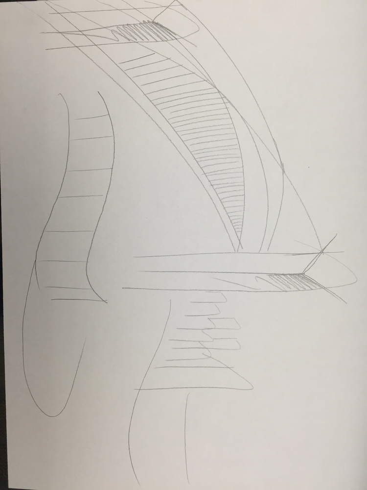
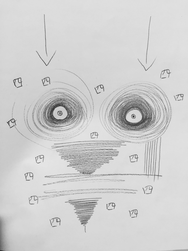
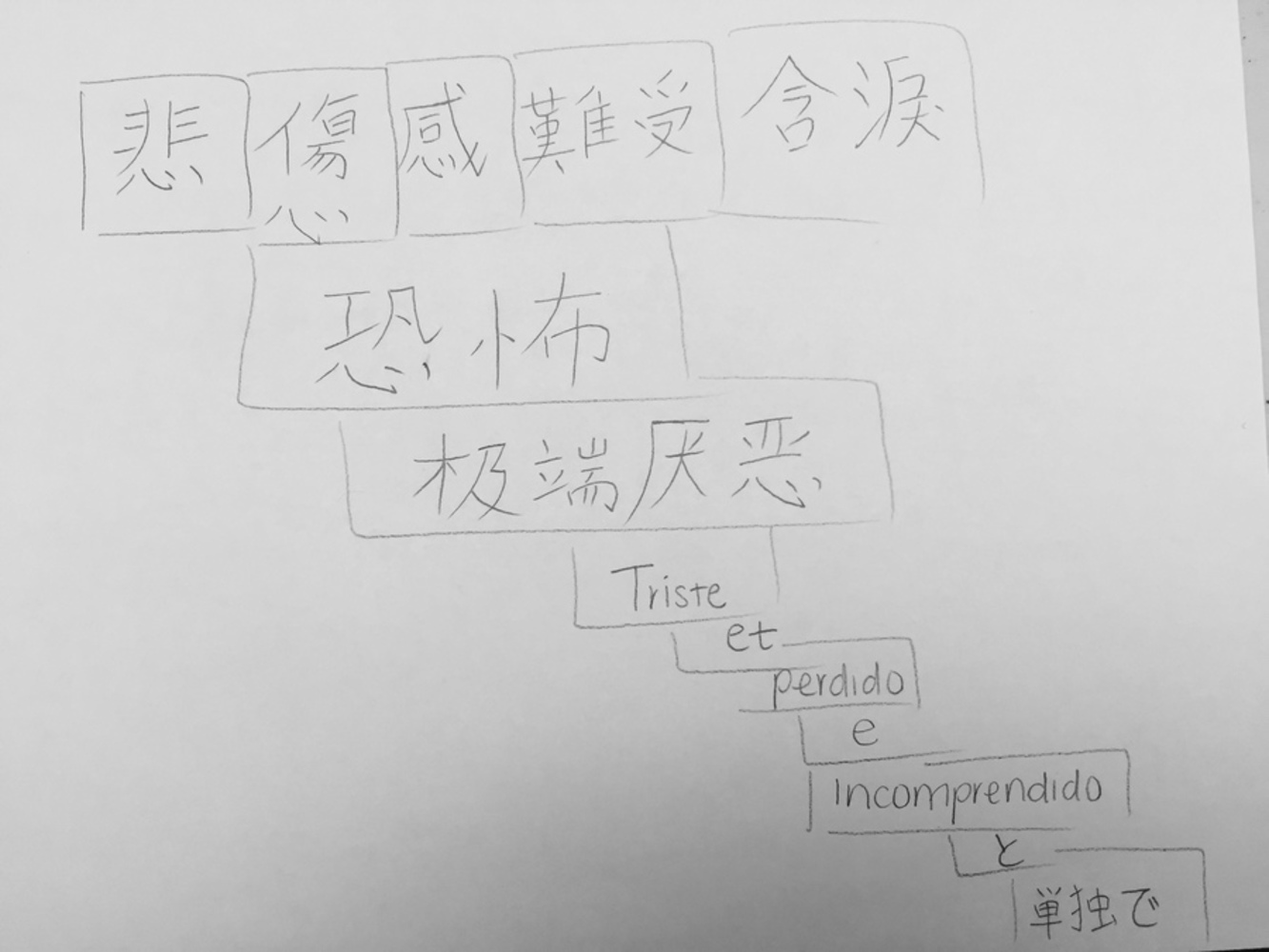
A big challenge with this project was trying to decide which spectrum to focus on when making the two final drawings for each category, and how to tie it back in meaning to what I was trying to convey. 

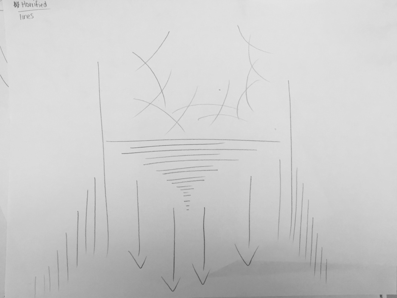
Additionally, it was difficult to try and keep visual resemblance in the first drawing without actually making any shapes.

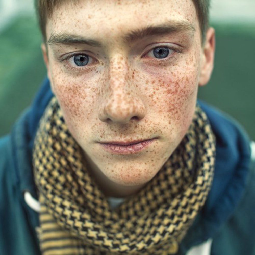
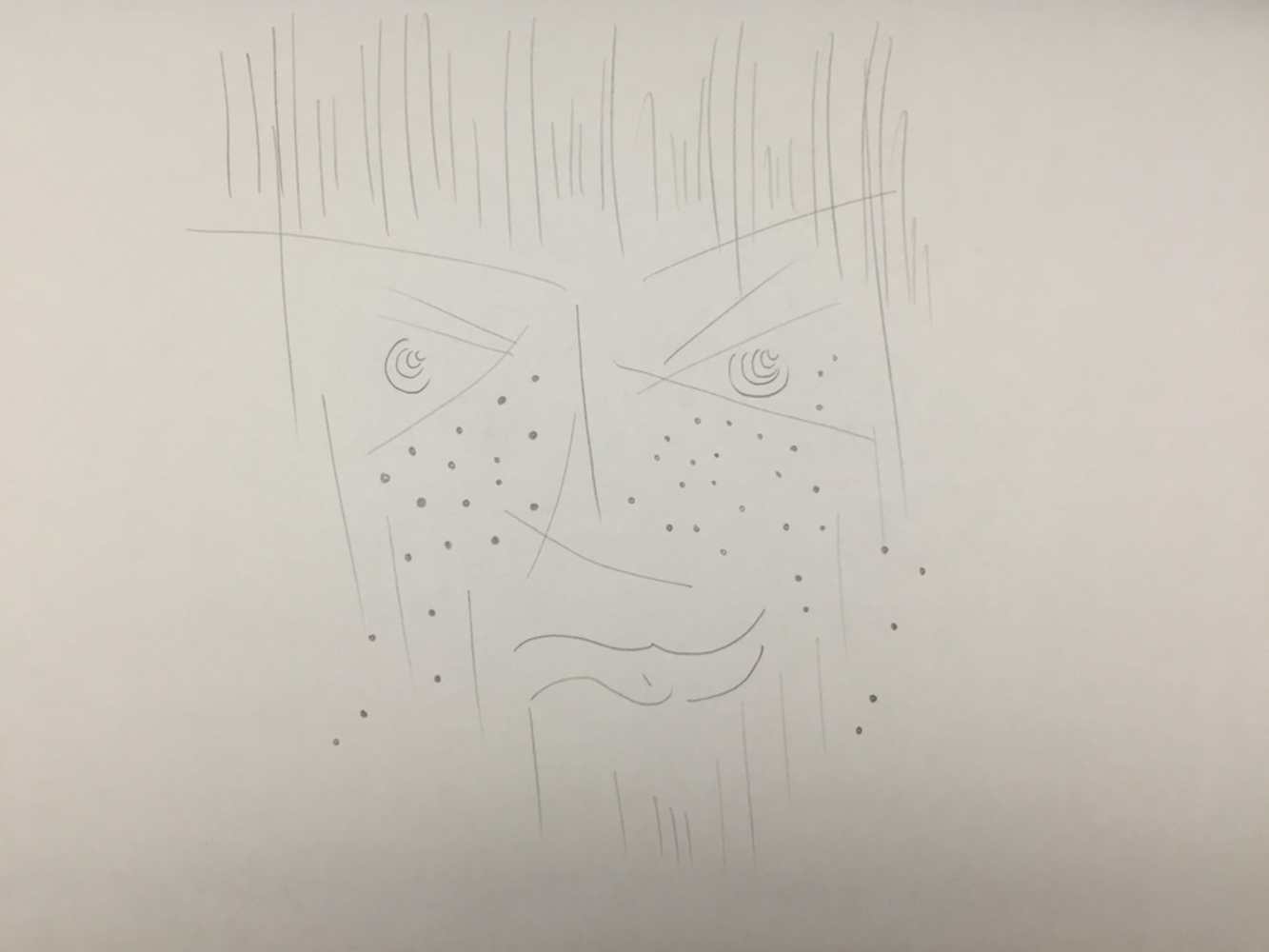
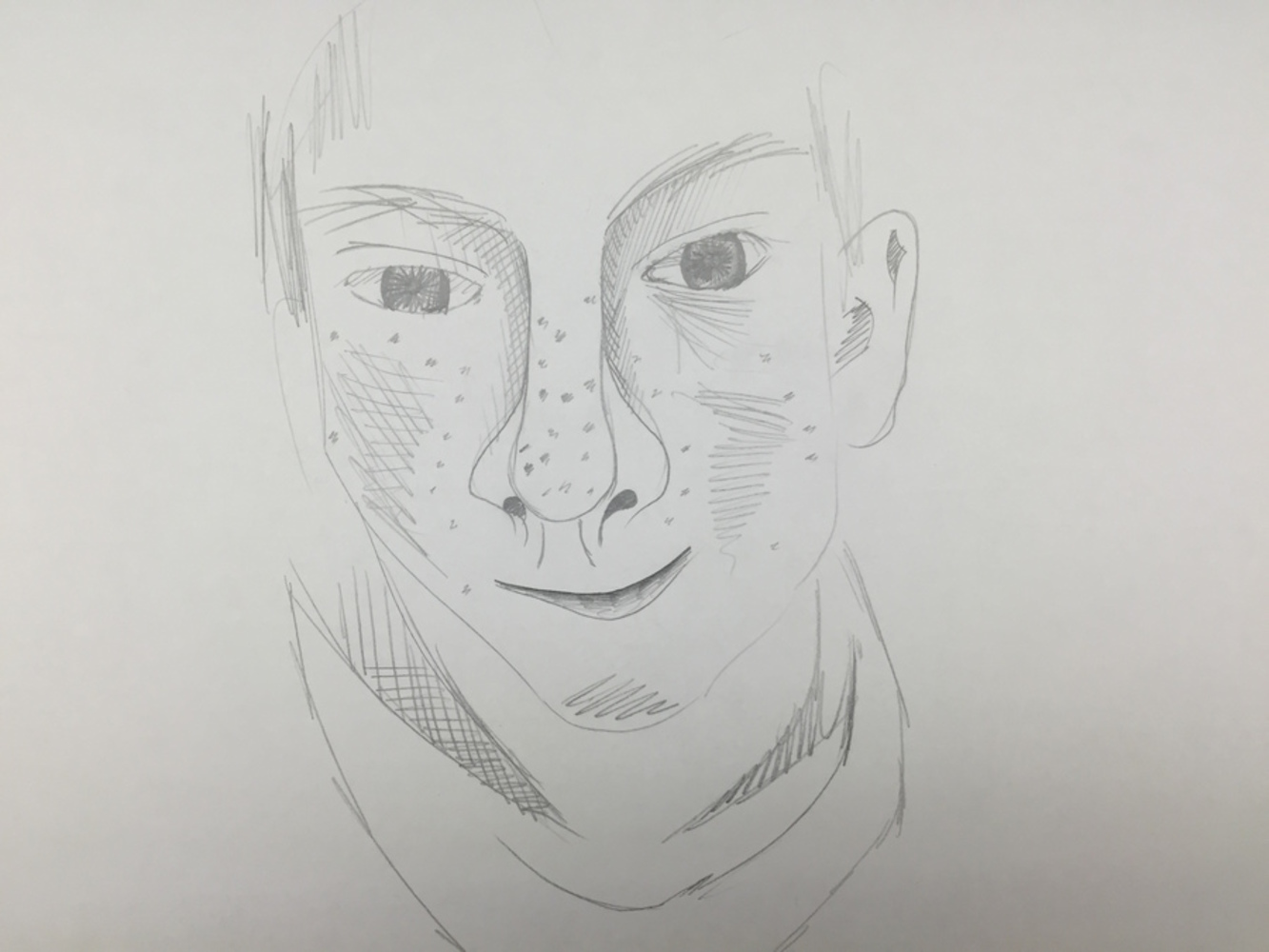
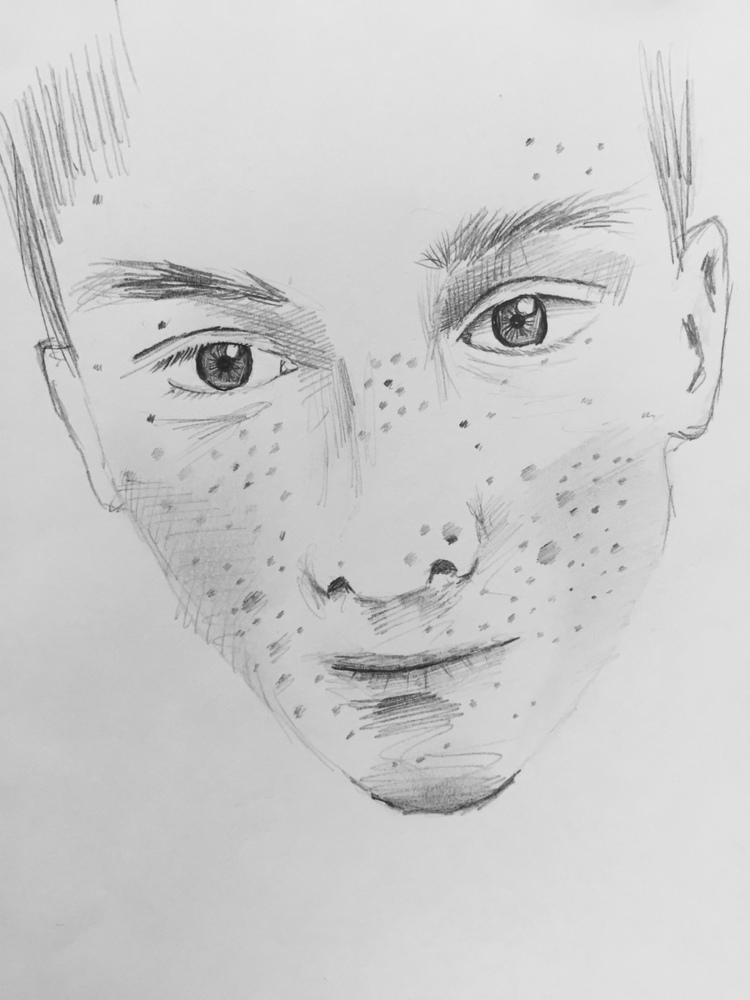
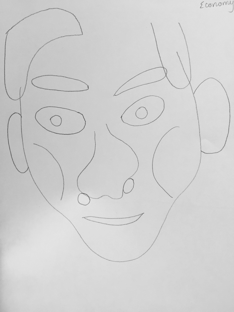
The most interesting part was seeing the differences between the two ends of the spectrum for a given representation. For the human form, especially, it was funny to see the boy's face go from the more detailed one to an overly simplified, saw-character looking one. 

x