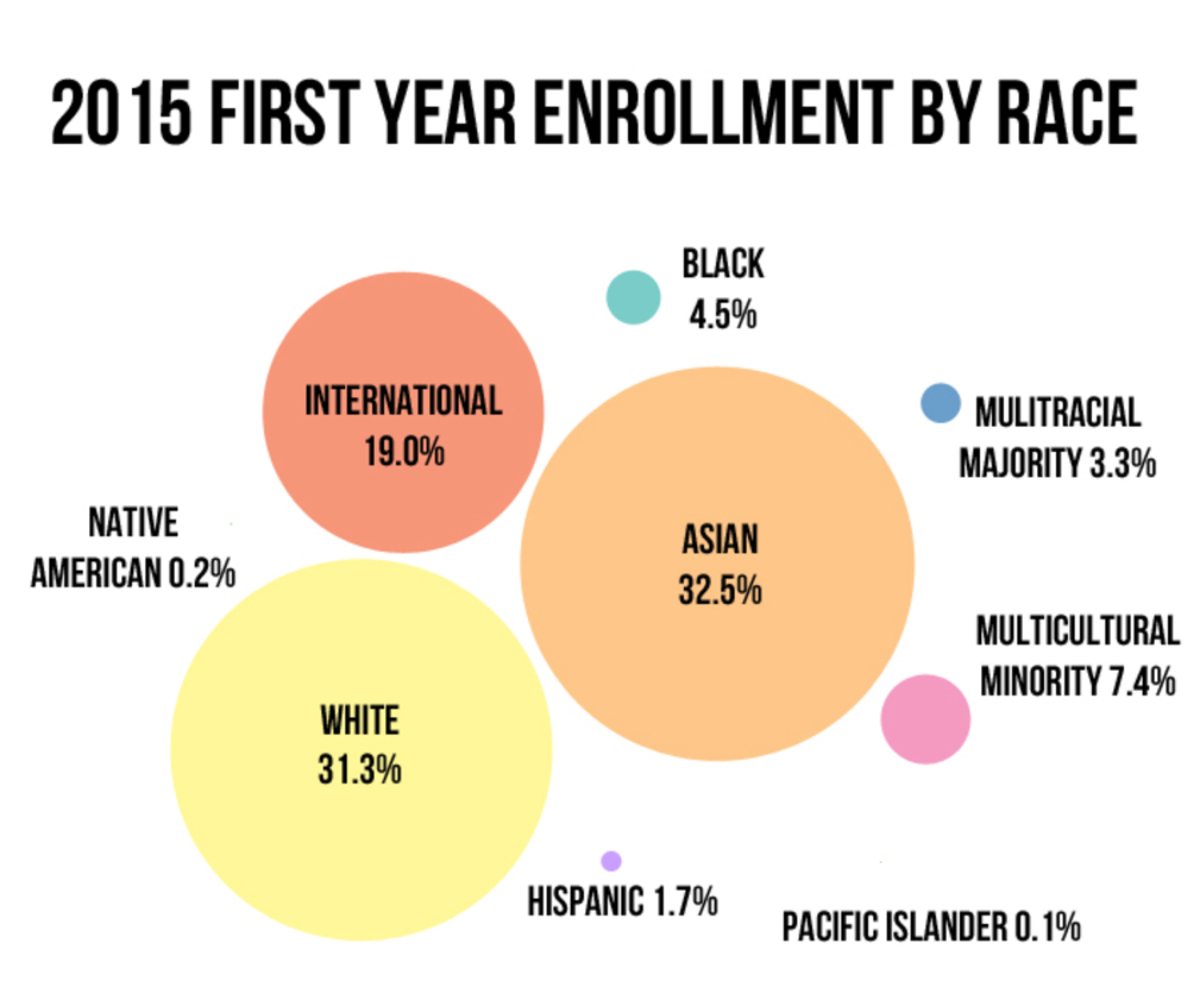
"CMU is Very Diverse"

Made by mmzucker

In this project, I will use reported data on diversity statistics published by CMU and create a visual organization that intentionally misleads.

Created: November 1st, 2015

0

Intention

When I first read the project statement, I thought about the ways diversity is depicted and how the ways institutions define race can sometimes lead to information being skewed in a certain way. Using data directly taken from Carnegie Mellon's self-reported 2015 Factbook, this project will take the universities reports on the racial make-up of students and display it in a way that is deceptive. While the product will be intentionally misleading for the purposes of this class, I hope that doing so will make people think about how diversity is reported and how the way racial make-ups are categorized causes systematic misreporting that implies student bodies are more diverse than we actually are. 

0

Product

Using an older Photoshop program on my computer, I created this bubble graph that relates the sizes of the circles to the percentage of first-year students in each racial category. Drawing from the most recent Carnegie Mellon Factbook, I used the reported data on the number of students in each pre-defined category. 

0

Context

One of the big motivations for choosing this subject came from how common it is to seeing numbers on diversity skewed. For instance, when universities publish data about student and faculty diversity, "international" is often a category on its own which can skew the data because it lumps people who may personally identify as Asian or Black into one category. In this way, "international" could include any and every other racial identifier but instead leads to an ambiguous display of information.

While I haven't seen a lot of examples of graphs that show misleading data on diversity specifically, it is not entirely uncommon for organizations to use misleading graphs as a way to show a specific viewpoint or better convince audiences of an opinion. Fox News, for example, has a history of getting caught for presenting misleading graphs like those shown below. 

0

Process

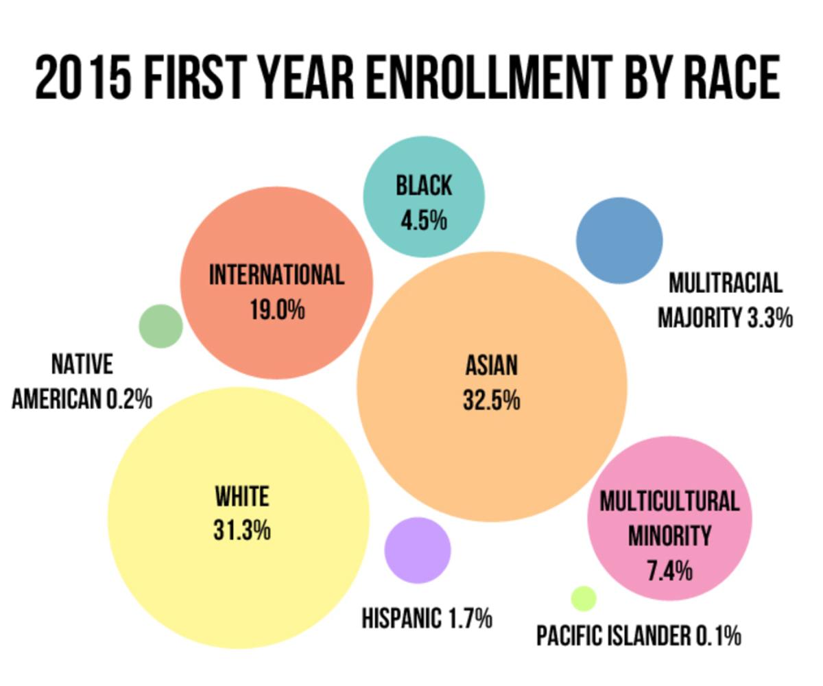
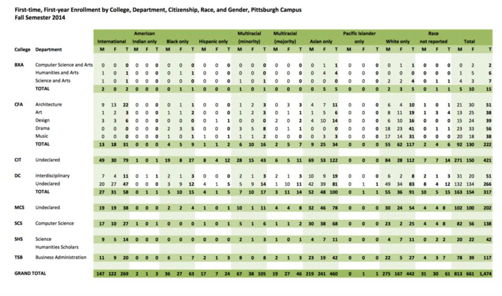
To start this project, I researched different ways information on diversity is displayed and chose this bubble graph style for its aesthetic appeal as well as for easily skewing the information. All the data used in this graphic came from the table below. Taken directly from Carnegie Mellon University's annual fact book, I took the totals (on the bottom row) from each racial category. From the total number of reported races, I calculated a percentage of a whole, leaving out the category for "race not reported". I then used these numbers to create circles for each category on Photoshop. 

While the largest three categories (International, White, and Asian) are proportional to each other based on this percentage, the smaller minority group data sets were made into bigger circles than proportional. In other words, instead of accurately displaying the percentage ratios, I made the circles representing minorities larger to make it look like these groups are more present and that we are a more diverse school. 

In doing this, the biggest challenge I faced was choosing just how much I wanted to misrepresent the data. It could be as subtle or obvious as I wanted, and I played around with the relative sizes and arrangements of the circles before choosing to go in the middle - not too obvious but visible enough to think the minority groups are better represented than the data says.

0

Misleading vs. Accurate Graphic

To better show how the data was manipulated, I also created the same graph again, but with ratios that actually accurately represented the data. When put side-by-side with the misleading graphic, its clear just how botched the first graphic is, and highlights how manipulating data in visual data representations like this can have a powerful impact on how we perceive information. 

When I made the second accurate graph (below), it was almost alarming how comparatively tiny many of the minority groups are. For students that identify as Pacific Islander and Native American, the representative circles are both just a couple pixels, and are nearly invisible when put on the same graph as the White, International, and Asian categories. I've included zoomed versions of this accurate graph that shows just how little these categories are.

0

Reflection

I really enjoyed making this project and found it fun to intentionally misrepresent data, and doing research on misleading graphs used by mainstream media was especially interesting and enlightening. I find it incredible that popular media outlets systematically create graphs like these to show a point in a dishonest way.

If would do this project differently, I would have made the graphic design of the bubble graph more compelling; I find it neat but a little bland so I would have tried to play around with different colors and styles, for instance using more 3-dimensional shapes or overlapping them. I also would be interested to see how it would look if the circles were more true to the reported data or more extremely abstracted. I think my graph strikes a nice middle point of being misleading without being too obvious but perhaps making the graph more misleading would have been an interesting approach.

0

Attribution

Carnegie Mellon Factbook, 2014-2105, Volume 29

http://www.cmu.edu/ira/factbook/pdf/facts2015/admission-and-first-year-enrollment.pdf

x
Share this Project


About

In this project, I will use reported data on diversity statistics published by CMU and create a visual organization that intentionally misleads.