Emotion Graph
Made by Mauricio Cano
Made by Mauricio Cano
Created: September 15th, 2014
What is the phenomenon?
The phenomenon I’ve chosen to focus on is the relationship between a person’s emotions and their confidence/self-esteem.
Why is it meaningful to you?
Personally, I spend a great deal of time thinking about my thoughts and the way I feel or react to situations in hopes that I’ll be able to understand their source and then change my behavior to promote positive emotions. Through this process, I’ve come to notice that self-esteem and confidence are big indicators of how happy I feel. It would be interesting to see how my emotions change based on my perceived confidence and vice-versa.
What do you want to communicate or express with your outcome?
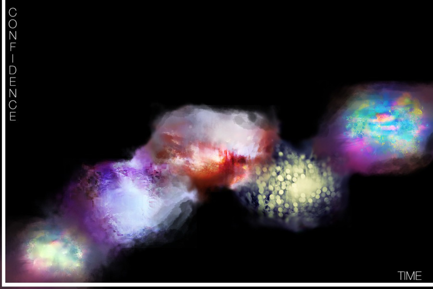
By charting emotion and confidence over a given period, I hope to show a correlation between generally positive emotions and a higher level of self-esteem. Also, see how likely it is that a person might succumb to feelings of stress, anger or desperation when self-confidence ratings are lower. Additionally, I hope to make it possible for people to see themselves through a concrete medium. I feel that this could help people better understand their own emotions and thoughts.
How do your key information design choices address your goals?
By having emotion represented as a combination of shapes and colors, I hope to illustrate the complexity of the human condition. I tend to think of emotion as a melting pot in the sense that at any given time a person might feel angry but also a bit scared, confused, jealous or just apathetic. Additionally, having these emotions charted directly over time and higher or lower on the graph to indicated confidence at a given point show the correlation between the two variables in an easy-to-understand form.
The data streams used to produce the information displayed on the graph are split into two categories:
Emotional data:
Emotions are easily interpreted through the physiological effects they have on those experiencing them. For this reason, the color, intensity and “shape” of the emotion graphics will be based on data collected about blood pressure, heart rate, eye liquid composition, tear crystallization, hormone levels and the kind of neurotransmitters present in the brain.
The data will be translated using special algorithms into a category of emotions ranging from anger, grief, anxiety and frustration to happiness, excitement, anticipation and even love.
The emotions will be averaged over regular intervals through the period to create an organic transition. Different hues and saturations will be assigned to each category of emotion and will be used to create a visualization of the person’s aggregate mood.
Self-esteem / Confidence data:
Given that confidence is a more complex phenomenon, we’ll have subjects rate their confidence on a spectrum at regular intervals throughout the charted period.
This data will be charted by having the emotion continuum flow up or down on the graph to illustrate fluctuations in self-esteem over time.
The way I’ve chosen to represent the data is an example of graphical excellence because it shows an otherwise complex set of data (that which describes human emotions) in a way that is easy to digest and retain. It also places an emphasis on substance rather than methodology and serves a clear purpose: description and exploration of a person’s feelings.
The piece embodies art’s forceful point of view by making the viewer reflect on the graphic and, upon finding that there are dips in the y direction (moments of lower self-esteem), their interest will be in figuring out ways to ensure constant high values of self-esteem. In this sense, the graphic’s way of representing the data has the side effect of imposing a particular perspective on the viewer.
In terms of my project’s connection to the readings and the example visualizations:
The data streams recorded in my chart are similar to those in Lozano-Hemmer’s pulse room. Both visualizations depend on biometric data (heart pulse for Lozano’s and things like blood pressure, heart rate and hormones) to generate a visible piece. Also, it resembles Frick’s approach of collecting personal data like heart-rate, sleep patterns and brain activity to make art.
One of my goals is to allow people to see themselves in the art, through an analysis of the “colors of their feelings. In a similar way, Lozano’s pulse room seeks to have the users feel that they are a piece of the visualization.
The graphic aims to make an impression—to present the data in a way that is easy to digest and retain. These principles are the same as William Playfair’s approach to data representation. Averaging emotions in text or numbers is difficult because there is no standardized terminology for the “in-between feelings.” Additionally, simply having these terms on a chart with self-esteem ratings does not leave an impression the observer and fails to meet the goal of having the subject connect with the piece. (It’s harder to relate to numbers than to colors and shapes that look like what they represent)
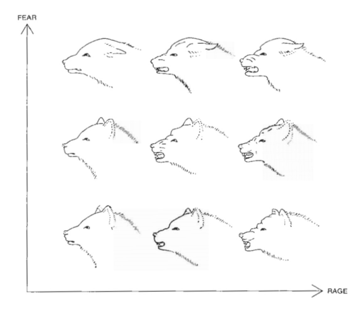
Joseph Minard’s illustration of Napoleon’s army can be considered to depict 3 dimensions, two dimensions of space and a dimension of time. In a similar way, the emotion graph shows three dimensions: a dimension of time, a dimension of self-esteem measured over a differentiable continuum and finally the more ethereal dimension that describes human emotion. The “emotion dimension” can be considered to be multidimensional in of itself since its degrees of change include at least 8 distinct feelings with an additional 18 based on intensity. This idea is illustrated by the following graphic:
In the plot, the data points themselves contain a large amount of information. My emotion chart is similar in that at any given (x, y) pair, you’ll find a data point that describes a complex phenomenon.
My teammates were useful in helping me see what the assignment was meant to be: representing data in a “creatively significant” way. That is, to find data that was important to me, make up a creative way of representing it that at the same time was useful in making the data simple to take in and understand.