Fast Food Trends

Made by Christina Reimond

My goal is to show the correlation between fast food consumption and health problems in the United States. In addition, I would like to draw attention to the large increase in fast food consumption over the last few decades. I plan to do this in a way that is familiar to much of the population and easy to understand: a chart in the form of a calendar.

Created: September 14th, 2014

0

Introduction

The problem I have chosen to focus on is unhealthy eating in the United States, particularly fast food, and how it affects health. Many members of my family have suffered from health problems related to unhealthy eating habits, such as heart problems and high cholesterol, so I see this as a huge problem especially in modern times. It seems as though many people truly do not understand how detrimental unhealthy eating can be; they just opt for the most convenient, and least expensive, choice. When I searched online for statistics showing correlation between fast food and weight problems, I stumbled upon several articles, but nothing presented in a clear, concise way to show just how many negative effects fast food can have on one's health. My goal is to show the negative effects in a way that is easy for someone to understand, so he or she has data to help consider lifestyle choices. I also would like to draw attention to how much eating has changed over the last 50 years or so, as our culture has evolved to one that constantly looking for quick solutions, such as fast food.

Design

I chose to place my information in the form of a calendar, as this is a format many people are familiar with, and are used to seeing on a regular basis. Each calendar correponds to a year from 1970 to 2013, and the viewer can click through the years using arrows at the upper right corner of the window. Each week represents a particular health problem, and each column corresponds to how often people eat fast food per week. A line graph indicates what proportion of people eating fast food, say 2-3 times a week, end up suffering from the particular health problem that week designates. The thickness of the lines in the graph shows what proportion of people fall in this particular category of eating fast food 2-3 times per week, so the line thickness is uniform throughout each column. Notice that it is the center of the line that indicates the proportion; not the top or the bottom.  This format is one that will allow a viewer to compare different categories easily, but for those who are more number oriented, or want more precise data, I will have a feature that allows a viewer to hover over a "day" and find the percentage of people in that particular category of eating fast food x times per week, and the percentage of those people that suffer from the given health problem.

Note that the following examples do not represent actual data; they are just rough drafts of the data representation.

0

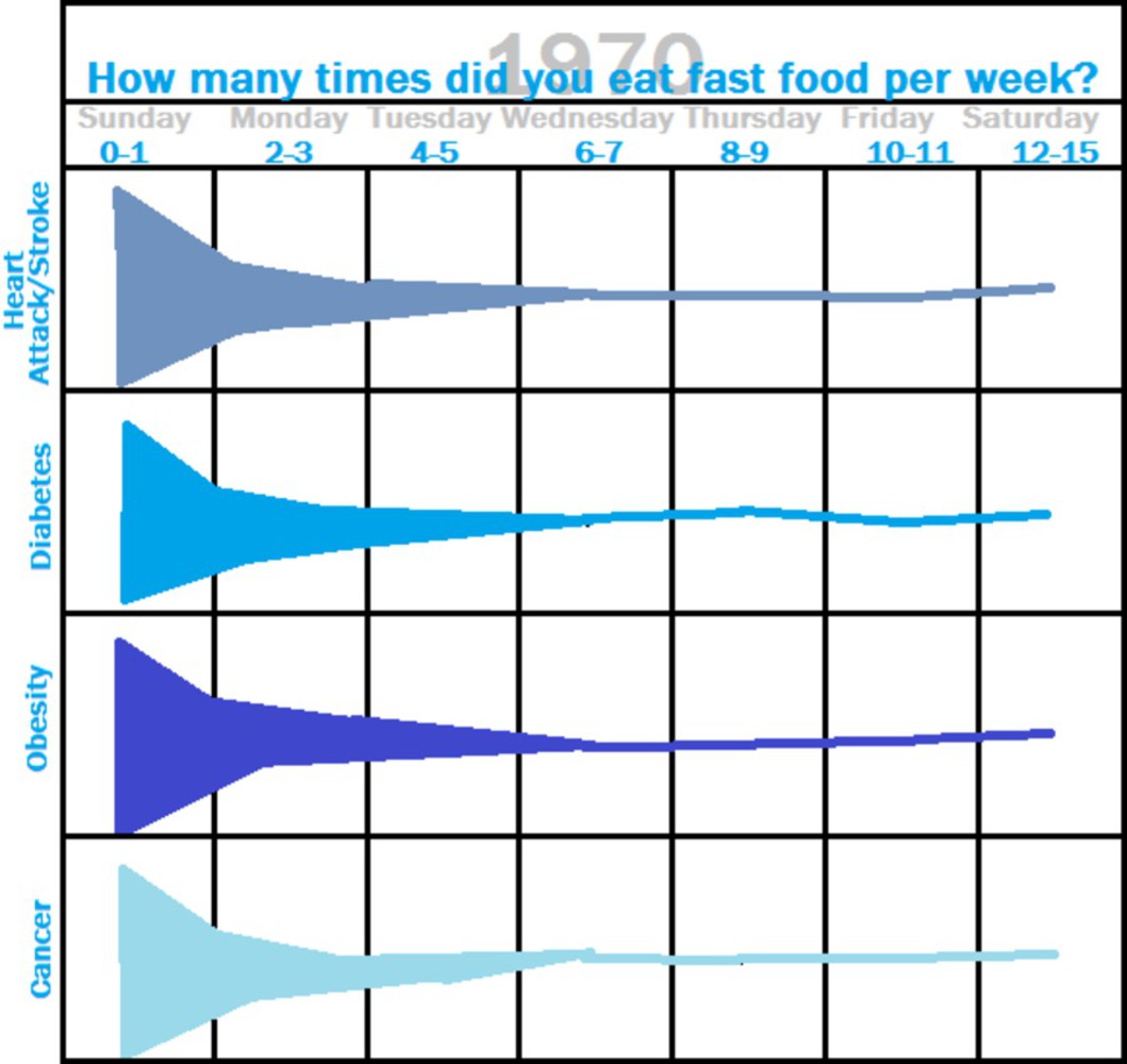
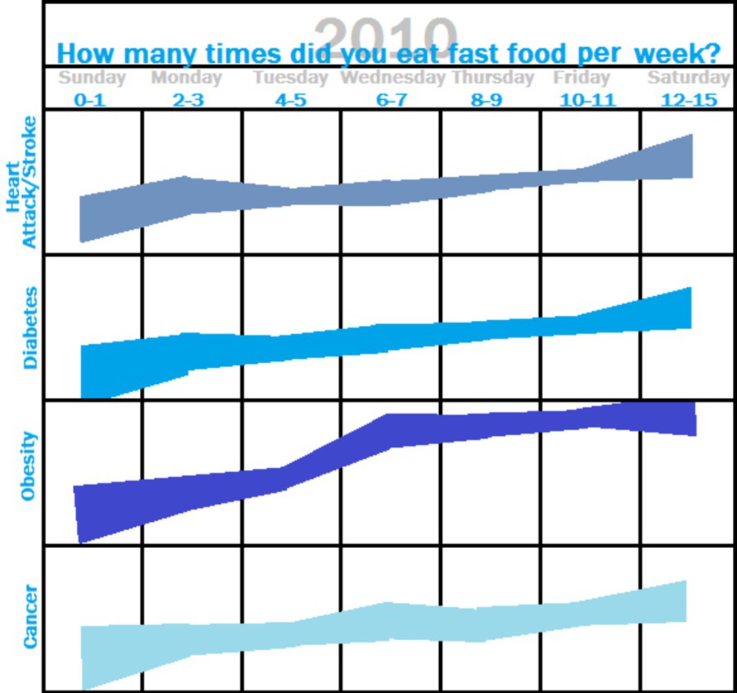
My "calendar" chart should not only show how people eat much more fast food now than a few decades ago, but also how fast food in current times is most likely correlated to more health problems, due to the greater amount of preservatives and chemicals in fast food today.

This calendar format expresses a great deal of data in a small, understandable area. It allows a viewer to compare data, and also to focus in on specific statistics if he or she chooses. It also expresses statistics to the viewer in a way that shows unhealthy eating and fast food consumption is a problem for one's health.

Feedback from my group helped me to express the data I have chosen in a more clear and concise way. I was having difficulties incorporating the proportion of people in each category of fast food consumption in a way that would not clutter the graph or be overwhelming to a viewer. Changing the thickness of the lines in the graph solved this problem.

Connecting to the readings:

1. My goal in this project was to provide information representation that is presentational. I wanted to present the facts in a way that others can understand and make their own decisions about, since I feel this would be the best way to address the problem I have chosen. An example of presentational information representation in the reading by Tufte is on page 19 in a graphic showing statistics about weather in New York City. My information representation is on a different topic, but it also is simply presenting the facts in a simple way.

2. Much like Charles Joseph Minard's Napoleon Map, I used thickness of lines in my graph to represent another aspect of the information; adding another dimension without cluttering the graph.

3. On page 31 of the Tufte reading, he mentions the idea of "small multiples", in which the design of a graph is repeated over several smaller "slices". He points out that "once viewers understand the design of one slice, they have immediate access to the data in all the other slices". I incorporated this in my design not only by repeating the same type of graph for each year, but also by structuring each of the "weeks" corresponding to health problems in my graph in the same way. My hope is that this will make my graph easier to understand.

4. Tufte claims that "Graphical displays should reveal the data at several levels of detail, from a broad overview to the fine structure". I incorporated this by allowing a viewer to just view the "calendar" which is less detailed, but also by allowing a more curious viewer to hover over the days to find numerical and precise information.

5. Tufte notes how data representations tell stories. My project does this by allowing a viewer to look through data over the past few decades, and observe how fast food consumption habits have changed.

Note: Cover image from www.computerclipart.com.

x
Share this Project


About

My goal is to show the correlation between fast food consumption and health problems in the United States. In addition, I would like to draw attention to the large increase in fast food consumption over the last few decades. I plan to do this in a way that is familiar to much of the population and easy to understand: a chart in the form of a calendar.