Graduate with Scottie

Made by Aliya Blackwood

Display the disproportion of the stats for students graduating

Created: November 2nd, 2015

0

Product

Detail what you created. What did you create, how, etc. What methods or techniques did you use? What tools and technologies were involved? Include images, code or video.


I created a pictograph  with Scottish terriers that is intended to portray the school's graduation and retention statistics. The red dogs represent the percent of students that graduate and the black dogs represent the students that do not graduate.

0

Intention

Write about the big ideas behind your project? What are the goals? Why did you make it? What are your motivations?


I wanted to convey how disproportionate the values the school portrays as a message of its high graduation rates amongst the many ethnic backgrounds that populate the school. It was intended to emphasize how little is truly shown in the data the school provides. We see the high rates of graduation, but there are significantly smaller populations of different groups. losing one person in a smaller population, can result in much larger drops in the percentage of graduates. Even Native Americans are excluded from the statistics because there are so few of them at school. I want to use the simple format of the pictograph to emphasize the graduation rates of the ethnic populations at school.

0

Context

Describe what informed your ideas and your outcome. How does your outcome relate to other work in the field? What are the precedent projects? Situate your ideas relative to work you've seen in class, or elsewhere


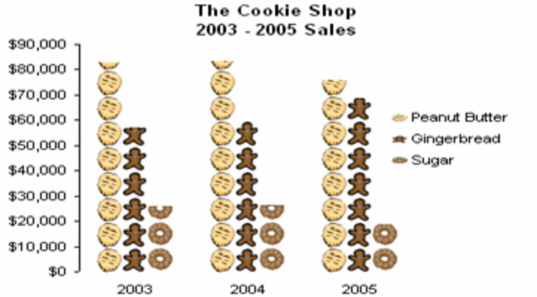
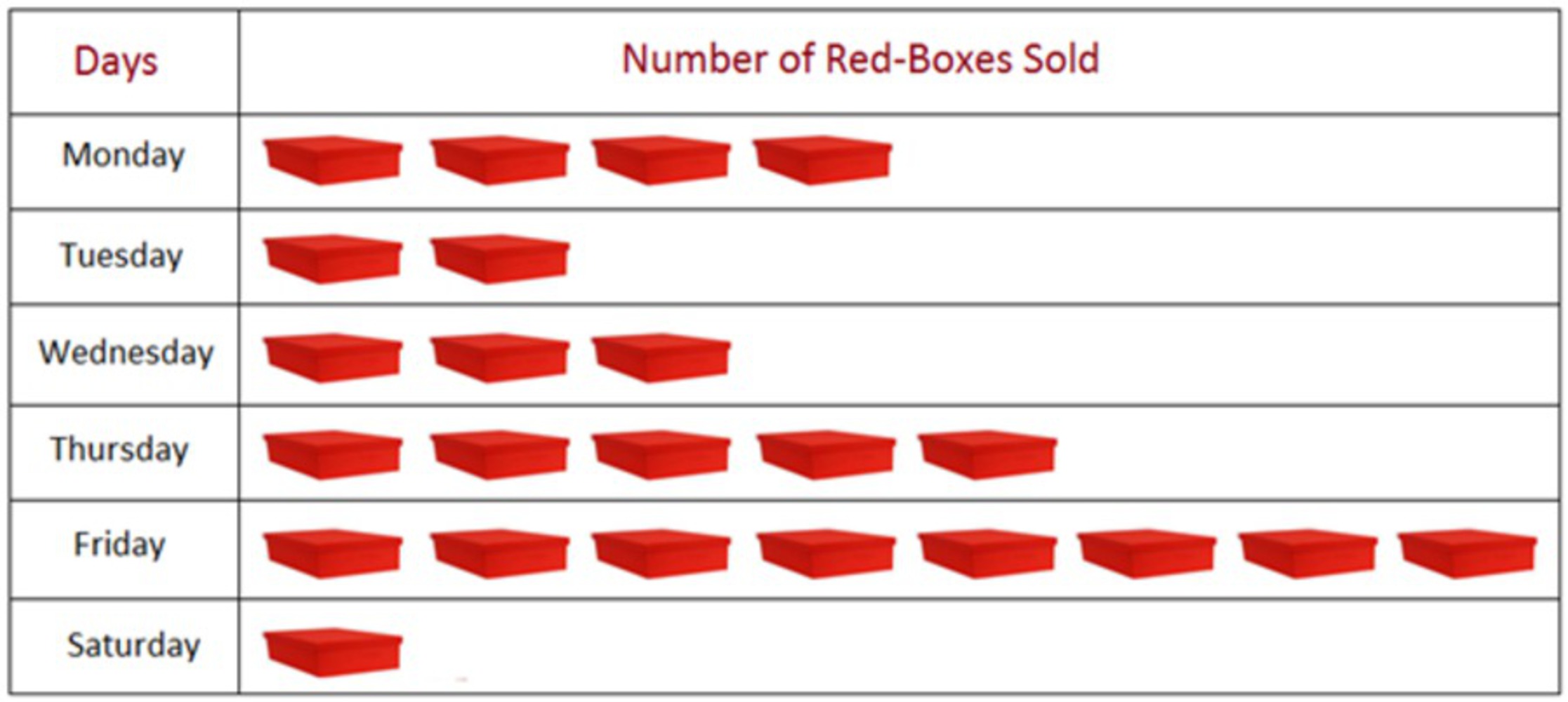
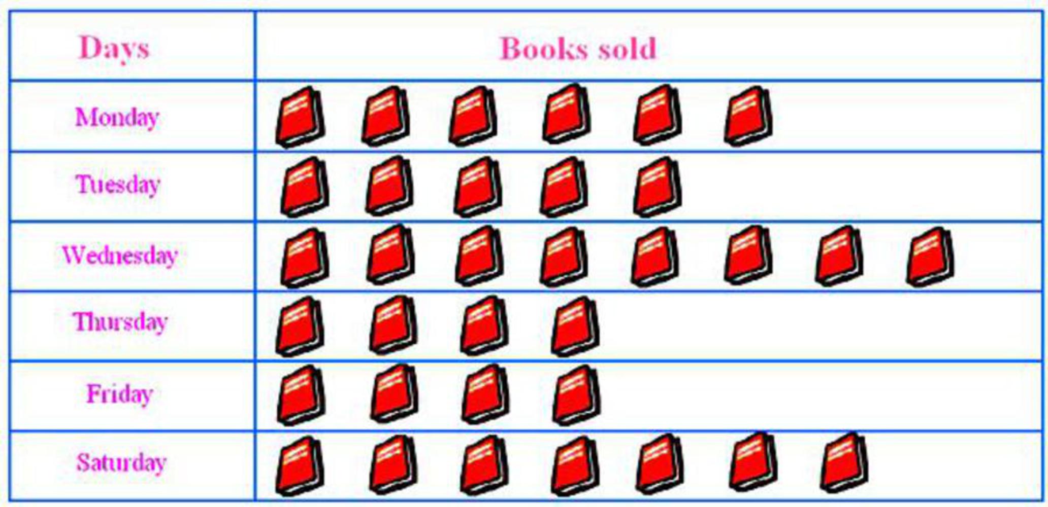
I remembered the lessons on interpreting charts that I was often taught in elementary school. The pictograph in particular, which relies on the viewer counting the objects belonging to a series, in order to compare the amounts of an object in a survey.

0

Process

Outline your approach to the project.  How did  you arrive out the outcome? What did you research and explore? What were the design choices? What challenges were encountered and how did you resolve them? Document design decisions and challenges encountered.


I tried to think of something that was universal for the students and realized that our school and our final goal of graduation were things we all shared in common. I looked for the school's mascot, the Scottish Terrier and used Inkscape to make multiple copies of the dog vector art. I lined them up and made ten columns of the dogs so that the viewer would assume that there were 100 dogs, but there are only 90 dogs. The amount of dogs that are black were purposely colored so that it seemed as if I was using the percentages properly. It would be easier to just count the amount of black dogs and assume that the sum is correct than it would be to count the red dogs to make sure that they sum up to the amount projected on the chart. I also covered some of the dogs so that counting the dogs would be more unappealing for viewers and they would assume that I am just telling the truth. 

0

Reflection

Reflect on the process of making this project. What did you learn? What would you do differently?


I would actually put all 100 of the dogs up, but I like the idea of purposely displaying the wrong number of dogs in order to exploit people's ignorance. I also think that I should have completed the statistics for white properly. There were errors on the chart for the white population of the school so it had to be deleted. Overall this was an interesting thing to look at because of the percentages the school portrays for itself . The percentages don't relay the actual population of each ethnic group at the school. I find the misconception the school portrays on its own as an interesting way to understand how easily we can be fooled by data. 

0

Attribution

Carnegie Mellon University Retention and Graduation Rate. https://www.cmu.edu/ira/carnegie-mellon-retention-and-graduation-rates-as-of-fall-2015.pdf

x
Share this Project


About

Display the disproportion of the stats for students graduating