Healthy Ride Analysis
Made by Tamara Cartwright · UNLISTED (SHOWN IN POOLS)
Made by Tamara Cartwright · UNLISTED (SHOWN IN POOLS)
This analysis will look at data from the Healthy Ride trip data
Created: November 25th, 2017
Our class is analyzing the data available through the WPRDC and Healthy Ride to determine the patterns and trends of bike rentals within the Pittsburgh region since May 31st 2015 to June 2017. This includes 170,312 trips taken from 501 bikes from 52 stations!
For my analysis I am using data 2nd quarter. It covers trips taken from April 1st to June 30th 2017 (some of which I imagine to be my trips!). During this period 24,241 trips were made by 451 bikes from 52 stations throughout Pittsburgh. The average trip lasted 1 hour, however the minimum checked out period was just 1 minute and the maximum period of a bike being checked out was roughly 47 hours!
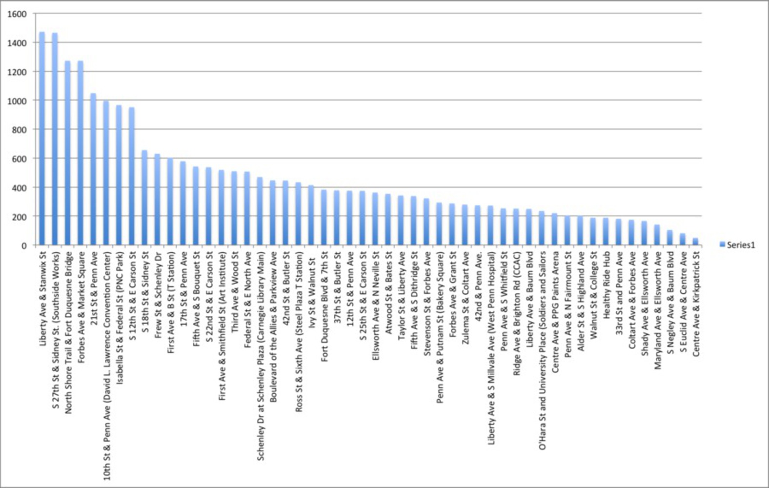
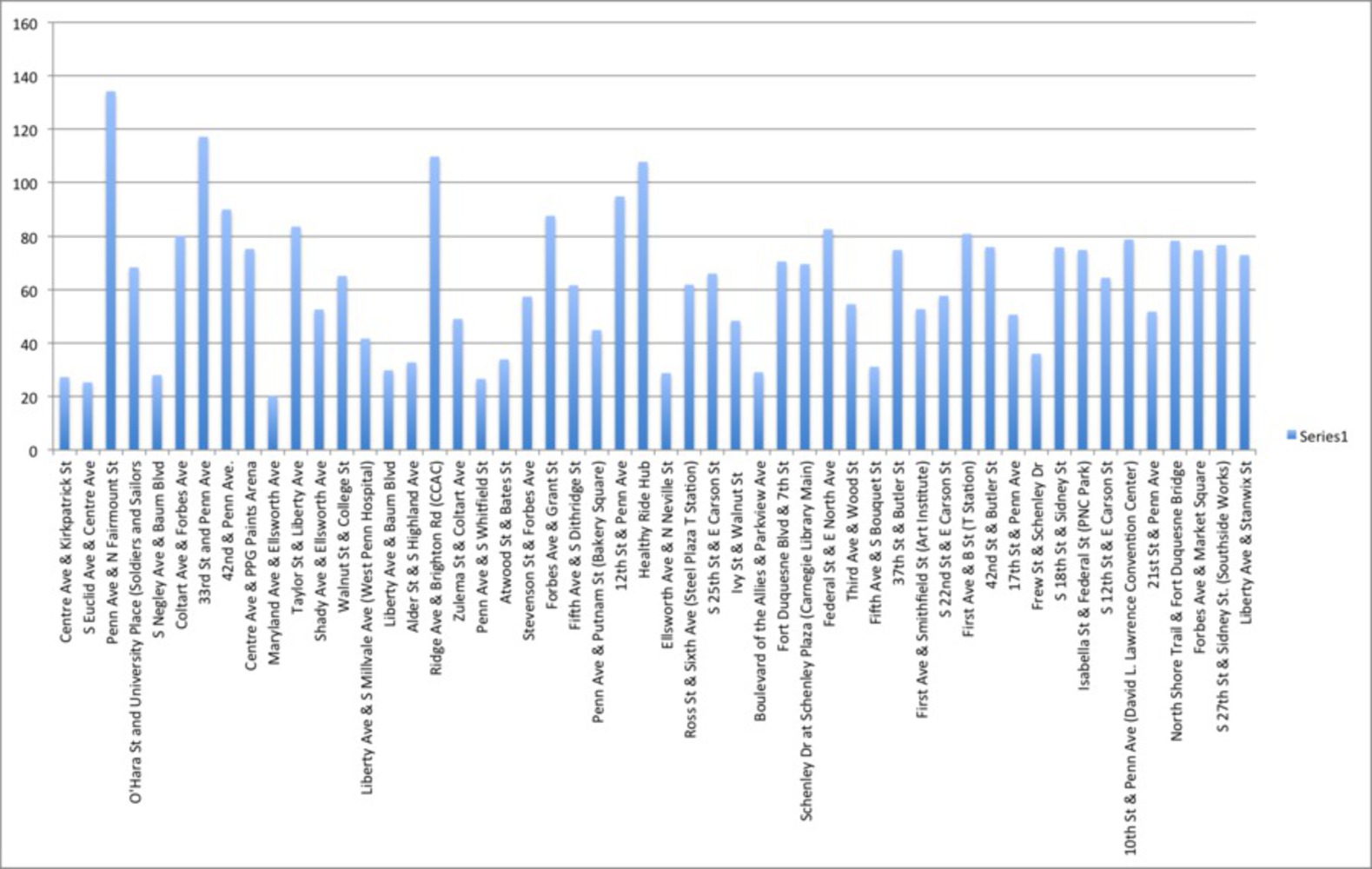
There are 52 bike stations in Pittsburgh with an average of 17.4 racks (min = 2, max = 35). The most popular Healthy Ride Hubs during this period were Liberty ave +Stanwix St with 1,472 rides originating there and S27th st +Sidney St with 1,465 rides. The least popular stations had less than 100 rides starting from them over the 3 month period; Centre Ave + Kirkpatrick St and Euclid Ave + Center ave had 49 and 81 rides beginning there respectively. Similarly these two hubs had the least rides arriving with just 10 rides ending in Centre Ave + Kirkpatrick!
Further exploration of the data show the rental trend increasing as we get into warmer weather. In April there were 6,832 rides, in May there was 7,743 and in June 9,666. This is roughly a 42% increase from he start of the Quarter to the end.
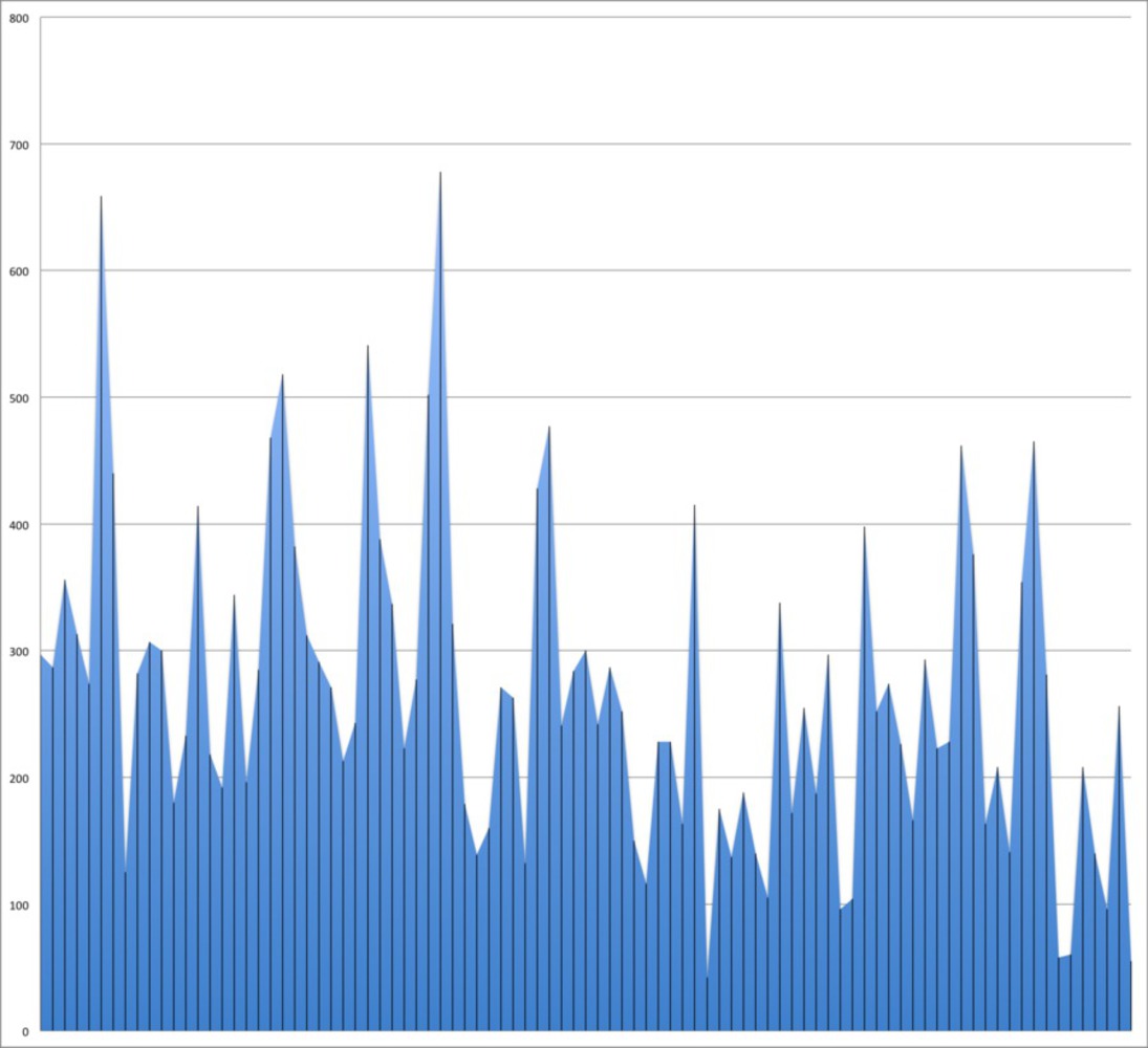
Fig 5- The days with the highest number of rides were:
May 28th- with 678 rides
June 25th- with 659 rides
These were both Open Street dates! On these days Healthy Rides spiked with other 100 rides more than the average high otherwise, demonstrating the impact of a safer, more active environment for people to take part in riding.
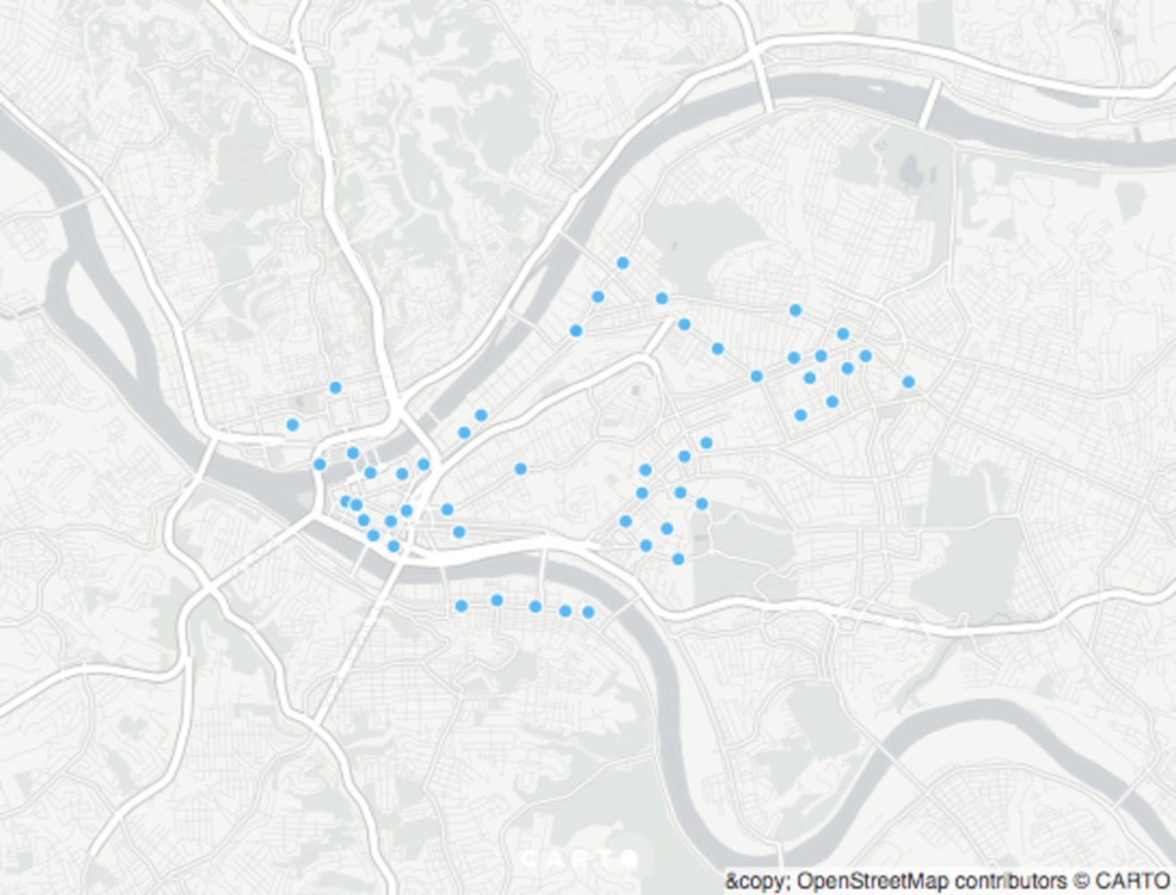
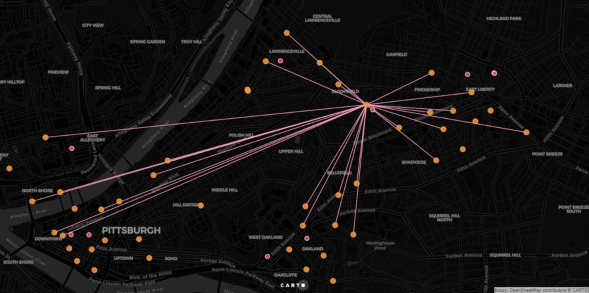
Delving deeper into this analysis I decided to overlay the farmers market locations on top of the bike stations. From there I narrowed my focus by analyzing which bike stations were in close proximity to the Pittsburgh markets.
Of the 23 Farmer's Markets in Pittsburgh, 9 of them are located near a bike station; and of the 52 bike stations, only 15 of them have the potential to serve a local farmer's Market. Personally, I like to use the Healthy Ride Bike station in Shadyside as a means to get to the Bloomfield Farmer's Market on Saturdays. This farmer's market is 9am- 2pm. So I chose to review bikes that traveled too and from this station during that time period.
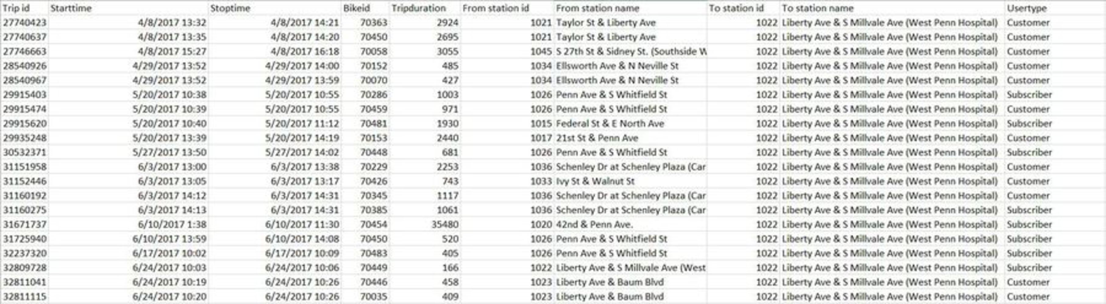
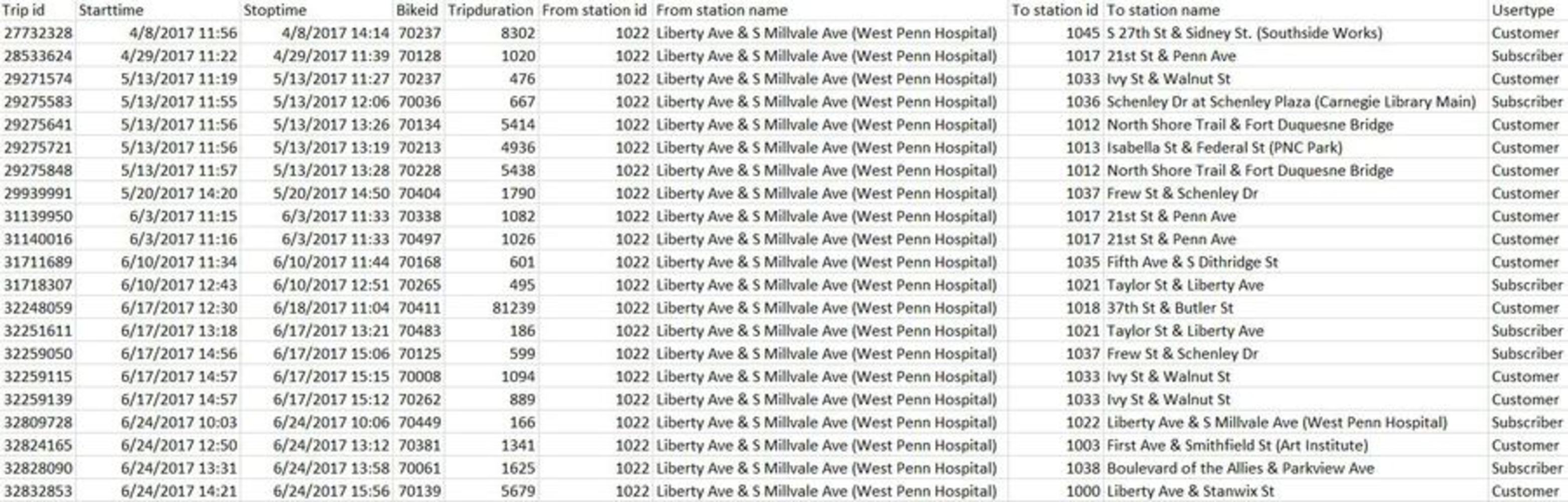
In order to gain a better understanding on the possibility and see patterns I took a deeper dive into the analysis of the data pertaining specifically to Bloomfield. I used SQL codes to query the data specific to the Bloomfield bike station (Liberty Ave & S Millvale Ave). Below are a screenshot of the interactive map that shows bikes traveling To the market and those traveling from the market on Saturday.
I was unable to create a query that narrowed the selection to only those within the time frame of the market, but the data set was relatively small so it was easy to manually do this.
There are only two days where there is no travel to or from this station- April 1 and May 6. On May 6th the weather dropped from 75 degrees the day before to 47 degrees! We can assume it was a very gloomy day and not one worth biking in, this case is similar on April 1st.
Conclusion, unfortunately a deeper look at the data showed that not many of the bikes traveled from and to a particular station. This concludes my study, and proves that not many people use the shared bike system as a tool to travel to and from the farmer's market.
Because of this I will not move forward with an analysis of the other stations. Thank you!
12/14/2017
Furthering my analysis I decided to explore the Healthy Ride full data set to see how many shared trips are taken using the bikes.
For this I used a combined data set of all Healthy Ride Trips from 2015-May 2017.
https://data.wprdc.org/dataset/healthyride-trip-data
As precedent I recall Mimi Onuoha's work on moving data in London.
http://mimionuoha.com/projects/#/pathways/ (Links to an external site.)Links to an external site.
Pathways (2015) is a data storytelling project presenting a month's worth of real mobile data collected from four groups of Londoners. Pathways explores what mobile data can (and cannot) reveal about common relationships and investigates ordinary people's relationships with their personal data. Through visualization and analysis, Pathways presents a window to the actual data trails of four groups: a couple, a set of co-workers, a family, and roommates.
Pathways was completed as part of the 2014-15 Fulbright-National Geographic Digital Storytelling Fellowship, with all data collection, design, development, research, UX, and copy done over the course of the year. The project also involved progress blogposts at National Geographic's news site that can be viewed here.
Additionally, Mimi Onouha's talk at the Eyeo festival has stuck with me throughout the semester and I am please to say that it was this talk that fully allowed me to see the potential or data analysis when dealing with urban issues.
http://eyeofestival.com/speaker/mimi-onuoha/ (Links to an external site.)Links to an external site.
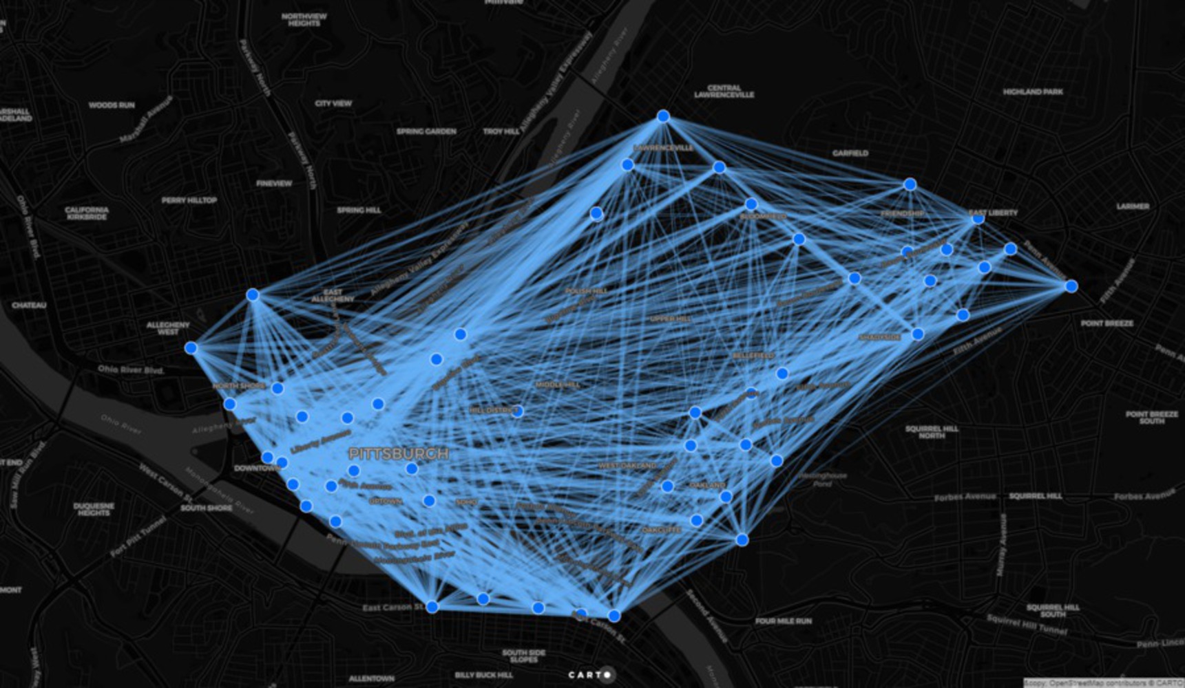
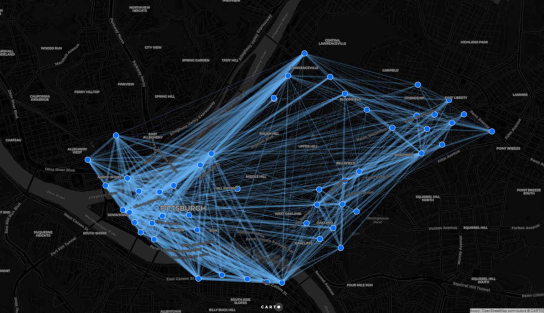
Like Mimi, I thought that it could be interesting to review the patterns of common relationships throughout the city via the Healthy Ride system. I was pleasantly surprised to see the number of shared trips taken within the city.
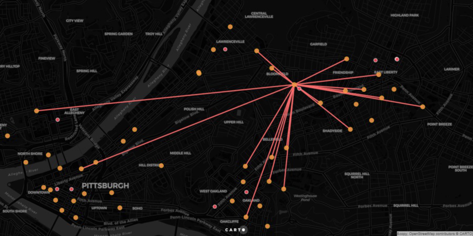
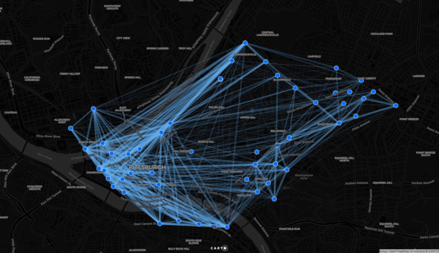
To begin we queried the total trips of our data set to narrow trips starting from the same station and ending at the same station within a 6 minute period (6 minutes allowed us to capture 3 minutes before/ after a trip to account for issues when checking in and out of a station.)
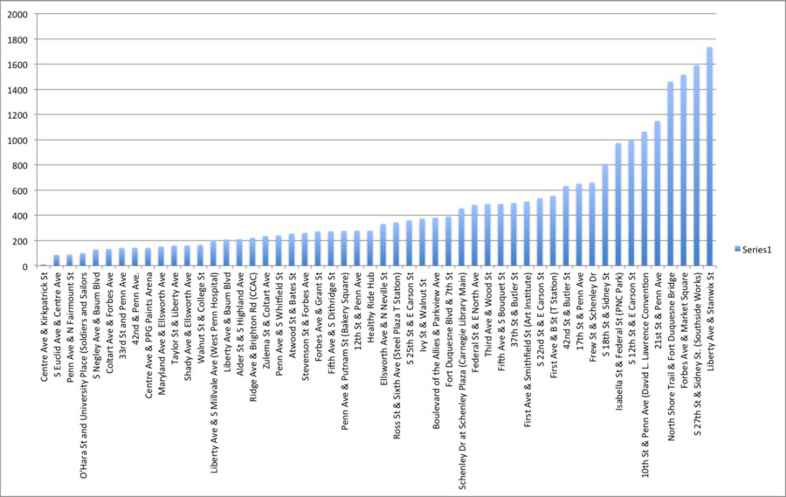
In total there were 41,165 shared trips throughout the city from May 2015-June 2017 (image below).
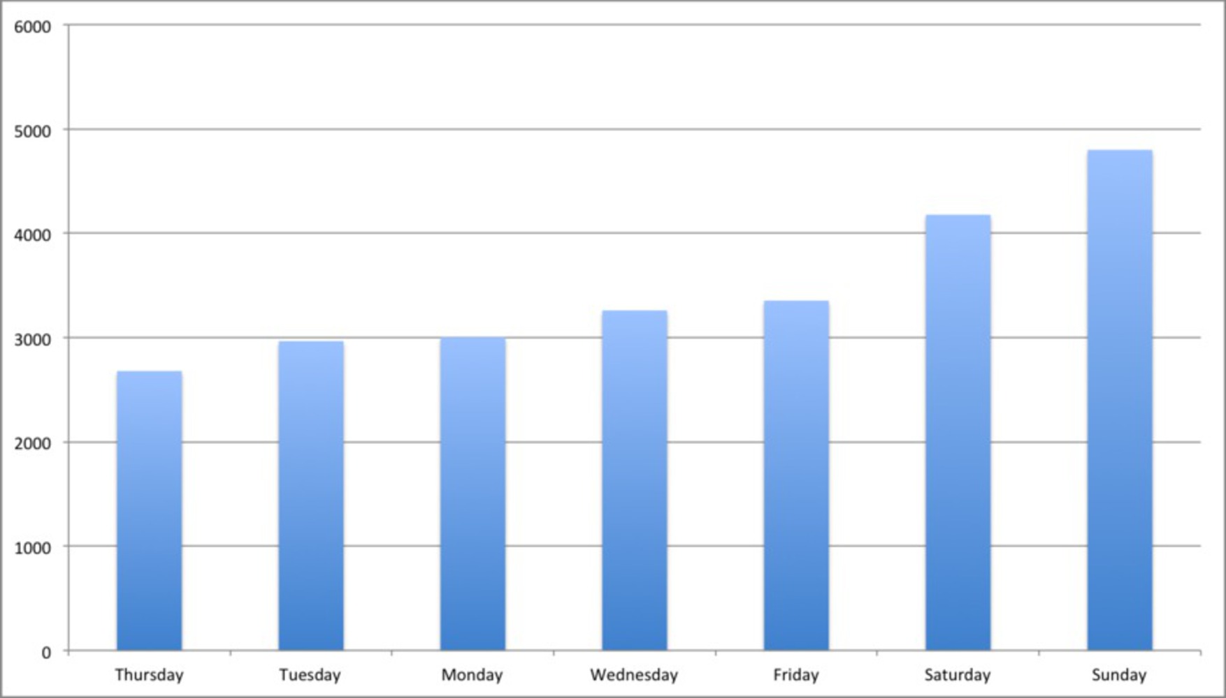
The station with the most trips was S 27th St & Sidney St. (Southside Works) with a total of 818 trips beginning and ending there. Followed shortly by North Shore Trail & Fort Duquesne Bridge with a total of 675 trips beginning and ending there.
Of the trips that began in one area and ended in another, Alder St & S Highland Ave to Penn Ave & Putnam St (Bakery Square) had the most trips with 149. Upon further analysis, almost all of these trips were taken after 5pm. (These are both popular bar/ restaurant areas!)
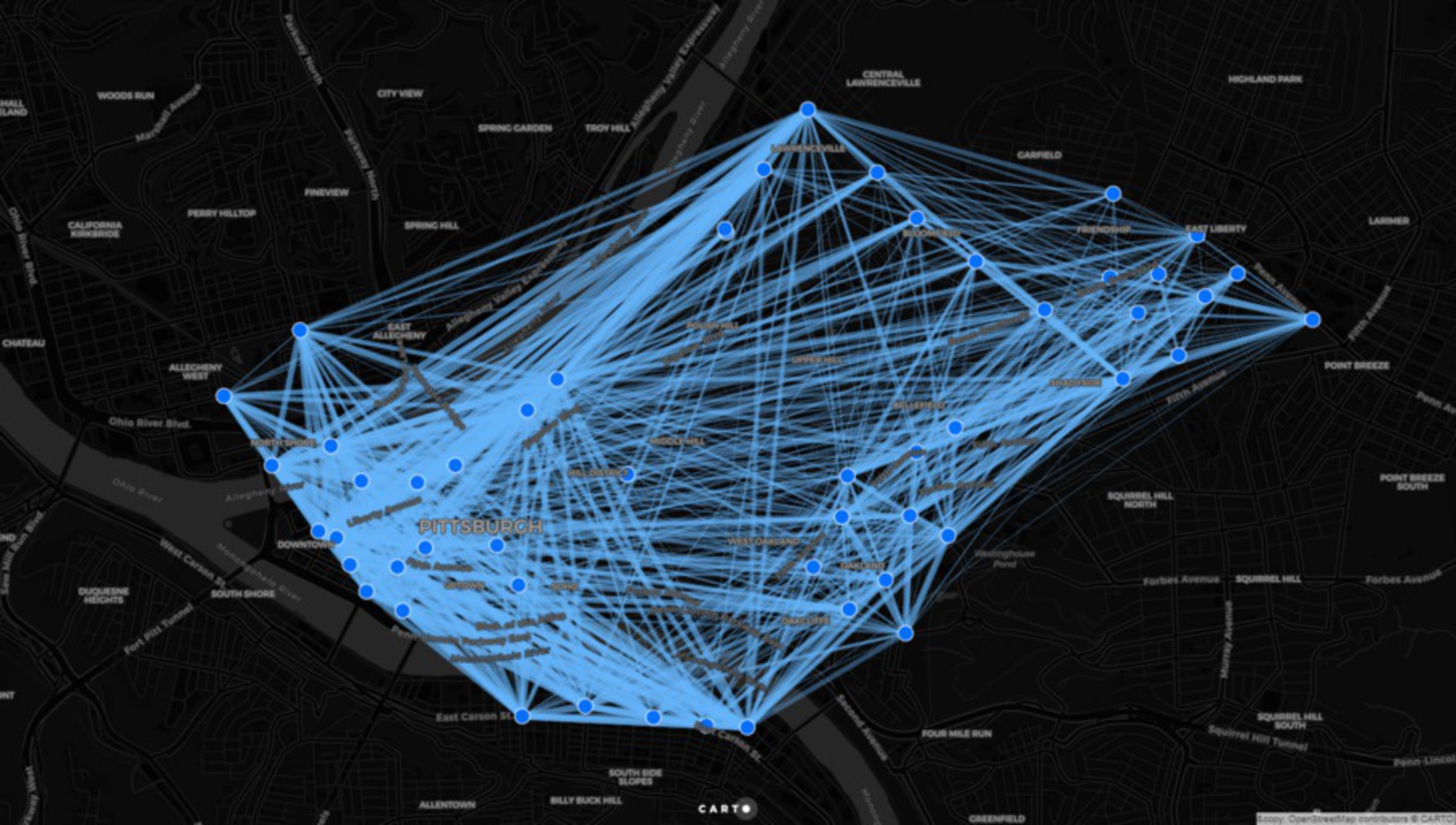
What is interesting to note is that the number of trips has reduced in 2017. This is an inverse to the data of the bike score of Pittsburgh as a whole which demonstrates that there has been an increase in the biker community over the years.
To compare the data, the total number of shared trips from January to June 2016 and 2017 reduced respectfully from 9,532 in 2016 to 7,941 in 2017.
In contrast however we see the number of trips spiking in 2016 as compared to 2015's data May to December. Where 2015 had a total of 13,972 trips and 2016 had a total of 15,028 shared trips. The increase from 2015-2016 could be related to the increase in bike stations and familiarity of the bike sharing program, as well as a demonstration of the progression of bikers and bike lanes within the city!
The use of this data and the visualization map has allowed me to begin forming deeper questions about the city as a whole:
Are fewer people using the shared bike system because they have decided to purchase a personal bike?
Will the introduction of the connect-card as a means to check out a bike help boost usage level again?
It will be interesting to continue monitoring the trend to see where and why people are using the bike share system.
Additionally, Healthy Ride can begin using the data to determine which stations potentially have more group activity and thus relies more on the availability of multiple bikes at a time. It could be useful to help determine the need for the growth of docking racks and be the start to mapping the individual station peaks and lows throughout particular days of the week. This could help to reduce issues of lack of availability of bikes and overall begin ensuring that bikes are more accessible to users.
Furthermore, the information found showed that majority of the shared trips were actually to areas with bars and restaurants- this helped me shape my proposal for the revamping of the rental stands to include a peer to peer destination list that could improve the depth of data being collected on the bikes now.
It has been noted that the station stands have recently been updated to allow checkout of a bike using a personal connect card (https://healthyridepgh.com/connectcard/).
Following this idea, it could be a useful and cheaper intervention to revamp the stands to allow for a more interactive experience with the community. Instead of simply being used to check out a bike, the stands could be used to find popular destinations throughout the city. As residents from the 'burgh check out a bike they can input their destination. This will allow the city and Healthy Rides to gather more in-depth data of the use of the shared bike system. This could also be reversed and shared with tourists/ new comers to the city to find recommended destinations within the city that are in close proximity to a bike station- think of it as a modern day yelp for bikers!
No longer will stands serve a solo purpose of checking out a bike, but rather it will be an informal collection of peer to peer data that allows the city to become even more interactive.
Further developing from that idea, the city could also look into adapting a Copenhagen Wheel: https://content.superpedestrian.com/
With data collected from the Copenhagen Wheel, users of the shared bike system could have the potential to review popular bike routes within the city. This will allow the user to find easier, safer, more popular biking paths, while also enjoying an easier ride!
With all of this data and growth of engagement through the city, we can begin pushing future design standards throughout the city even farther and ensure that our assumptions and designs are making a change, without having to actively organize a public participatory process each time we would like to improve the biking infrastructure of the city. If this form of participatory engagement was built into the use of the bike rental and include the fun aspect of data collection for interesting destinations, we can ensure that a similar affect to the VoxBox (http://2012.cities.io/project/vox-box/) occurs - without the costly design!
Thank you!
This project is only listed in this pool. Be considerate and think twice before sharing.
This analysis will look at data from the Healthy Ride trip data