create-recreate
Made by Katherine Martinez
Made by Katherine Martinez
I will research and study the work of Wassily Kandinsky and attempt to recreate it in an hour or less.
Created: September 24th, 2015
Kandinsky was born in Moscow to a rich family, fascinated by color & color interaction from an early age. Skipped school to paint, then enrolled in proper art school where he again showed a zealousness for color. At his mentor's request, he spent a full year woring solely in black and white to study pure form.
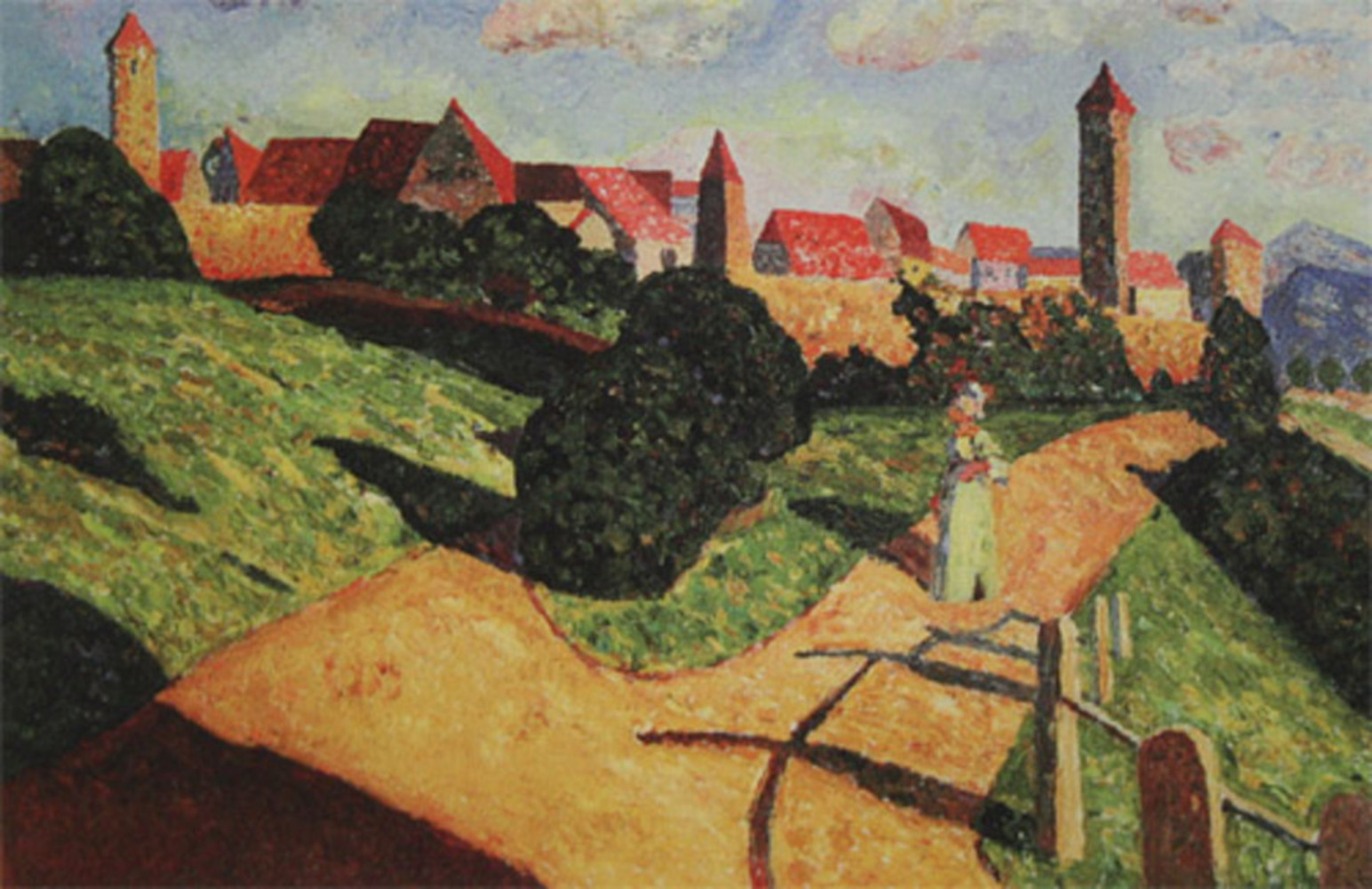
He travelled Europe for a while, painting mostly landscapes like the one displayed below. Despite the straightforward depiction, the colors are still quite bright and the shapes used to construct the image are simple. (1st image)
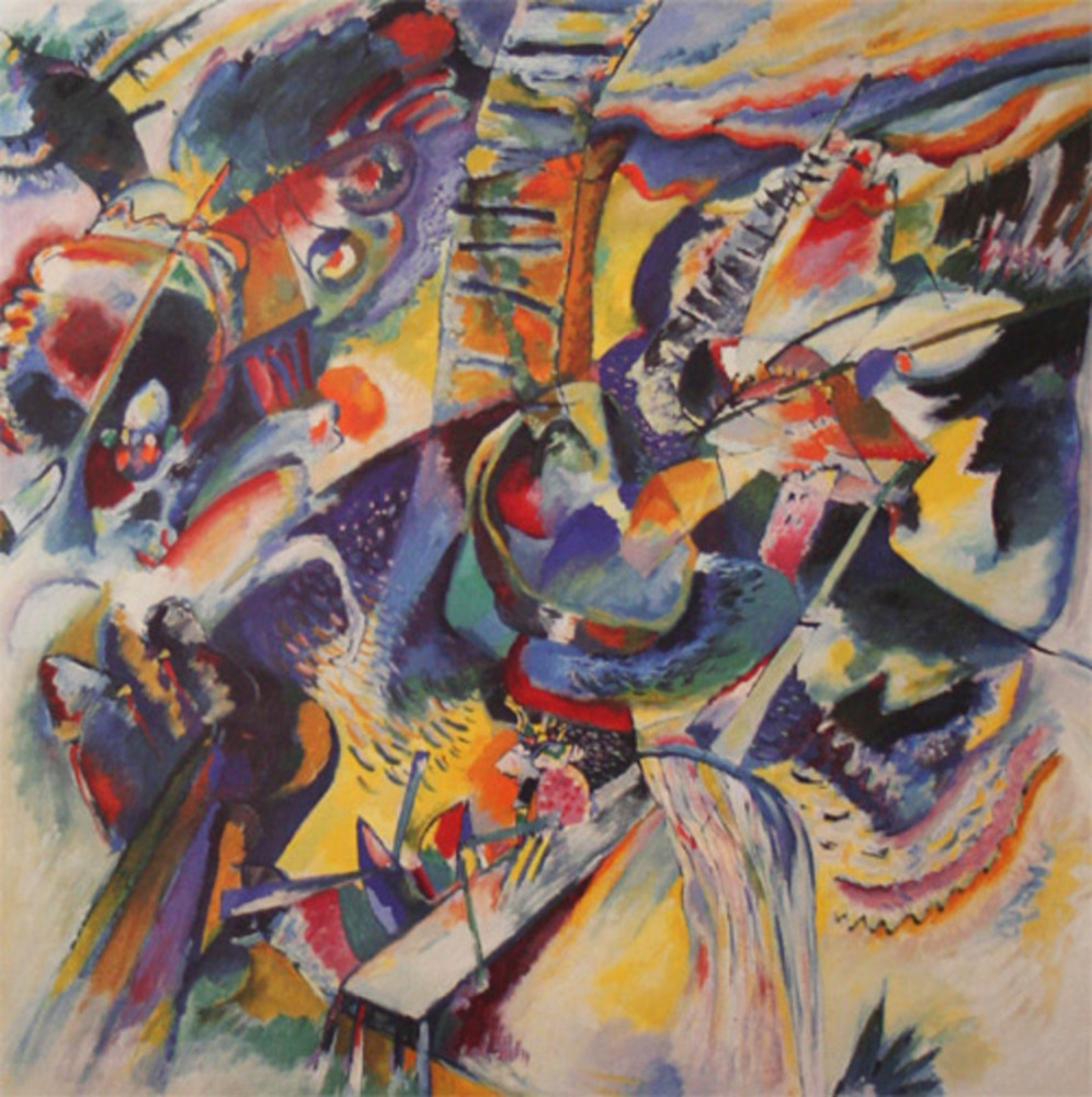
In the early 1910's, Kandinsky and a friend founded an art group called Blue Rider, focused on the interactions between color, line, and composition. His art evolved to reflect a chaotic boldness of color and form, as well as becoming more improvised and abstract. (2nd image)
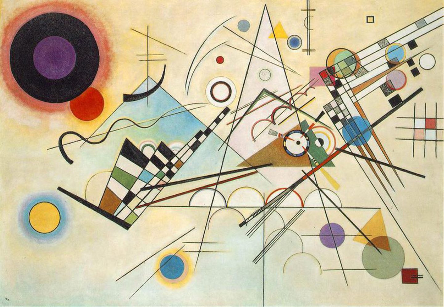
Between the 20's and 30's, Kandinsky's work became geometric and he experimented much more with form and color, influenced by the Bauhaus movement. He used more dissonant color combinations and forms that seemed scattered and chaotic, but had a very coherent composition. (3rd image)
Description
The forms of this work are very basic, consisting mostly of lines and arcs. The forms are mininal, though they convey a direction through angle respective to other forms. The circles are mostly bright colors, while the lines are dark with mostly earthy tones in the boxs they form.
Many of the circles are clearly outlined and radiate vibrant colors. The lines are arranged in a varienty of ways, with some parallel and others intersecting or forming a grid. The eye seems drawn towards the large triangle, which contains some of the most complex shapes. All the lines (and single wavy curve) are set at angles that suggest they are directed at the triangle. The piece is balanced, despite the busiest forms being on the right side.
Response
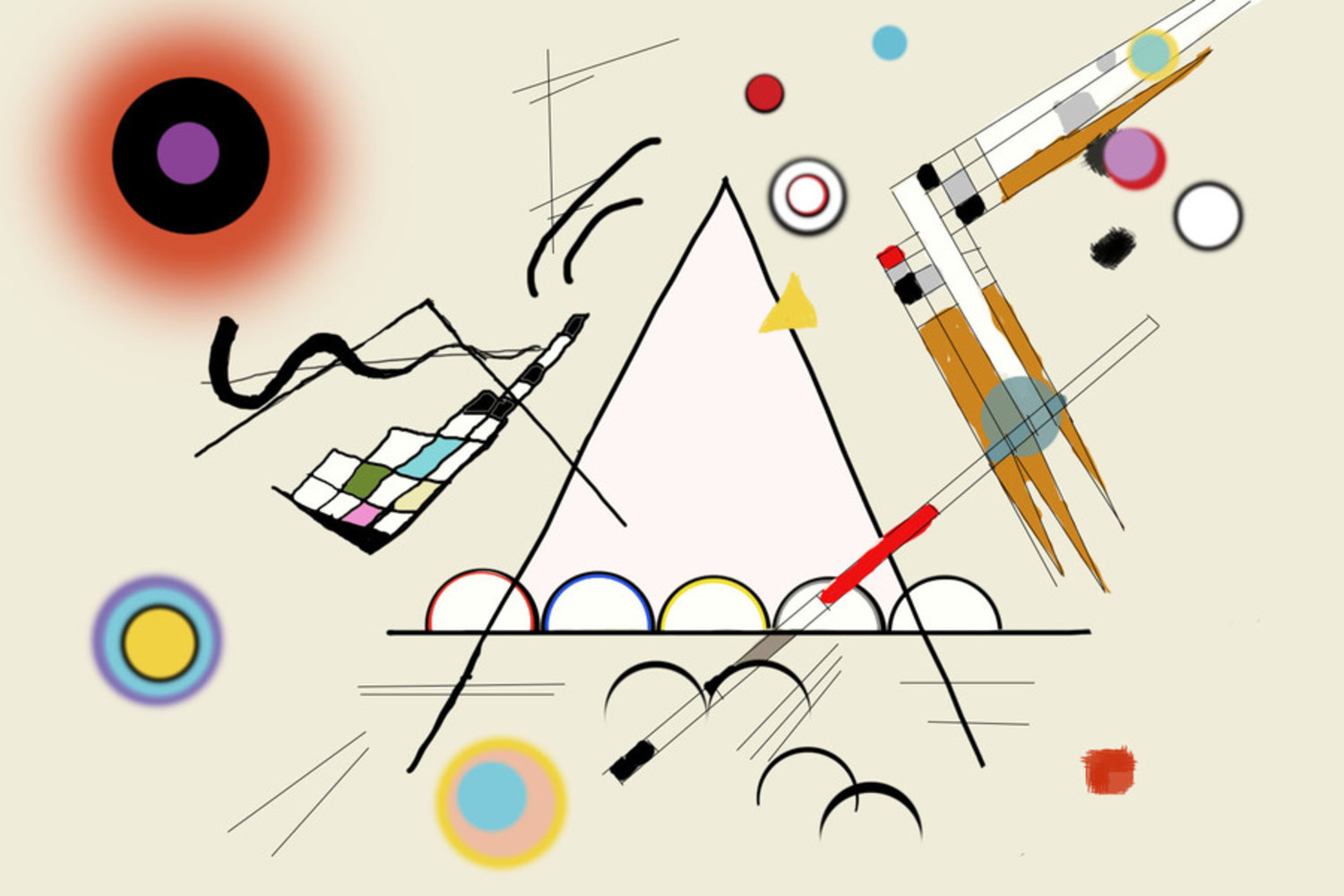
My most easily described response to this piece is one of satisfaction. The balance and simplicity of the forms is very pleasant to my eye. The colors span a wide spectrum, but still remain part of a coherent family. The complexities of some of the smaller shapes, like the circle in the brown and green triangle, take a few moments of observation to really notice, but they make it apparent that this work is carefully calculated, not just shapes tossed on a canvas. Additionally, none of the colors used are the same. There's many different hues used of each color.
However, this piece doesn't evoke any psychological response in me, nor can I describe its elements as anything other than what they are. I believe this is intended, since the painting is about as nonrepresentational as you can get. Instead of being able to just talk about my response to it, I find myself struggling to define the painting in responsive rather than descriptive ways, which ends up bringing a new level of experience to the painting.
The first thing I noticed as I worked was that I struggled greatly with the medium - digitally drawing does not feel like traditional art even with a tablet. I found it very hard to control the thicker forms, especially given the geometric nature of the piece. I think that this, more than anything else, contributed to the difficulty of this assignment for me. I spent so much time struggling to get lines right that I ended up not being able to complete all the elements that I had intended to add. I don't feel like my representation accurately captured the themes of the original work as it lacks both the texture of the original painting and the balance and precision of the forms. My color choices were also not as discerning, as I only noticed the particularity of the original's colors partway through.
I managed to make something that maybe echoes the original at half second's glance, but it simply doesn't hold up at all. It has the same general idea, but lacks any of the details that make the original so striking.
If I were to do this again, I probably would have spent more time in preparation playing with brushes and colors. I also might have kept a palette. More than anything, I would try to practice creating accurate geometry in digital art.
I chose Kandinsky for this project because I've always felt I didn't really "get" his work, but always wanted to appreciate it more. I definitely have a much stronger appreciation for his work, but still I'm not sure if I "get" it. But now, I think that's the point.
I will research and study the work of Wassily Kandinsky and attempt to recreate it in an hour or less.