Lines, Dots & Shapes
Made by Jacob Slone
Made by Jacob Slone
Created: November 25th, 2014
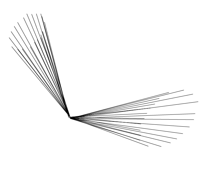
I attempted to use lines to convey the motion of stirring quickly while cooking. In order to create more balance I omitted representing the object being stirred and the rest of the body, as neither were really necessary for conveying the sense of motion. I also chose to place the object being stirred in front of the person, as staying true to the positioning would lead to foreshortening issues which would take away from the composition.
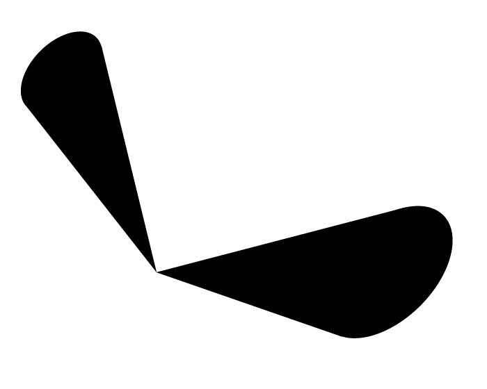
I wasn't quite sure how to apply shape to simply improve the previous composition, so instead I decided to explore how it would change it. While the solid shape does create nicer balance and it does still vaguely resemble an arm, the sense of motion is almost completely lost. I think this could be recovered with some clever shading, possibly in a cyclone like pattern, but as it is I'm not sure that shape improved the composition.
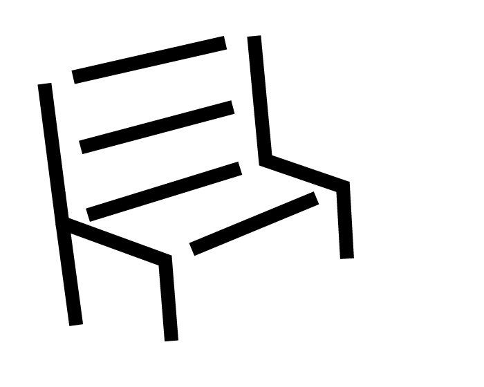
This composition was a very iterative process. It started as just two sets of three lines, one of which can be seen furthest to the right. From there, I added the second leg to the closest side, as it wasn't super clear it was a bench without it. While I thought that created an interesting image, the whitespace between the edges of the bench were too much, and made the composition feel very unbalanced. It took me a little while to decide on how to fill the middle in order to balance out the image without creating shape, but eventually I landed on the idea of using these "edge" lines to imply the surfaces of the bench.
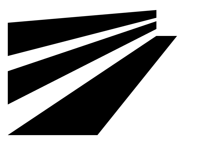
This was a little closer to the original image I was working from, but also a little more abstract. Knowing that it is a bench, it definitely feels like a really long bench, but without that information I'm not sure someone would figure that out. However, I would say it is better compositionally with much better balance, and the vanishing point is very well defined. Subject does seem a little unclear, though, as I could see someone looking at the negative space and misinterpreting it as sunlight and rays.
Drawing people is well beyond my skill set, so I decided to take the same emotion, look at some of the base elements that captured that emotion in the original photograph, and try to depict them in a pure form. So I took that feeling of protecting or doting from the original photograph and applied it to the dot and line, where the line is shielding the dot from all of the dark negative space. My biggest problem with this one was subject, as it was rather difficult to make the two objects feel separate. If we could work with tones, I probably would have opted to make the line a light grey to create this distinction, but as it is I just moved the dot around until looking at the two together felt slightly off with the hope that this would cause viewers to visually separate them.
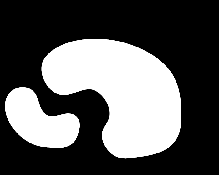
This was the same idea as the previous, but I wanted to make the line softer and the dot more autonomous. So, I made the line more of an organic shape, and for the dot I chose to mimic that organic shape with slight variations and smaller size. The result was really nice, I was also able to tweak it so that they fit together, which I think really heightened what I was going for originally.