Should State Sizes be Reduced for Energy Efficiency?

Made by Jeffrey Bradley

Show how bad data can lead to misinformed conclusions.

Created: October 31st, 2015

0

Product:

I've created a plot relating renewable electricity installed capacity per capita to populaiton for states in the US in 2013. I used census data from governing.com and energy data from nrel.gov. The plot was generated using Microsoft Excel.

0

Intent:

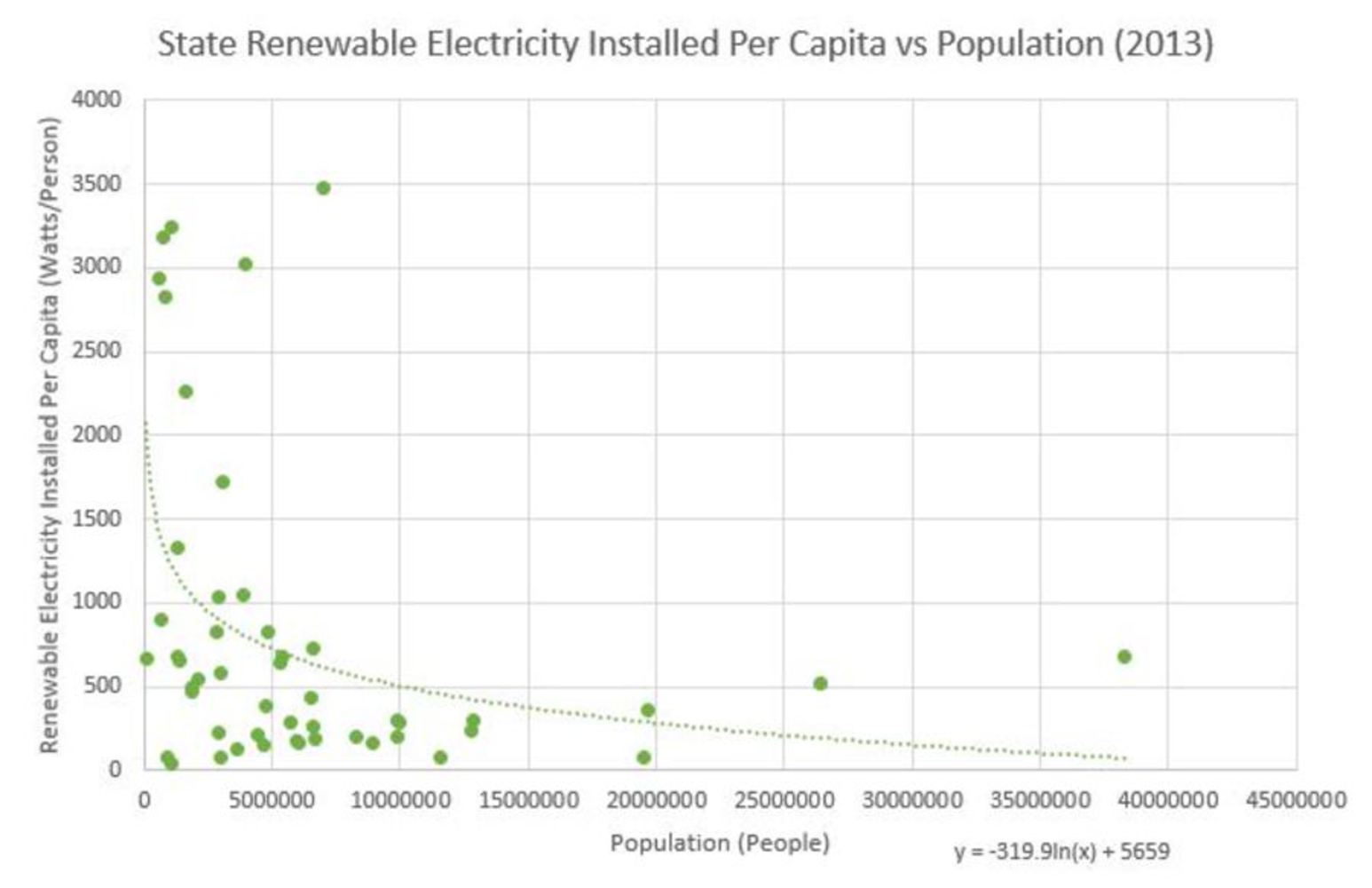
I made this in order to show how one is able to take two loosely related sets of data and force a comparison that is ultimately useless. Here, we see renewable electricity in use per person for each state in the US plotted against each state's population. This might seem somewhat useful at first glance, but then one remembers how the value of interest is calculated. Of course one will see abnormally high values of anything per person in places with fewer people. We are dividing a value by a smaller value rather than a bigger one. Other factors influence the value of interest here, thereby making the relationship shown above less meaningful if not meaningless. 

Data is skewed in this way all the time. It becomes a problem, however, when people fail to realize mistakes in data representation and make efforts to change policies. 

"How could you believe in global warming? My home town had its coldest winter ever! Why should we change pollution laws if the whole thing is a hoax?"

Failure to consider context and methods can make bogus graphs like the one above seem legitimate. 

"Wait! We should cut all states in half so we can use more renewable electricity!"

0

Context:

Renewable electricity installed capacity refers to the intended sustainable output of renewable electricity by some source. The data explored here takes that value for each state and divides it by the population to give a capacity per person. The graph above is not meaningful, however, because both population and area in which one can produce electricity are related to the size of the states themselves. We cannot gather anything from the relationship above. 

0

Process:

I gathered population and energy data from the sources below to create a graph relating the two. The data and chart can be found below. 

0

Reflection:

The work is not at all visually appealing. However, I believe it can be thought provoking if one is fooled by the data at first. It represents a plausible way in which useless data can be presented in a somewhat convincing way. 

x
Share this Project


About

Show how bad data can lead to misinformed conclusions.