Mantra of the Manta Ray
Made by Rikky Roy Koganti
Made by Rikky Roy Koganti
Balance and Instability
Created: December 1st, 2014
The dichotomy I chose was balance versus instability. Balance to me is one of the first things I take notice of in any visual composition after all, and anything that seems off-balance just always strikes out at me. I chose a manta ray as my subject, but this was not a random decision. I wanted to choose some form of marine life, as I have always admired the aesthetic quality of underwater life. My reason for choosing a manta ray, was because of its unique shape in the marine world since most aquatic animals are much more streamlined in shape. Also, its flatness makes it easier to represent in a two dimensional space.
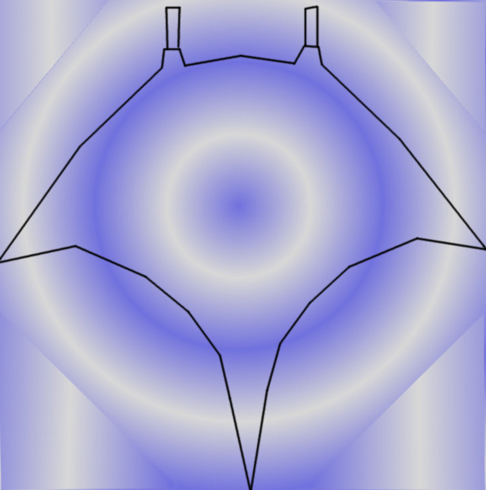
The above representation is supposed to be an overhead view of a manta ray swimming close to the surface of the water, with the sun shining down upon it. The major technique I used to achieve balance in this photo, was symmetry. Notice how the outline of the manta ray, the shades of light and the circles are perfectly symmetrical via an vertical axis straight down the middle. I used the outwardly expanding circles in the center to represent ripples in the water, and they helped to give of a feeling of being in water as well. The fact that these circles can also be viewed as converging inward on that dark point in the middle is another attempt of mine to balance the photo by making the whole composition seem to be centered.
Initially, I did not have the 4 diagonal lines carving out the right angled triangles at the four corners; there was just another bigger circle, but I wanted to create an effect where it seems like we are peering at the manta ray through a lens of sorts, and the lines were added in for such effect. I then used straight rays of white in each of the four corners, in order to contrast against the circular lines so far in the photo. I felt that the straight lines help to give the composition a sense of direction, drawing attention to the direction in which the manta ray is moving. Lastly, I experimented with a bunch of different color gradients, but ended up choosing the above color schemes, as those best represented clear water and sunlight to me.
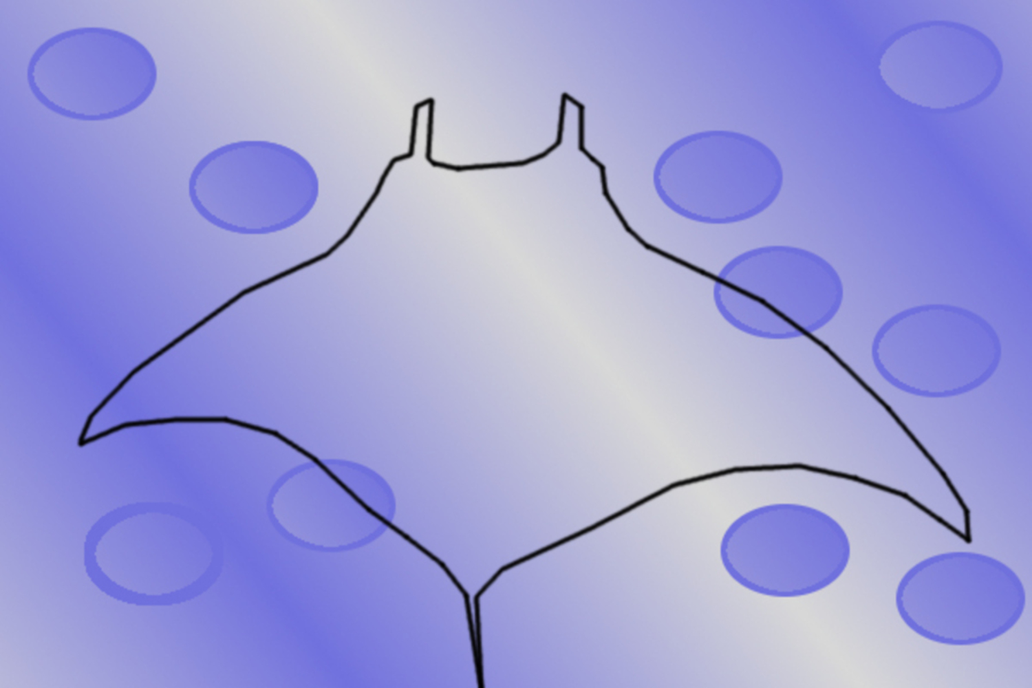
The above composition is once again supposed to represent an overhead view of a manta ray swimming close to the surface of the water, with the sun shining down upon it. However, a quick look makes it pretty clear that the above composition is nowhere near as balanced as the previous one. But in truth, I believe that this composition is closer to how the actual scene would look in nature. The outline of the manta ray is not perfectly symmetrical anymore, down the vertical center axis, but in reality, a manta ray is rarely swimming symmetrically. It has to keep itself at a certain angle to fight against the currents, and its fins and tails are constantly in motion, to help it balance its large flat body in the water. It seems ironic that it looks visually unstable when it is in fact in balance. That's the message I wanted to convey with this composition of instability. It might look unbalanced, but in reality, that is the way it needs to be.
In this composition, the circles are meant to represent bubbles coming from the manta ray's gills. Once again, in reality, such air bubbles would rarely be equidistant or symmetrical with one another. Therefore, I positioned them at various positions near the edges of the manta ray's fins but in various patterns and amounts. Lastly, we have the light shining down on the ray. I simply use one ray of light shining down in the center, and position darker lines on either side to better contrast with the light. However, the white ray is not diagonal and does not cut the ray through a symmetrical position either. I only had one diagonal white ray, because this would give the picture a sense of being off-balance. When there is only one such diagonal line that stands out, most people would expect that line to be entering and exiting at each opposite corner of the picture. And yet, it does not. Thus, its position being clearly off-center makes the unbalanced effect more pronounced.