Mortality and Lies

Made by mzhong1

"Data!Data!Data! I can't make bricks without clay!" -Sherlock Holmes To lie about the statistical data about mortality rates in the U.S.

Created: October 31st, 2015

0

Product

I built pictures of circle data!  I used https://pixlr.com/editor/ instead of Photoshop since its free for the final products and http://www.onlinecharttool.com/graph for the graphs so I could make some more sense of the data and Notepad for the actual ACTUAL data in relation to the total population of the U.S. I used circles because I like them and because they are so easy to misinterpret as being larger than other circles and they also are great for misconstruing comparisons.  
0

It's easier to compare with a bar graph though, so here's a bar graph:

0

And Don't forget the Data: 

Percentage Deaths

Total: .86% total population

White: .99% ~ 1%

Black: 2.84%

Native: .58%

Asian: .38%

Lies: 1. Used 2010 data for population and 2013 data for deaths

2. the actual percentage of deaths in comparison to the total population of each demoraphic is actually quite small

and relatively the same.

3. It is only when comparing how many people of one demographic die to another that anything is miscontrued.

4. I built the graphic so it only compares the number of people of each demographic to each other out of the total.

In actuality, the relative number of deaths is actually the same.

0

Intention

The point of this infographic was the emphasize how we look at numbers and statistics.  Specifically, the fact that while data can be entirely accurate, with no manipulations in the minutiae, it can still be represented in such a way that exaggerates the numbers.  In this case, I wanted to exaggerate the death rates of various demographics in the U.S. My goal was the present the actual data correctly in circles, which, when looked at, seems like a large amount -a total of 2,563, 706 people died in 2013, which is a lot of people, and the numbers in each demographic is quite accurate.  However, when comparing the actual percentages, only about .8% of the total U.S. population died in 2013, and each demographic had about 1% of people dead (in the first graph, anyways).  So I really wanted to show how relativity in data can be skewed towards a bias.  Since I don't actually show how many people, especially in the first graph, are of a specific demographic, it seems as if a lot more people die than in reality.  
0

Context

I was inspired by a TED Talk where the data in that context was not the number of deaths but the number of soldiers each country has.  In this case, looking at just the number of soldiers gives the impression that China has a massive military force.  However, when the presenter showed how many soldiers there were in comparison to the population of each country, North Korea and Israel came out on top.  I thought that I would do something similar with death rates.  Show how information can be entirely accurate in terms of data but skewed in the presentation of relative data. 
0

Process

First I found the data by looking online.  Originally I was going to use Unity to create animated circles which one could click which would present the statistics of each country, and it could be sorted by demographics given by census.  This was....way out of scope.  Also, there was the small problem of getting the data for other countries besides the U.S.  So it was back to the drawing board.


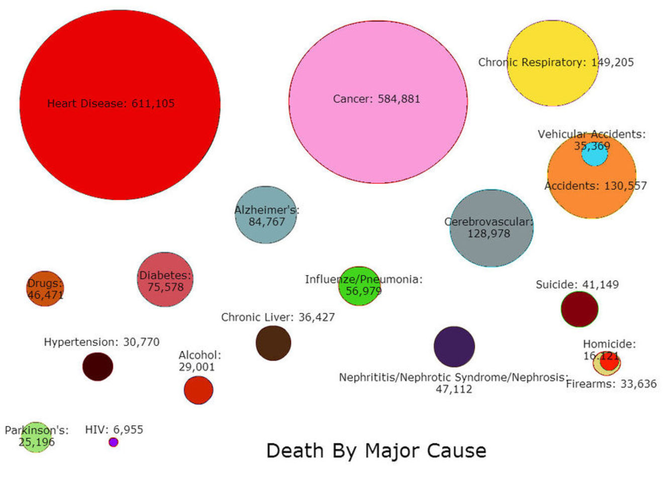
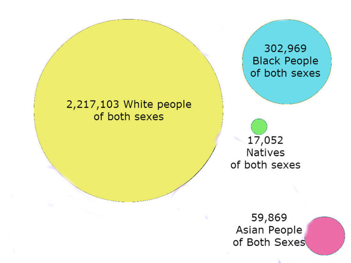
Next, I decided to limit my scope to the U.S.  So I did manage to get the data for the U.S. but there sorting the data into different territories and finding precise data for states and territories was also out of scope.  So in the end, I just used the census for different ways of death, which was much more manageable.  

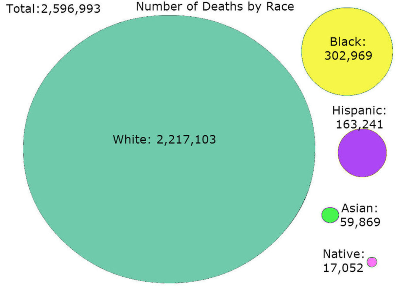
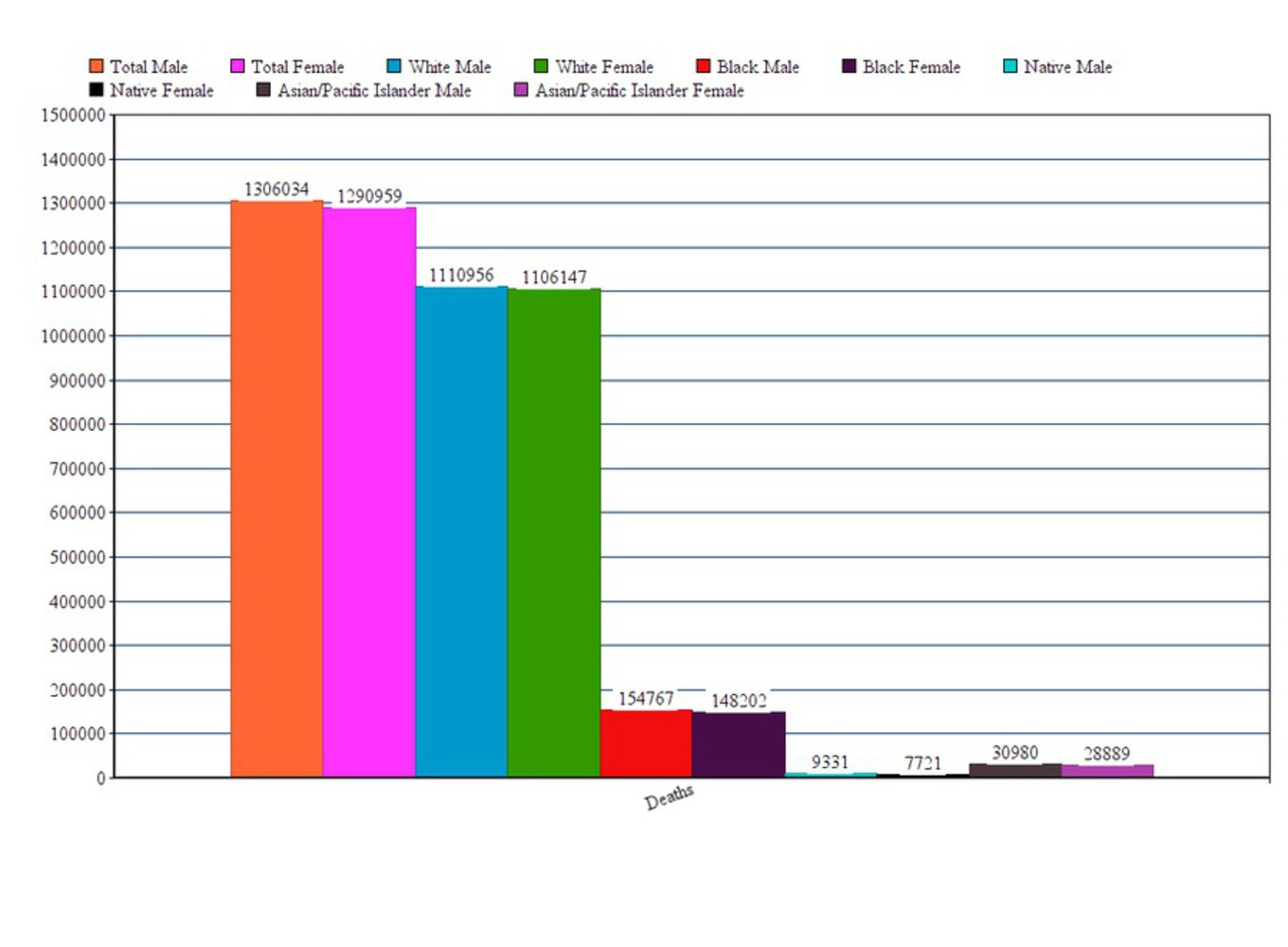
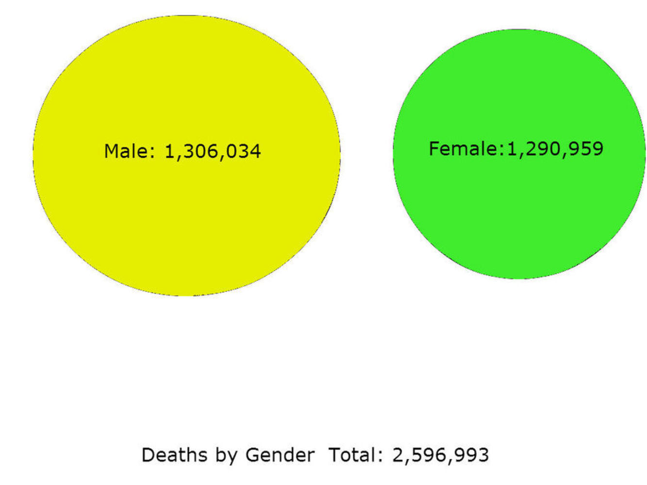
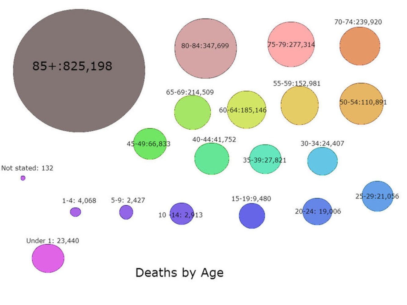
I then looked at the data, and built graphs for each set.  However, this wasn't very pretty.  Bar graphs can only be so interesting.  So instead, I went back to the circle approach.  I approximated sizes of circles based on the numbers given and drew circles labelled with the data.  The totals were the background, which were labelled.  I then calculated the actual percentages compared to the total population in 2010 (since I couldn't find the data for 2013.  So the nice circle graphs are the actual product, which is quite misleading, while I also had a nice table with the actual percentages relative to the total population in the U.S.

0

Reflection

Well, this project I was really excited about.  I wanted to do so many things, like animated circles which could present data in cool ways and have a UI which would let people look at the data in different ways and compare the relations of the data.  Then I realized that that would not be feasible in the amount of time that I had.  Not to mention, the kinds of data I wanted (murder statistics and other things) aren't actually readily available, and especially not for other countries.  So I had to scale down.  A lot.  It was very disappointing actually.  If I had more time I could probably make what I originally wanted on a smaller scale (U.S. only), but I realize that with certain time allocations some things really should be kept simple.  Not to mention that inputting data and approximating circles based on large numbers is actually REALLY HARD.  More time means finding a formula that would produce more accurate and pretty results.   Otherwise, I was disappointed that I had to scale down my idea to simple graphics instead of nice, animated circles and data, but it was still a lot of fun.  
x
Share this Project


About

"Data!Data!Data! I can't make bricks without clay!"
-Sherlock Holmes
To lie about the statistical data about mortality rates in the U.S.