Myers Briggs
Made by Janine Louie
Made by Janine Louie
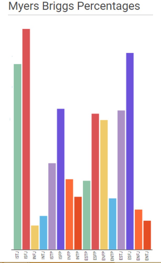
To try and convince the viewer that their Myers Briggs Result is either really rare or very ordinary.
Created: November 2nd, 2015
To try and convince the viewer that their Myers Briggs Result is either really rare or very ordinary.