LOVE

Made by Judy Mai

to draw on ideas from pop art and create a potentially valuable work of art

Created: October 9th, 2015

0

Intention

0

What defines pop art as art? It's certainly not the traditional fine art that one would expect, but rather art that draws from advertisements and news and embodies ideas mass culture, hence "popular" art.

0

I wanted to make pop art that referenced back to something iconic and valuable and that meant something to me.

A lot of the time, such as in many Andy Warhol paintings, pop art has a lot of repetition. It could be the same image over and over again with a slight modification, such as his Campbell Soup Cans series, or his multicolor Marilyn Monroe series.

0
Campbell's Soup Cans (left), Marilyn Monroe (right)
Campbell soup marilyn.thumb Andy Warhol (1962)
0

Context

0

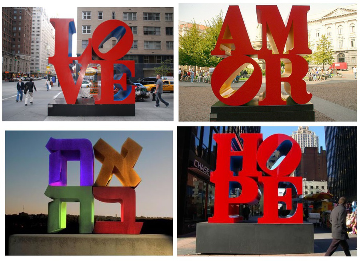
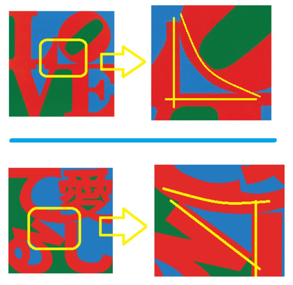
This LOVE steel sculpture has caught my eye many times already. I've seen pretty much all over the place (in New York, UPenn, etc) and in different forms (such as cute miniature ones).

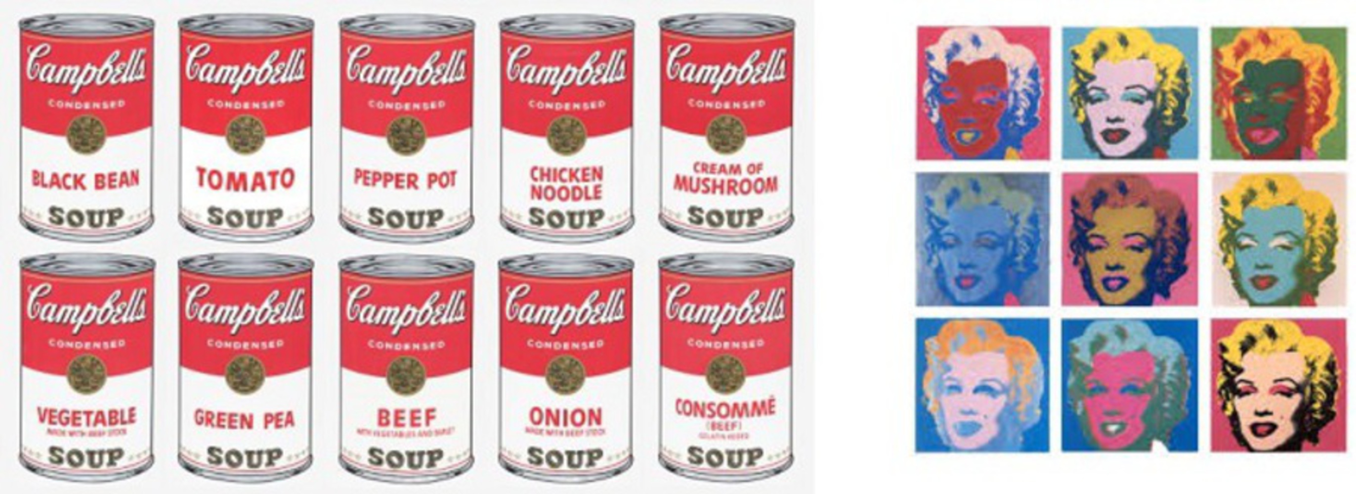
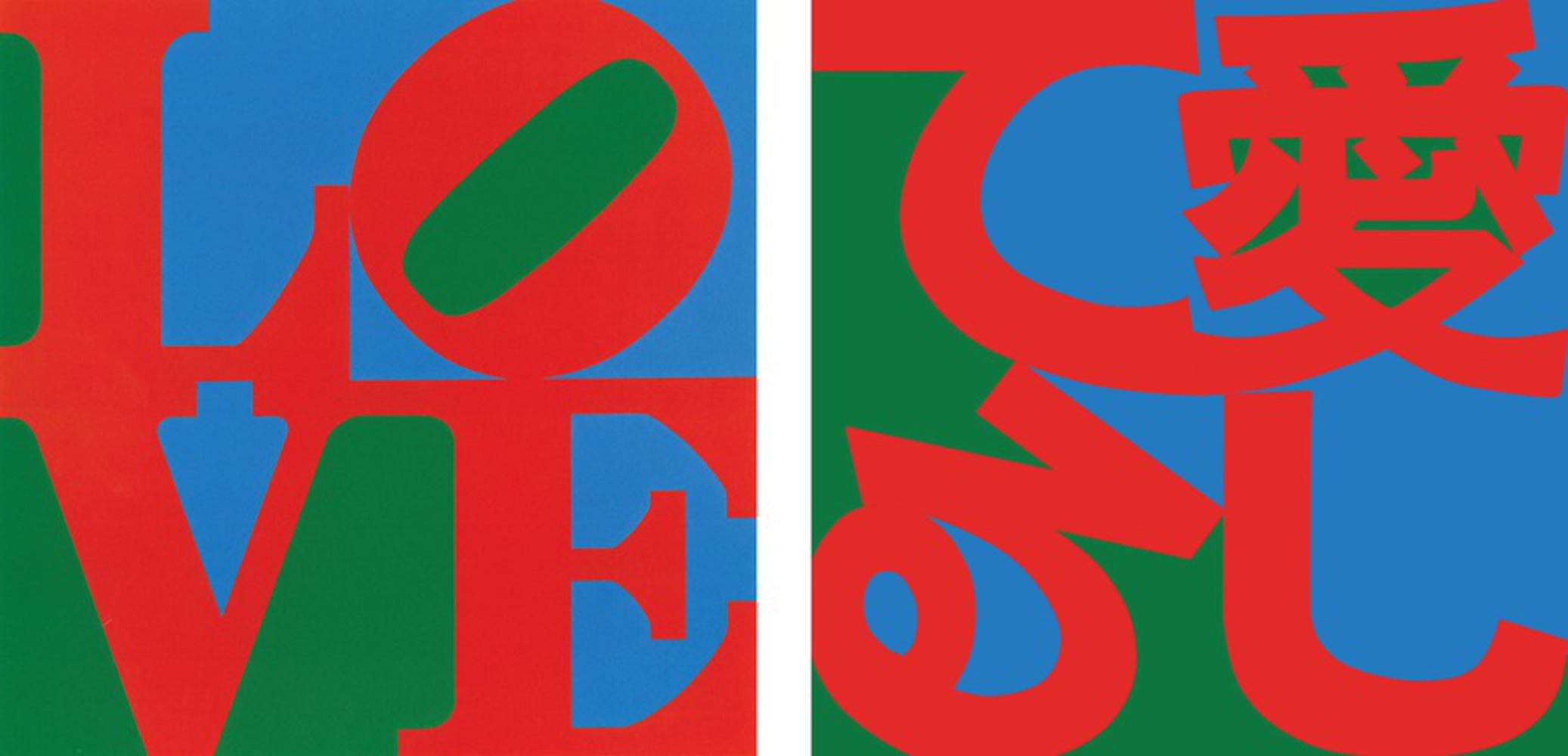
Though it is relatively simple, LOVE in red with the O slanted and green/blue backing, it conveys a powerful meaning that connects everyone. This iconic image was made by pop artist Robert Indiana, and originally stemmed off an image for a Christmas card. It also comes in different languages, such as in Chinese, Hebrew, Italian, and the Spanish version: AMOR. There's even a HOPE version.

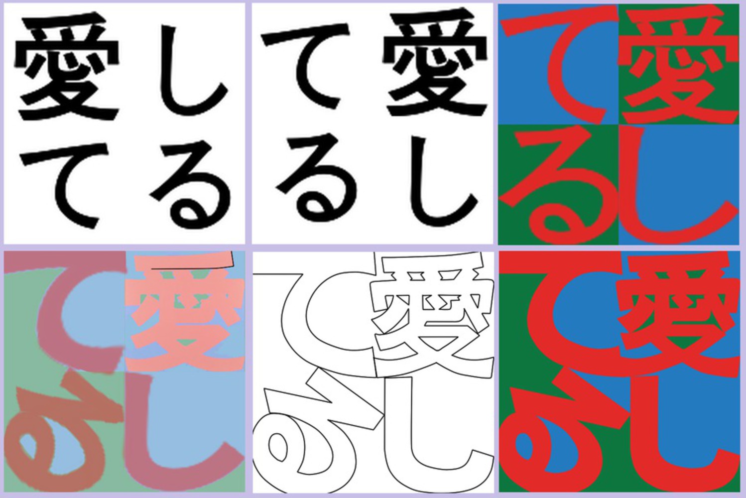
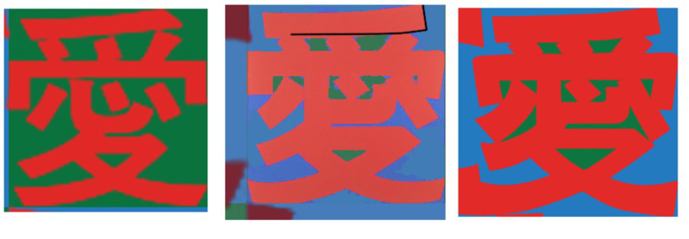
Since there are so many different versions of this popular sculpture, I wanted to create my own. I've always really loved the word "LOVE" and the deep meaning behind it, which really speaks out to me.

I decided to do it in Japanese, since it hasn't been done before.

0
LOVE
Love sculptures.thumb Robert Indiana
0

Process

0
Process (left to right)
Process.thumb Judy Mai (2015)
0

I chose to use the words: 愛してる ("ai-shi-te-ru") which means "I love you" in Japanese. At first I was going to use 好きです ("su-ki-de-su"), which means "I like you," but I really wanted to follow the love theme.

At first I layed it out left to right as Robert Indiana did, but Japanese is read from right to left and vertically, so I rearranged it accordingly for accuracy.

Next I generally figured out the colors and the thickness of the words and rearranged/resized the composition. I nearly forgot to slant one of the characters, as LOVE has O slanted. This is a crucial distinctive factor, but I had some trouble incorporating it into my 4 characters, which looked a bit strange. I couldn't really slant 愛, し, or て without making it look illegible or like a different character, so I think slanting る was a good choice.

0

Product

0
愛してる
Aishiteru 6.thumb Judy Mai (2015)
0

This is my final product, 愛してる.

I think it accurately emulates Robert Indiana's LOVE and I even incorporated some of the elements in the original (naturally I couldn't make a sculpture so I used his original drawing). 

0
LOVE (1962), 愛してる (2015)
Compare.thumb Robert Indiana (left), Judy Mai (right)
0

I wanted to make sure that I had enough blue and green in the negative space, and I had a lot of trouble figuring out how to get enough green in the 愛 character because it's so detailed. I had to re-line it several times before I could get an amount I was satisfied with.

0
Negative green space
Green.thumb
0

Another element I wanted to follow was the center point of the drawing.

In the original LOVE, there's a curved right-triangle blue shape in the center where the four letters meet up, and I wanted to sort of emulate that for unity.

As you can see, I tried to imitate that curved triangular shape in mine as well, which took some rearranging of the top two characters to get the curve right.

0
Curved triangle technique
Technique.thumb
0

Critique

0

 愛してる obviously emulates a similar style to Robert Indiana's LOVE. Because of the nature of the Japanese language, there are many more curves involved, which detracts from LOVE's simplicity and clear-cut lines.

Especially since the 愛 character has significantly more detail, your eye is drawn to it, but that is the character that symbolizes "love" in Japanese, so it is alright, although the image is less unified.

But because of that, I think there's not enough definition in the negative spaces. Despite efforts trying to increase the amount of green, there is no "large patch" of it, and instead many cut up bits and pieces of it which is slightly unappealing. However, even if I were to increase the amount of space by making the character thinner, then the character would be even thinner than it already is and would be similarly unappealing.

0

Reflection

0

Creating this image was honestly harder than I expected. I thought it would be as easy as just throwing down 4 Japanese characters and then resizing accordingly and then coloring in the background, but I ran into other complications, such as it being oddly too thin or putting them together in strange shapes that didn't go together well.

The largest part of my time went in reshaping the Japanese font I used to look properly in the square canvas. I had to adjust the thickness of the font and how it was shaped and also account for certain techniques (such as the curved triangle or the amount of negative space).

I think that choosing to slant る was a good call. If I had more time I would try to perfect my forms more, especially in 愛. I could try to make the thicknesses more even (or perhaps try to vary the thicknesses as Indiana did).

Overall though, I think this was a decent attempt at creating a Japanese version of LOVE ♥  

0

Sources

x
Share this Project


About

to draw on ideas from pop art and create a potentially valuable work of art