PopArt, Technology, and Consumerism

Made by Christina Reimond

Created: December 3rd, 2014

0

When watching the documentary about Warhol’s life, I noticed that much of his work seemed to be commenting on consumerism. Today, much of consumerism is about technology. This is especially noticeable this time of year, during the pre-Christmas shopping rush. We spend so much time, money, and energy on technology. People stand in long lines to get the newest phone, or gaming console, or laptop. Hours are spent updating Facebook and other social media sites. Technology definitely has its benefits, but are we spending too much on it?

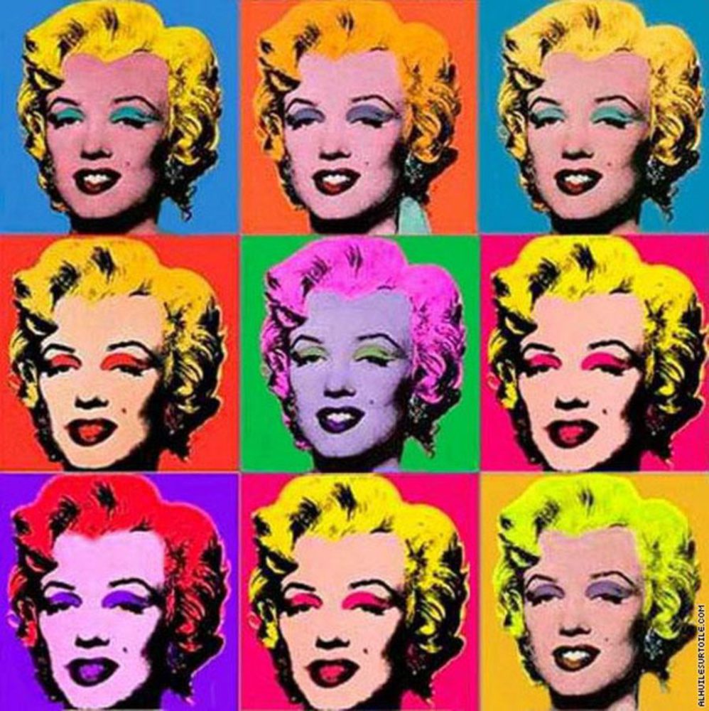
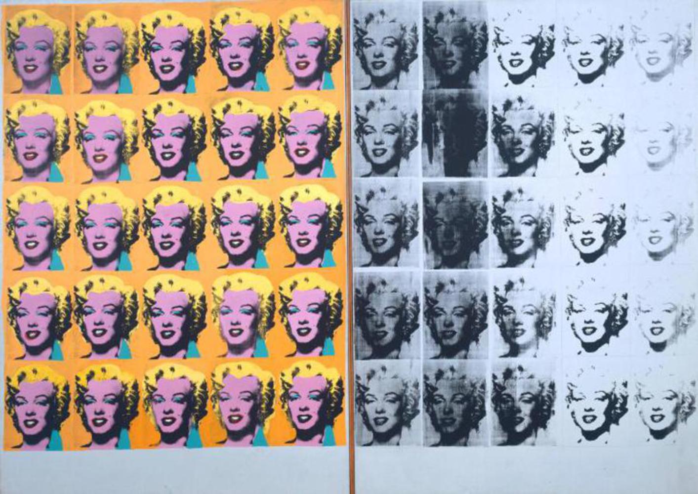
My goal with my piece is to cause a viewer to think about technology and the role it plays in our lives. I drew inspiration from several of Warhol’s pieces. First, I thought of his piece depicting cans of Campbell’s soup. He depicted a logo, over and over, yet changed slightly in each case. This was (and still is!) an everyday item, and yet he turned it into art that caused viewers to think about it. Similarly to this work, I chose a logo to depict: the Apple logo. This logo is very familiar to our culture, and immediately causes us to think of laptops, phones, iPods, and other forms of technology.  

Outcome:

0

Approach:


Like the Campbell’s soup piece, I chose to repeat the logo over and over, changing each one slightly. However, I chose to change the color in each, not an aspect of the image. 

0

This is where I began to draw inspiration from Warhol’s pieces depicting Marilyn Monroe. Each one depicts her with bright, almost clashing, colors. These colors change the whole mood of the image. One can look almost comical, another glamorous, and another serious. I replicated this idea in repeating the logo over and over, changing the colors each time. I chose to start with brighter, more playful colors to the left, and move to deeper, darker ones at the right, to draw a viewer’s eyes from right to left. I also made sure to repeat my use of some of the colors to tie the different squares together to form a unified piece.


0


When I was choosing the colors to use, I remembered how the speaker in the documentary commented on one of Warhol’s pieces depicting Marilyn Monroe. He noted how the images went from color and lighter, to darker and more serious, remarking on her early death.

I went for a similar quality, going from light to dark, ending on a very serious note with a black and white logo, with a touch of red. I am hoping to cause a viewer to think about technology and consumerism and their roles in our lives.


0

Images from:

http://en.wikipedia.org/wiki/Campbell%27s_Soup_Cans

www.alhuilesurtoile.com/prod/marilyn-monroe-3x3-warhol-1925,217.html

http://www.tate.org.uk/art/artworks/warhol-marilyn-diptych-t03093

x